Eating Locally is not Necessarily Ecological

Super fact 30: Eating locally is often promoted as an environmentally friendly choice, but that is not always the case.

Whether the food you eat is sustainable and environmentally friendly or not depends on a lot of factors including agricultural methods, whether greenhouse farming or monocropping was used, and whether the crop is natural to its environment. In addition, inefficient local transportation can result in higher emissions than faraway transport by ships and trains. If a crop is grown locally in greenhouses, the extra energy that is needed, and the resulting extra carbon emissions are often much larger than the emissions from the transport.

Cargo ship at sunset. Emissions from the transport of produce is not the main factor for emissions.
Photo by aries nha on Pexels.com

I consider this a super fact because it is often assumed that buying locally is the best choice for the environment. After all, transporting something across the world causes a lot of emissions, right? It turns out not to be that simple.

Articles on Transportation of Food in my French Book

The first time this issue was brought to my attention was in my French class. I am learning French, just as a hobby. There was an article in our French book on the transportation of food around the world “Notre planète ne tourne pas rond!”.

We read that cashews were grown in the Ivory Coast in Africa and then sent for peeling and cleaning in Brazil and then sent to France to be sold. The cashews travelled 10,000 kilometers or 6.250 miles. We read about cod that was caught in Norway then sent to China to be cut into filets and then sent to France to be sold. That cod travelled 15,000 kilometers. We all thought it was crazy, and very bad for the environment, so much unnecessary emissions from transportation. But we all learned a few new French words.

Then at our next class, we turned the page “Consommer local, vraiment bon pour la planète?” / “Consuming locally, really good for the planet?”. Wait what? The next article confused us since it stated that in many cases eating locally was bad for the environment, not good for the environment. Transporting the food around the globe might be good for the environment.

Incidentally, at the time I was reading “Not the End of the World, How we can be the first generation to build a sustainable planet” by Hannah Richie, the research director for “Our World in Data”. “Our World in Data” is a highly regarded free and open-source website that collects and analysis vetted statistics on a large range of topics. In that book she stated that the data showed that tomatoes imported to Sweden from Spain caused less carbon emission than tomatoes grown locally in Sweden.

The Problem with Locally Grown Tomatoes

This article from University of Southern Denmark claim that importing tomatoes from warm countries are better for the environment than buying locally. The reason being that when tomatoes are grown in an open field, the production emits an average of 80 kg CO2 per ton, but if the tomatoes are grown in a greenhouse, they emit up to 700 kg CO2 per ton. In northern countries it is common to grow tomatoes in greenhouses, especially when they are out of season. The long transport of the tomatoes causes much less emissions than that.

This scientific article analyses the issue a bit deeper and concludes that “that the distance travelled by the tomatoes is not the most important environmental burden”. Whether the tomatoes were grown in greenhouses or not matters a lot, but there are many other factors. In short, it is complicated.

Lots of fresh red tomatoes | Eating Locally is not Necessarily Ecological
Photo by Julia Nagy on Pexels.com

This study of local vs. imported tomato production in Canada concludes that locally grown tomatoes grown in greenhouses on average cause 1,070 grams of carbon emissions per kilo of tomatoes grown and tomatoes grown open field in Mexico cause 775 grams of carbon emissions per kilo of tomatoes, despite the 3,800-kilometer journey from Mexico to Ontario, Canada. The reason for the higher emissions for locally grown tomatoes is again that greenhouses use a lot of energy.

Naturally, this would change if you grew the tomatoes in season without using greenhouses. The article also notes that carbon emissions are not the only issue for sustainability. Water usage is another important factor.

The Problem with Locally Grown Vegetables and Fruits

Tomatoes are just one example. The same hold true for cucumbers, lettuce and salad greens, potatoes, bell peppers, hot peppers, green beans and other bean varieties, berries, pineapples, bananas, mangoes, other tropical fruits. In addition, some of these crops can deplete the soil and require large amounts of water, which can be bad if they are being cultivated in areas where water resources are already scarce such as growing avocados in California. In general, growing vegetables and fruits in their natural environment tends to be the most sustainable.

Fresh yellow bananas | Eating Locally is not Necessarily Ecological
Photo by Dom J on Pexels.com

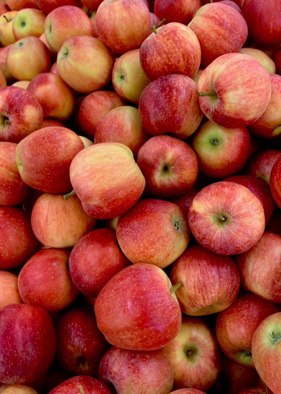
The Problem with Locally Grown Apples

The problem with apples tends to be the opposite, geography wise. In warmer areas, they might require significant water resources or chemical inputs to thrive. Apples from cooler climates need less water and fewer chemicals, reducing their ecological impact.

Lots of apples | Eating Locally is not Necessarily Ecological
Photo by Pierpaolo Riondato on Pexels.com

Local versus Imported It’s Complicated

I should point out that growing locally sometimes being worse for the environment than importing does not mean that importing produce is better for the environment. It just means that it is complicated and that you need to make that determination on a case-by-case basis. The environment is also not the only concern. Another consideration is the protection of local farmers and the local economy.

My opinion is, instead of worrying a lot about local versus imported produce, it is better to focus on things that we know cause a lot of emissions. A dirty grid, coal power stations, a non-hybrid SUV with an internal combustion engine, unnecessary business trips, eating a lot of red meat, basically start with the low hanging fruit.

Eating Locally is not Necessarily Ecological
Photo by Janusz Walczak on Pexels.com
To see the other Super Facts click here

EV Cars Indeed Emit Less Carbon Pollution

Super fact 29: EV Cars emit less pollution than Internal Combustion Engine Cars, even considering manufacturing, disposal and EV Cars being charged by dirty grids.

EV Cars emitting less carbon pollution is a Super Fact

At least here in Texas it is quite common to hear people say that EV cars do not reduce emissions. After all EV cars use electricity from the dirty grid. It is also frequently implied that environmentalists and people who care about fossil fuel emissions do not understand that the electricity for EV cars typically comes from the dirty grid. However, the environmentalists I know do know that. In fact, they typically know more and have sometimes done the math. This is why I consider it a super fact. We know that it is true that EV Cars emit less carbon pollution. This is a fact that matters, it is not trivia, and yet this fact is frequently disputed, argued over, or surprising to people.

EV Cars are more efficient than Internal Combustion Engines

For starters, EV cars are much more efficient than Internal Combustion Engine cars, or ICE, and even a coal-fired power plant is less wasteful than a car engine. The net result is that the emissions caused by EVs via the electrical grid are significantly less per mile. The miles per gallon equivalent (MPGe) for electric vehicles (EVs) varies by state/grid and depends on the model of the car but in general it is much better than for an ICE . Replacing gasoline-powered cars with EVs saves energy, regardless of the energy source used to recharge the EVs. For an ICE 16-25% of the original energy goes to the wheels whereas for an EV 87-91% of the original energy goes to the wheels.

Image showing an ICE car and its various carbon losses | EV Cars Indeed Emit Less Carbon Pollution
16-25% of original energy goes to the wheels. Data from FuelEconomy.gov, Image by Karin Kirk for Yale Connections.
Image showing an EV car and its various carbon losses | EV Cars Indeed Emit Less Carbon Pollution
87-91% of original energy goes to the wheels. Data from FuelEconomy.gov, Image by Karin Kirk for Yale Connections.

The Manufacture and Disposal of EV Cars

It takes more energy to manufacture an EV battery for an EV car than it does to produce a combustion engine. So, the production of an electric vehicle does emit more carbon than a petrol car. However, the lower emissions resulting from driving an EV means that an electric car quickly pays back that debt, so to speak. It is typically paid back within two years, according to Hannah Richie, the research director at Our World in Data. The statistics show that switching from an average ICE to an equally sized EV will save 1.2 tons of carbon emissions per person and year. That is a lot considering that the average carbon footprint per year is 4 tons worldwide and 14.4 tons per year for an American.

So, are electric vehicles definitely better for the climate than gas-powered cars? This article from MIT answers the question in the affirmative. The graph below includes construction of facilities, manufacturing of vehicle and battery, production of fuel, vehicle operation as well as disposal. It  is taken from this government website and this article also answers the question above in the affirmative. This is an article from the Department of Energy is stating the same thing.

The histogram graph show that if you consider construction of facilities, manufacturing of vehicle and battery, production of fuel, vehicle operation as well as disposal the total average greenhouse gas emissions from EV cars is 52% less.
Lifecycle greenhouse gas emissions comparison of average gasoline car and average EV.

Hannah Richie at Our World in Data also states that other environmental damages related to EVs such as mining for minerals are less than the damage from mining and extraction for fossil fuel cars, and she claims that the price of lithium-ion batteries has fallen by 98% over the last three decades. It should be noted that EVs are becoming increasingly common. According to Our World in Data in 2022, 88% of all cars sold in Norway were EVs and 54% of all cars in Sweden were EVs.

EV Cars Indeed Emit Less Carbon Pollution
Photo by Kindel Media on Pexels.com

Other EV Myths

There are other EV myths that you may want to have debunked, such as Electric vehicle batteries are unreliable and need to be replaced every few years. In 2011 battery failures were common, 7.5%, but in 2023 battery failures were 0.1%. See this article for details and other myth debunking. A related post is my post on electrification.

I should add that there are some drawbacks with EVs such as the easy with which you can charge them, depending on your location. This post is not a promotion of EVs, and I do not drive an EV for various reasons. This post, like most posts in this blog, is about correcting misinformation and getting the facts correct.

To see the other Super Facts click here

That Earth is round was well known long before Columbus

Image above by Kevin from The Beginning at Last

Super fact 28: That Earth is round, or spherical (or closely spherical) had been known for at least a couple of thousand years by the time Columbus set sail. Columbus did not set sail to prove that earth was round, and he knew it was round.

Old wooden ship on stormy waters | That Earth is round was well known long before Columbus
How I imagine one of Columbus’ ships. This is a submission for Kevin’s No Theme Thursday

The ancient Greeks, particularly philosophers like Pythagoras and Aristotle knew that earth was round from observing how ships disappeared over the horizon hull first, while their masts were still visible. They noticed the earth’s round shadow cast on the moon during lunar eclipses.

If earth was flat, earth’s shadow would not appear round, especially not all the time. They also noticed that different constellations were visible depending on the location (on earth). So, noticing that earth was round was a simple and obvious observation that easily could be made thousands of years ago.

A photo of spherical earth | That Earth is round was well known long before Columbus
Earth is a sphere, or closely spherical. Photo by Pixabay on Pexels.com.

According to historian Jeffrey Burton Russell, “no educated person in the history of Western Civilization from the third century B.C. onward believed that the Earth was flat.” In 240 BC (2,260 years ago) the Greek mathematician and philosopher Eratosthenes calculated the radius and circumference of earth within an error of 2%.  So why did Columbus want to sail west?

Columbus thought that the earth’s circumference was smaller than what Eratosthenes calculation had shown because he relied on maps created by Ptolemy instead of the calculations made by Eratosthenes. When he landed in the New World it seemed like Columbus had been vindicated but that did not last long. Essentially, Columbus sailed west and discovered America because he miscalculated the earth’s circumference.

The earth globe showing the side with the Pacific Ocean. The Pacific Ocean covers most of this side.
Columbus thought earth was smaller. He did not know about the Pacific Ocean. Earth Pacific Ocean view Stock Illustration ID: 1617553012 by Matis75

It should be noted that even though the earth is very close to being a sphere, it is more correctly an ellipsoid because it is slightly bulging at the equator due to centrifugal forces. You sometimes hear people say that Copernicus or Galileo proposed that earth was round. This is of course false.

Copernicus’s theory of the solar system, the heliocentric model, proposed that the Sun is at the center of the solar system and the Earth, along with other planets, revolve around it. This was not a well-known fact at the time, unlike the fact that the earth is round. Galileo defended Copernicus theory. The famous alleged quote “And yet it moves” / “E pur si muove” is said to have originated from his argument with the church (however, this is not certain).

So, we know that people knew that earth was round thousands of years before Columbus, and thousands of years before the renaissance, and we know that Columbus did not sail west to prove that earth was round, and he certainly did not prove it. Yet I’ve heard this claim quite often, which is why I consider that earth being round being well known long before Columbus a super fact. Too few people believe earth to be flat like a pancake for me to consider earth being round a super fact.

Eratosthenes Calculates the Circumference of Earth

Around 500 BC (2,500 years ago) most Greeks believed that the Earth was round, but they did not know how big it was. The Greek philosopher and mathematician Eratosthenes devised a clever method of estimating its circumference and he got very close. He had heard from travelers about a well in Syene (now Aswan) that at noon on the summer solstice, about June 21 every year, the sun illuminated the entire bottom of a well, without casting any shadows, indicating that the sun was directly overhead. He had also heard that perfectly vertical poles had no shadows at this time.

The reason for this was that Syene/Aswan is located very close to the tropic of Cancer (23.5 degrees versus 24 degrees, or about 60 miles).

In Alexandria, north of Syene, the sun was not directly overhead on the summer solstice. Eratosthenes measured the angle of a shadow cast by a stick at noon on the summer solstice in Alexandria and found it to be 7.2 degrees. Using the distance from Alexandria to Syene and this angle Eratosthenes calculated earth’s circumference to be between 40,250 to 45,900 kilometers. Earth’s circumference is 40,075 kilometers.

On the left a wheel with spokes. On the right there is a sphere and sun rays that hit in two places. One without a shadow and one with a shadow.
Illustration of the measurement of the Earth circumference by Eratosthenes. On June 21st there is no shadow in Syene/Aswan but there is one in Alexandria. Asset id: 2319651251 by Javier Jaime

Resurgence in Flat Earth Beliefs

While very few people believed the Earth was flat 50 years ago, there has been a recent rise in Flat Earth conspiracy theories, largely fueled by online misinformation. Now a day 2% of Americans aged 18-24 years old firmly believe it is flat. That is despite the fact that it is easy to directly observe earth’s round shape. That is a small minority but why would anyone believe such a thing today.

For example, on a flat Earth, a Sun that shines in all directions would illuminate the entire surface at the same time, and all places would experience sunrise and sunset at the horizon at about the same time. With a spherical Earth, half the planet is in daylight at any given time and the other half experiences nighttime. Well just give someone overseas a phone call and you’ll see what the case is. In addition, different places have different amounts of daylight at the same time, which wouldn’t happen with a flat earth.

You can observe the round shape from an airplane. If you stand on a hill by the coast, you can see ships disappearing over the horizon hull first, and you can see earth’s round shadow cast on the moon during lunar eclipses. If you travel far, you can see the constellations and the stars being in different positions in the sky. The southern and northern hemisphere have completely different constellations.

Never mind Eratosthenes, gravity, the Coriolis force, other celestial bodies being round, eyewitness accounts by astronauts, ring-laser gyroscopes, and Foucault pendulums. The moon shows the same face to everyone on earth, which would not be possible if earth was flat. Also never mind NASA photos and the fact that no one has found the earth’s edge.

Below is a youTube video showing an animation composed of actual satellite photos by NASA. Earth is obviously round in this video.

In this video the near side of the moon is dark and what you see is the far side. The far side looks a little bit different from the near side of the moon. It is a new moon and the people on earth don’t see the moon. The sun is behind us and lights up both earth and the far side of the moon (this side people on earth do not see). Also, since there is daylight, the camera does not capture faint objects such as stars.

To see the other Super Facts click here

Neanderthals Never Lived in Africa

Super fact 27: Neanderthals never lived in Africa. Neanderthals, or Homo Neanderthalensis, lived in Europe and Asia but never in Africa.

Photo of a reconstruction of a Neanderthal man | Neanderthals Never Lived in Africa
Reconstruction of a Neanderthal by Natural History Museum. Werner Ustorf, CC BY-SA 2.0 <https://creativecommons.org/licenses/by-sa/2.0&gt;, via Wikimedia Commons

It is a common belief that humans originated in Africa. That is true but human ancestry is complicated, and in the past, there were many human species and subspecies. Starting with Homo Erectus, it is estimated that they lived between 1.6 million years ago until about 100,000 years ago.

Homo Erectus was the ancestor of Homo Heidelbergensis (between 700,000 and 200,000 years ago) as well as Homo Floresiensis (hobbit people – between 100,000 and 50,000 years ago). Homo Heidelbergensis in turn was the ancestor of (at least) three homo species, Homo Sapiens (between 300,000 until now), Homo Neanderthalensis (between 400,000 to 40,000 years ago),  and Homo Denisova 300,000 to 25,000 years ago.

However, note that Homo Neanderthalensis is not an ancestor of Homo Sapiens. Homo Heidelbergensis was an ancestor to both. Homo Neanderthalensis originated in Europe and Asia and stayed there, whilst Homo Sapiens originated in Africa and ventured elsewhere (see picture below).

Homo Neanderthalensis and Homo Sapiens (or Homo Sapiens Sapiens) interbred, and so did Homo Denisova and Homo Sapiens, and Homo Neanderthalensis interbred with Homo Denisova. What a mess! I can add that Homo Neanderthalensis and Homo Sapiens were different species, so it may seem strange that they could interbreed.

However, species is a complex concept and at certain points in history you could consider Homo Neanderthalensis and Homo Sapiens to be different subspecies rather than different species. That is why you sometimes hear the terms Homo Sapiens Neanderthalensis and Homo Sapiens Sapiens. Now when you know how complicated it is, I suggest you take a look at the map below.

A world map showing portions of Africa being yellow and red, and portions of Asia being yellow and dark yellow with red arrows representing migrating Homo Sapiens. The map features several time markers representing the arrival of Homo Sapiens | Neanderthals Never Lived in Africa
The spread of Homo Erectus (yellow), Homo Sapiens (red) and Homo Neanderthalensis (dark yellow). NordNordWest, Public domain, via Wikimedia Commons

I can add that genetic testing can reveal how much Neanderthal DNA you have. I took a test with 23AndMe to find out about my ancestry (it was 98% Scandinavian and Finnish) and to find out about my risk for genetic illnesses. 23AndMe also told me that I was in the 99 percentiles with respect to carrying Neanderthal genes, meaning that I had unusually many Neanderthal genes (but not 99%). However, no one has called me a Neanderthal to my face yet.

The Extent of the Neanderthal Habitat

The map below indicates where skeleton remains of Neanderthals had been found as of 2017.

This map of Europe and West Asia shows the region where Neanderthals have been found | Neanderthals Never Lived in Africa
Known Neanderthal range in Europe (blue), Southwest Asia (orange), Uzbekistan (green), and the Altai mountains (violet), as inferred by their skeletal remains (not stone tools). There were 165 such places by 2017. Nilenbert, N. Perrault, auteur du guide complet du canotageI, CC BY-SA 3.0 <http://creativecommons.org/licenses/by-sa/3.0/&gt;, via Wikimedia Commons

Other Neanderthal Facts

There are a lot of other interesting and surprising facts about Neanderthals, such as:

  • They lived in caves, but they also built shelters.
  • They had complex tools and skills, cooked and processed food and created art and jewelry, cooked glue, and had musical instruments (for example a bone flute).
  • Neanderthals not only used fire, they were able to control and maintain fire, and they used it to cook food, make tools, and for warmth and shelter.
  • Neanderthals were stockier and more muscular than modern humans, with broader rib cages and shorter limbs. This helped them conserve heat and survive in the cold environments in Europe and Asia during the ice ages.
  • They might have spoken language.
  • There’s evidence that they were seafaring as far back as 200,000 to 150,000 years ago.
  • Their brains were larger than ours. The braincases of Neanderthal men and women averaged about 1,600 cm3 and 1,300 cm3, respectively, which is considerably larger than the modern human average (1,260 cm3 and 1,130 cm3, respectively).
  • They had medical knowledge. They had knowledge of medicinal plants and well-healed fractures on many bones indicate the setting of splints. They also knew how to treat wounds.
  • They hunted big game.
  • They interbred with modern humans.

The Cause of the Ice Ages

Regarding the Ice Ages, which were a great challenge to Neanderthals, they are caused by earth’s orbital cycles. However, keep in mind that does not mean that orbital cycles are causing the current rapid global warming. NASA keeps track of the orbital cycles, and they should slowly be causing a cool down right now, not a  rapid warming. In addition, if the warming was caused by orbital cycles (or the sun), the upper troposphere would be warming as well as the lower troposphere.

However, what we are seeing is a warming of the lower troposphere and cooling of the upper troposphere consistent with greenhouse gas emissions causing the warming (the blanket effect). To read more about what is causing the current global warming, click here.

Three illustrated orbital cycles. On the left orbital eccentricity, in the middle is the axial tilt and on the right axial precession.
Illustration of Milankovitch cycles from MIT’s Climate Primer.

Above from PBS explanation and overview of earth’s three orbital cycles.

Endangered Species

When I was a teenager, I read a few of Jean M. Auels novels about pre-historic humans.  I loved them and I saw the movie. Now I am reading Jacqui Murray’s novels about pre-historic humans. Jacqui Murray’s books are even more fascinating and very realistic and well researched.

The latest Jacqui Murray book I’ve read is Endangered Species, the first book in her new series Savage Lands. This book is set to take place 75,000 years ago among Neanderthals and ancient Homo sapiens. I love all her books, but especially Endangered Species. I was also happy that she included canines as heroes in the book (Ump, White Streak, etc.) I am a dog lover after all. I can add that at the end of the book there are a lot of interesting Neanderthal Facts.

You can read my Amazon review for Endangered Species by clicking here and you can read my Virtual Book Blast post for Endangered Species (promoting this book) by clicking here. All the Virtual Book Blasts for Endangered Species feature interesting Neanderthal facts. To see a few more Virtual Book Blasts for this book click on the links in the list below.

  • Virtual Book Blast for Endangered Species – Darlene Foster – Click here
  • Virtual Book Blast for Endangered Species – Liz Gauffreau – Click here
  • Virtual Book Blast for Endangered Species – Carol Cooks – Click here
  • Virtual Book Blast for Endangered Species – John Howell – Click here
  • Virtual Book Blast for Endangered Species – Booomcha, Kymber Hawke – Click here
Front cover of Endangered Species by Jacqui Murray
Front cover of Endangered Species. Click on the image to go to the Amazon page for the paperback version of the book.
To see the other Super Facts click here

The Hockey Stick Graph is not Wrong

Superfact 26: The disputed Hockey Stick Graph showing that recent global warming is unprecedented in the context of the past thousand years has been shown to be correct.

The Mann, Bradley, and Hughes hockey stick curve published in 1998 in Nature and showing a sharp upturn in global temperatures in recent years as well as relatively flat temperatures in the previous 1,000 years, ignited a firestorm.

Initially some scientists criticized it for being wrong, and the rightwing media and think tanks, and especially politicians criticized the graph and even attacked the scientists involved accusing them of being frauds. Al Gore was harshly criticized for using the hockey stick in his documentary “an inconvenient truth”. There were congressional hearings, politicians intimidating scientists, fake scandals, threats, and lawsuits.

The propaganda campaign against the hockey stick graph succeeded in winning over the public and that included me. I was for the longest time convinced that the hockey stick graph was wrong and perhaps a fraud. I was wrong. I had been bamboozled just like large segments of the American public.

The scandal around the hockey stick curve and the related climate-gate (fake scandal) was used to question the entire concept of global warming / climate change. As you may know, the evidence clearly shows that global warming is happening and is caused by us.

It should be noted that the way Mann, Bradley, and Hughes implemented their statistical analysis was not 100% correct, but the discrepancy was very small and did not make a big difference. However, this discrepancy was very useful for their detractors.

The controversy led to an investigation resulting in the so-called North Report. The 2006 North Report published by the United States National Academy of Sciences endorsed the MBH studies with a few reservations.

Subsequent research has resulted in more than two dozen reconstructions, using various refined statistical methods and combinations of proxy records. They are not identical to the original hockey-stick graph but closely resemble it and consistently show a slow long-term cooling trend changing into relatively rapid warming in the 20th century.

Since there is now a scientific consensus supporting the hockey stick graph, it is important news, and a lot of people still have not gotten the memo or are refusing to believe it, I consider it a super fact.

Before The Hockey Stick Graph

Before the hockey stick curve there was a lot of talk about the medieval warm period and the little ice age. Many people used these periods to cast doubt on global warming claims by scientists. I should say that the climate scientists claim about global warming was not based on the temperature record for the last 1,000 years. It was because the observed recent uptick in average global temperatures was not expected naturally.

Their worries were based on the fact that our greenhouse gas emissions could explain the uptick whilst there was no climate cycle or natural phenomenon that could explain it. That combined with the fact that the manner in which the warming was happening (it’s fingerprint if you will) showed that it was our greenhouse gases causing it.

So, the comparably high temperatures during the medieval warm period and the very cold temperatures during the little ice age should not have mattered much. But as you can see in the graph below, the old temperature graphs could be used by global warming skeptics.

It should be noted that previous estimates for the temperatures during the medieval warm period and the little ice age were based insufficient data and guesstimates.

The graph below from the 1990 IPCC report shows three curves, a red, a blue and a black one, and a green extension to the blue from 1998 to 2007. The red graph shows a large bulge corresponding to the medieval warm period, a significant drop corresponding to the little ice age, and a minor uptick in recent temperatures. The blue curve shows a flattened medieval warm period with only a minor little ice age and sharper uptick in recent temperatures. The green extension stretching from 1998 to 2007 shows a significantly sharper uptick in temperatures. The black curve is an alternative temperature curve by Moberg.

As you can see the estimates for the average global temperatures during the medieval warm period and little ice age were too large. When the hockey stick curve came along (next graph), a propaganda tool was diminished, which led to the media storm.

The graph below from the 1990 IPCC report shows three curves, a red, a blue and a black one, and a green extension to the blue from 1998 to 2007 | The Hockey Stick Graph is not Wrong
The red line is from the 1990 IPCC report and shows what was believed at the time about temperatures during the last 1,000 years. The blue line is the (MBH) hockey stick graph from 1998. Graph taken from this page. William M. Connolley derivative work: Dave souza, CC BY-SA 3.0 <http://creativecommons.org/licenses/by-sa/3.0/&gt;, via Wikimedia Commons
Hockey stick curve going back 1,000 years. The recent uptick in global temperature is very sharp and very sudden | The Hockey Stick Graph is not Wrong
The so-called hockey stick curve depicting the last 1,000 years. The blue line is the first hockey stick curve ever created (by Michael Mann). He used proxy measurements such as tree rings, green-dots 30-year average, red temperature measurements. Wikimedia commons <<https://creativecommons.org/licenses/by-sa/4.0/deed.en>>. This graph is taken from this page.

Multiple Hockey Stick Graphs

As mentioned, various refined statistical methods and combinations of proxy records, has resulted in another couple of dozen hockey stick curves that largely agree with the original MBH hockey curve. Below are a few examples taken from various sources. The first two graphs below are taken from the real climate website, a website created by climate scientists.

IPCC 3rd Assessment Report

On the left is the original MBH 1998/1999 hockey stick curve extending back 1,000 years and, on the right, a more recent reconstruction extending back 2,000 years. The curves look like each other but the more recent one looks even more like a hockey stick | The Hockey Stick Graph is not Wrong
Side-by-side comparison of the (left) original Mann et al (1999) “Hockey Stick” reconstruction as featured in the Summary for Policy Makers of the IPCC 3rd Assessment report (2001) and the (right) longer, sharper “Hockey Stick” as featured in the Summary for Policy Makers of the IPCC 6th Assessment report (2021).

Eight Hockey Sticks by New Scientist

The graphics below are focused on the northern hemisphere. The top graph shows the 2001 IPCC hockey stick curve with data from thermometers (in red). Below that graph are eight more hockey stick curves plus a red dotted line corresponding to the instrumental record. This was compiled for New Scientist by Rob Wilson of the University of Edinburgh, UK.

The IPCC curve is at the top and below it is another graph containing eight hockey stick curves, Jones 1998 (red), Crowley 2000 (yellow), Briffa 2001 (black), Esper 2002 (purple), Huang 2004 (light blue), Moberg 2005 (black), Oerlemans 2995 (black), D'Arrigo 2006 (green).
The top graph shows the 2001 IPCC version of the hockey stick curve stretching back 1,000 years. The error bars (in grey) show the 95% confidence range. The blue line is from tree rings, corals, ice cores and historical records. All curves correspond to the departures in temperatures in centigrade from the 1961 to the 1990 average.

The Hockey Stick Wars

I also wanted to add a few examples related to the propaganda wars against the first hockey stick graph and its author Dr. Michael Mann and climate science in general. If you haven’t followed this topic, I can add that it did get intense.

On April 23, 2010, Virginia Attorney General Ken Cuccinelli issued a Civil Investigative Demand (CID) to the University of Virginia (UVA). The CID demanded that UVA provide every email, record, or document it had related to Dr. Mann from his time there from 1999 to 2005. This resulted in a strong reaction from the scientific community.

On 2 March 2012 the Supreme Court ruled that Cuccinelli as Attorney General had no legal authority to demand the records from the university. Dr. Mann was also severely harassed and received chilling death threats against himself as well as his family, as documented in his book “The Hockey Stick and the Climate Wars: Dispatches from the Front Lines”.

In February 2024, Michael Mann won a defamation lawsuit against conservative writers Rand Simberg and Mark Steyn (Mann v. Competitive Enterprise Institute). The jury awarded Mann $1 million in punitive damages and $1 in compensatory damages. The lawsuit was over blog posts written by Simberg and Steyn that accused Mann of manipulating data in his famous “hockey stick” graph. It was not so much about questioning the science but rather about the fact that they intentionally tried to ruin his reputation using false information.

For example, they were comparing him to the infamous pedophile Jerry Sandusky. Jerry Sandusky was a football coach at Penn State University and Dr. Michael Mann is a distinguished Professor of Atmospheric Science at Penn State.

To see the other Super Facts click here