The goal of this blog is to create a list of super facts. Important facts that are true with very high certainty and yet surprising, misunderstood, or disputed by many. This blog aims to be challenging, educational, and fun, without it being clickbait. I determine veracity using evidence, data from reputable sources and longstanding scientific consensus. Prepare to be challenged (I am). Intentionally seek the truth not confirmation of your belief.
Category: Super fact
This post is about a super-fact. The goal of this blog is to create a list of facts or insights that are important and not trivia, known to be true, and yet highly surprising, shocking, amazing, or widely disputed amongst the public but not disputed among the scientists or experts in the relevant fields. However, not all of my posts are super-facts. This category distinguishes posts that are super-facts.
Super fact 66 : Bots make up more than half of all internet traffic surpassing human activity for the first time in 2024. The 2025 Imperva Bad Bot Report found that bots accounted for 51% of all web traffic. Human activity accounted for 49% of all internet traffic, malicious “bad bots” accounted for 37%, and 14% of traffic comes from “good bots,” such as search engine crawlers.
What made me look up this information is that I’ve recently seen a lot of idiotic and inflammatory comments, as well as inappropriate laughing emojis on social media pages and posts. The pages that seem to be targeted the most by this abuse seems to be pages related to things like climate change, clean energy, EV cars, evolution, vaccines, modern medicine, modern physics, geopolitics, information on political issues, etc. However, those topics might reflect my interests. Perhaps all topics are targeted by this growing strange abuse.
It looks like those among us who slept through the science classes in high school now think they are the real experts and have declared war on all science nerds. The question that arose in my mind is, are these keyboard warriors humans or are they bots? It is true that Artificial Intelligence does not (yet) demonstrate true independent intelligence, but that is true for many people as well. So, how do you know the difference? Anyway, that is the background to why I investigated this issue.
Many people are also spreading false information and some of them are scammers, but the fact that machines do it as well add to the problem. It is also very common for bots and fake accounts to leave reactions on Facebook posts, which might be what I saw, but I am not sure. What is certain is that I have come across a lot of false information on Facebook, as well as scams and deep fakes, and Meta/Facebook is obviously not able to clean it out. There are also bots that are remotely controlled ransomware, computer viruses, spyware, and other malware.
Warning of a system hacked. Virus, cyber attack, malware concept. Asset id: 1916985977 by Sashkin
Why I consider this a super fact is because it appears to me that people underestimate the influence of malicious bots. If you had asked me before I looked this up how common bot traffic was, I might have said a few percent. After all streaming, youTube, gaming, etc., require a lot of bandwidth. Considering all the fake stuff and nonsense that is spreading partially with the help of bots, this is dangerous. We know the bots make up more than half of all internet traffic, and bot traffic is growing faster than human traffic, it is important information, and I think it is surprising information to a lot of people, thus making it a super fact.
Fake Nonsense on Facebook
This section is not directly tied to the super fact above, but it concerns a related topic and is based on my personal experience with the social media platform that I have used the most, Facebook. Instagram seems to be even worse, but I am not using it as much. Why I am bringing this up is because increased bot traffic and the increased presence of fake accounts and deep fakes on social media can make this a lot worse. Combined with our gullibility and lack of critical thinking as well as the failure of social media platforms to keep after this, we are facing a serious threat.
Gullible Planet
It is well known that there are a lot of nonsense posts on Facebook (and elsewhere). The fact that we so easily fall for it and don’t check with reliable sources is a big problem. When I see something fake, I often post corrections, for example, using sites like snopes. Sometimes people are grateful, sometimes they get angry, and I’ve even been blocked and lost friends just by posting a snopes link. A lot of the fake stuff is posted by people, but a lot of posts, comments and reactions are posted by bots, and this is becoming more common. With increased malicious bot traffic, AI and deep fakes, we must improve our critical thinking skills.
Below are some examples of fake stuff I’ve come across on Facebook
Did you read that viral article on Facebook claiming that they found 20 feet humanoid skeletons in Turkey? The article stated that archeologists think that they might be fossilized Nephilim, the giants mentioned in the Old Testament. If so, did you doubt the accuracy of the article? If you did, you did good. It was based on an article in a satirical website called World News Daily Report. However, judging from the comment section, including the comments of some of my friends, most people didn’t doubt the article’s accuracy.
How about the story from a purported science magazine that scientists had just discovered that the Easter Island statues/heads have bodies/torsos below the ground. The article stated that this was a revolution in archeology that forced a reevaluation of history. The commentors were amazed over this discovery and some pointed out that not realizing this sooner was a big failure on the part of archeologists and scientists. Well, that the Easter Island statues/heads have bodies/torsos below the ground has been known all along.
How about the story about the lunch lady named Aileen G. Ainuse who poisoned the water supply at Sunnydale High School in Goobersville, Indiana, killing over 300 students and staff. It was accompanied by a scary photo of a starving lady. The readers were shocked and appalled, but not many bothered to verify the story, for example, with the help of snopes. The story was false.
Another article stated that the fact that there were no stars in the black sky in a photo allegedly taken on the moon was proof that the photo was fake and that the astronauts were never on the moon. First of all, it was day, the sun was out. When the sun is out it is very difficult to see the stars because the sun’s light is a million times brighter than the light from the stars and in addition the bright sunlight reflected off the surface of the moon dims the stars. In addition, the cameras used had short shutter speeds for picking up the bright light, not faint stars. Seeing stars in a daytime photo taken on the moon is not something you should expect. Several commentors pointed this out but most other commentors didn’t pay attention and were fooled.
I’ve also seen the opposite, people refusing to believe a true story because they fundamentally misunderstand something. Below is a youTube video showing an animation composed of actual satellite photos by NASA. Many commentors seeing this video insisted that it was a hoax because the back side of the moon is dark. But it is not. When the side of the moon that is turned towards us (the near side) is dark (a new moon) the back side reflects the sun’s light (like a full moon). The backside (far side) of the moon also looks different from the side turned towards us. In the video below the sun is behind the camera and shines on earth as well as the backside of the moon.
A final example is a deep fake Ad featuring Meryl Streep and Dr. Sanjay Gupta promoting an Alzheimer’s cure. I saw it on Facebook several times over a period of several weeks. It looked very real to me, but something felt off, so I fact checked. It turned out that Meryl Streep and Sanjay Gupta had nothing to do with the video. They were AI generated likenesses promoting a scam product. The video used all the typical polemic tricks such as “a cure that the billion dollar companies don’t want you to know about”, “buy now before they take our website down”…. We need to get better at protecting ourselves and believing 20 feet skeletons on Facebook are real is not the way to do it.
Super fact 65 : The United States covers approximately 6.14% of Earth’s total land area. Despite that approximately 75% of the world’s tornadoes occur in the United States, making the risk of a tornado in the US 46 times higher than in the rest of the world. Tornadoes are particularly common in Tornado alley. Canada is the country with the second-highest number of tornadoes globally.
Our neighborhood was ravaged by an EF3 tornado in the evening of October 20, 2019. Today is the six year anniversary of that event. One year ago, I was interviewed by the NBC about this event. Yes, I was on TV. NBC had found me via my Leonberger dog blog. I’ve included the clip below.
It appears that the most common statistics stated by reliable sources is that approximately 75% of the world’s tornadoes occur in the United States (click here, here, or here). As stated, 75% is an approximate number and another common number is 90%. 90% might be overstated because smaller tornadoes are underreported in the rest of the world. Whether the correct number is 75% or 90% it is clear that the United States has the most tornadoes. It is the Tornado Country of the world.
It is quite astonishing that one country, the United States, has such a high concentration of this extreme weather phenomenon. Most Americans know that their country is special in this regard. I’ve met a lot of Europeans (I am from Europe / Sweden myself) who thinks tornadoes is just Hollywood thing. However, it is a real and very common phenomenon in the United States, and that is surprising to much of the rest of the world. It is also an important extreme weather phenomenon that kills a lot of people and causes billions of dollars in damage every year. This is why I consider “United States is Tornado Country” a super fact.
A tornado. Stock Photo ID: 2369175167 by g images.com.
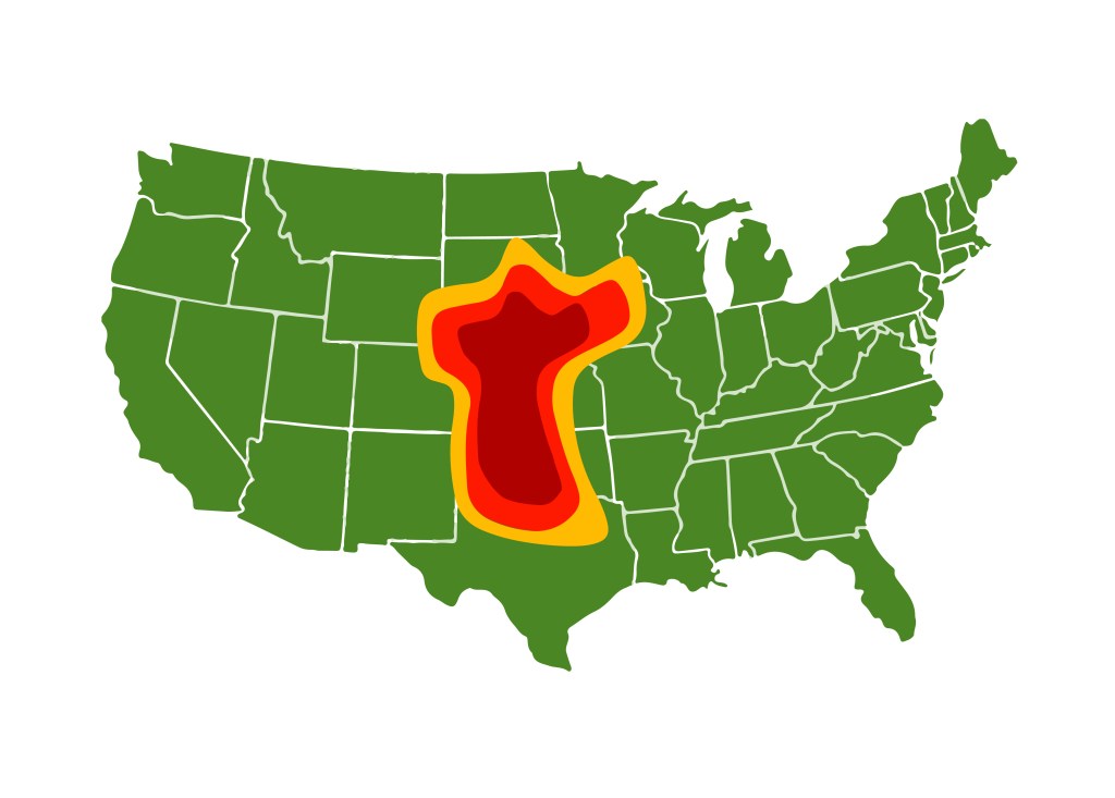
Tornado Alley
Tornadoes can happen anywhere, but as mentioned they are more common in North America and especially in tornado-alley. Despite tornado alley’s small size, a quarter of all significant tornadoes in the world occurred there according to a study (1921 – 1995). The extent of tornado alley includes north Texas, Oklahoma, Kansas, Nebraska, South Dakota, Iowa, and the corners of Minnesota, Wyoming, Colorado and New Mexico. Dallas, where we live, is in Tornado Alley.
Map showing Tornado Alley. It includes north Texas / Dallas. Stock Vector ID: 1719764089 by Adansijav Official.
Dixie Alley
Another region with a lot of tornadoes is Dixie Alley. Dixie Alley stretches from eastern Texas and Arkansas across Louisiana, Mississippi, Tennessee, Alabama, Georgia, and mid to western Kentucky to upstate South Carolina and western North Carolina; the area reaches as far north as southeast Missouri.
Dixie Alley has fewer tornadoes than Tornado Alley, but they tend to be deadlier and more violent than in Tornado Alley. The tornadoes in Dixie Alley occur year-round, at night, and the Tornadic storms in Dixie Alley are often high precipitation supercells due to an increase of moisture from proximity to the nearby Gulf of Mexico. The heavy rain makes it difficult to detect the tornadoes. Dixie Alley also has more mobile homes, homes tend to not have basements, and it is more densely populated than Tornado Alley. NOAA records indicate that the majority of deaths from tornadoes in the US have occurred in Dixie Alley.
Another related issue that has been brought to me is that many Europeans do not know the difference between a hurricane and a tornado. This is not strange since both of these extreme weather phenomena are less common in Europe.
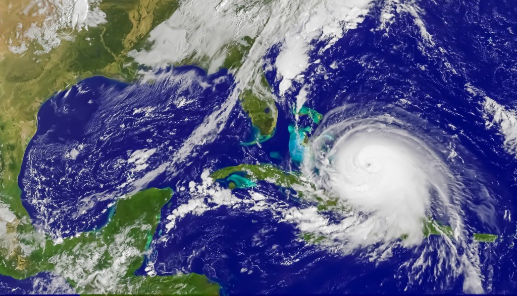
A hurricane is a big rotating storm system originating in the ocean that sometimes makes landfall and devastates our coasts. Hurricanes are big, thousands of square miles and even a million square miles. A hurricane has wind speeds of 74 miles per hour (mph) or higher. That’s 119 kilometers per hour or 33 meters per second. They are called hurricanes in the Atlantic and the northeast Pacific, and Typhoons in the northwest Pacific, and otherwise just cyclones.
Satellite photo of hurricane approaching Cuba and Florida. Stock Photo ID: 2202605185 by Emre Akkoyun.
A tornado is a violently rotating column of air that is in contact with both the surface of the Earth and a cloud. They originate with thunderstorms, especially supercells, and are more of an inland phenomenon even though hurricanes can sometimes generate tornadoes. Tornadoes are much smaller than hurricanes in area, almost always much smaller than a square mile, or just 10 or 30 meters across. The reason they can be as deadly as hurricanes is that they tend to have stronger winds and they appear and disappear quicker thus taking people by surprise.
A so called supercell but without a tornado. Stock Photo ID: 1768468151 by Laura Hedien.An F5 tornado in Canada. From Wikimedia Commons.
So, in summary, Hurricanes cover a large area and lasts a long time. They come from the sea and devastate coastal areas and are less common than tornadoes. Tornadoes are formed on land from thunderstorms, typically supercells. They are particularly common in tornado-alley. They cover a small area and go high up into the air forming a funnel and are commonly more intense. They are also more common, and they can surprise people. Therefore, on average, tornadoes cause more deaths in the US than hurricanes. You can read more about it here.
Our Tornado Experience
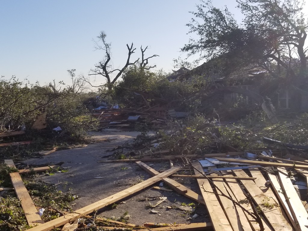
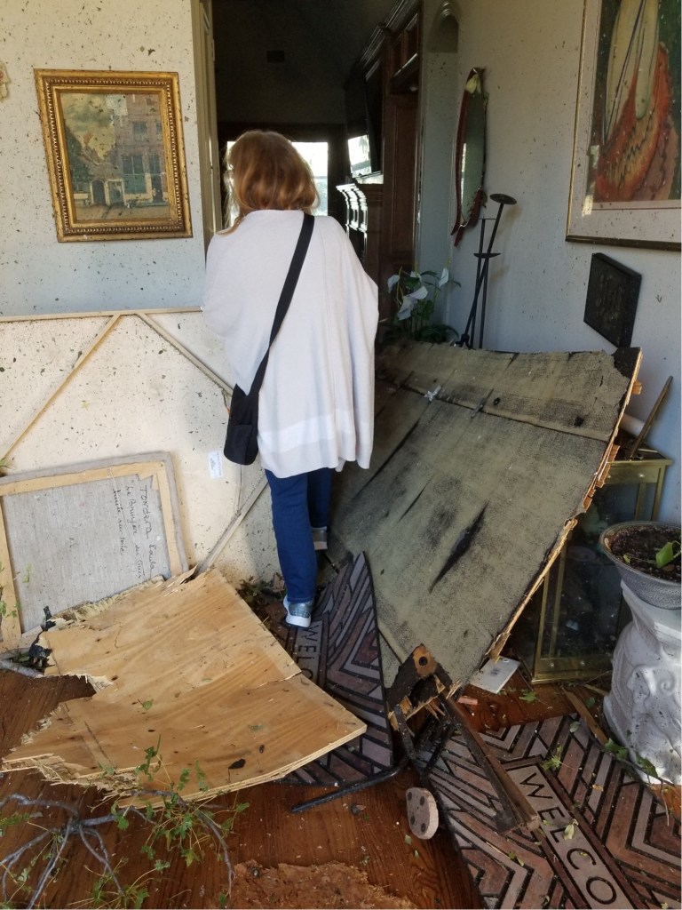
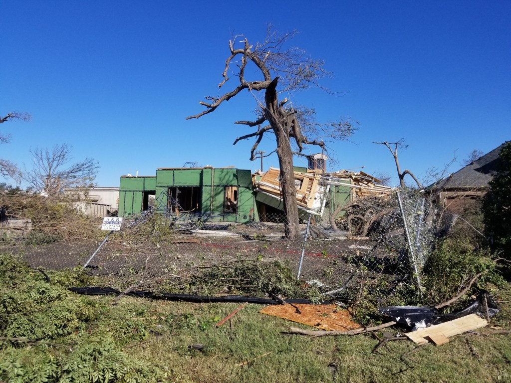
As mentioned, on October 20, 2025, our neighborhood was ravaged by an EF3 tornado. I was sitting outside in the backyard drinking a beer (Yellow Rose from Lone Pint brewery) when the sirens went off and my cell phone started screaming tornado warning “seek shelter immediately”. I did not see any problem, so I thought it was just one of unnecessary warnings again and I wanted to finish my beer. However, I decided to walk back into the house. About one minute later there was a lot of noise and a piece of the neighbor’s roof flew into our chimney, smashed it and it started raining bricks.
The house shook and thought to myself, “that was some thunderstorm”. I opened the door to the backyard, and I was astounded when I saw the devastation. My backyard was covered in debris, bricks, trees, garbage, my grill had flown off, several of our neighbors’ houses were just rubble. I guessed it must have been a tornado. My wife Claudia told me to go and check on her parents who lived about a mile away. I started driving my Toyota Prius, but I did not get very far because a neighbor’s roof was lying across the road. We live on a circle, so I decided to go the other way instead but about 30 trees lying across the road stopped me. So, I started walking but four firemen stopped me and told me that it was too dangerous to walk around. I had to go home. We would later learn that my wife’s father was injured. I am describing this in the NBC interview below.
We lost power for four days, we needed a new roof and a new chimney, the wiring and piping (for air conditioning) in the attic was destroyed, the fence and garage door were broken. It cost $50,000.00 to repair, nut our house stood, the frame was fine, and luckily our insurance paid for all of it, except for the parasol the flew away. We had no proof it ever existed. Not everyone was that lucky, especially those whose houses were destroyed. Unfortunately, our Leonberger dog Bronco had a heart failure one week after this. However, he recovered. But we are guessing that the fact that we did not have air conditioning for a while could have affected his heart. It was a tough day for Bronco, our Leonberger Dog. <<Link-13>>
A neighbor’s house the morning of October 21st, 2019.Another neighbor’s house. This house was about 100 yards from our house. It took a direct hit from the tornado.Another neighbor’s house (a bit further away from us).Inside Claudia’s parents’ house. This was the morning after. We are walking into their house to check on them (that’s my wife).This is the next-door neighbor of Claudia’s (my wife) parents.Destroyed house in the neighborhood.Another house in the neighborhood.The remains of the veterinary clinic where we used to take our dogs. Luckily there were no animals staying overnight at this time.View of the shopping center in our neighborhood.A store at a nearby shopping centerThis was a school bus belonging to the school where my boys went.Streetview from the neighborhood.
My Interview with NBC
As I mentioned, last year NBC interviewed me about this event. They said that they had been reading my Leonberger blog and were interested in a post that I had made about the tornado in Dallas on October 20, 2019. They wanted to interview me and asked for permission to use a few of my photos.
Seeing myself on the TV was a bit surreal. Click on the image to see the interview. My interview starts at 1 minute and 11 seconds.Here I am with NBC journalist Katie Blake. Click on the image or here to see the interview. My interview starts at 1 minute and 11 seconds.
I would like to stress that there are thousands of people whom they could have interviewed. Thousands of people who probably would have been better candidates. What made all the difference was the post I made on my blog. Therefore, fellow bloggers, perhaps this is an example of the fact that blogs bring attention.
Super fact 63 : Evolution is both a fact and a scientific theory. It is a fact that life has changed over time. This is supported by overwhelming evidence, while the theory of evolution provides a comprehensive scientific explanation for these changes, using processes like natural selection.
This is very confusing to people who do not know what a scientific fact is or what a scientific theory is. First of all, a scientific fact (they exist) is not the same as the scientific theory associated with that fact. Secondly, theory in science does not mean a guess, or a hypothesis, as is often the case in common parlance. In science, a theory is far more than a guess — it is a well-tested, comprehensive explanation of natural phenomena, supported by an extensive body of evidence. I think a good example of this confusion is the following dialogue that I found on Facebook.
I follow “The Credible Hulk”, a Facebook page managed by a group of anonymous scientists dedicated to correcting misinformation around vaccines, global warming, evolution and GMOs. I did not save the post, but it went something like this: The Credible Hulk posted a meme that looked like this.
One of the commentors said : “Calling evolution a “fact” defeats your argument. The Theory of Evolution is by definition a theory not a fact. It’s the currently agreed upon hypothesis but not a fact.” He did not know that he did not know what he was talking about. Since the Credible Hulk page is administered by scientists and a lot of its followers are also scientists, or people with a science education, he got schooled. You can read more about this confusion in my post “There Are Scientific Facts”, or here.
The evidence for evolution is both vast and compelling. Evolution is not just a process of the distant past — it can be observed in real time. Bacteria developing antibiotic resistance, viruses adapting to immune systems, and insects evolving resistance to pesticides are clear, measurable examples of evolution in action. The extensive fossil record, transitional fossils, comparative anatomy, sub-optimality, evidence from biogeography, etc., provide a very large body of conclusive evidence for evolution. Modern genetics provides perhaps the strongest proof of evolution.
Far from being a matter of belief, evolution is a scientifically established reality that shapes life continuously. Its understanding is vital, not only for biology but also for medicine, ecology, and environmental science. It allows us to track disease outbreaks, design new treatments, and appreciate the delicate balance of ecosystems. Evolution is not speculation — it is the foundation of modern biology and a dynamic process still unfolding around us. Evolution is a fact.
According to the pew research center around a third of all Americans reject the idea of evolution. Since this is an important fact that is widely disputed amongst the public, and yet we know it is true, I consider it a super fact. I also would like to reiterate that none of my super facts are scientific theories, but some of them are scientific facts, which again, is not the same thing.
Evidence for Evolution
The evidence for evolution as a phenomenon (fact) is conclusive as we can directly observe it (see below). That is all I need for my statement above that evolution is a fact. However, most people want to know how strong the evidence is for large-scale evolutionary changes that have occurred over geologic time, and what evidence there is for evolution being as the origin of species. In other words, how strong is the evidence for the theory of evolution. It turns out the evidence for that is also very strong. That is not the same as my super fact, but it is related and a quite interesting discussion.
Fossil records preserved in rock layers reveal a chronological history of life on Earth, documenting gradual changes in species over millions of years. Transitional fossils, such as Archaeopteryx linking dinosaurs to birds, demonstrate how one group of organisms evolved into another. Comparative anatomy adds to the case, showing homologous structures across species that point to shared ancestry.
Biogeography shows patterns of species distribution explained by common descent and migration. Modern genetics provides perhaps the strongest proof. DNA — the universal code of life — shows striking similarities across organisms. Humans, for example, share a large percentage of their genome with chimpanzees, and remarkably, the same genetic code underlies all living things, from bacteria to mammals, confirming a common evolutionary origin.
Making a list of all the evidence with brief explanations is far beyond the scope of this blog post and reading a 1,000,000+ word essay about evidence is not everyone’s cup of tea. Therefore, I am just providing a very small sample with very brief explanations (this post is long enough as it is).
This website offers a more extensive overview including 29+ evidences for so called macroevolution. Macroevolution describes large-scale evolutionary changes that occur over geologic time. Scientist tend to avoid the word Macroevolution because it is so misunderstood. First of all, Macroevolution is just the combination of a large number of smaller scale changes. New species do not randomly pop up because of some amazing mutation.
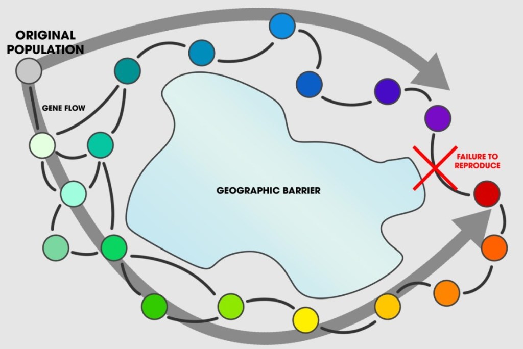
Speciation is considered relative. It is often said that two animals belong to the same species if they can interbreed in nature and produce viable, fertile offspring. However, it is not that simple. An animal A may be able to successfully interbreed with an animal B, and that animal B may be able to successfully interbreed with an animal C, but animal A and C cannot interbreed. Animal A could be said to be a different species relative to animal C but animal B could be said to be the same species as both animal A & C.
A great geography related example of this is ring species. In a ring species, gene flow occurs between neighboring populations of a species, but at the ends of the ring the populations don’t interbreed. Macroevolution is the result of repeated microevolution, so you cannot claim that microevolution is possible but not macroevolution.
Illustration of ring species, an example of how speciation can be relative. All the circles next to each other can interbreed but at the end it no longer works. Andrew Z. Colvin, CC BY-SA 4.0 <https://creativecommons.org/licenses/by-sa/4.0>, via Wikimedia Commons
Direct Observation
Evolution in viruses and bacteria has been observed and is well-documented, providing a direct window into evolutionary processes. Examples include the development of antibiotic-resistant bacteria, the annual evolution of influenza viruses and researchers can also directly observe rapid adaptation through experiments, such as the ongoing “arms race” between bacteria and viruses in lab settings. Direct observation supports my claim that “evolution is a fact”, because we’ve seen it. However, the evidence for so called macroevolution over longer periods of time is more indirect but still extremely strong.
Evidence from Biogeography
Biogeography provides evolutionary evidence by revealing patterns in the geographic distribution of species that can only be explained by common descent and evolutionary processes. For example, oceanic islands, which are islands that are formed from the sea bottom typically through volcanic activity, feature very narrow sets of native species (flora + fauna) that do not exist elsewhere.
One example is the Hawaiian Islands, which make up only 0.004 percent of the earth’s land and yet they contain nearly half of the world’s two thousand species of Drosophila. Darwin’s finches is another example. Another example is that oceanic islands do not have any native freshwater fish, or amphibians and rarely any native reptiles or mammals. These kinds of examples match the narrative that certain species (birds, insects, etc.) travelled to these islands and then evolved resulting in a unique set of species. BTW non-native freshwater fish, amphibians, and mammals do just fine, so it is not the environment. The book Why Evolution Is True by Jerry A. Coyne gives an extensive overview of biogeographic evidence for evolution.
Fossil Record
There are millions of found fossils representing 250,000 different species (there are likely trillions of not yet found fossils). The fossil record shows that early life was simple with complex life appearing later, with the youngest fossils being most similar to currently living species. It documents the orderly succession of life forms through geologic time. This is predicted by the theory of evolution. In addition, the various so called gaps in the fossil record keep being filled out. Opponents to evolution often criticize the dating methods used to date fossils. However, these criticisms do not hold water. You can read about that in my post We Know That the Earth is Billions of Years Old.
The fossil record is a lot more solid and much less problematic than the creationist books I have read claimed. Shutter Stock Photo ID: 1323000239 by Alizada Studios
Evidence of Evolution from DNA
DNA provides strong evidence for evolution. It is perhaps the strongest evidence for evolution. For example, related species share genes for fundamental traits, and the more similar the DNA sequences of two organisms, the more recently they shared a common ancestor. As time goes by DNA mutations accumulate acting like a “genetic clock,” allowing scientists to estimate how long ago different lineages split from each other. That’s how we know that Chimpanzees and Hominins / Humans share a common ancestor about 6-8 million years ago without having a fossil.
I can add that this was just a sample with a very brief summary for each case. Other types of evidence is the development of embryos. For example, whale and dolphin embryos have limbs that disappear, fetuses look like fish early on, human fetuses go through a hairy (primate) stage. There is evidence in the anatomy of our bodies, sub-optimality, curious anatomical imperfections due to our evolutionary history, so called atavisms, and vestiges. But that is enough for now.
Objections to Evolution
If you pay attention to this topic, you will come across a lot of flawed objections to evolution. When I was a teenager, I was a young earth creationist myself. Since I did not know a lot about the subject at the time I accepted many of these flawed objections and I even believed in a young earth. It doesn’t matter how many flawed objections you have to a theory (or a fact), if they are flawed, they don’t matter. I was very interested in science and went to science high school in northern Sweden. As I learned more about science, I came to realize that I had been bamboozled. You can read more about that in my post “Bamboozlement Misunderstandings, Big Surprises and My Journey”.
Since then, I have tried to argue with creationists about evolution, and I have come to realize that a lot of people are very emotionally invested in their opposition to evolution. For example, back in high school my wife was asked whether she believed in evolution and when she said yes, another girl threatened to beat her up in the bathroom. Once I was arguing online with a couple of strict fundamentalists who took a very aggressive and self-assured attitude to the topic despite not knowing much about the related science or evidence. It seemed to be impossible for them to understand normal scientific or logical arguments and yet they were totally sure, and they used mockery a lot. One of them found out that I “believed/accepted” that global warming is real and caused by us and started mocking me for that, a totally unrelated issue. Then the other one told me that if you believe in evolution, then you and your children will burn in hell forever. Well, if that is really what you believe, no wonder you can’t be rational about it. Anyway, at this point I pressed the block button. Talk about a hot discussion.
In my youth I read dozens of creationist books of various kinds, so I’ve have come across a lot of creationist objections. In the end I came to realize that none of them worked. I can add that the book “The Counter-Creationism Handbook” address over 400 of the most prevalent claims made by creationists. Below I am just very briefly addressing a few.
If humans descended from monkeys how come there are still monkeys?
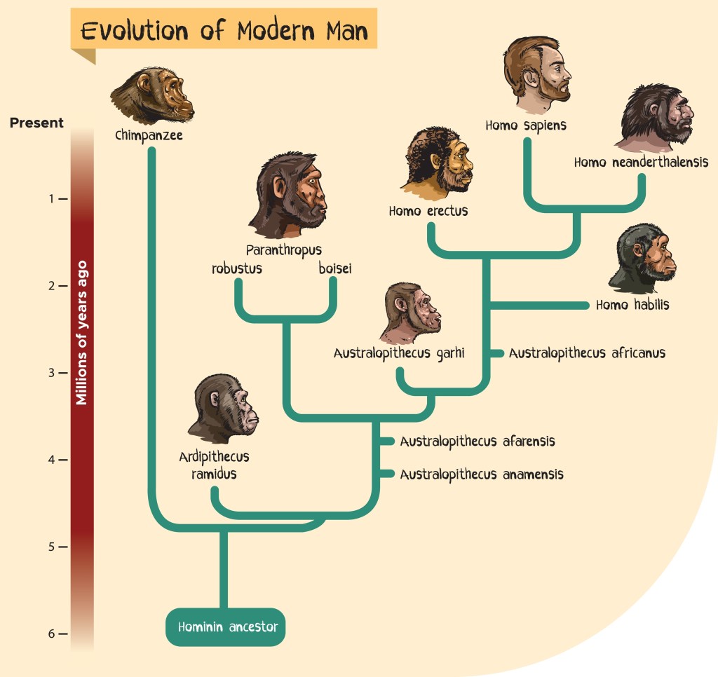
This is perhaps one of the more simplistic objections, but it is still worth mentioning. Even if it would have been true that monkeys evolved from monkeys, there’s no reason monkeys would stop existing just because humans evolved from some monkeys. However, that is not what happened. Genetics provides overwhelming evidence that hominins (including humans) and chimpanzees share a common ancestor. We have not found a fossil for this ancestor, but human and chimpanzee DNA tells us that such an ancestor lived about 6 to 8 million years ago. The simplified cladogram for hominins below demonstrates this. I can add that there are around 6000 hominin fossils, and up to 31 hominin species.
Simple cladogram showing evolution of modern man from Hominid Ancestor Shutterstock Asset id: 2093535535 by CLOUD-WALKER
Evolution is not Falsifiable
A theory is scientific only if it can be proven false. It must be falsifiable. Opponents to evolution often claim that evolution is not falsifiable because it deals with unobservable, unrepeatable events. However, the theory of evolution is falsifiable. There are no Precambrian rabbits or Mesozoic human fossils, but if there were that would have proven the theory of evolution false. Note evolution would still have been directly observable (viruses and bacteria), so evolution is a fact that would still be true, but the theory of evolution would have been proven wrong.
Second law of Thermodynamics contradicts Evolution
The second law of thermodynamics states that entropy (typically denoted ‘S’ in physics), which could be said to represent disorder, always increases or stays the same in a closed system. Creationists believe evolution creates complexity and order, which would seem to be a decrease in entropy. One weakness of this argument is that entropy representing disorder only loosely relates to order and disorder as used in common language. More correctly, entropy is defined as; for a given set of macroscopic variables, the entropy measures the degree to which the probability of the system is spread out over different possible microstates. Much more importantly, the creationist argument fails because the second law of thermodynamics requires a closed system, and evolution does not operate in a closed system. For example, the sun is shining and providing earth with energy.
Second law of thermodynamics Shutter Stock Vector ID: 2342031619 by Sasha701
Evolution is Random and Improbable
Another creationist argument is that evolution is random, and randomness cannot create an elephant or an airplane. No matter how many times you randomly throw pieces of junk around you won’t get an airplane. The error in this argument is that evolution is not random. It is guided by natural selection (theory of evolution), and natural selection can be very powerful over time. For example, several computer simulations have been created to model the evolution of the eye, demonstrating that a complex camera-type eye can evolve gradually from a simple light-sensitive patch through a series of small, advantageous steps.
I can add that I have some personal experience with genetic algorithms myself. At work I created an algorithm that interpreted data from a camera for the purpose of sorting mail effectively. I started out with a chromosome that was very bad. Then my program applied random mutations and few other genetic features and allowed the best chromosomes to survive. Eventually a very complex but effective algorithm/chromosome resulted. I did not create this powerful algorithm; randomness combined with natural selection did. Randomly throw lots of junk around but also add some natural selection and you may very well get an airplane.
Microevolution is possible but not Macroevolution
Creationists like to say this because they must accept the reality of observable microevolution. It is a scientific fact. However, so called macroevolution is just repeated microevolution. There is no reason that macroevolution wouldn’t be possible. In addition, as you saw in the paragraphs before the ring species image above, the evidence for macroevolution is very strong. Again, microevolution and macroevolution are concepts that creationists like to use more than scientists.
Anyway, this became very long, almost 3,000 words.
Super fact 62 : Facts exist in science; a scientific “fact” is an observation of a natural phenomenon that has been repeatedly confirmed by independent observers and is accepted as true for all practical purposes.
Outside of mathematics and logic nothing is ever the final truth, not in science, and not anywhere else. However, there are facts that have been so well confirmed and are so basic that there is no reason to doubt them. Earth is not flat like a pancake, and the sun is a star, are two examples of astronomical facts. Most dogs have four legs is another fact. The speed of light in vacuum is the same for all observers is a fact in physics that is surprising if you didn’t know it before. Scientific facts are verified by repeatable careful observation or measurement by experiments or other means. It is possible that we are all living in a virtual reality, like in the movie The Matrix, and that Earth is really flat like a pancake after all, because all of reality is a dream. However, for all practical purposes, it is not the case.
This blog, super facts, deal with facts that are surprising, strange, or disputed by non-experts, and yet true because they have been verified, for example, in the case of scientific facts, by repeatable careful observation. Anyone is free to object if you think I am wrong about a fact.
My next super fact is going to be “Evolution is a fact”. Evolution is also a scientific theory, but it means something different from when you say evolution is a fact. Moreover, a Scientific Theory is not a guess, as commonly but incorrectly assumed. I am bringing this up because many people who are typically unaware of the evidence behind a fact will use arguments such as “science does not know everything”, “it is just a theory”, etc., in efforts to dismiss a well-supported claim.
I should say that this post is inspired by a Facebook post by “The Credible Hulk”, a Facebook page managed by a group of anonymous scientists opposing misinformation around vaccines, global warming, evolution and GMOs. I did not save the post, but it went something like this:
One of the commentors said : “Calling evolution a “fact” defeats your argument. The Theory of Evolution is by definition a theory not a fact. It’s the currently agreed upon hypothesis but not a fact”
What the commentor did not realize is that “Theory” in the context of science does not mean what he thought it did. I am using past tense because he got “schooled”. To his credit he did not respond with insults and neither did the Credible Hulk, which does not seem to be standard on Facebook. However, his comment illustrates something that drives scientists like those who created “The Credible Hulk” nuts, and that is the widespread lack of understanding of the difference between a guess, a hypothesis, a scientific fact, theory as used in common language and used when talking about a scientific theory.
Rather than having this discussion over at my upcoming “Evolution is a fact” post, I am making a separate post about it. I consider “There are Scientific Facts” a super fact because it is true, and yet the confusion around it and what a Scientific Theory pertains is massive, and it is an important topic.
What is Science?
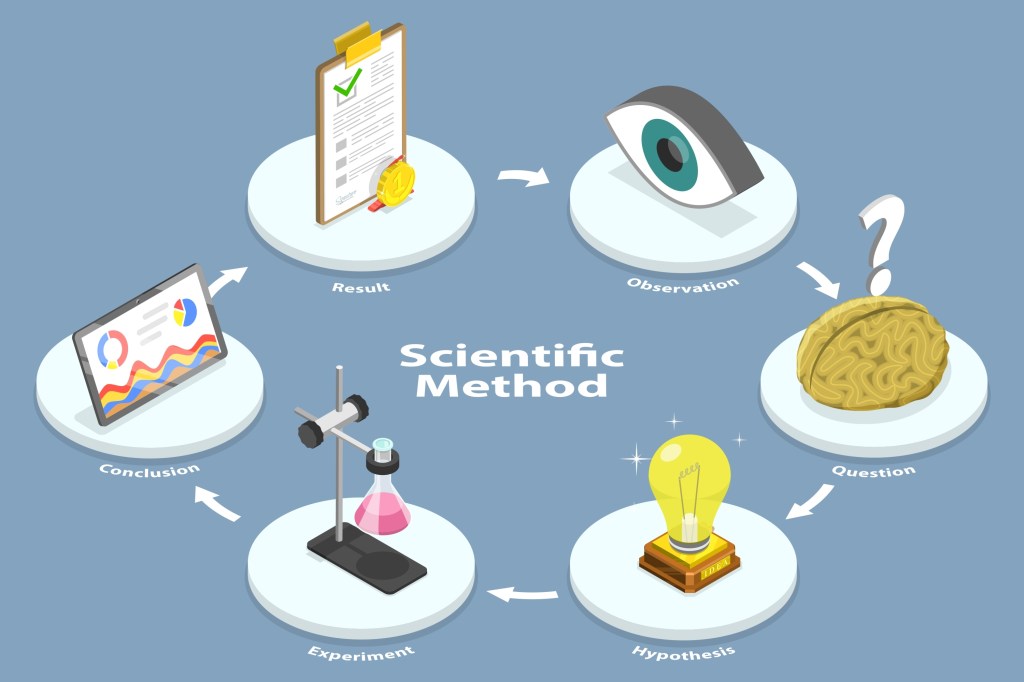
Science is the process of learning about the world through systematic observation and experimentation to gain knowledge about how things work. It involves observing phenomena, forming testable ideas (hypotheses), systematic studies, conducting experiments, and collecting evidence and facts that support or refute those ideas, ultimately leading to a deeper understanding of general truths and natural laws. If an idea/hypothesis correctly predicts and explains facts, it becomes a theory, which is something that is very different from a guess.
The process of making observations, formulating testable hypotheses, conducting experiments, analyzing data, and drawing conclusions to understand phenomena and solve problems is referred to as the scientific method, and there are different types of scientific methods. Some involve experiments, other involve analysis historical artifacts or existing data. Objectivity, reproducibility, falsifiability, and predictive power or problem solving are essential.
Aspects of scientific research include analysis, data collection, sometimes surveys, development, establishing facts, creating knowledge, and data entry so that others can repeat it and verify results. Shutterstock Asset id: 1100776715 by Trueffelpix
What is a Scientific Theory?
When people hear the phrase “evolution is a theory,” many mistakenly assume it means evolution is just a guess or speculation. In science, however, a theory is far more than a guess. A scientific theory is an explanation of an aspect of the natural world that can be or that has been repeatedly tested and has corroborating evidence in accordance with the scientific method, using accepted protocols of observation, measurement, and evaluation of results. In other words, it is a well-tested, comprehensive explanation of natural phenomena, supported by an extensive body of evidence.
Conceptual Illustration of Scientific Method and Knowledge Acquiring. Notice, not all scientific methods necessarily include experiments. Some include surveys, or testing of ancient artifacts, etc. Shutterstock Asset id: 2139402875 by TarikVision
The evidence for evolution is both vast and compelling. It is not just the massive fossil record, it is in DNA, anatomy, there’s geographic evidence, and evidence from dozens of other scientific fields, not to mention that evolution is directly observable. There is a Theory of Evolution, that is the well supported explanation for evolution, or evolution by natural selection. There is also “Evolution is a fact” referring to, for example, the fact that we can directly observe it. It is true for all practical purposes, and that does not mean that evolution stops being a scientific theory as well as a fact.
Afterword
Even though science is constantly evolving and our knowledge is evolving and sometimes our understanding and scientific theories on a topic needs to be updated, scientific facts exist. Some scientific facts are extremely unlikely to change. For example, Jupiter has multiple moons, galaxies exist, global warming is real and is caused by us, and evolution is a fact. Before you decide to dismiss such a fact make sure you know what “theory” means in science, and most importantly educate yourself on the relevant evidence. There might be a whole lot more than you imagined, and you may discover that the evidence you thought was contrary is not evidence.
You often hear “science does not know everything”. That’s true. If science knew everything it would stop. However, the collective knowledge created by science is enormous and as individuals we know next to nothing. So be humble and learn from scientific evidence presented by reliable sources.
Super fact 60 : Superfluids such as liquid Helium cooled below -455.58 Fahrenheit exhibit some very strange characteristics such as it flows right through many solids, it climbs walls, it has near zero viscosity, it exhibits circulating flows that never stop despite no energy being added. It is a Macroscopic Quantum Phenomenon.
When gases are cooled far enough, they will turn into liquids and eventually typically to solids. For example, Oxygen becomes a liquid when its temperature drops to -297 Fahrenheit, which is -183 Celsius, or 90 degrees Kelvin. Kelvin is 0 at absolute zero, the coldest possible temperature, and in addition it uses Celsius for the scale. So, 90 degrees Kelvin is 90 degrees Celsius above absolute zero or 162 degrees Fahrenheit above absolute zero. When Oxygen becomes a liquid, it turns into a pale blue liquid. Oxygen becomes a solid at 54 Kelvin, or −218.8 Celsius, and −361.8 Fahrenheit (at normal pressure). It becomes sky blue ice.
Helium stays a gas until very extreme temperatures. Helium becomes a liquid at 4.2 kelvin or -269 Celsius, or -452.11 Fahrenheit. If the temperature is reduced further by almost half to 2.17 Kelvin, or -270.98 Celsius, or -455.8 Fahrenheit, then Helium suddenly becomes a superfluid, exhibiting macroscopic quantum phenomena. It is so different from normal liquid Helium that it is called Helium II. Its heat conductivity (speed of heat/cold transfer) suddenly increases by one million, and the temperature will become the same throughout the liquid instantly. Even a big pool of liquid helium would almost instantly get the same temperature throughout, and the atoms will start behaving in unison. Regular bubbles can no longer exist (atom sized electron bubbles can exist though).
The liquid starts behaving in bizarre ways. If you place an open metal container of Helium II in a closed room the Helium II would climb out of the container and escape, and a thin film of Helium II would climb the walls and the ceiling. If the floor was made of metal or glazed tile the Helium II would remain on the floor. If the floor was made of unglazed tile or stone, it would leak right through the floor as if the floor was a sieve. If you get a whirlpool or fountain going it will keep going forever without any energy loss. In addition, it would also exhibit many quantum effects that are out of scope for this post.
Unlike ordinary liquids, helium II will creep along surfaces in order to reach an equal level; after a short while, the levels in the two containers will equalize. The Rollin film also covers the interior of the larger container; if it were not sealed, the helium II would creep out and escape. From : Hampel, Clifford A. (1968). The Encyclopedia of the Chemical Elements. New York: Van Nostrand Reinhold. pp. 256–268 (referenced by Wikipedia). Design: Aarchiba; SVG rendering: Júlio Reis, CC BY-SA 3.0 <https://creativecommons.org/licenses/by-sa/3.0>, via Wikimedia Commons
I consider this a super fact because this is a strange, surprising and not a well-known phenomenon. It is a quantum effect that you can observe with your own eyes. It is important because the discovery of superfluidity and its twin effect superconductivity are very important for science and might lead to revolutionizing energy transport in the future. It is no doubt that the phenomenon is real (true), and it has been documented by numerous experiments and papers. It is described in thousands of textbooks, and I’ve observed the phenomenon with my own eyes (that is next).
Our Experiment with Superfluid Helium
During my first class in Quantum Physics, we performed experiments with liquid Helium. We started out by cooling helium using liquid nitrogen (colder than -196 Celsius or -321 Fahrenheit). Then using vacuum pumps, we kept cooling the Helium until it became liquid. We continued cooling it and we could see lots of bubbles and boiling as we kept going, and then it boiled extra much, and then very quickly the bubbles vanished, and the content of the entire glass container settled down and then stood perfectly still.
As 2.17 Kelvin was reached the viscosity (flow resistance) was instantly lowered with about one million times, and non-microscopic bubbles could no longer exist. The heat conductivity (the speed with which temperature spreads) increased by one million times. It means that the heat of a drop falling in one end of a swimming pool of Helium II would spread throughout the swimming pool in a second. Except, we only had a glass container in which sameness reigned throughout the liquid.
We continued doing experiments such as watching the Helium II climb walls inside the experimental setup, and of course the famous fountain. Insert a little metallic straw and watch a Helium fountain start to flow, by itself. Without any energy or pressure added, it just kept going by itself because no energy was lost either.
I can add that it was more of a demonstration than an experiment that we actively participated in because playing with extreme temperatures high or low is dangerous. If you’ve read this blog for a while you might remember when I put a Cesium-137 sample (800 times more radioactive than Plutonium-239) in my jeans pocket instead of back into its lead brick container and walked around with it a whole day. Or that time when I replaced a fuse for a 380 volt three phase powered laser with my finger because I was curious what would happen if I put my finger in there, and I was shocked, and it hurt. Students shouldn’t play with dangerous stuff.
Below is a one minute and forty four second YouTube video of a Superfluid / Helium II experiment showing an eternal fountain.
Below is a four minute explanation of a superfluid / Helium II experiment.
I can add that Helium II (super cold helium) is not the only superfluid but the easiest one to achieve.