The goal of this blog is to create a list of super facts. Important facts that are true with very high certainty and yet surprising, misunderstood, or disputed by many. This blog aims to be challenging, educational, and fun, without it being clickbait. I determine veracity using evidence, data from reputable sources and longstanding scientific consensus. Prepare to be challenged (I am). Intentionally seek the truth not confirmation of your belief.
Today is the sixth time I participate in Linda Hill’s streams of consciousness. To read about the rules and participate click here. To read my five previous entries click here “Prediction Failures and My Lucky Day from Hell”, <<Link-3>> or here “The Review Wars on Amazon”, or here, “Reindeer Hide Memories”, or here “25 Sweet Leonberger and Dog Photos”, or here “Bad Travel Memories”. <<Link-7>> I put this post on my Super-factful blog because it is factual and not related to Leonbergers. “Everything is in Motion” could be a super fact, but a super-fact post requires editing, looking up facts, or verifying facts, and lots of links, so that is for another post. This post is just my musings.
2019-2020 SoCS Badge by Shelley!
Today’s prompt for Stream of Consciousness Saturday September 5, 2026, is “Motion”. Use it anyway you’d like. The first rule is: there should be minimal planning and no editing except typos. I did not edit but I did add a few pictures. I like adding pictures. I just copied the pictures including captions from a few of my other posts.
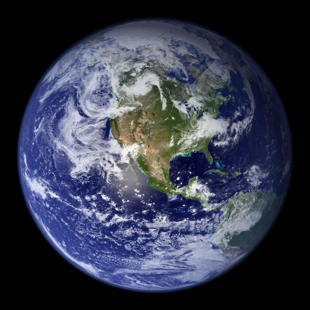
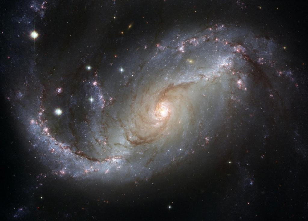
The first thing that came to my mind for this prompt was that Motion is relative and everything is in Motion. You may be sitting in your chair completely still thinking that you are not moving but you are. Earth rotates around its axis at hundreds or thousands of miles per hour and you follow along wherever you are sitting. Sitting at the geographic north Pole won’t help you because Earth is also wobbling and it is rotating around the sun at more than 60 thousand miles per hour, and the sun is rotating around the center of our galaxy the Milky Way at several hundred thousands miles per hour, and our galaxy is moving compared to the Andromeda galaxy at millions of miles per hour, and it moves billions of miles per hour compared to other galaxies.
Motion is not absolute. It is always relative to something else. The universe has no center, no ether to compare with, there is no absolute reference point. It is not possible to declare anything as truly standing still. Understanding this is the first step towards understanding the theories of relativity.
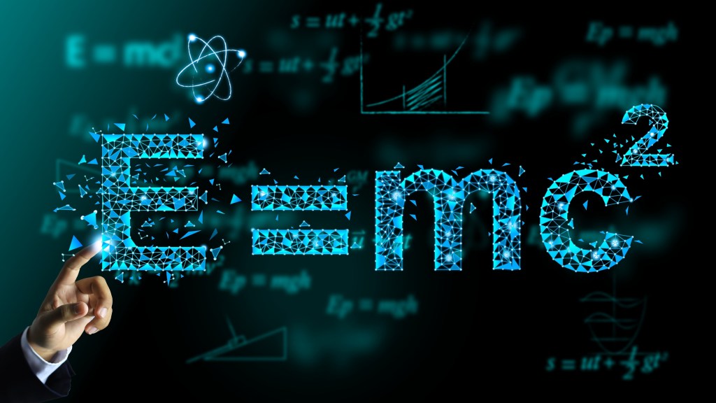
Mass is energy and vice versa, a direct result of the way time and space are related. Stock Photo ID: 2163111377 by Aree_S
You could of course say that; well, compared to my reference frame, my room right here, I am sitting still. I am not in motion compared to my chair. So, in that sense it is possible to say that I am not in motion. Well, I am sorry to disappoint you. You are still moving through time at the speed of light. To bring up relativity again, space and time is a four dimensional continuum, and space can be converted into time and vice versa. The conversion factor between space and time is a constant identical to the speed of light in vacuum. Without explaining the details this means that you when you are sitting absolutely still in space, relative to something like your chair, you are still moving through time, in that reference frame, at the speed of light. You see “Everything is in Motion” is an unescapable fact.
Man thinking he is sitting still drawn with the help of ChatGPT
A related interesting fact is that nothing that has mass can move through space at the speed of light. Everything that has mass must move slower than the speed of light through space. Conversely, particles that do not have mass, such as light particles (called photons), and gluons, must always move through space at the speed of light, and as a result for them time does not move. Actually, for them time does not exist.
Billions of photons coming into the eye. For them time does not exist. Shutterstock asset id: 2629068895 by muratart.
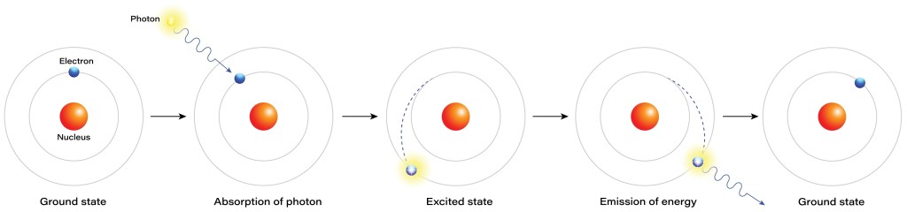
There are a couple of obvious objections to the last paragraph. Very far away, beyond the limit of the visible Universe, galaxies can move away from us faster than the speed of light. However, they are not moving faster than the speed of light compared to the space where they are. What is going on is that space and time are stretching fast due to the expansion of the Universe. Another objection is that light can move slower than the speed of light in vacuum through transparent materials such as glass and water, so how can the claim that all massless particles must always move at exactly the speed of light in vacuum be true? The answer to that is that the light particles (photons) in those materials are being absorbed and re-emitted as new photons by the atoms. However, in between the atoms the photons move exactly at the speed of light in vacuum.
From ground state to excited state, absorption and emission of a photon in an atom. Shutterstock asset id: 2180385419 by rktz.
Anyway, the conclusion is, “Everything is in Motion”, through space, and through time.
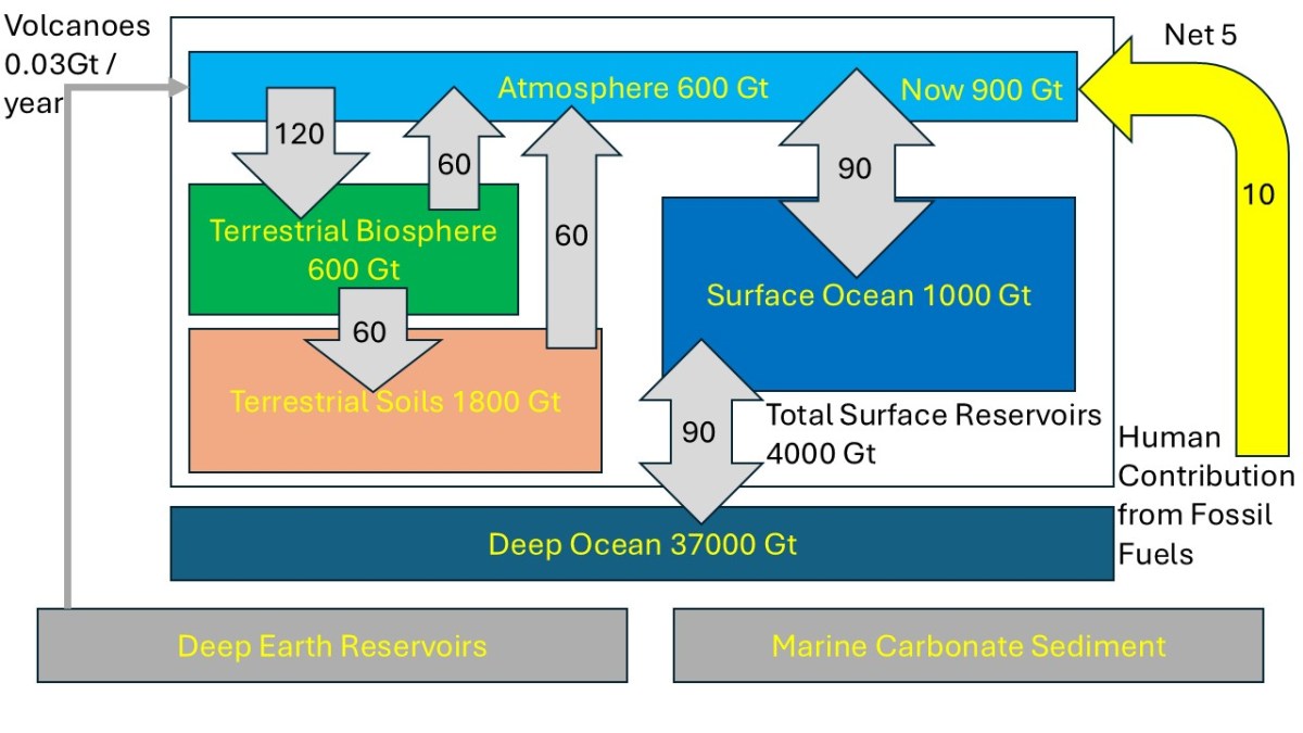
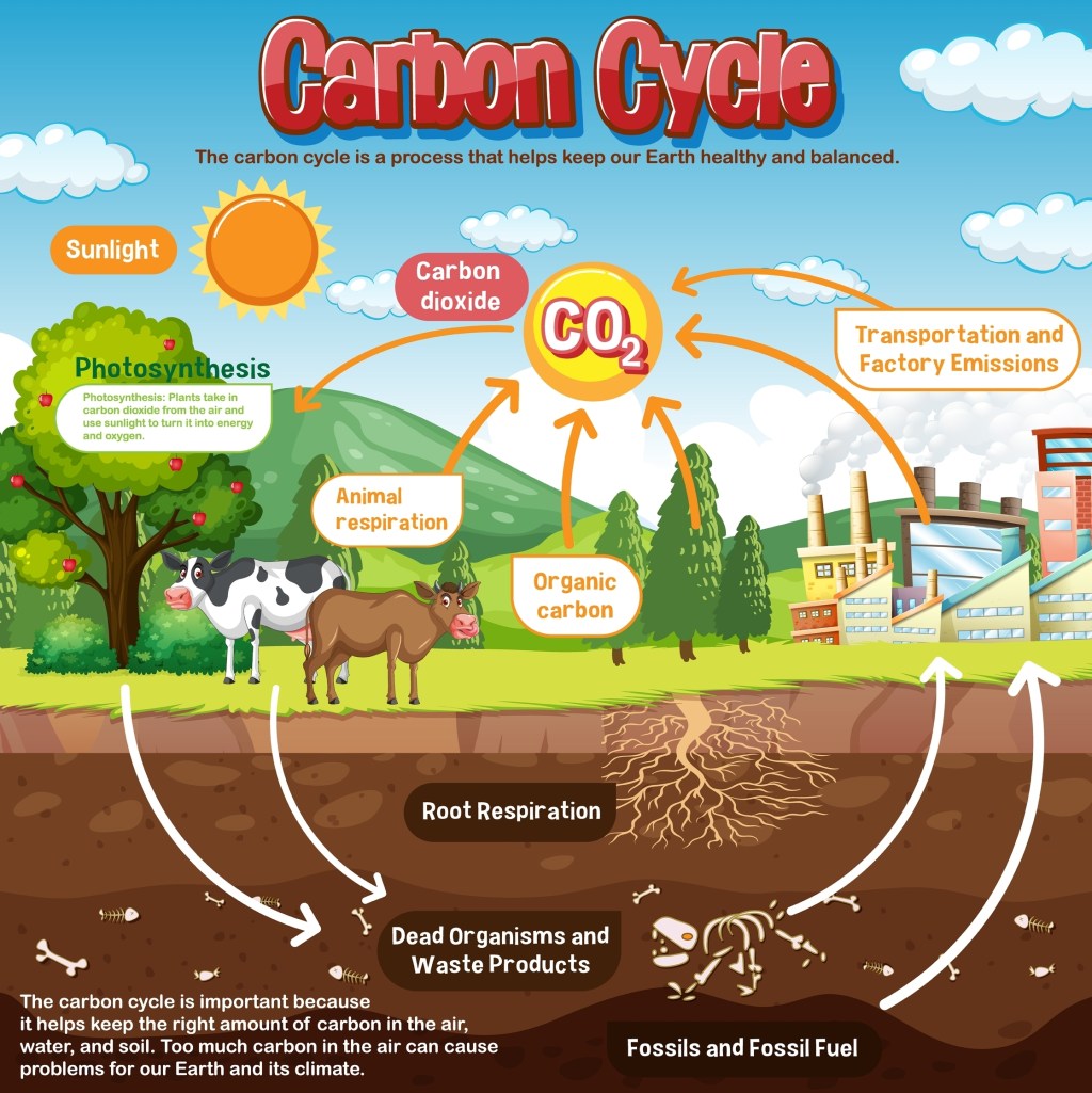
Superfact 128: There are a lot of natural carbon emissions from the soil, rotting plants, animal and human respiration, and oceans, and a small amount from volcanoes. However, carbon is also absorbed by the oceans, and by plants via photosynthesis, etc., and this creates a balance that has existed for many thousands of years. This is called the carbon cycle. Despite the fact that the carbon emissions from our burning of fossil fuels are much smaller than some of the naturally occurring carbon emissions mentioned, they are what is behind the increase of carbon in the atmosphere because they are a new addition that disrupts the carbon cycle.
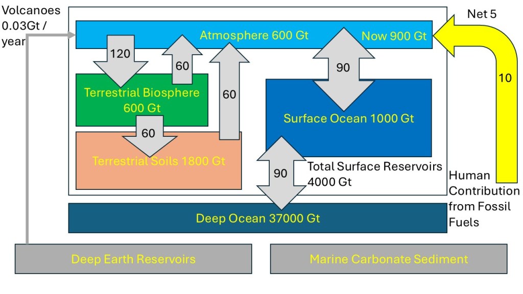
Regarding the picture above, the units are in Gigatons of carbon, i.e. the weight of the carbon atom. To get the numbers in Gigatons of carbon dioxide multiply all numbers by 3.67. The numbers in yellow inside the blocks correspond to how much carbon is stored in the system. The numbers without units in the grey arrows correspond to the number of Gigatons of carbon per year. I can add that Lawrence M. Krauss is not a climate scientist but a prominent theoretical physicist focusing on cosmology and quantum physics. However, he took a deep dive into the physics of climate change.
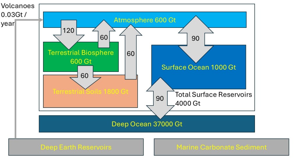
This is the same picture as above, but I added the contribution from our recent additional carbon emissions such as the emissions from the burning of fossil fuels. This is depicted at far right in yellow. Since this is not part of the original carbon cycle the amount of carbon in the atmosphere grew from 600 Gigatons (pre-industrial) to 900 Gigatons.
As you can see in the picture above the amount of carbon stored in the atmosphere was 600 Gigaton originally and now we have increased it to 900 Gigaton. We are adding 10 Gigatons of carbon from our emissions, chiefly from burning fossil fuels, which correspond to 37 Gigatons of carbon dioxide. About half of this is absorbed by the ocean and other systems, resulting in a net addition of 5 Gigatons per year. The carbon dioxide added and stored in the atmosphere will be there for hundreds or thousands of years.
The existence of the carbon cycle and how it explains what is going on is an important fact that is widely misunderstood and therefore a surprising fact. You quite often see or hear claims such as “animal and human respiration emit a lot more carbon dioxide than our burning of fossil fuels, and therefore human caused global warming is BS”. The first part of that sentence is true, but the rest ignores the carbon cycle and the balance that has existed for many thousands of years. Therefore, this is a super fact.
This illustration of the Carbon Cycle is simplified but artistic. Shutterstock asset id: 2271978649 by GraphicsRF.com
More on the Carbon Cycle
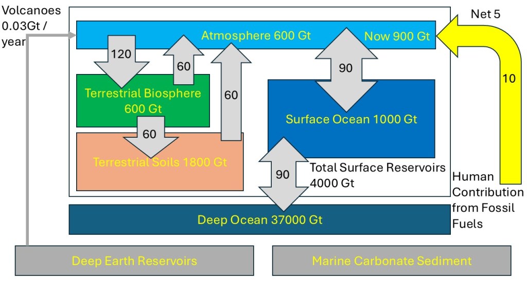
Same as the picture above but notice the flows depicted by the arrows and the total amounts stored in each system.
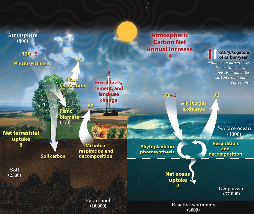
The carbon cycle describes the process in which carbon atoms continually travel from the atmosphere to the Earth and then back into the atmosphere. In the picture above you can see that the atmosphere, the oceans, the biosphere, and the soil, as well as deep Earth reservoirs and Marine Carbonate Sediments are all absorbing and emitting carbon (dioxide). For example, the terrestrial biosphere absorbs 120 Gigatons of carbon per year, chiefly through photosynthesis, and emits 60 Gigatons of carbon into the atmosphere, via for example, animal / microbial / human respiration, rotting plants, and it adds another 60 Gigatons of carbon to terrestrial soils. 120 Gigatons of carbon correspond to 440 Gigatons of carbon dioxide.
Carbon cycle schematic showing the movement of carbon between land, atmosphere, and oceans in billions of tons (gigatons) per year. Yellow numbers are natural fluxes, red are human contributions, and white are stored carbon. The effects of the slow (or deep) carbon cycle, such as volcanic and tectonic activity are not included. Diagram adapted from U.S. DOE, Biological and Environmental Research Information System., Public domain, via Wikimedia Commons.
The carbon cycle was relatively stable until we started burning massive amounts of fossil fuels. Our burning of fossil fuels emits 10 Gigatons of carbon (37 Gigatons of carbon dioxide) into the atmosphere. About 30% of this carbon is absorbed by the oceans. This slows the warming but causes ocean acidification, which is another dangerous problem. In total 50% of the carbon emissions are absorbed by oceans, the soil, the biosphere, etc., according to “The Physics of Climate Change by Lawrence M. Krauss”. This is why I wrote Net 5 Gigatons per year in the picture above. You can read more about the Carbon Cycle here and here.
Another thing to pay attention to in the diagrams above is that not only are volcanoes part of the carbon cycle, but their contribution to carbon emissions is tiny compared to our emissions, which contradicts the many false claims you see on social media. You can read about that in my post “Volcanoes emit a tiny fraction of carbon compared to humans”.
Conclusion
Many of our Planet’s systems (oceans, biosphere, terrestrial soil, atmosphere, etc.) emit (and absorb) more carbon dioxide than our burning of fossil fuels does. However, the fact that they are part of the long existing carbon cycle makes them irrelevant to the rapid and sudden global warming phenomenon that we are witnessing. The recent rapid Global Warming is happening, and it is caused by us, chiefly because of our burning of fossil fuels. I am illustrating this using the two bathtub pictures below.
The stream of water from the faucet is the same as the stream from the drain keeping the water level steady. The bathtub is half full and stays half full.I generated the picture with the help of ChatGPT.The stream of water from the faucet is faster than the stream from the drain so the water level increases. The additional amount from the faucet represents the carbon emissions we added. The bathtub is now 2/3 up and rising. I generated the picture with the help of ChatGPT.
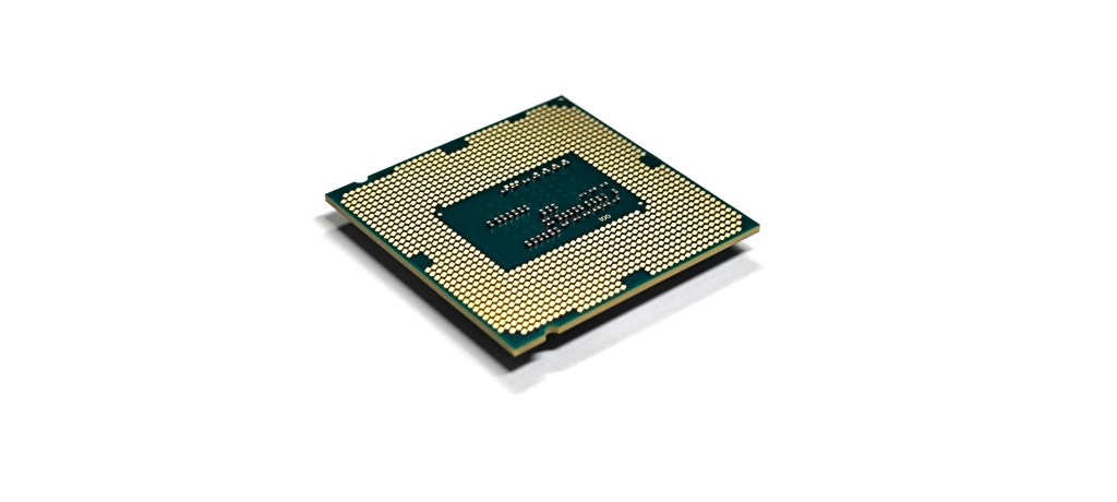
Superfact 127: The Intel 4004 processor chip created in 1971 had 2,308 transistors. Modern cutting-edge processors and AI accelerators exceed 50 billion to over 200 billion transistors, which is 25 million to nearly 100 million times as many transistors per chip. This follows Moore’s law, which states that the number of transistors on a microchip doubles roughly every two years, while the cost of computers drops. As a result, computer chips have gotten millions of times faster and the cost of memory (RAM) has dropped by four trillion times. This has made the modern AI / LLM possible.
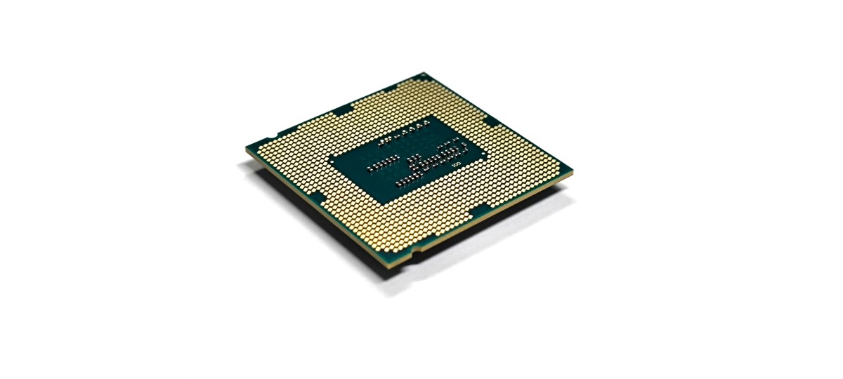
CPU (a processor or a central processing unit). Concept of technological advancement. Shutterstock asset id: 2760284753 by pisanstock
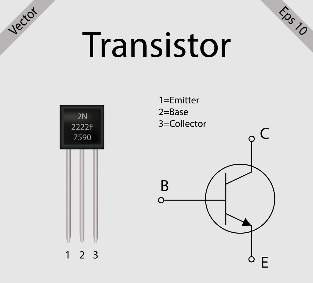
The transistor below is a large transistor that you can hold between your fingers. Transistors inside a computer chip are very small. They are microscopic. In the diagram, whenever a small voltage ( typically 0.7 volts) is applied to the base (B) it allows a much larger current to flow through the main terminals from the collector (C) to the emitter (E). Since electrons are negative this means that the electrons are flowing from the emitter to the collector. If there is no voltage or current at the base there is no current flowing from the collector to the emitter either. This is how you control the transistor and achieve more complex behavior if you have many connected transistors. Also, note that the transistor is a one way street.
A large NPN-BJP transistor with its symbol diagram on the right. Shutterstock asset id: 2169223279 by Surkhab Ahmad Art
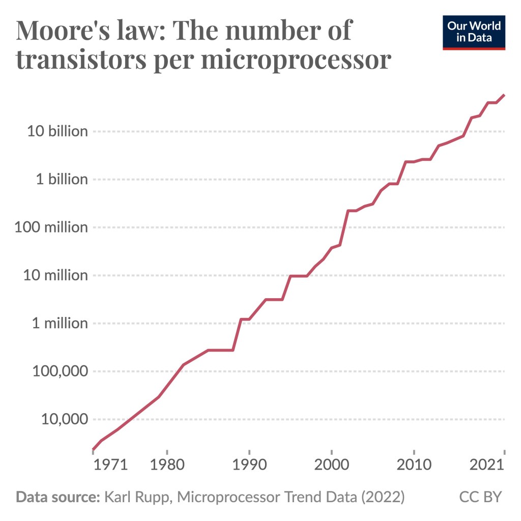
Moore’s law, which states that the number of transistors on a microchip doubles roughly every two years, is not a physical law, it is a purely observational law that has held for well over half a century. It is just a reflection of how good we are at improving processors. No one knows whether Moore’s law will continue to hold but if it does, then today’s computers and today’s AI are very bad compared to tomorrows computers and AI, and they are super bad compared to what we will have 20 years from now.
The diagram below shows 100+ microprocessors (CPUs), their number of processors, and the year they were introduced going from 1970 to 2020. The microprocessor data comes from this list. Intel 4004 is located in the lower left corner of the diagram and as mentioned it has 2,308 transistors. The AMD Epyc Rome processor in the upper right corner has 39.54 billion processors. Notice that the number of processors is on a logarithmic scale (not 1,2,3,4,5….but 1,10,100,1000,10000, etc.) A curve that grows exponentially becomes like a line in such a diagram. This is another way of saying that the technological progress for microprocessors is exponential. Every six and a half years the number of transistors is 10-doubled.
Moore’s Law: The number of transistors on microchips has doubled every two years. Moore’s law describes the empirical regularity that the number of transistors on integrated circuits doubles approximately every two years. This advancement is important for other aspects of technological progress in computing – such as processor speed or the price of computers. Data source: Wikipedia (wikipedia.org/wiki/Transistor_count). OurWorldData.org – Research and data to make progress against the world’s largest problem. Licensed under CC-BY by the authors Hannah Ritchie and Max Roser.
However, the processor that currently has the most transistors is the Cerebras Wafer Scale Engine 3 (WSE-3) with 4 trillion transistors. It is not in the diagram. A comparison between Intel 4004 and Cerebras Wafer Scale Engine 3 (WSE-3) may not be entirely fair since it is a wafer sized CPU specifically made for AI and much bigger than Intel 4004. However, the standard consumer or workstation CPU with currently the most transistors is Apple’s M3 Ultra (normal sized) with 184 billion transistors. However, 184 billion transistors that is more than 79 million times as many transistors as the Intel 4004.
Moore’s law: The number of transistors per microprocessor. Data source: Karl Rupp, Microprocessor Trend Data (2022) CC BY
This is a super fact because it is an important fact that is a surprise to you if you did not know about Moore’s law and mind-blowing even if you did.
Computational Capacity / Speed
One benefit of transistors and other electronic components becoming much smaller is increased speed. The graph below shows that the fastest supercomputers in 1993 had a processing speed of 124 Gigaflops and in 2025 a processing speed of 1.81 billion Gigaflops, which is 14.6 million times faster. One gigaflop equals one billion floating-point operations per second. Multiplying 3.1415926536 times 2.7182818284 = 8.5397342225 is an example of a floating point operation. Note that 1.81 billion Gigaflops is 1.81 quintillion floating-point operations per second.
Computational capacity of the fastest supercomputers. Number of floating-point operations carried out per second by the fastest supercomputer in any given year. This is expressed in gigaflops, equivalent to one billion floating-point operations per second. Data source: Dongarra et al. (2025) OurWorldinData/technological-change | CC BY
Cost of Memory
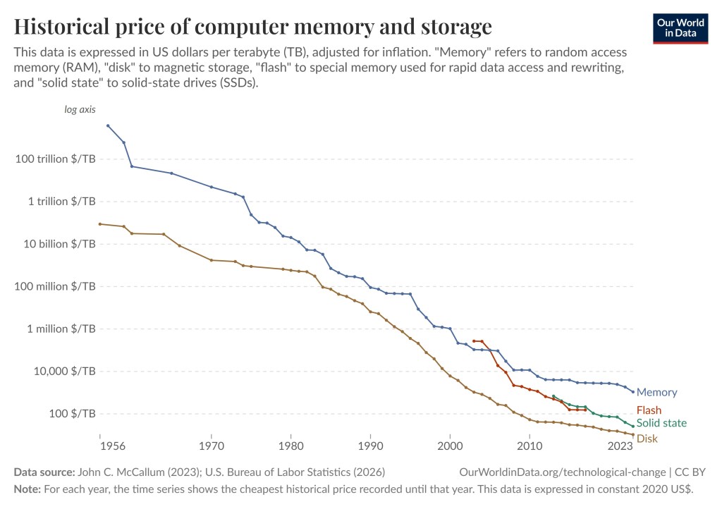
Much smaller and faster and transistors and other kinds of electronic components also come with additional benefits such as an extreme reduction in the price of memory, including the extreme reduction in the price of random access memory, RAM. In the diagram below (taken from this page ) the blue line shows that the price for one Terabyte of memory (RAM) in 1957 was 3,79 quadrillion dollars and now in 2023 it is only 1,088 dollars. 3,79 quadrillion dollars is a lot of money.
You may object that and point out that 3,79 quadrillion dollars is even more than our national deficit. So how can that be possible? The answer is that one terabyte of memory did not exist in 1957. 3,79 quadrillion dollars per terabyte is the same as 3.79 million dollars per kilobyte, but those are the numbers that make sense for 1957. The gigantic computers back then only had a few kilobytes of memory. You just need to do the conversion. Anyway, 3,79 quadrillion dollars versus 1,088 dollars corresponds to a reduction in price by 3,48 trillion times. For disk memory the price per terabyte went down from 87.5 billion in 1956 to 11 dollars in 2023, a reduction of 7.95 billion times.
Historical price of computer memory and storage. This data is expressed in US dollars per terabyte (TB), adjusted for inflation. “Memory” refers to random access memory (RAM), “disk” to magnetic storage, “flash” to special memory used for rapid data access and rewriting, and “solid state to solid-state” drives (SSDs). Data source: John C. McCallum (2023); U.S. bureau of Labor Statistics (2026). Note: For each year, the time series shows the cheapest historical price recorded until that year. This data is expressed in constant 2020 US$. OurWorldinData.org/technological-change | CC BY
Increased Computational Power and Artificial Intelligence
My super fact 88 states that “Artificial Intelligence is Not New” It goes back to at least 1943 with the creation of the first artificial neural network model, the first trainable (able to learn) neural network in 1957, and the foundation of the field of “Artificial Intelligence Research” in 1956. In 1986 a landmark paper was published by David Rumelhart, Geoffrey Hinton, and Ronald Williams which introduced the Rumelhart backpropagation algorithm, which is used today by modern AI and Large Language Models, such as ChatGPT. Geoffrey Hinton, who is said to be the father of Artificial Intelligence, received the Nobel Prize in physics in 2024. David Rumelhart and Ronald Williams were both dead and could therefore not receive the Nobel Prize.
So why did it take so long for today’s commercial LLMs to appear? The answer is, for the most part, that the computational power and huge memory required did not exist until recently. Sure, training these large AI systems require enormous amounts of data that comes from outside of the processors (internet) but you need enormous amounts of memory to store this data and an enormous computational processing power to run the algorithms such as Rumelhart’s backpropagation algorithm. For example, ChatGPT 3.5 and 4.0 feature 96 versus 120 hidden layers of neurons with hundreds of billions and trillions of parameters/neurons in total. The enormous increase in computer processing power and memory is an essential aspect of scaling up AI. Our World in Data has an article about this here.
The dots in the diagram are neurons. With permission from kwholley63
Conclusion
Moore’s law, a purely observational law, states that the number of transistors on a microchip doubles roughly every two years. This also means that the computational processing power of processors has greatly increased and the cost of memory has dropped by a lot. This in turn has made the existence of modern Large Language Models such as ChatGPT possible.
Transistors per Microchip Increased by More than 50 million Times in 50 Years. Processing speed has increased14.6 million times in 32 years. The reduction in price per Tera Byte has gone down 3,48 trillion times in 67 years.
If Moore’s law holds, we can expect that in twenty years the number of transistors per Microchip will increase by more than 1,000 times, that processing speed will increase roughly 29,000 times, and that memory RAM will be more than 6,000 times cheaper. These are my calculations based on the graphs above.
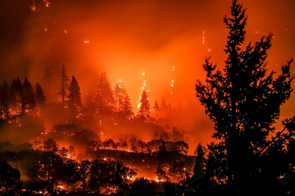
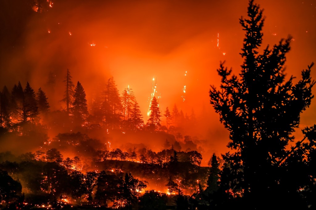
Superfact 126: Climate change worsens wildfires in North America, especially in the western U.S. and Canada, as well as in southern and western Europe, the Arctic and Siberia, Australia, and parts of South America and central Africa. That is because these areas face longer dry spells and rising temperatures due to climate change. However, changes in human land-use, such as farming expansion, and landscape fragmentation in Northern Africa and south Asia have caused the total burned area to decline.
As mentioned, climate change worsened wildfires in North America, especially in the western U.S. and Canada, as well as in southern and western Europe, the Arctic and Siberia, Australia, and parts of South America and central Africa. However, changes in population distribution, land use, forest fragmentation and the conversion of land for urban development and agriculture in particularly south Asia and North Africa have suppressed wildfires, driving down global burned area. The net effect is estimated to be a reduction of the burned area by 5%. You can read more here, or here, or here, or here.
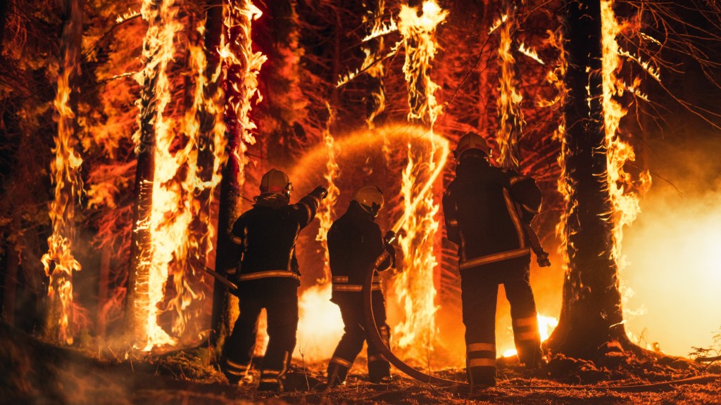
Highly skilled hotshot firemen crew working in a challenging remote area with flames reaching the treetops. Shutter stock asset id: 2258645599 by Gorodenkoff
This is an important fact that is also paradoxical. On the one hand climate change / global warming is worsening wildfires. On the other hand, the size of the total area burned by wildfires has declined because of the change of human land use. Those who knew that wildfires are getting worse due to climate change are likely surprised to hear that total area burned by wildfires has declined. Those who use the fact that the total area burned by wildfires has declined to deny that global warming is worsening wildfires might be surprised to learn that they are wrong.
Some Clarification on Wildfires
Wildfires are not started by climate change or poor forest management. They are started by lighting, falling powerlines, campfires that are not properly put out, and sometimes by arson. That doesn’t mean that climate change and poor forest management does not increase the risk and extent of wildfires.
Research organizations such as NOAA recognize that wildfire is a natural part of the western US ecosystem. However, climate change is significantly exacerbating the problem by creating conditions more conducive to intense and widespread wildfires.
Suppression of fire in certain ecosystems may in fact increase the likelihood that a wildfire will occur.
In the past, forests evolved with frequent, low-intensity fires that helped clear out underbrush. They can have ecological benefits. Therefore, the number of wildfires may not have increased over the last 100 years.
Local conditions and forest management have evolved through time complicating the wildfire statistics around the world.
In the past reporting was not always consistent.
Climate change worsens wildfires in the US
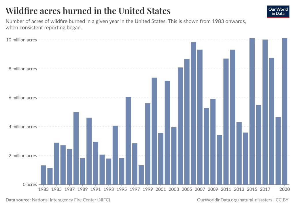
Climate change, including increased heat, extended drought, and a thirsty atmosphere, has been a key driver in increasing the risk and extent of wildfires in the United States, particularly the western United States during the last two decades. The number of Wildfire acres burned in the United States has significantly increased even though the number of wildfires has not. Another important factor is forest management.
Wildfire acres burned in the United States. Number of acres of wildfire burned in a given year in the United States. This is shown from 1983 onwards, when consistent reporting began. Data source : National Interagency Fire Center (NIFC). Presented by OurWorldinData/natural disasters.
You can read more about the increased wildfires in the United States in this superfactful post.
Imagine my delight when I saw the post above. Sally is sharing my super fact 56:
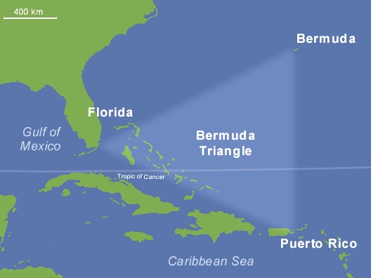
Super fact 56 : The Bermuda Triangle mystery is a myth. There is not a higher risk of disappearances in the Bermuda Triangle. To be specific, disappearances do not occur in the so-called Bermuda Triangle, or Devils Triangle, with any higher frequency than in other comparable regions of the ocean. The “mystery” of the Bermuda Triangle is largely a manufactured one, perpetuated by sensationalized accounts that often misrepresent the facts and downplay the role of natural hazards like storms.
In addition, she is promoting my Leonberger dog book for which D.L. Finn wrote a great review. Thank you so much Sally and D.L. Finn. Please click the link and see the Smorgasbord blog magazine post.
The Bermuda Triangle: It is approximately defined as a triangle Florida, Bermuda, and Puerto Rico. There is no exact definition. Alphaiosderivative work: -Majestic-, Public domain, via Wikimedia Commons.








 Super Facts