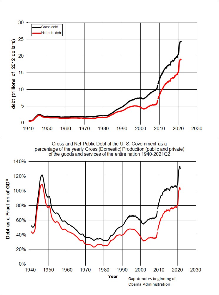
Super fact 76 : The current US national debt is a record 38.35 trillion dollars and growing despite it being peacetime and no recession. The expected GDP for 2025 is 30.6 trillion, which corresponds to a debt to GDP Ratio of 125 percent.

The federal government needs to borrow money to pay its bills when its ongoing spending activities and investments cannot be funded by federal revenues alone. That the national debt is growing in terms of dollars may not be shocking. There is inflation, the country is growing, and as the economy grows its ability to pay the debt increases. Therefore, the debt to GDP Ratio is a better measurement of the size of the problem as this metric relates to our ability to pay the debt back. When the debt to GDP Ratio is growing there is a real problem.
Wars and recessions tend to add to the federal debt. While debt spikes during crises, it historically receded after. The second World War is an example (see below). However, since 1980 US debt has grown without seeming to come back down. Not only does the current debt to GDP Ratio exceed the one after the Second World War, the current trends show persistent deficits even in peacetime, unlike post-WWII, making the long-term outlook scary.

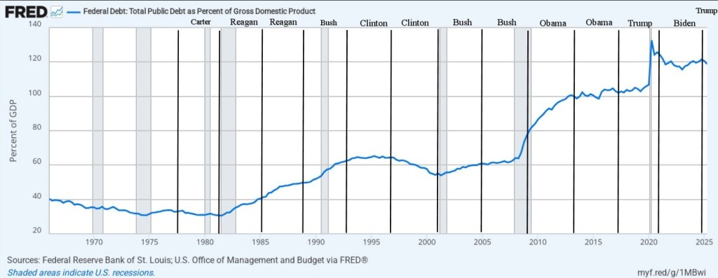
Below is an overview of the Federal Debt as percent of the GDP starting with 1965 to the beginning of 2025. The graph does not include most of the more than 2 trillion increases in debt during 2025, including a 1 trillion increase that happened in just two months toward the end of the year. So at the end there is a missing uptick. The graph below comes from this website.

In the past we used to discuss the national debt and the national deficit a lot, and it was viewed as an important and urgent problem to solve. It was a matter of intergenerational justice. There are some big problems that we have largely solved, for example, the sulfur dioxide pollution that created acid rain has fallen by 95 percent in the US, and the emissions of ozone-depleting gases have fallen by 99 Percent. As a result, we have mostly stopped talking about those problems. However, as the problem with national debt has grown, we have not increased but decreased our attention to the problem. The fact that the debt is now more than 38 trillion dollars, or $112,000 per person in US, and keeps rising despite no wars or recessions happening is probably a shock to many. It is true, it is an important fact, and it is surprising and perhaps shocking and therefore it is a super fact. To read more about the national debt click here.
Debt to GDP Presidents
One might be curious as to how the debt changed during specific Presidencies. I took the graph above and inserted lines representing the starting and ending years for the most recent Presidents. For example, Joe Biden’s Presidency started January 20, 2021, and ended January 20, 2025. I might not have gotten it exactly right so don’t read too much into it.

Below is a table I found online.
| President | Years in Office | Debt-to-GDP at Start | Debt-to-GDP at End | Change (Percentage Points) |
| Franklin D. Roosevelt | 1933–1945 | ~20% | ~112.9% | +92.9 (WWII/Depression) |
| Harry S. Truman | 1945–1953 | 112.9% | ~67.1% | -45.8 |
| Dwight D. Eisenhower | 1953–1961 | ~67.1% | ~55.2% | -11.9 |
| Lyndon B. Johnson | 1963–1969 | ~46.9% | ~38.6% | -8.3 |
| Jimmy Carter | 1977–1981 | ~35.8% | ~32.5% | -3.3 |
| Ronald Reagan | 1981–1989 | ~32.5% | ~53.1% | +20.6 |
| George H.W. Bush | 1989–1993 | ~53.1% | ~66.1% | +13.0 |
| Bill Clinton | 1993–2001 | ~66.1% | ~56.4% | -9.7 |
| George W. Bush | 2001–2009 | ~56.4% | ~84.2% | +27.8 (Wars/Recession) |
| Barack Obama | 2009–2017 | ~84.2% | ~103.6% | +19.4 (Great Recession aftermath) |
| Donald Trump | 2017–2021 | ~103.6% | ~132.8% (peak in Q2 2020) | +29.2 (Pandemic relief/tax cuts) |
| Joe Biden | 2021–Present | ~132.8% (at start of term, Q2 2020 peak) | ~124.3% (as of 2024) | Fluctuation/slight decrease due to GDP recovery/inflation |
Other Types of Debt
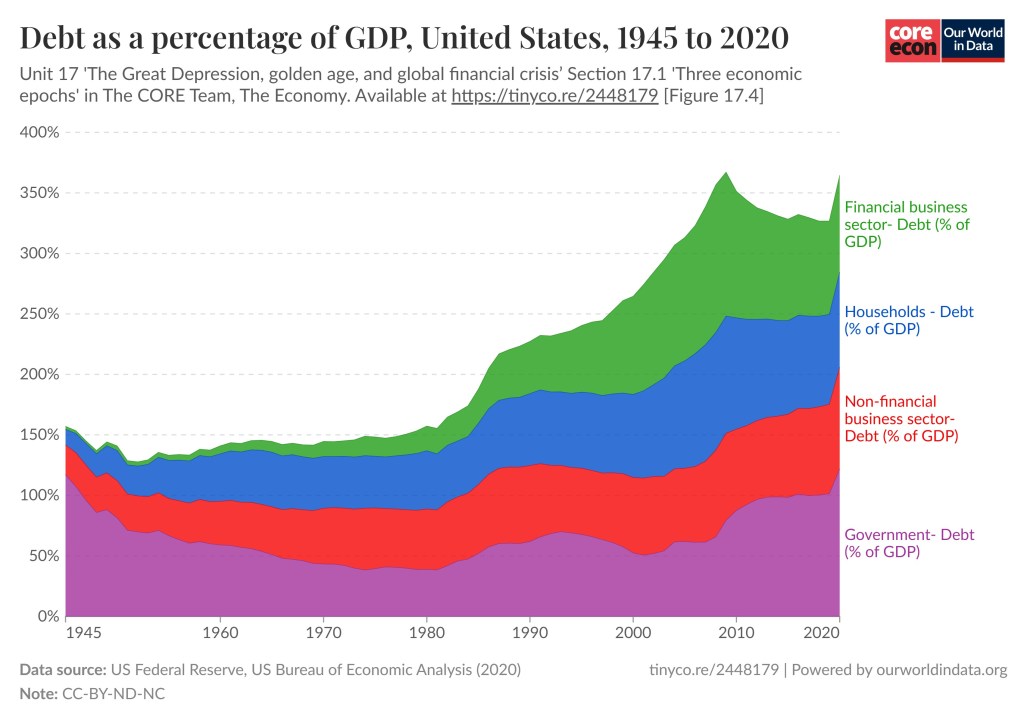
I should add that there are other types of debt not just federal debt / national debt (gross and net). American companies and financial institutions owe money and consumers have debt. As you can see in the graph below the debt to GDP ratio increase is true for those kinds of debts as well. We are a nation in debt. To read more about the graph below click here.

