The goal of this blog is to create a list of super facts. Important facts that are true with very high certainty and yet surprising, misunderstood, or disputed by many. This blog aims to be challenging, educational, and fun, without it being clickbait. I determine veracity using evidence, data from reputable sources and longstanding scientific consensus. Prepare to be challenged (I am). Intentionally seek the truth not confirmation of your belief.
Author: thomasstigwikman
My name is Thomas Wikman. I am a software/robotics engineer with a background in physics. I am currently retired. I took early retirement. I am a dog lover, and especially a Leonberger lover, a home brewer, craft beer enthusiast, I’m learning French, and I am an avid reader. I live in Dallas, Texas, but I am originally from Sweden. I am married to Claudia, and we have three children. I have two blogs. The first feature the crazy adventures of our Leonberger Le Bronco von der Löwenhöhle as well as information on Leonbergers. The second blog, superfactful, feature information and facts I think are very interesting. With this blog I would like to create a list of facts that are accepted as true among the experts of the field and yet disputed amongst the public or highly surprising. These facts are special and in lieu of a better word I call them super-facts.
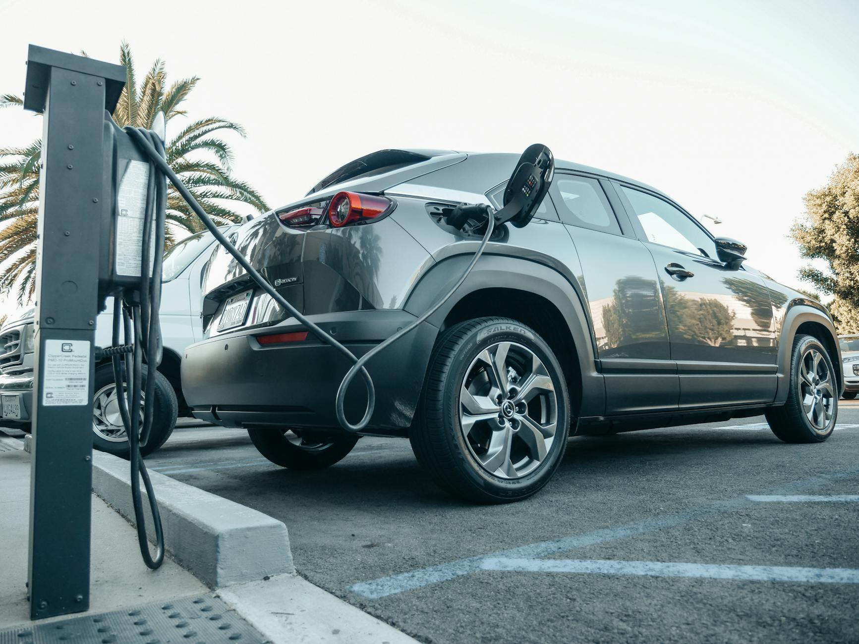
Super fact 29: EV Cars emit less pollution than Internal Combustion Engine Cars, even considering manufacturing, disposal and EV Cars being charged by dirty grids.
EV Cars emitting less carbon pollution is a Super Fact
At least here in Texas it is quite common to hear people say that EV cars do not reduce emissions. After all EV cars use electricity from the dirty grid. It is also frequently implied that environmentalists and people who care about fossil fuel emissions do not understand that the electricity for EV cars typically comes from the dirty grid. However, the environmentalists I know do know that. In fact, they typically know more and have sometimes done the math. This is why I consider it a super fact. We know that it is true that EV Cars emit less carbon pollution. This is a fact that matters, it is not trivia, and yet this fact is frequently disputed, argued over, or surprising to people.
EV Cars are more efficient than Internal Combustion Engines
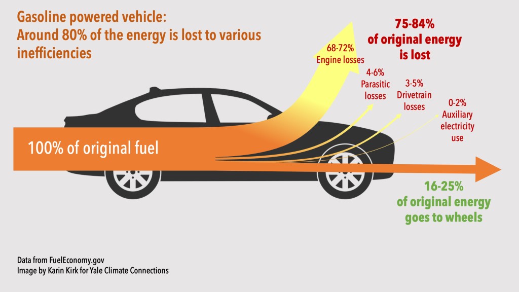
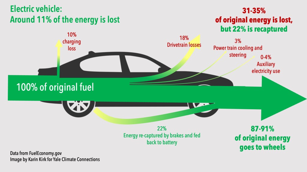
For starters, EV cars are much more efficient than Internal Combustion Engine cars, or ICE, and even a coal-fired power plant is less wasteful than a car engine. The net result is that the emissions caused by EVs via the electrical grid are significantly less per mile. The miles per gallon equivalent (MPGe) for electric vehicles (EVs) varies by state/grid and depends on the model of the car but in general it is much better than for an ICE . Replacing gasoline-powered cars with EVs saves energy, regardless of the energy source used to recharge the EVs. For an ICE 16-25% of the original energy goes to the wheels whereas for an EV 87-91% of the original energy goes to the wheels.
16-25% of original energy goes to the wheels. Data from FuelEconomy.gov, Image by Karin Kirk for Yale Connections.87-91% of original energy goes to the wheels. Data from FuelEconomy.gov, Image by Karin Kirk for Yale Connections.
The Manufacture and Disposal of EV Cars
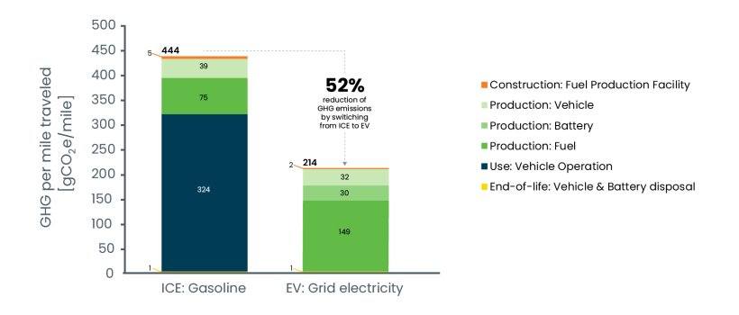
It takes more energy to manufacture an EV battery for an EV car than it does to produce a combustion engine. So, the production of an electric vehicle does emit more carbon than a petrol car. However, the lower emissions resulting from driving an EV means that an electric car quickly pays back that debt, so to speak. It is typically paid back within two years, according to Hannah Richie, the research director at Our World in Data. The statistics show that switching from an average ICE to an equally sized EV will save 1.2 tons of carbon emissions per person and year. That is a lot considering that the average carbon footprint per year is 4 tons worldwide and 14.4 tons per year for an American.
So, are electric vehicles definitely better for the climate than gas-powered cars? This article from MIT answers the question in the affirmative. The graph below includes construction of facilities, manufacturing of vehicle and battery, production of fuel, vehicle operation as well as disposal. It is taken from this government website and this article also answers the question above in the affirmative. This is an article from the Department of Energy is stating the same thing.
Lifecycle greenhouse gas emissions comparison of average gasoline car and average EV.
Hannah Richie at Our World in Data also states that other environmental damages related to EVs such as mining for minerals are less than the damage from mining and extraction for fossil fuel cars, and she claims that the price of lithium-ion batteries has fallen by 98% over the last three decades. It should be noted that EVs are becoming increasingly common. According to Our World in Data in 2022, 88% of all cars sold in Norway were EVs and 54% of all cars in Sweden were EVs.
There are other EV myths that you may want to have debunked, such as Electric vehicle batteries are unreliable and need to be replaced every few years. In 2011 battery failures were common, 7.5%, but in 2023 battery failures were 0.1%. See this article for details and other myth debunking. A related post is my post on electrification.
I should add that there are some drawbacks with EVs such as the easy with which you can charge them, depending on your location. This post is not a promotion of EVs, and I do not drive an EV for various reasons. This post, like most posts in this blog, is about correcting misinformation and getting the facts correct.
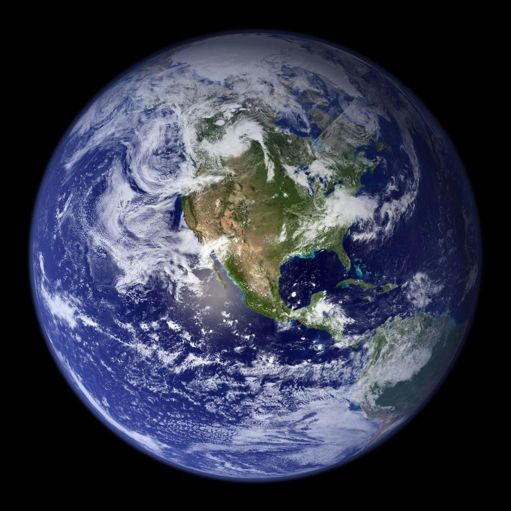
Super fact 28: That Earth is round, or spherical (or closely spherical) had been known for at least a couple of thousand years by the time Columbus set sail. Columbus did not set sail to prove that earth was round, and he knew it was round.
The ancient Greeks, particularly philosophers like Pythagoras and Aristotle knew that earth was round from observing how ships disappeared over the horizon hull first, while their masts were still visible. They noticed the earth’s round shadow cast on the moon during lunar eclipses.
If earth was flat, earth’s shadow would not appear round, especially not all the time. They also noticed that different constellations were visible depending on the location (on earth). So, noticing that earth was round was a simple and obvious observation that easily could be made thousands of years ago.
Earth is a sphere, or closely spherical. Photo by Pixabay on Pexels.com.
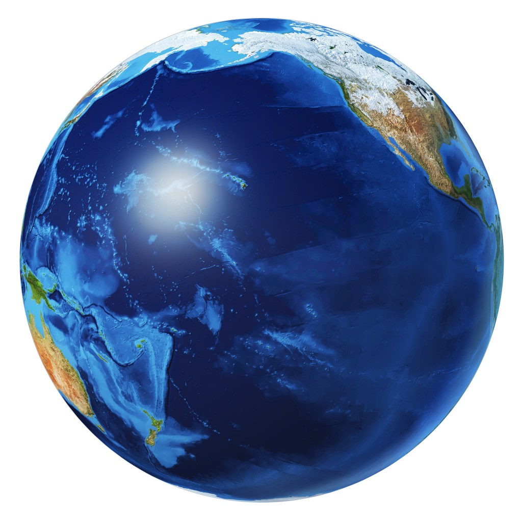
Columbus thought that the earth’s circumference was smaller than what Eratosthenes calculation had shown because he relied on maps created by Ptolemy instead of the calculations made by Eratosthenes. When he landed in the New World it seemed like Columbus had been vindicated but that did not last long. Essentially, Columbus sailed west and discovered America because he miscalculated the earth’s circumference.
Columbus thought earth was smaller. He did not know about the Pacific Ocean. Earth Pacific Ocean view Stock Illustration ID: 1617553012 by Matis75
It should be noted that even though the earth is very close to being a sphere, it is more correctly an ellipsoid because it is slightly bulging at the equator due to centrifugal forces. You sometimes hear people say that Copernicus or Galileo proposed that earth was round. This is of course false.
Copernicus’s theory of the solar system, the heliocentric model, proposed that the Sun is at the center of the solar system and the Earth, along with other planets, revolve around it. This was not a well-known fact at the time, unlike the fact that the earth is round. Galileo defended Copernicus theory. The famous alleged quote “And yet it moves” / “E pur si muove” is said to have originated from his argument with the church (however, this is not certain).
So, we know that people knew that earth was round thousands of years before Columbus, and thousands of years before the renaissance, and we know that Columbus did not sail west to prove that earth was round, and he certainly did not prove it. Yet I’ve heard this claim quite often, which is why I consider that earth being round being well known long before Columbus a super fact. Too few people believe earth to be flat like a pancake for me to consider earth being round a super fact.
Eratosthenes Calculates the Circumference of Earth
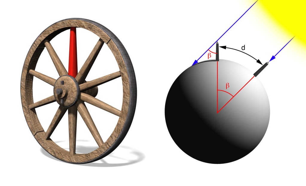
Around 500 BC (2,500 years ago) most Greeks believed that the Earth was round, but they did not know how big it was. The Greek philosopher and mathematician Eratosthenes devised a clever method of estimating its circumference and he got very close. He had heard from travelers about a well in Syene (now Aswan) that at noon on the summer solstice, about June 21 every year, the sun illuminated the entire bottom of a well, without casting any shadows, indicating that the sun was directly overhead. He had also heard that perfectly vertical poles had no shadows at this time.
The reason for this was that Syene/Aswan is located very close to the tropic of Cancer (23.5 degrees versus 24 degrees, or about 60 miles).
In Alexandria, north of Syene, the sun was not directly overhead on the summer solstice. Eratosthenes measured the angle of a shadow cast by a stick at noon on the summer solstice in Alexandria and found it to be 7.2 degrees. Using the distance from Alexandria to Syene and this angle Eratosthenes calculated earth’s circumference to be between 40,250 to 45,900 kilometers. Earth’s circumference is 40,075 kilometers.
Illustration of the measurement of the Earth circumference by Eratosthenes. On June 21st there is no shadow in Syene/Aswan but there is one in Alexandria. Asset id: 2319651251 by Javier Jaime
Resurgence in Flat Earth Beliefs
While very few people believed the Earth was flat 50 years ago, there has been a recent rise in Flat Earth conspiracy theories, largely fueled by online misinformation. Now a day 2% of Americans aged 18-24 years old firmly believe it is flat. That is despite the fact that it is easy to directly observe earth’s round shape. That is a small minority but why would anyone believe such a thing today.
For example, on a flat Earth, a Sun that shines in all directions would illuminate the entire surface at the same time, and all places would experience sunrise and sunset at the horizon at about the same time. With a spherical Earth, half the planet is in daylight at any given time and the other half experiences nighttime. Well just give someone overseas a phone call and you’ll see what the case is. In addition, different places have different amounts of daylight at the same time, which wouldn’t happen with a flat earth.
You can observe the round shape from an airplane. If you stand on a hill by the coast, you can see ships disappearing over the horizon hull first, and you can see earth’s round shadow cast on the moon during lunar eclipses. If you travel far, you can see the constellations and the stars being in different positions in the sky. The southern and northern hemisphere have completely different constellations.
Never mind Eratosthenes, gravity, the Coriolis force, other celestial bodies being round, eyewitness accounts by astronauts, ring-laser gyroscopes, and Foucault pendulums. The moon shows the same face to everyone on earth, which would not be possible if earth was flat. Also never mind NASA photos and the fact that no one has found the earth’s edge.
Below is a youTube video showing an animation composed of actual satellite photos by NASA. Earth is obviously round in this video.
In this video the near side of the moon is dark and what you see is the far side. The far side looks a little bit different from the near side of the moon. It is a new moon and the people on earth don’t see the moon. The sun is behind us and lights up both earth and the far side of the moon (this side people on earth do not see). Also, since there is daylight, the camera does not capture faint objects such as stars.
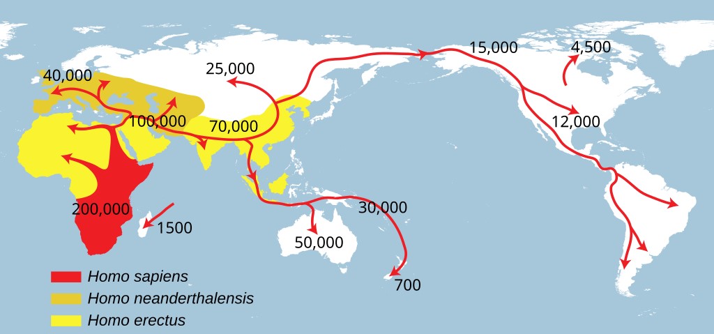
It is a common belief that humans originated in Africa. That is true but human ancestry is complicated, and in the past, there were many human species and subspecies. Starting with Homo Erectus, it is estimated that they lived between 1.6 million years ago until about 100,000 years ago.
However, note that Homo Neanderthalensis is not an ancestor of Homo Sapiens. Homo Heidelbergensis was an ancestor to both. Homo Neanderthalensis originated in Europe and Asia and stayed there, whilst Homo Sapiens originated in Africa and ventured elsewhere (see picture below).
Homo Neanderthalensis and Homo Sapiens (or Homo Sapiens Sapiens) interbred, and so did Homo Denisova and Homo Sapiens, and Homo Neanderthalensis interbred with Homo Denisova. What a mess! I can add that Homo Neanderthalensis and Homo Sapiens were different species, so it may seem strange that they could interbreed.
However, species is a complex concept and at certain points in history you could consider Homo Neanderthalensis and Homo Sapiens to be different subspecies rather than different species. That is why you sometimes hear the terms Homo Sapiens Neanderthalensis and Homo Sapiens Sapiens. Now when you know how complicated it is, I suggest you take a look at the map below.
The spread of Homo Erectus (yellow), Homo Sapiens (red) and Homo Neanderthalensis (dark yellow). NordNordWest, Public domain, via Wikimedia Commons
I can add that genetic testing can reveal how much Neanderthal DNA you have. I took a test with 23AndMe to find out about my ancestry (it was 98% Scandinavian and Finnish) and to find out about my risk for genetic illnesses. 23AndMe also told me that I was in the 99 percentiles with respect to carrying Neanderthal genes, meaning that I had unusually many Neanderthal genes (but not 99%). However, no one has called me a Neanderthal to my face yet.
The Extent of the Neanderthal Habitat
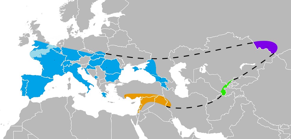
The map below indicates where skeleton remains of Neanderthals had been found as of 2017.
Known Neanderthal range in Europe (blue), Southwest Asia (orange), Uzbekistan (green), and the Altai mountains (violet), as inferred by their skeletal remains (not stone tools). There were 165 such places by 2017. Nilenbert, N. Perrault, auteur du guide complet du canotageI, CC BY-SA 3.0 <http://creativecommons.org/licenses/by-sa/3.0/>, via Wikimedia Commons
Other Neanderthal Facts
There are a lot of other interesting and surprising facts about Neanderthals, such as:
They lived in caves, but they also built shelters.
They had complex tools and skills, cooked and processed food and created art and jewelry, cooked glue, and had musical instruments (for example a bone flute).
Neanderthals not only used fire, they were able to control and maintain fire, and they used it to cook food, make tools, and for warmth and shelter.
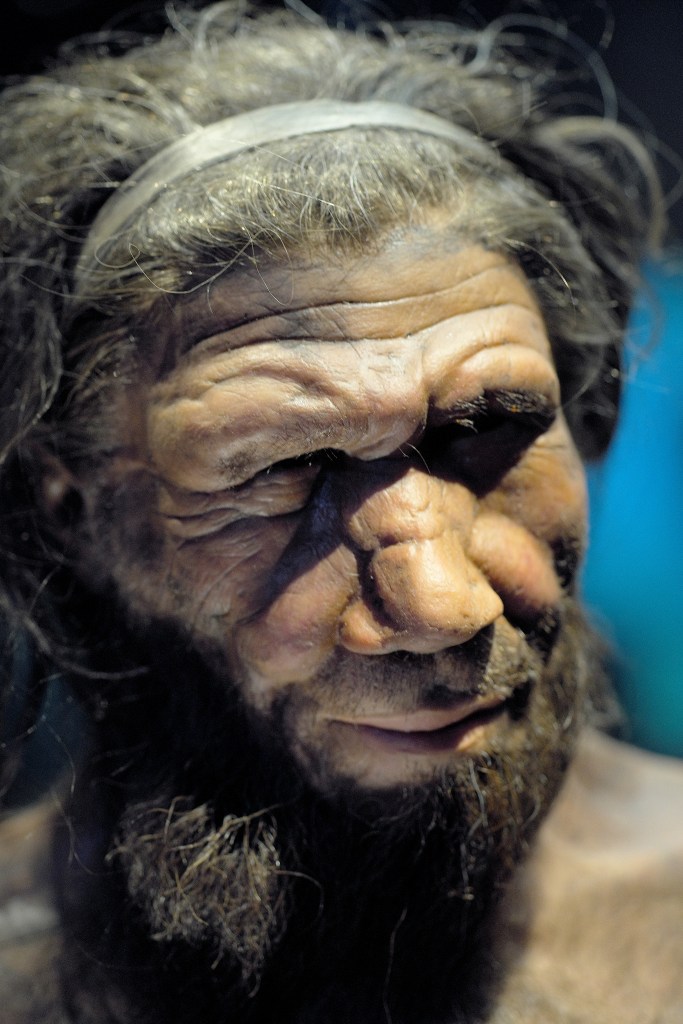
Neanderthals were stockier and more muscular than modern humans, with broader rib cages and shorter limbs. This helped them conserve heat and survive in the cold environments in Europe and Asia during the ice ages.
They might have spoken language.
There’s evidence that they were seafaring as far back as 200,000 to 150,000 years ago.
Their brains were larger than ours. The braincases of Neanderthal men and women averaged about 1,600 cm3 and 1,300 cm3, respectively, which is considerably larger than the modern human average (1,260 cm3 and 1,130 cm3, respectively).
They had medical knowledge. They had knowledge of medicinal plants and well-healed fractures on many bones indicate the setting of splints. They also knew how to treat wounds.
They hunted big game.
They interbred with modern humans.
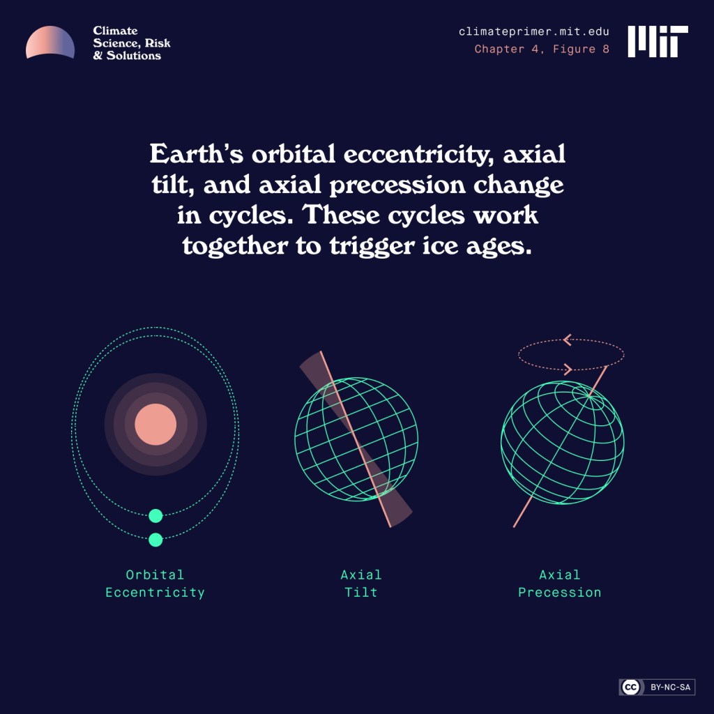
The Cause of the Ice Ages
Regarding the Ice Ages, which were a great challenge to Neanderthals, they are caused by earth’s orbital cycles. However, keep in mind that does not mean that orbital cycles are causing the current rapid global warming. NASA keeps track of the orbital cycles, and they should slowly be causing a cool down right now, not a rapid warming. In addition, if the warming was caused by orbital cycles (or the sun), the upper troposphere would be warming as well as the lower troposphere.
However, what we are seeing is a warming of the lower troposphere and cooling of the upper troposphere consistent with greenhouse gas emissions causing the warming (the blanket effect). To read more about what is causing the current global warming, click here.
Illustration of Milankovitch cycles from MIT’s Climate Primer.
Above from PBS explanation and overview of earth’s three orbital cycles.
Endangered Species
When I was a teenager, I read a few of Jean M. Auels novels about pre-historic humans. I loved them and I saw the movie. Now I am reading Jacqui Murray’s novels about pre-historic humans. Jacqui Murray’s books are even more fascinating and very realistic and well researched.
The latest Jacqui Murray book I’ve read is Endangered Species, the first book in her new series Savage Lands. This book is set to take place 75,000 years ago among Neanderthals and ancient Homo sapiens. I love all her books, but especially Endangered Species. I was also happy that she included canines as heroes in the book (Ump, White Streak, etc.) I am a dog lover after all. I can add that at the end of the book there are a lot of interesting Neanderthal Facts.
You can read my Amazon review for Endangered Species by clicking here and you can read my Virtual Book Blast post for Endangered Species (promoting this book) by clicking here. All the Virtual Book Blasts for Endangered Species feature interesting Neanderthal facts. To see a few more Virtual Book Blasts for this book click on the links in the list below.
Virtual Book Blast for Endangered Species – Darlene Foster – Click here
Virtual Book Blast for Endangered Species – Liz Gauffreau – Click here
Virtual Book Blast for Endangered Species – Carol Cooks – Click here
Virtual Book Blast for Endangered Species – John Howell – Click here
Virtual Book Blast for Endangered Species – Booomcha, Kymber Hawke – Click here
Front cover of Endangered Species. Click on the image to go to the Amazon page for the paperback version of the book.
Look at that happy and friendly beer muse above. That is Kevin’s picture. Wouldn’t you like a beer? I like beer and I also brew beer at home. My dog Rollo loves it when I spill wort on the kitchen floor. The wort is what you have before fermentation. It is like a grainy sticky sweet soup, and he likes to lick it up. However, my wife does not like it when there’s sticky wort all over her kitchen floor and the stove. Everyone has their own perspective.
Rollo in the kitchen hoping for the wort to boil over or spill.This is an IPA that I brewed at home, and it came out pretty good. Look how happy my beer garden gnome is.
Beer is one of the oldest alcoholic beverages in the world, dating back over 7,000 years to ancient Mesopotamia. There are more than 100 different styles of beer worldwide, with the main categories being lagers and ales. The beer advocate currently lists 120. Below are a few examples of Lagers and Ales.
Lagers : Pilsner, Märzen (Oktoberfest), Adjunct Lager, Pale Lager, Scwarzbier (a black lager), Bock.
Ales : IPA, Stout, Porter, Wheat Beer, Belgian Beer, Blonde Ale, Saison, Barley Wine, Lambic, Geuze
Brewing Beer at Home
When you brew beer at home you start by boiling the wort. You boil water and you add the malts and the hops for the flavoring and the aroma at specific times. This all depends on the recipe you are following. Warning! The wort easily boils over. Then you cool the wort (I use an ice bath to do this), add the yeast, and you let it ferment, typically for a couple of weeks.
You can add various things for flavoring, such as whiskey infused wood chips if you want your beer to have a taste of whiskey and wood (yes, I have done that). Whiskey and wood are great added flavors in stouts. After the two weeks of fermentation, you add sugar and bottle the beer and let it ferment for a few weeks before you put it in the fridge.
Boiling wort on the kitchen stove. It contains water, malts, hops, and maybe sugar or honey.
A few words about the bottling process. The bottling process below is using siphoning instead of pouring to achieve some filtering and to avoid splashing. Splashing can cause excessive oxidation which can ruin the beer the same way bananas turn brown. This seems to matter for New England style IPAs, but not so much for other beer styles (my observation).
Here I am bottling beer while drinking a renowned IPA called Pliny the Elder, one of the best India Pale Ales in the world.
Measuring the alcohol content in home brews
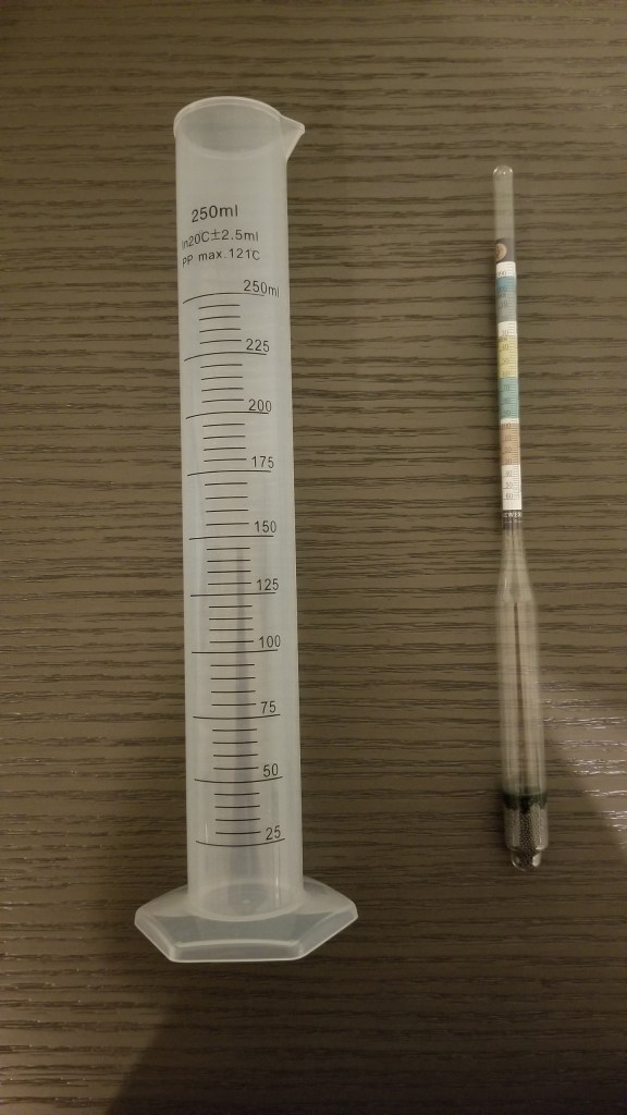
When you brew beer at home you don’t have the advanced equipment that breweries sometimes do so measuring the alcohol content is a challenge. However, you can do it with an indirect method using a hydrometer. I will explain how to do this. There are instruction booklets, books and online websites that explain how to do this, but I will keep it short and succinct.
During the fermentation process, yeast converts sugars into alcohol (and carbon dioxide). As the sugar is used up, the wort slowly becomes less dense. By measuring the density before and after fermentation (using the hydrometer), you can calculate how much alcohol is in the finished beer. In the beer world this is called measuring the gravity, not to be confused with the fundamental force of attraction between objects with mass. You can buy a hydrometer in a lot of places including Amazon.
This is a measuring cup (left) and a hydrometer (right). Don’t worry about markings on the measure cup. It is the markings on the hydrometer that you use.Close up of a hydrometer.
The density/gravity of water is used for reference as 1.000. To be exact, it also depends on the temperature, but for now we’ll ignore that. After the initial boil of the wort, and before you add the yeast, there is no alcohol in the wort. This is a good point to measure what is called original gravity (OG).
I should mention that you need to let the wort cool off before doing your measurement. The temperature at this point should be around room temperature, 72 degrees (60 to 75 degrees). Then after fermentation (in your container, carboy, whatever) you measure it again. This is called the final gravity (FG).
Original gravity/density Was 1.072. Final gravity/density was 1.018 (in picture).
I should add that after the fermentation in your container/carboy is done you add a little bit more sugar (called priming sugar), you bottle the beer, and you let it ferment a little bit more, which will add a little bit more alcohol as well as carbon dioxide. You want some carbon dioxide in the beer but not too much. This extra amount of alcohol is not accounted for using the final gravity. However, it is typically around 0.2% and if you wish to include it, you can just add that number.
Using the original gravity (OG) and the final gravity (FG) you can now calculate the ABV, Alcohol by Volume, by using the formula below. For this brew, an IPA (India Pale Ale), I got OG = 1.072 and FG = 1.018. Ideally FG is around 1.010, but for whatever reason I did not get there.
ABV = (OG – FG) x 131.25 = 0.054 x 131.25 = 7.1%
So that would be 7.3% with the bottle fermentation. That is a good enough measurement, but if you want precision, there is a more exact formula.
ABV = (76.08 x (OG – FG) / (1.775 – OG)) * (FG/0.794) = which in my case yields ABV = 7.23% which would yield 7.43% with the bottling. I can add the recipe predicted ABV = 7.5%. There are even more exact formulas that account for the temperatures at the points of measurement of original gravity and the final gravity. But that would be really nerdy.
Superfact 26: The disputed Hockey Stick Graph showing that recent global warming is unprecedented in the context of the past thousand years has been shown to be correct.
Initially some scientists criticized it for being wrong, and the rightwing media and think tanks, and especially politicians criticized the graph and even attacked the scientists involved accusing them of being frauds. Al Gore was harshly criticized for using the hockey stick in his documentary “an inconvenient truth”. There were congressional hearings, politicians intimidating scientists, fake scandals, threats, and lawsuits.
The propaganda campaign against the hockey stick graph succeeded in winning over the public and that included me. I was for the longest time convinced that the hockey stick graph was wrong and perhaps a fraud. I was wrong. I had been bamboozled just like large segments of the American public.
The scandal around the hockey stick curve and the related climate-gate (fake scandal) was used to question the entire concept of global warming / climate change. As you may know, the evidence clearly shows that global warming is happening and is caused by us.
It should be noted that the way Mann, Bradley, and Hughes implemented their statistical analysis was not 100% correct, but the discrepancy was very small and did not make a big difference. However, this discrepancy was very useful for their detractors.
The controversy led to an investigation resulting in the so-called North Report. The 2006 North Report published by the United States National Academy of Sciences endorsed the MBH studies with a few reservations.
Subsequent research has resulted in more than two dozen reconstructions, using various refined statistical methods and combinations of proxy records. They are not identical to the original hockey-stick graph but closely resemble it and consistently show a slow long-term cooling trend changing into relatively rapid warming in the 20th century.
Since there is now a scientific consensus supporting the hockey stick graph, it is important news, and a lot of people still have not gotten the memo or are refusing to believe it, I consider it a super fact.
Before The Hockey Stick Graph
Before the hockey stick curve there was a lot of talk about the medieval warm period and the little ice age. Many people used these periods to cast doubt on global warming claims by scientists. I should say that the climate scientists claim about global warming was not based on the temperature record for the last 1,000 years. It was because the observed recent uptick in average global temperatures was not expected naturally.
Their worries were based on the fact that our greenhouse gas emissions could explain the uptick whilst there was no climate cycle or natural phenomenon that could explain it. That combined with the fact that the manner in which the warming was happening (it’s fingerprint if you will) showed that it was our greenhouse gases causing it.
So, the comparably high temperatures during the medieval warm period and the very cold temperatures during the little ice age should not have mattered much. But as you can see in the graph below, the old temperature graphs could be used by global warming skeptics.
It should be noted that previous estimates for the temperatures during the medieval warm period and the little ice age were based insufficient data and guesstimates.
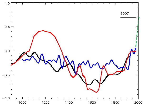
The graph below from the 1990 IPCC report shows three curves, a red, a blue and a black one, and a green extension to the blue from 1998 to 2007. The red graph shows a large bulge corresponding to the medieval warm period, a significant drop corresponding to the little ice age, and a minor uptick in recent temperatures. The blue curve shows a flattened medieval warm period with only a minor little ice age and sharper uptick in recent temperatures. The green extension stretching from 1998 to 2007 shows a significantly sharper uptick in temperatures. The black curve is an alternative temperature curve by Moberg.
As you can see the estimates for the average global temperatures during the medieval warm period and little ice age were too large. When the hockey stick curve came along (next graph), a propaganda tool was diminished, which led to the media storm.
The red line is from the 1990 IPCC report and shows what was believed at the time about temperatures during the last 1,000 years. The blue line is the (MBH) hockey stick graph from 1998. Graph taken from this page. William M. Connolley derivative work: Dave souza, CC BY-SA 3.0 <http://creativecommons.org/licenses/by-sa/3.0/>, via Wikimedia CommonsThe so-called hockey stick curve depicting the last 1,000 years. The blue line is the first hockey stick curve ever created (by Michael Mann). He used proxy measurements such as tree rings, green-dots 30-year average, red temperature measurements. Wikimedia commons <<https://creativecommons.org/licenses/by-sa/4.0/deed.en>>. This graph is taken from this page.
Multiple Hockey Stick Graphs
As mentioned, various refined statistical methods and combinations of proxy records, has resulted in another couple of dozen hockey stick curves that largely agree with the original MBH hockey curve. Below are a few examples taken from various sources. The first two graphs below are taken from the real climate website, a website created by climate scientists.
IPCC 3rd Assessment Report
Side-by-side comparison of the (left) original Mann et al (1999) “Hockey Stick” reconstruction as featured in the Summary for Policy Makers of the IPCC 3rd Assessment report (2001) and the (right) longer, sharper “Hockey Stick” as featured in the Summary for Policy Makers of the IPCC 6th Assessment report (2021).
Eight Hockey Sticks by New Scientist
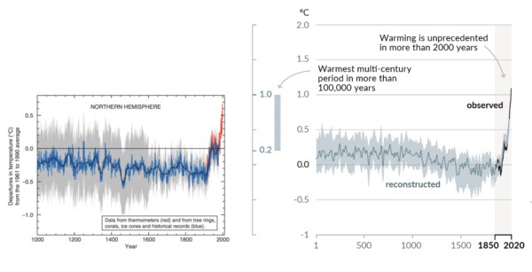
The graphics below are focused on the northern hemisphere. The top graph shows the 2001 IPCC hockey stick curve with data from thermometers (in red). Below that graph are eight more hockey stick curves plus a red dotted line corresponding to the instrumental record. This was compiled for New Scientist by Rob Wilson of the University of Edinburgh, UK.
The top graph shows the 2001 IPCC version of the hockey stick curve stretching back 1,000 years. The error bars (in grey) show the 95% confidence range. The blue line is from tree rings, corals, ice cores and historical records. All curves correspond to the departures in temperatures in centigrade from the 1961 to the 1990 average.
The Hockey Stick Wars
I also wanted to add a few examples related to the propaganda wars against the first hockey stick graph and its author Dr. Michael Mann and climate science in general. If you haven’t followed this topic, I can add that it did get intense.
On April 23, 2010, Virginia Attorney General Ken Cuccinelli issued a Civil Investigative Demand (CID) to the University of Virginia (UVA). The CID demanded that UVA provide every email, record, or document it had related to Dr. Mann from his time there from 1999 to 2005. This resulted in a strong reaction from the scientific community.
On 2 March 2012 the Supreme Court ruled that Cuccinelli as Attorney General had no legal authority to demand the records from the university. Dr. Mann was also severely harassed and received chilling death threats against himself as well as his family, as documented in his book “The Hockey Stick and the Climate Wars: Dispatches from the Front Lines”.
In February 2024, Michael Mann won a defamation lawsuit against conservative writers Rand Simberg and Mark Steyn (Mann v. Competitive Enterprise Institute). The jury awarded Mann $1 million in punitive damages and $1 in compensatory damages. The lawsuit was over blog posts written by Simberg and Steyn that accused Mann of manipulating data in his famous “hockey stick” graph. It was not so much about questioning the science but rather about the fact that they intentionally tried to ruin his reputation using false information.
For example, they were comparing him to the infamous pedophile Jerry Sandusky. Jerry Sandusky was a football coach at Penn State University and Dr. Michael Mann is a distinguished Professor of Atmospheric Science at Penn State.