IPCC Did Not Backtrack on Global Warming Being Human Caused

Superfact 106: IPCC likely retiring the RCP8.5 emissions scenario does not mean that the IPCC  backtracked on any climate science. It does not mean that climate change does not remain a serious and dangerous problem, and it definitely does not mean that global warming is not human caused.

The photo below was recently taken by the International Space Station proving once and for all that Earth is flat like a pancake. NASA issued a statement on Thursday stating that Earth being closely spherical in shape is a long standing hoax created by leftwing extremists.

The picture shows a disk representing a flat Earth. A world map is on top of it and the sun is in the background. | IPCC Did Not Backtrack on Global Warming Being Human Caused
Digital illustration of flat Earth. Shutterstock asset id: 797857906 by Amanda Carden

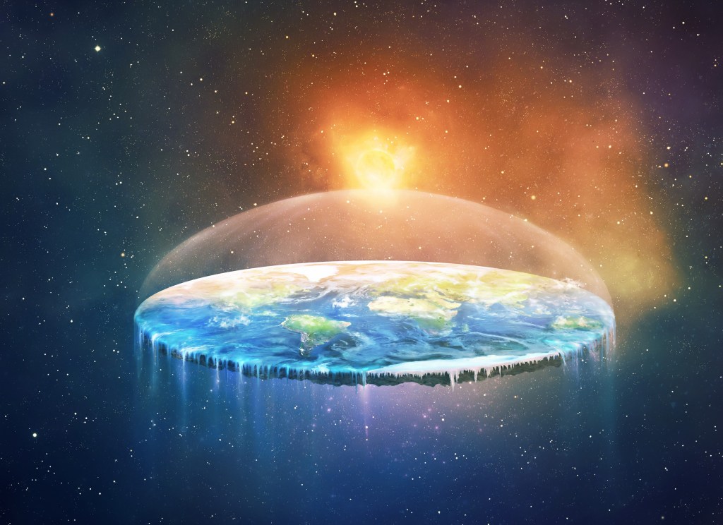
OK, that isn’t true. It sounds like an April 1st joke, doesn’t it? It is a joke, except it isn’t April 1st. However, a fairly recent survey showed that 10% of the US population believe Earth is flat, not roundish. Imagine you not understanding any of the evidence for Earth being round and imagine that you’ve never stood on a tall hill watching ships disappearing below the horizon and imagine you being surrounded by a lot of people who claim that Earth is flat. It would be easy for you to believe that Earth is flat like a pancake. Wouldn’t it? Trying to understand evidence and science is crucial to understanding the world.

When I was young, I was bamboozled into thinking Earth was 6,000 years old and that evolution was a hoax. Then I got a science education, and I had to abandon those beliefs. Later as a young adult, I was bamboozled again, this time by rightwing media, into thinking that global warming wasn’t happening, well at least not very much of it, but then I learned something about the related evidence and about climate science, and I had to abandon that misconception too.

When you do not know about or understand the evidence, you are easy to fool, and that includes you fooling yourself by misunderstanding articles you are reading. Science is not a well understood topic despite its high importance in today’s world. Conspiracy theories, anti-vaccine propaganda, creationism, anti-climate-science, and other anti-science is spreading fast today, and it is easy to get bamboozled. Anti-science has become a cultural phenomenon.

To us who understand a little bit of the evidence that we are causing climate change, the evidence is conclusive enough that claims that it isn’t us causing it, sound just like the flat Earth claim above. It sounds like an April 1st joke to us because we know something. On the other hand, if you don’t know about the evidence, then you are easy to fool, and you might easily jump to false conclusions. Watch your biases and wishful thinking and pay attention to what the experts in the field are saying, not politicians, not influencers, not Facebook memes.

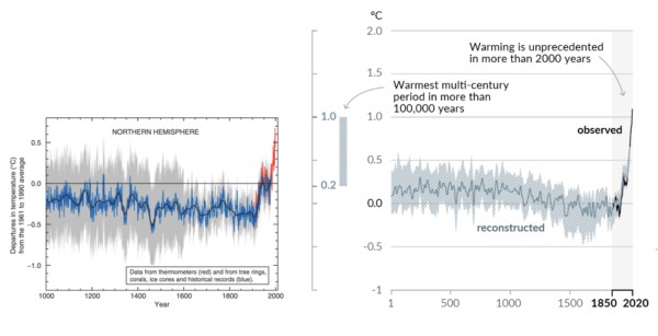
Examples of evidence that we humans are causing climate / global warming / climate disruption (pick your preferred moniker) include satellites having directly measured our greenhouse gases trapping heat, the upper troposphere cooling whilst the lower troposphere is warming, a phenomenon explained by greenhouse gas emissions, the unnatural speed of the warming, the manner in which the warming happens (explained only by greenhouse gas emissions), and that possible natural causes such as the sun, orbital cycles / Milankovitch cycles cannot explain the current warming. Add isotope studies that show that the added greenhouse gases originate from burning fossil fuels and that volcanoes emit less than 1% CO2 of what we emit.

You can read more about the evidence here.

IPCC (Intergovernmental Panel on Climate Change) being likely to drop the so called RCP8.5 (or SSP5-8.5) scenario in the upcoming Seventh Assessment Report upon the suggestion of the Scenario Model Intercomparison Project has set off a flood of misinformation and misinterpretation. Not the least by politicians, notably our President, who made some very bizarre and clueless statements on the issue.

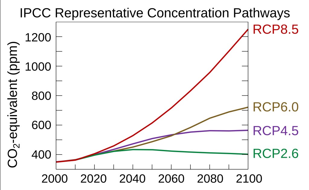
IPCC and the Scenario Model Intercomparison Project never stated that climate change is not caused by humans, or that climate change is not a serious problem. The Representative Concentration Pathways (RCPs) fundamentally depends on how much greenhouse gases we emit, as can be seen in the graph below. RCP8.5 corresponds to a very extreme scenario of burning enormous amount of coal. It was never a likely scenario to begin with, and it had become implausible due to the successful transitions to clean energy. That is why it makes sense to drop RCP8.5.

It was not because climate scientists were wrong about the climate science, or because environmentalists are exaggerating. In contrast to what many media outlets will tell you it is a vindication or victory for environmentalists. The global efforts to transition to clean energy have made it so that we can declare the worst of the worst scenario as implausible.

The graph shows four scenarios RCP2.6, RCP4.5, RCP6.0, RCP8.5, each corresponding to different concentrations of CO2. The Y-axis shows the amount of CO2 in the atmosphere going from 300 ppm to 1300 ppm. The X-axis corresponds to the years going from year 2000 to the year 2100.
Different RCP scenarios result in different predicted greenhouse gas concentrations in the atmosphere (from 2000 to 2100). RCP8.5 would result in the highest greenhouse gas concentration (measured as CO2-equivalents). Efbrazil, CC BY-SA 4.0 https://creativecommons.org/licenses/by-sa/4.0, via Wikimedia Commons.

Since there are so much confusion, misinformation and hoopla surrounding this seemingly non-controversial event, I have reasons to consider the rectification of the misinformation a super-fact.

Official Statements on RCP8.5 by IPCC and the Scenario Model Intercomparison Project

It should also be noted that IPCC issues assessment reports based on research done by other organizations such as the Scenario Model Intercomparison Project. The IPCC does not conduct its own research. That is another common misrepresentation across media. It was not IPCC that decided to drop the RCP8.5 scenario, and the seventh assessment report has not yet been released. It was a suggestion by the Scenario Model Intercomparison Project published as a paper in Geoscientific Model Development, which stated “the CMIP6 high emission levels (quantified by SSP5-8.5) have become implausible, based on trends in the costs of renewables, the emergence of climate policy and recent emission trends”. You can read this paper here (and search for the quote).

Notice that the paper by the Scenario Model Intercomparison Project is NOT stating that global warming / climate change is not human caused. It does NOT state that it is not a serious problem. It does not in anyway imply anything like what the President and certain media outlets claim. There is additional reading from the Scenario Model Intercomparison Project here. You can read IPCC’s official comment on the issue here and its statement here. They were published May 20, 2026. The Washington Post and EOS provide some pretty accurate and easy to read explanations of what happened, for those wanting lighter reading.


To see the Other Super Facts click here

The Hockey Stick Graph is not Wrong

Superfact 26: The disputed Hockey Stick Graph showing that recent global warming is unprecedented in the context of the past thousand years has been shown to be correct.

The Mann, Bradley, and Hughes hockey stick curve published in 1998 in Nature and showing a sharp upturn in global temperatures in recent years as well as relatively flat temperatures in the previous 1,000 years, ignited a firestorm.

Initially some scientists criticized it for being wrong, and the rightwing media and think tanks, and especially politicians criticized the graph and even attacked the scientists involved accusing them of being frauds. Al Gore was harshly criticized for using the hockey stick in his documentary “an inconvenient truth”. There were congressional hearings, politicians intimidating scientists, fake scandals, threats, and lawsuits.

The propaganda campaign against the hockey stick graph succeeded in winning over the public and that included me. I was for the longest time convinced that the hockey stick graph was wrong and perhaps a fraud. I was wrong. I had been bamboozled just like large segments of the American public.

The scandal around the hockey stick curve and the related climate-gate (fake scandal) was used to question the entire concept of global warming / climate change. As you may know, the evidence clearly shows that global warming is happening and is caused by us.

It should be noted that the way Mann, Bradley, and Hughes implemented their statistical analysis was not 100% correct, but the discrepancy was very small and did not make a big difference. However, this discrepancy was very useful for their detractors.

The controversy led to an investigation resulting in the so-called North Report. The 2006 North Report published by the United States National Academy of Sciences endorsed the MBH studies with a few reservations.

Subsequent research has resulted in more than two dozen reconstructions, using various refined statistical methods and combinations of proxy records. They are not identical to the original hockey-stick graph but closely resemble it and consistently show a slow long-term cooling trend changing into relatively rapid warming in the 20th century.

Since there is now a scientific consensus supporting the hockey stick graph, it is important news, and a lot of people still have not gotten the memo or are refusing to believe it, I consider it a super fact.

Before The Hockey Stick Graph

Before the hockey stick curve there was a lot of talk about the medieval warm period and the little ice age. Many people used these periods to cast doubt on global warming claims by scientists. I should say that the climate scientists claim about global warming was not based on the temperature record for the last 1,000 years. It was because the observed recent uptick in average global temperatures was not expected naturally.

Their worries were based on the fact that our greenhouse gas emissions could explain the uptick whilst there was no climate cycle or natural phenomenon that could explain it. That combined with the fact that the manner in which the warming was happening (it’s fingerprint if you will) showed that it was our greenhouse gases causing it.

So, the comparably high temperatures during the medieval warm period and the very cold temperatures during the little ice age should not have mattered much. But as you can see in the graph below, the old temperature graphs could be used by global warming skeptics.

It should be noted that previous estimates for the temperatures during the medieval warm period and the little ice age were based insufficient data and guesstimates.

The graph below from the 1990 IPCC report shows three curves, a red, a blue and a black one, and a green extension to the blue from 1998 to 2007. The red graph shows a large bulge corresponding to the medieval warm period, a significant drop corresponding to the little ice age, and a minor uptick in recent temperatures. The blue curve shows a flattened medieval warm period with only a minor little ice age and sharper uptick in recent temperatures. The green extension stretching from 1998 to 2007 shows a significantly sharper uptick in temperatures. The black curve is an alternative temperature curve by Moberg.

As you can see the estimates for the average global temperatures during the medieval warm period and little ice age were too large. When the hockey stick curve came along (next graph), a propaganda tool was diminished, which led to the media storm.

The graph below from the 1990 IPCC report shows three curves, a red, a blue and a black one, and a green extension to the blue from 1998 to 2007 | The Hockey Stick Graph is not Wrong
The red line is from the 1990 IPCC report and shows what was believed at the time about temperatures during the last 1,000 years. The blue line is the (MBH) hockey stick graph from 1998. Graph taken from this page. William M. Connolley derivative work: Dave souza, CC BY-SA 3.0 <http://creativecommons.org/licenses/by-sa/3.0/&gt;, via Wikimedia Commons
Hockey stick curve going back 1,000 years. The recent uptick in global temperature is very sharp and very sudden | The Hockey Stick Graph is not Wrong
The so-called hockey stick curve depicting the last 1,000 years. The blue line is the first hockey stick curve ever created (by Michael Mann). He used proxy measurements such as tree rings, green-dots 30-year average, red temperature measurements. Wikimedia commons <<https://creativecommons.org/licenses/by-sa/4.0/deed.en>>. This graph is taken from this page.

Multiple Hockey Stick Graphs

As mentioned, various refined statistical methods and combinations of proxy records, has resulted in another couple of dozen hockey stick curves that largely agree with the original MBH hockey curve. Below are a few examples taken from various sources. The first two graphs below are taken from the real climate website, a website created by climate scientists.

IPCC 3rd Assessment Report

On the left is the original MBH 1998/1999 hockey stick curve extending back 1,000 years and, on the right, a more recent reconstruction extending back 2,000 years. The curves look like each other but the more recent one looks even more like a hockey stick | The Hockey Stick Graph is not Wrong
Side-by-side comparison of the (left) original Mann et al (1999) “Hockey Stick” reconstruction as featured in the Summary for Policy Makers of the IPCC 3rd Assessment report (2001) and the (right) longer, sharper “Hockey Stick” as featured in the Summary for Policy Makers of the IPCC 6th Assessment report (2021).

Eight Hockey Sticks by New Scientist

The graphics below are focused on the northern hemisphere. The top graph shows the 2001 IPCC hockey stick curve with data from thermometers (in red). Below that graph are eight more hockey stick curves plus a red dotted line corresponding to the instrumental record. This was compiled for New Scientist by Rob Wilson of the University of Edinburgh, UK.

The IPCC curve is at the top and below it is another graph containing eight hockey stick curves, Jones 1998 (red), Crowley 2000 (yellow), Briffa 2001 (black), Esper 2002 (purple), Huang 2004 (light blue), Moberg 2005 (black), Oerlemans 2995 (black), D'Arrigo 2006 (green).
The top graph shows the 2001 IPCC version of the hockey stick curve stretching back 1,000 years. The error bars (in grey) show the 95% confidence range. The blue line is from tree rings, corals, ice cores and historical records. All curves correspond to the departures in temperatures in centigrade from the 1961 to the 1990 average.

The Hockey Stick Wars

I also wanted to add a few examples related to the propaganda wars against the first hockey stick graph and its author Dr. Michael Mann and climate science in general. If you haven’t followed this topic, I can add that it did get intense.

On April 23, 2010, Virginia Attorney General Ken Cuccinelli issued a Civil Investigative Demand (CID) to the University of Virginia (UVA). The CID demanded that UVA provide every email, record, or document it had related to Dr. Mann from his time there from 1999 to 2005. This resulted in a strong reaction from the scientific community.

On 2 March 2012 the Supreme Court ruled that Cuccinelli as Attorney General had no legal authority to demand the records from the university. Dr. Mann was also severely harassed and received chilling death threats against himself as well as his family, as documented in his book “The Hockey Stick and the Climate Wars: Dispatches from the Front Lines”.

In February 2024, Michael Mann won a defamation lawsuit against conservative writers Rand Simberg and Mark Steyn (Mann v. Competitive Enterprise Institute). The jury awarded Mann $1 million in punitive damages and $1 in compensatory damages. The lawsuit was over blog posts written by Simberg and Steyn that accused Mann of manipulating data in his famous “hockey stick” graph. It was not so much about questioning the science but rather about the fact that they intentionally tried to ruin his reputation using false information.

For example, they were comparing him to the infamous pedophile Jerry Sandusky. Jerry Sandusky was a football coach at Penn State University and Dr. Michael Mann is a distinguished Professor of Atmospheric Science at Penn State.

To see the other Super Facts click here