
Super fact 57 : Half the World’s Population live within a circle that covers 2% of the world’s surface, or 10% of earth’s land area. This circle is often referred to as the “Valeriepieris Circle” or Yuxi Circle, and it is centered on southeast Asia.
This circle, has a radius of a bit more than 2,000 miles, and encompasses densely populated areas of East and South Asia, including major population centers like China, India, and Indonesia. The original Valeriepieris Circle was created by a teacher named Ken Myers in 2013 and was larger (radius 2,500 miles) than the more optimized circle created in 2015. In 2015, Singaporean professor Danny Quah—with the aid of an intern named Ken Teoh created a significantly smaller circle (radius 2,050 miles) that included half the world’s population. 4.2 billion people live in the Valeriepieris Circle, which is 5.6 times as many people as in Europe and 12.4 times as many people as in the Unites States.
I consider this a super fact because it is true, it is an important fact, and it is a surprising fact to those of us who have not come across this information before. It is an important fact because it impacts how we view our world. The circle is located far away from Europe and North America, in a part of the world that is rising quickly economically. The people in this highly populated circle have different cultures, music, literature and religions from the US and Europe. They speak different languages, and they play different sports, well soccer (the real football) is international but not as common in the Valeriepieris Circle as in Europe or South America.
Those among us who live outside of this circle, for example, in the United States or Europe, probably need to pay more attention to this half of world. Especially, if you live in the United States, it is easy to believe that the world is about us. The existence of this circle demonstrates that this view is not a realistic view.


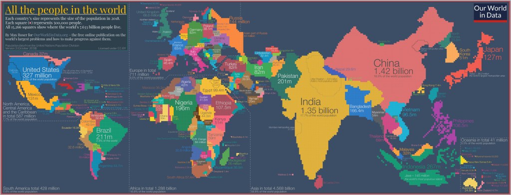
Population of Southeast Asia
The countries that are part of the Valeriepieris Circle are, for example,
- India (1.47 billion people)
- China (1.415 billion people)
- Indonesia (286 million people)
- Bangladesh (176 million people)
- Japan (123 million people). It is not included in the second circle.
- Philippines (117 million people)
- Vietnam (102 million people)
- Pakistan (256 million people)
- Thailand (72 million people)
- Myanmar (55 million people)
- and a dozen more countries.
Population Statistics
Most people know that in recent centuries the world population has grown almost exponentially but is now projected to level off sometime around the middle of this century. Europe is an interesting example. A thousand years ago Europe’s share of the world population was around 14.5%. Then came the scientific revolution and the industrial revolution and by 1900 it was 25%. As other countries around the world became industrialized Europe’s share of the world population shrunk, even though the population of Europe kept increasing, just slower. Now Europe’s share of the world population is 9%.
As countries become wealthier their population growth tends to slow down, not just in Europe, but around the world. The world’s population growth is illustrated by the image from Our World in Data below (starting 5,000 years ago, ending the year 2000) and the six minute YouTube video below from the American Museum of Natural History (starting 100,000 years ago and ending the year 2100). The YouTube video also shows the projected population decline beyond the year 2050.

A somewhat related super fact is – Poverty and child mortality has been sharply reduced worldwide.
Next Super fact coming up is : Time is the fourth dimension
