The goal of this blog is to create a list of super facts. Important facts that are true with very high certainty and yet surprising, misunderstood, or disputed by many. This blog aims to be challenging, educational, and fun, without it being clickbait. I determine veracity using evidence, data from reputable sources and longstanding scientific consensus. Prepare to be challenged (I am). Intentionally seek the truth not confirmation of your belief.
Imagine my delight when I saw the post above. Sally is sharing my super fact 57: Super fact 57 : Half the World’s Population live within a circle that covers 2% of the world’s surface, or 10% of earth’s land area. This circle is often referred to as the “Valeriepieris Circle” or Yuxi Circle, and it is centered on southeast Asia. In addition, she is promoting my Leonberger dog book for which Robbie wrote a great review. Thank you so much Sally and Robbie. Please hop over to Smorgasbord blog magazine and read it.
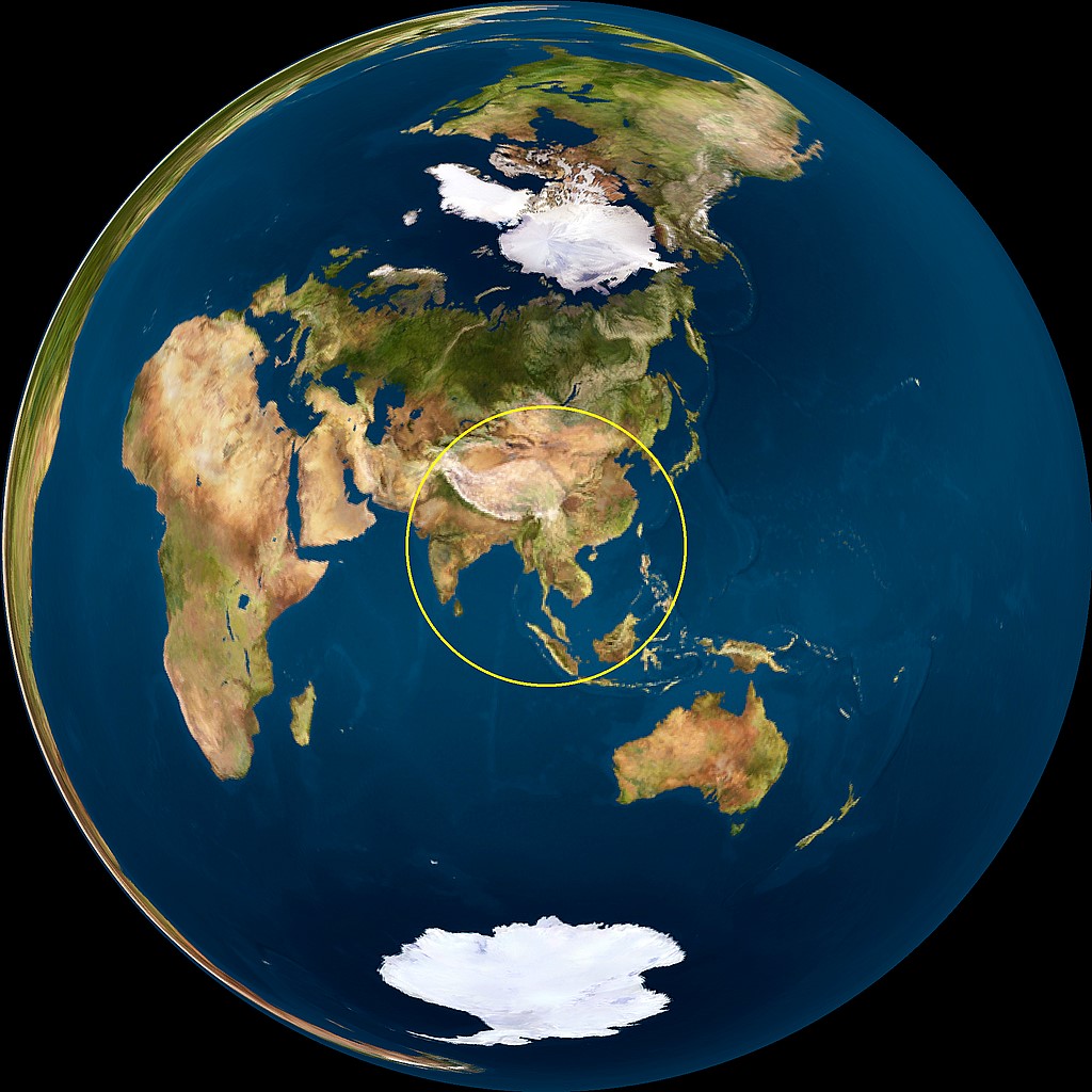
Super fact 57 : Half the World’s Population live within a circle that covers 2% of the world’s surface, or 10% of earth’s land area. This circle is often referred to as the “Valeriepieris Circle” or Yuxi Circle, and it is centered on southeast Asia.
This circle, has a radius of a bit more than 2,000 miles, and encompasses densely populated areas of East and South Asia, including major population centers like China, India, and Indonesia. The original Valeriepieris Circle was created by a teacher named Ken Myers in 2013 and was larger (radius 2,500 miles) than the more optimized circle created in 2015. In 2015, Singaporean professor Danny Quah—with the aid of an intern named Ken Teoh created a significantly smaller circle (radius 2,050 miles) that included half the world’s population. 4.2 billion people live in the Valeriepieris Circle, which is 5.6 times as many people as in Europe and 12.4 times as many people as in the Unites States.
I consider this a super fact because it is true, it is an important fact, and it is a surprising fact to those of us who have not come across this information before. It is an important fact because it impacts how we view our world. The circle is located far away from Europe and North America, in a part of the world that is rising quickly economically. The people in this highly populated circle have different cultures, music, literature and religions from the US and Europe. They speak different languages, and they play different sports, well soccer (the real football) is international but not as common in the Valeriepieris Circle as in Europe or South America.
Those among us who live outside of this circle, for example, in the United States or Europe, probably need to pay more attention to this half of world. Especially, if you live in the United States, it is easy to believe that the world is about us. The existence of this circle demonstrates that this view is not a realistic view.
The original 2013 map by Ken Myers, with the interior of the circle. Half as many people live inside the circle as outside the circle. However, it is larger and less optimized compared to the circle from 2015 below. This circle is NASA, Public domain, via Wikimedia CommonsDanny Quah’s 2015 circle, on a Lambert azimuthal equal-area projection. It should be noted that the fraction of the area of the circle to that of the globe is equal to its equivalent on Earth. Again, half as many people live inside the circle as outside the circle. From Wikipedia cmglee, jimht at shaw dot ca, CC BY-SA 4.0 <https://creativecommons.org/licenses/by-sa/4.0>, via Wikimedia Commons.
Population of Southeast Asia
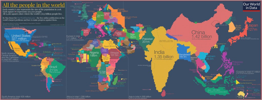
The countries that are part of the Valeriepieris Circle are, for example,
Each country’s size represents the size of the population in 2018. Each little square represents 500,000 people. All 15,266 squares show where the world’s 7,633 billion peopls lived in 2018 (now the world population is 8,244 billion people). Image from our World in Data. By Max Roser for OurWorldinData.org – the free online publication on the world’s largest problems and how to make progress against them.
Population Statistics
Most people know that in recent centuries the world population has grown almost exponentially but is now projected to level off sometime around the middle of this century. Europe is an interesting example. A thousand years ago Europe’s share of the world population was around 14.5%. Then came the scientific revolution and the industrial revolution and by 1900 it was 25%. As other countries around the world became industrialized Europe’s share of the world population shrunk, even though the population of Europe kept increasing, just slower. Now Europe’s share of the world population is 9%.
As countries become wealthier their population growth tends to slow down, not just in Europe, but around the world. The world’s population growth is illustrated by the image from Our World in Data below (starting 5,000 years ago, ending the year 2000) and the six minute YouTube video below from the American Museum of Natural History (starting 100,000 years ago and ending the year 2100). The YouTube video also shows the projected population decline beyond the year 2050.
Population per square kilometer. Source of the original visualization Klein Goldewijk, Beusen and Janssen (2010). Long term dynamic modeling of global population and built-up area in a spatially explicit way: HYDE 3.1. In the Holocene 20(4) 565-573. The original visualization was adapted by OurWorldinData.org




 Super Facts