Environmental Benefits of Recycling Are Overestimated

Super fact 32: The common perception that recycling is one of the best things you can do for the environment is an exaggeration. Its impact is often not very large and if not done properly it can be counterproductive.

In general recycling is beneficial, because you conserve natural resources, reduce climate change, save energy and reduce waste and pollution. Battery recycling is particularly important since it reduces toxic waste and reduces the risk of a future shortage of certain minerals. Recycling is often viewed as a very important activity that everyone should participate in, and neighbors often shame those who fail to comply.

The shocking news is that even though recycling in general is good for the environment it may not be as beneficial as it is assumed. It turns out to be complicated. As you will see later, most people think that recycling is the most impactful action you can take as an individual to reduce carbon emissions, when in fact it is of very marginal importance. This is what made me consider this a super fact.

A company where a big green hand is depicted to symbolize the protection of the environment, where climate-friendly topics are also depicted, such as wind turbines or recycling | Environmental Benefits of Recycling Are Overestimated
This content was generated by an Artificial Intelligence (AI) system. Asset id: 2531547331

Recycling and Greenhouse Gases

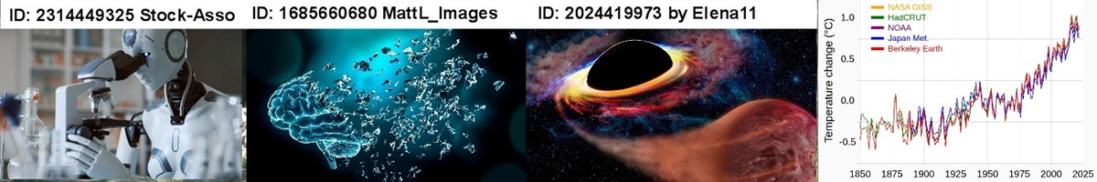
According to EPA recycling saves 193 million metric tons of carbon emissions, which sounds a lot until you consider that the US emit 6,343 million metric tons per year according to EPA making it 3%. According to this website consumers can save 732 kilograms of CO2 assuming they do the recycling correctly. This should be compared to the average carbon footprint for an American (US), which is 16 metric tons, making the savings for good recyclers 4.6%.

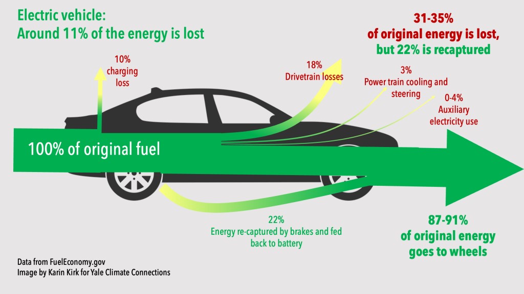
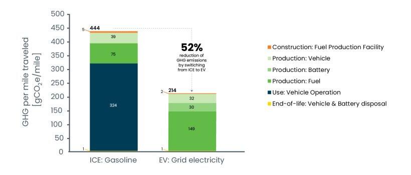
According to our World in Data (Not the End of the World page 114), based on this research, giving up an average SUV for a sedan would save 3.6 metric ton, or 22.5%. Switching to a plant-based diet would save 2.2 metric ton per person, or 13.8%. Actions saving more greenhouse gases than recycling that we as consumers can take, are for example: give up SUV, go car free, have a plant-based diet, avoid transatlantic flights, buy green energy, switch to electric car, switch from electric car to no car, avoid medium flights, laundry in cold water, and hand dry clothing.

Surveys across 21,000 adults in 30 countries showed that the two actions that people believed saved the most greenhouse gases were recycling (59%) and upgrading lightbulbs (36%). Upgrading lightbulbs have an even smaller effect than recycling. It is of course still a good action to take.

However, what this data demonstrates is that we are bad at guessing which actions are impactful. We need to get better informed and not make assumptions. It should be noted that the efficiency of the recycling efforts varies from country to country. Among the 32 developed countries for which there is data the United States ranks 25.

Recycling and Plastic Waste

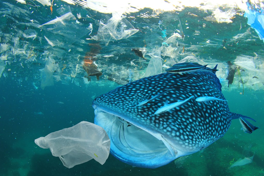
Greenhouse gas emissions is certainly not the only issue to consider. What about plastic waste? As it turns out plastic is very difficult to recycle (depending on the kind of plastic) and according to the EPA less than 9% of plastic is recycled. According to Our World in Data and the book “Not the End of the World” by Hannah Ritchie the US and Europe have well managed landfills and good waste management systems that make our plastic problem less of an issue. That’s good news.

But what about the awful problem with plastic in the ocean? Plastic ending up in the ocean is indeed a bad problem. However, 81% of all plastic in the ocean come from Asia, and the rest mostly comes from Latin America. Only 1% come from the United States and 1% from Europe and Oceania. According to Scientific American 93% of plastic in ocean come from just 10 rivers. Eight of them are in Asia: the Yangtze; Indus; Yellow; Hai He; Ganges; Pearl; Amur; Mekong. Two are in Africa – the Nile and the Niger.

None of them are in North America or Europe. Therefore, if we in the developed world greatly improve our recycling of plastic, it would not make much of a difference with respect to the problem of plastic in the ocean. What we need to do is assist China, India and southeast Asia with improving their waste management systems.

Whale Shark swimming in the ocean about to swallow a plastic bag.
Plastic Ocean pollution. Whale Shark filter feeds in polluted ocean, ingesting plastic. Asset id: 1120768061 by Rich Carey

Another issue to keep in mind is that uneducated consumers can do a lot of damage to the recycling process. For example, throwing a greasy pizza box into the recycling bin can ruin the entire batch. You are not just recycling incorrectly you are ruining the recycling efforts of your neighbors too. There are many ways to ruin the recycling process, by throwing items in the recycling that don’t belong there. Recycling requires consumers to pay attention to the instructions. It should also be noted that some companies have been found to ignore the recycling process and throw all recycled items in with the trash. There are also neighborhoods that don’t have recycling.

Conclusion

In summary, recycling may not be as great as it is often made out to be. You should still do it if you care about the environment. Just be aware that there are actions that you can take and that your government can take that are much more impactful.

One of the conclusions you can draw from this discussion is that if you are driving a big SUV or eating red meat every day you should probably abstain from shaming your neighbor for not recycling.

To see the other Super Facts click here

Eating Organic is not Necessarily Ecological

Super fact 31: The common perception that organic food is by default better for the environment or is an ideal way to reduce environmental impact is a misconception. Across several metrics, organic agriculture proves to be more harmful for the world’s environment than conventional agriculture.

There are things you can do as an individual to reduce your carbon footprint, use public transportation instead of driving, fly less, eat less read meat, don’t waste food, reduce your energy usage. There are straightforward actions you can take to reduce your use of water and avoid adding harmful pollution to the environment. However, as with eating locally grown food, eating organic food is often viewed as an environmentally friendly choice even though it often is not.

Organic farming is a method of growing food without using synthetic chemicals or genetically modified organisms (GMOs). Organic farming practices are intended to protect soil fertility, promote ecological balance, and reduce environmental impact. That’s all good. On the other hand, it should be noted that modern farming techniques, for example, using synthetic pesticides, have greatly increased cereal yield per acre and GMOs can reduce the use of toxic pesticides. It is complicated.

I consider this a super fact because it is often incorrectly assumed that eating organic food is the best choice for the environment.

Global Land Use

Before looking at the details of conventional farming versus organic farming lets look at global land use. In the figure below from Our World in Data you can see that agriculture already uses nearly half of all habitable land in the world. We cannot easily enlarge this percentage and therefore crop yield per acre is a very important factor to consider, and this is a great weakness for organic farming.

Also notice that 80% of agricultural land is used for livestock, meat, dairy and textile, but it only provides 17% global calorie supply. This second observation indicates that the type of food you eat may matter a lot more than whether it is produced via organic or conventional farming.

Earth’s surface is 29% land of which 76% is habitable land. Of that 45% is used for agriculture, of which 80% is used for livestock, meat, dairy and textiles and 16% is used for crops for food. livestock, meat, dairy and textiles provide 17% of the global calories supply and 38% of the global protein supply.
Global land-use graphics. Licensed under CC-BY by authors Hannah Ritchie and Max Roser (September 2023).

As you can see in the graph below, again from Our World in Data, the land used for producing 100 grams of protein varies enormously between different food groups. 100 grams of protein from lamb and mutton require on average 52.8 times as much land as 100 grams of protein from groundnuts. This graph does not make a distinction between organic farming and conventional farming, but it highlights the huge difference between different food sources. I’ll get to the difference between organic farming and conventional farming with respect to land use later in the post.

The graph shows that for 100 grams of protein you need on average 184.8 square meters for Lamb & Mutton, 163.6 square meters for beef, 39.8 square meters for cheese, 27.1 square meters for milk, 7.9 square meters for nuts, 4.6 square meters for grains, and 3.5 square meters for groundnuts. There are a few more items listed in the graph | Eating Organic is not Necessarily Ecological
Additional calculations by Our World in Data. OurWorldinData.org/environmental-impacts-of-food | CC BY

Agriculture and Greenhouse Gas Emissions

The next two graphs focus on the greenhouse gas emissions including those from agriculture. Electricity and Transport dominate both globally and in the United States, but globally agriculture comes in at 6 billion of the 40 billion tons of greenhouse gas emissions for 2021, which is 15%. For the United States agriculture comes in at 10.6% of greenhouse gas emissions for 2021. In other words, agriculture was not the largest contributor of greenhouse gas emissions but still an important factor.

The largest contributor of greenhouse gas emissions in the World is electricity and then comes Transport. After that comes manufacturing and construction, agriculture, industry, fugitive emissions, buildings, waste, land-use change and forestry, aviation and shipping, other fuel combustion | Eating Organic is not Necessarily Ecological
Data source : Climate Watch (2024). Note : Land use emissions can be negative. OurWorldinData.org/co2-and-greenhouse-gas-emissions| CC BY
The largest contributor of greenhouse gas emissions in the US is electricity and heat but it has gone down. Transport is number two. Then comes buildings, manufacturing and construction, fugitive emissions, agriculture, industry, waste, aviation and shipping, other fuel combustion, land-use change and forestry | Eating Organic is not Necessarily Ecological
Data source : Climate Watch (2024). Note : Land use emissions can be negative. OurWorldinData.org/co2-and-greenhouse-gas-emissions| CC BY

Finally, the contribution for different types of food. Notice that beef (beef herd) at 49.89kg is 188 times larger than the 0.26kg for nuts. 188 people eating nuts contribute as much to carbon emissions as one person eating beef.

The graphs show that beef (beef herd) generates 49.89 kilograms of carbon emissions per 100 gram of protein that it provides. For Lamb and mutton, it is 19.85 kilograms, for prawns 18.19 kilograms, for milk 9.5 kilograms, for eggs 4.21 kilograms, for grains 2.7 kilograms, for groundnuts 1.23 kilograms, for peas 0.44 kilograms and for nuts 0.26 kilograms | Eating Organic is not Necessarily Ecological
Greenhouse gas emissions per 100 grams of protein. Greenhouse gas emissions are measured in kilograms of carbon dioxide equivalents (see below). Data source: Poore and Nemecek (2018). OurWorldinData.org/co2-and-greenhouse-gas-emissions| CC BY

Carbon dioxide equivalents (CO2eq)

Carbon dioxide is the most important greenhouse gas, but not the only one. To capture all greenhouse gas emissions, researchers express them in “carbon dioxide equivalents” (CO2eq). This takes all greenhouse gases into account, not just CO2. To express all greenhouse gases in carbon dioxide equivalents (CO2eq), each one is weighed by its global warming potential (GWP) value. GWP measures the amount of warming a gas creates compared to CO2. CO2 is given a GWP value of one.

If a gas had a GWP of 10 then one kilogram of that gas would generate ten times the warming effect as one kilogram of CO2. Carbon dioxide equivalents are calculated for each gas by multiplying the mass of emissions of a specific gas by its GWP factor. This warming can be stated over different timescales. To calculate CO2eq over 100 years, we’d multiply each gas by its GWP over a 100-year timescale (GWP100). Total greenhouse gas emissions – measured in CO2eq – are then calculated by summing each gas’ CO2eq value.

Environmental Impact of Organic Versus Conventional Agriculture

At this point it should be clear that eating different types of food, nuts and vegetables versus red meat makes huge difference regarding the environment. How about organic versus conventional farming? Well, it is complicated. You have to take into account land use, greenhouse gas emissions, biodiversity, pesticide application, energy use and more.

Clark and Tilman (2017) published a meta-analysis of results of published organic-conventional comparisons across 742 agricultural systems over 90 unique foods. The food groups consisted of cereals, pulses and oil crops, fruits, vegetables, dairy and eggs, and meats. As you can see in the resulting graph below organic agriculture is worse for the environment for most food groups with regards to land use, eutrophication potential, and acidification potential. The result is mixed with respect to greenhouse gas emissions and energy use.

It appears that it is best to choose organic pulses and fruits and choose non-organic for all other food products (cereals, vegetables, dairy and eggs, and meat). However, if your primary concern is whether the potato accompanying your steak is conventionally or organically produced, then your focus is arguably misplaced. Whether you go organic or non-organic the steak is much worse for the environment.

The graph shows the six food groups and their impact across greenhouse gas emissions, land use, eutrophication potential,  acidification potential and energy usage.
Shown is the relative environmental impact of organic and conventional agriculture across various ecological and resource indicators based on a meta-analysis of 164 published life-cycle analyses (LCAs) across 742 agricultural systems. Roughly, lower in the graph means organic is better and higher up in the graph means conventional farming is better. Data source: Clark & Tilman (2017) – Comparative analysis of environmental impacts of agricultural production systems, agricultural input efficiency, and food choice. In Environmental Research Letters. The data visualization is available at OurWorldinData.org. There you can find research and more visualizations on this topic. Licensed under CC BY-SA by the authors Hannah Ritchie and Max Roser.

Conclusion

In this post I present empirical evidence from reliable sources comparing organic to conventional agriculture in terms of environmental impact. Despite strong public perception of organic agriculture producing better environmental outcomes, conventional agriculture often performs better on environmental measures including land use, greenhouse gas emissions, and pollution of water bodies. There are, however, some contexts where organic agriculture may be better for the environment. In short it is complicated.

What really matters though is the type of food you eat, not whether it is organic or not. Another thing to note is that if you eat 300 steaks per year you will have a 100 times larger environmental impact compared to someone who eats 3 steaks per year. Quantity matters. This post was about environmental impacts. There are other considerations such as health, what you like, whom you want to support, etc.

To see the other Super Facts click here

EV Cars Indeed Emit Less Carbon Pollution

Super fact 29: EV Cars emit less pollution than Internal Combustion Engine Cars, even considering manufacturing, disposal and EV Cars being charged by dirty grids.

EV Cars emitting less carbon pollution is a Super Fact

At least here in Texas it is quite common to hear people say that EV cars do not reduce emissions. After all EV cars use electricity from the dirty grid. It is also frequently implied that environmentalists and people who care about fossil fuel emissions do not understand that the electricity for EV cars typically comes from the dirty grid. However, the environmentalists I know do know that. In fact, they typically know more and have sometimes done the math. This is why I consider it a super fact. We know that it is true that EV Cars emit less carbon pollution. This is a fact that matters, it is not trivia, and yet this fact is frequently disputed, argued over, or surprising to people.

EV Cars are more efficient than Internal Combustion Engines

For starters, EV cars are much more efficient than Internal Combustion Engine cars, or ICE, and even a coal-fired power plant is less wasteful than a car engine. The net result is that the emissions caused by EVs via the electrical grid are significantly less per mile. The miles per gallon equivalent (MPGe) for electric vehicles (EVs) varies by state/grid and depends on the model of the car but in general it is much better than for an ICE . Replacing gasoline-powered cars with EVs saves energy, regardless of the energy source used to recharge the EVs. For an ICE 16-25% of the original energy goes to the wheels whereas for an EV 87-91% of the original energy goes to the wheels.

Image showing an ICE car and its various carbon losses | EV Cars Indeed Emit Less Carbon Pollution
16-25% of original energy goes to the wheels. Data from FuelEconomy.gov, Image by Karin Kirk for Yale Connections.
Image showing an EV car and its various carbon losses | EV Cars Indeed Emit Less Carbon Pollution
87-91% of original energy goes to the wheels. Data from FuelEconomy.gov, Image by Karin Kirk for Yale Connections.

The Manufacture and Disposal of EV Cars

It takes more energy to manufacture an EV battery for an EV car than it does to produce a combustion engine. So, the production of an electric vehicle does emit more carbon than a petrol car. However, the lower emissions resulting from driving an EV means that an electric car quickly pays back that debt, so to speak. It is typically paid back within two years, according to Hannah Richie, the research director at Our World in Data. The statistics show that switching from an average ICE to an equally sized EV will save 1.2 tons of carbon emissions per person and year. That is a lot considering that the average carbon footprint per year is 4 tons worldwide and 14.4 tons per year for an American.

So, are electric vehicles definitely better for the climate than gas-powered cars? This article from MIT answers the question in the affirmative. The graph below includes construction of facilities, manufacturing of vehicle and battery, production of fuel, vehicle operation as well as disposal. It  is taken from this government website and this article also answers the question above in the affirmative. This is an article from the Department of Energy is stating the same thing.

The histogram graph show that if you consider construction of facilities, manufacturing of vehicle and battery, production of fuel, vehicle operation as well as disposal the total average greenhouse gas emissions from EV cars is 52% less.
Lifecycle greenhouse gas emissions comparison of average gasoline car and average EV.

Hannah Richie at Our World in Data also states that other environmental damages related to EVs such as mining for minerals are less than the damage from mining and extraction for fossil fuel cars, and she claims that the price of lithium-ion batteries has fallen by 98% over the last three decades. It should be noted that EVs are becoming increasingly common. According to Our World in Data in 2022, 88% of all cars sold in Norway were EVs and 54% of all cars in Sweden were EVs.

EV Cars Indeed Emit Less Carbon Pollution
Photo by Kindel Media on Pexels.com

Other EV Myths

There are other EV myths that you may want to have debunked, such as Electric vehicle batteries are unreliable and need to be replaced every few years. In 2011 battery failures were common, 7.5%, but in 2023 battery failures were 0.1%. See this article for details and other myth debunking. A related post is my post on electrification.

I should add that there are some drawbacks with EVs such as the easy with which you can charge them, depending on your location. This post is not a promotion of EVs, and I do not drive an EV for various reasons. This post, like most posts in this blog, is about correcting misinformation and getting the facts correct.

To see the other Super Facts click here

Neanderthals Never Lived in Africa

Super fact 27: Neanderthals never lived in Africa. Neanderthals, or Homo Neanderthalensis, lived in Europe and Asia but never in Africa.

Photo of a reconstruction of a Neanderthal man | Neanderthals Never Lived in Africa
Reconstruction of a Neanderthal by Natural History Museum. Werner Ustorf, CC BY-SA 2.0 <https://creativecommons.org/licenses/by-sa/2.0&gt;, via Wikimedia Commons

It is a common belief that humans originated in Africa. That is true but human ancestry is complicated, and in the past, there were many human species and subspecies. Starting with Homo Erectus, it is estimated that they lived between 1.6 million years ago until about 100,000 years ago.

Homo Erectus was the ancestor of Homo Heidelbergensis (between 700,000 and 200,000 years ago) as well as Homo Floresiensis (hobbit people – between 100,000 and 50,000 years ago). Homo Heidelbergensis in turn was the ancestor of (at least) three homo species, Homo Sapiens (between 300,000 until now), Homo Neanderthalensis (between 400,000 to 40,000 years ago),  and Homo Denisova 300,000 to 25,000 years ago.

However, note that Homo Neanderthalensis is not an ancestor of Homo Sapiens. Homo Heidelbergensis was an ancestor to both. Homo Neanderthalensis originated in Europe and Asia and stayed there, whilst Homo Sapiens originated in Africa and ventured elsewhere (see picture below).

Homo Neanderthalensis and Homo Sapiens (or Homo Sapiens Sapiens) interbred, and so did Homo Denisova and Homo Sapiens, and Homo Neanderthalensis interbred with Homo Denisova. What a mess! I can add that Homo Neanderthalensis and Homo Sapiens were different species, so it may seem strange that they could interbreed.

However, species is a complex concept and at certain points in history you could consider Homo Neanderthalensis and Homo Sapiens to be different subspecies rather than different species. That is why you sometimes hear the terms Homo Sapiens Neanderthalensis and Homo Sapiens Sapiens. Now when you know how complicated it is, I suggest you take a look at the map below.

A world map showing portions of Africa being yellow and red, and portions of Asia being yellow and dark yellow with red arrows representing migrating Homo Sapiens. The map features several time markers representing the arrival of Homo Sapiens | Neanderthals Never Lived in Africa
The spread of Homo Erectus (yellow), Homo Sapiens (red) and Homo Neanderthalensis (dark yellow). NordNordWest, Public domain, via Wikimedia Commons

I can add that genetic testing can reveal how much Neanderthal DNA you have. I took a test with 23AndMe to find out about my ancestry (it was 98% Scandinavian and Finnish) and to find out about my risk for genetic illnesses. 23AndMe also told me that I was in the 99 percentiles with respect to carrying Neanderthal genes, meaning that I had unusually many Neanderthal genes (but not 99%). However, no one has called me a Neanderthal to my face yet.

The Extent of the Neanderthal Habitat

The map below indicates where skeleton remains of Neanderthals had been found as of 2017.

This map of Europe and West Asia shows the region where Neanderthals have been found | Neanderthals Never Lived in Africa
Known Neanderthal range in Europe (blue), Southwest Asia (orange), Uzbekistan (green), and the Altai mountains (violet), as inferred by their skeletal remains (not stone tools). There were 165 such places by 2017. Nilenbert, N. Perrault, auteur du guide complet du canotageI, CC BY-SA 3.0 <http://creativecommons.org/licenses/by-sa/3.0/&gt;, via Wikimedia Commons

Other Neanderthal Facts

There are a lot of other interesting and surprising facts about Neanderthals, such as:

  • They lived in caves, but they also built shelters.
  • They had complex tools and skills, cooked and processed food and created art and jewelry, cooked glue, and had musical instruments (for example a bone flute).
  • Neanderthals not only used fire, they were able to control and maintain fire, and they used it to cook food, make tools, and for warmth and shelter.
  • Neanderthals were stockier and more muscular than modern humans, with broader rib cages and shorter limbs. This helped them conserve heat and survive in the cold environments in Europe and Asia during the ice ages.
  • They might have spoken language.
  • There’s evidence that they were seafaring as far back as 200,000 to 150,000 years ago.
  • Their brains were larger than ours. The braincases of Neanderthal men and women averaged about 1,600 cm3 and 1,300 cm3, respectively, which is considerably larger than the modern human average (1,260 cm3 and 1,130 cm3, respectively).
  • They had medical knowledge. They had knowledge of medicinal plants and well-healed fractures on many bones indicate the setting of splints. They also knew how to treat wounds.
  • They hunted big game.
  • They interbred with modern humans.

The Cause of the Ice Ages

Regarding the Ice Ages, which were a great challenge to Neanderthals, they are caused by earth’s orbital cycles. However, keep in mind that does not mean that orbital cycles are causing the current rapid global warming. NASA keeps track of the orbital cycles, and they should slowly be causing a cool down right now, not a  rapid warming. In addition, if the warming was caused by orbital cycles (or the sun), the upper troposphere would be warming as well as the lower troposphere.

However, what we are seeing is a warming of the lower troposphere and cooling of the upper troposphere consistent with greenhouse gas emissions causing the warming (the blanket effect). To read more about what is causing the current global warming, click here.

Three illustrated orbital cycles. On the left orbital eccentricity, in the middle is the axial tilt and on the right axial precession.
Illustration of Milankovitch cycles from MIT’s Climate Primer.

Above from PBS explanation and overview of earth’s three orbital cycles.

Endangered Species

When I was a teenager, I read a few of Jean M. Auels novels about pre-historic humans.  I loved them and I saw the movie. Now I am reading Jacqui Murray’s novels about pre-historic humans. Jacqui Murray’s books are even more fascinating and very realistic and well researched.

The latest Jacqui Murray book I’ve read is Endangered Species, the first book in her new series Savage Lands. This book is set to take place 75,000 years ago among Neanderthals and ancient Homo sapiens. I love all her books, but especially Endangered Species. I was also happy that she included canines as heroes in the book (Ump, White Streak, etc.) I am a dog lover after all. I can add that at the end of the book there are a lot of interesting Neanderthal Facts.

You can read my Amazon review for Endangered Species by clicking here and you can read my Virtual Book Blast post for Endangered Species (promoting this book) by clicking here. All the Virtual Book Blasts for Endangered Species feature interesting Neanderthal facts. To see a few more Virtual Book Blasts for this book click on the links in the list below.

  • Virtual Book Blast for Endangered Species – Darlene Foster – Click here
  • Virtual Book Blast for Endangered Species – Liz Gauffreau – Click here
  • Virtual Book Blast for Endangered Species – Carol Cooks – Click here
  • Virtual Book Blast for Endangered Species – John Howell – Click here
  • Virtual Book Blast for Endangered Species – Booomcha, Kymber Hawke – Click here
Front cover of Endangered Species by Jacqui Murray
Front cover of Endangered Species. Click on the image to go to the Amazon page for the paperback version of the book.
To see the other Super Facts click here

The Hockey Stick Graph is not Wrong

Superfact 26: The disputed Hockey Stick Graph showing that recent global warming is unprecedented in the context of the past thousand years has been shown to be correct.

The Mann, Bradley, and Hughes hockey stick curve published in 1998 in Nature and showing a sharp upturn in global temperatures in recent years as well as relatively flat temperatures in the previous 1,000 years, ignited a firestorm.

Initially some scientists criticized it for being wrong, and the rightwing media and think tanks, and especially politicians criticized the graph and even attacked the scientists involved accusing them of being frauds. Al Gore was harshly criticized for using the hockey stick in his documentary “an inconvenient truth”. There were congressional hearings, politicians intimidating scientists, fake scandals, threats, and lawsuits.

The propaganda campaign against the hockey stick graph succeeded in winning over the public and that included me. I was for the longest time convinced that the hockey stick graph was wrong and perhaps a fraud. I was wrong. I had been bamboozled just like large segments of the American public.

The scandal around the hockey stick curve and the related climate-gate (fake scandal) was used to question the entire concept of global warming / climate change. As you may know, the evidence clearly shows that global warming is happening and is caused by us.

It should be noted that the way Mann, Bradley, and Hughes implemented their statistical analysis was not 100% correct, but the discrepancy was very small and did not make a big difference. However, this discrepancy was very useful for their detractors.

The controversy led to an investigation resulting in the so-called North Report. The 2006 North Report published by the United States National Academy of Sciences endorsed the MBH studies with a few reservations.

Subsequent research has resulted in more than two dozen reconstructions, using various refined statistical methods and combinations of proxy records. They are not identical to the original hockey-stick graph but closely resemble it and consistently show a slow long-term cooling trend changing into relatively rapid warming in the 20th century.

Since there is now a scientific consensus supporting the hockey stick graph, it is important news, and a lot of people still have not gotten the memo or are refusing to believe it, I consider it a super fact.

Before The Hockey Stick Graph

Before the hockey stick curve there was a lot of talk about the medieval warm period and the little ice age. Many people used these periods to cast doubt on global warming claims by scientists. I should say that the climate scientists claim about global warming was not based on the temperature record for the last 1,000 years. It was because the observed recent uptick in average global temperatures was not expected naturally.

Their worries were based on the fact that our greenhouse gas emissions could explain the uptick whilst there was no climate cycle or natural phenomenon that could explain it. That combined with the fact that the manner in which the warming was happening (it’s fingerprint if you will) showed that it was our greenhouse gases causing it.

So, the comparably high temperatures during the medieval warm period and the very cold temperatures during the little ice age should not have mattered much. But as you can see in the graph below, the old temperature graphs could be used by global warming skeptics.

It should be noted that previous estimates for the temperatures during the medieval warm period and the little ice age were based insufficient data and guesstimates.

The graph below from the 1990 IPCC report shows three curves, a red, a blue and a black one, and a green extension to the blue from 1998 to 2007. The red graph shows a large bulge corresponding to the medieval warm period, a significant drop corresponding to the little ice age, and a minor uptick in recent temperatures. The blue curve shows a flattened medieval warm period with only a minor little ice age and sharper uptick in recent temperatures. The green extension stretching from 1998 to 2007 shows a significantly sharper uptick in temperatures. The black curve is an alternative temperature curve by Moberg.

As you can see the estimates for the average global temperatures during the medieval warm period and little ice age were too large. When the hockey stick curve came along (next graph), a propaganda tool was diminished, which led to the media storm.

The graph below from the 1990 IPCC report shows three curves, a red, a blue and a black one, and a green extension to the blue from 1998 to 2007 | The Hockey Stick Graph is not Wrong
The red line is from the 1990 IPCC report and shows what was believed at the time about temperatures during the last 1,000 years. The blue line is the (MBH) hockey stick graph from 1998. Graph taken from this page. William M. Connolley derivative work: Dave souza, CC BY-SA 3.0 <http://creativecommons.org/licenses/by-sa/3.0/&gt;, via Wikimedia Commons
Hockey stick curve going back 1,000 years. The recent uptick in global temperature is very sharp and very sudden | The Hockey Stick Graph is not Wrong
The so-called hockey stick curve depicting the last 1,000 years. The blue line is the first hockey stick curve ever created (by Michael Mann). He used proxy measurements such as tree rings, green-dots 30-year average, red temperature measurements. Wikimedia commons <<https://creativecommons.org/licenses/by-sa/4.0/deed.en>>. This graph is taken from this page.

Multiple Hockey Stick Graphs

As mentioned, various refined statistical methods and combinations of proxy records, has resulted in another couple of dozen hockey stick curves that largely agree with the original MBH hockey curve. Below are a few examples taken from various sources. The first two graphs below are taken from the real climate website, a website created by climate scientists.

IPCC 3rd Assessment Report

On the left is the original MBH 1998/1999 hockey stick curve extending back 1,000 years and, on the right, a more recent reconstruction extending back 2,000 years. The curves look like each other but the more recent one looks even more like a hockey stick | The Hockey Stick Graph is not Wrong
Side-by-side comparison of the (left) original Mann et al (1999) “Hockey Stick” reconstruction as featured in the Summary for Policy Makers of the IPCC 3rd Assessment report (2001) and the (right) longer, sharper “Hockey Stick” as featured in the Summary for Policy Makers of the IPCC 6th Assessment report (2021).

Eight Hockey Sticks by New Scientist

The graphics below are focused on the northern hemisphere. The top graph shows the 2001 IPCC hockey stick curve with data from thermometers (in red). Below that graph are eight more hockey stick curves plus a red dotted line corresponding to the instrumental record. This was compiled for New Scientist by Rob Wilson of the University of Edinburgh, UK.

The IPCC curve is at the top and below it is another graph containing eight hockey stick curves, Jones 1998 (red), Crowley 2000 (yellow), Briffa 2001 (black), Esper 2002 (purple), Huang 2004 (light blue), Moberg 2005 (black), Oerlemans 2995 (black), D'Arrigo 2006 (green).
The top graph shows the 2001 IPCC version of the hockey stick curve stretching back 1,000 years. The error bars (in grey) show the 95% confidence range. The blue line is from tree rings, corals, ice cores and historical records. All curves correspond to the departures in temperatures in centigrade from the 1961 to the 1990 average.

The Hockey Stick Wars

I also wanted to add a few examples related to the propaganda wars against the first hockey stick graph and its author Dr. Michael Mann and climate science in general. If you haven’t followed this topic, I can add that it did get intense.

On April 23, 2010, Virginia Attorney General Ken Cuccinelli issued a Civil Investigative Demand (CID) to the University of Virginia (UVA). The CID demanded that UVA provide every email, record, or document it had related to Dr. Mann from his time there from 1999 to 2005. This resulted in a strong reaction from the scientific community.

On 2 March 2012 the Supreme Court ruled that Cuccinelli as Attorney General had no legal authority to demand the records from the university. Dr. Mann was also severely harassed and received chilling death threats against himself as well as his family, as documented in his book “The Hockey Stick and the Climate Wars: Dispatches from the Front Lines”.

In February 2024, Michael Mann won a defamation lawsuit against conservative writers Rand Simberg and Mark Steyn (Mann v. Competitive Enterprise Institute). The jury awarded Mann $1 million in punitive damages and $1 in compensatory damages. The lawsuit was over blog posts written by Simberg and Steyn that accused Mann of manipulating data in his famous “hockey stick” graph. It was not so much about questioning the science but rather about the fact that they intentionally tried to ruin his reputation using false information.

For example, they were comparing him to the infamous pedophile Jerry Sandusky. Jerry Sandusky was a football coach at Penn State University and Dr. Michael Mann is a distinguished Professor of Atmospheric Science at Penn State.

To see the other Super Facts click here