Carbon Cycle Emissions Does Not Cause Global Warming

Superfact 128: There are a lot of natural carbon emissions from the soil, rotting plants, animal and human respiration, and oceans, and a small amount from volcanoes. However, carbon is also absorbed by the oceans, and by plants via photosynthesis, etc., and this creates a balance that has existed for many thousands of years. This is called the carbon cycle. Despite the fact that the carbon emissions from our burning of fossil fuels are much smaller than some of the naturally occurring carbon emissions mentioned, they are what is behind the increase of carbon in the atmosphere because they are a new addition that disrupts the carbon cycle.
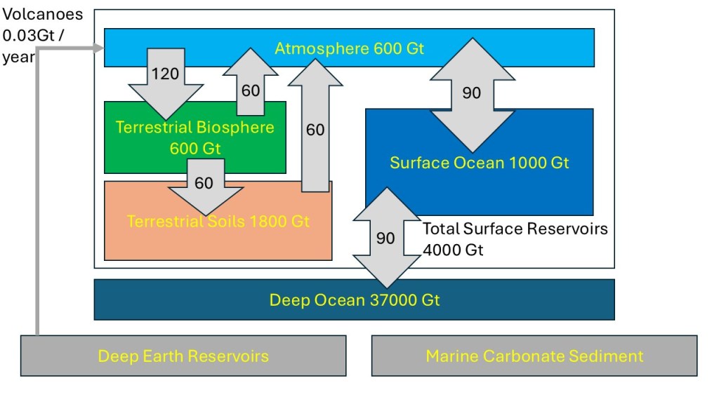
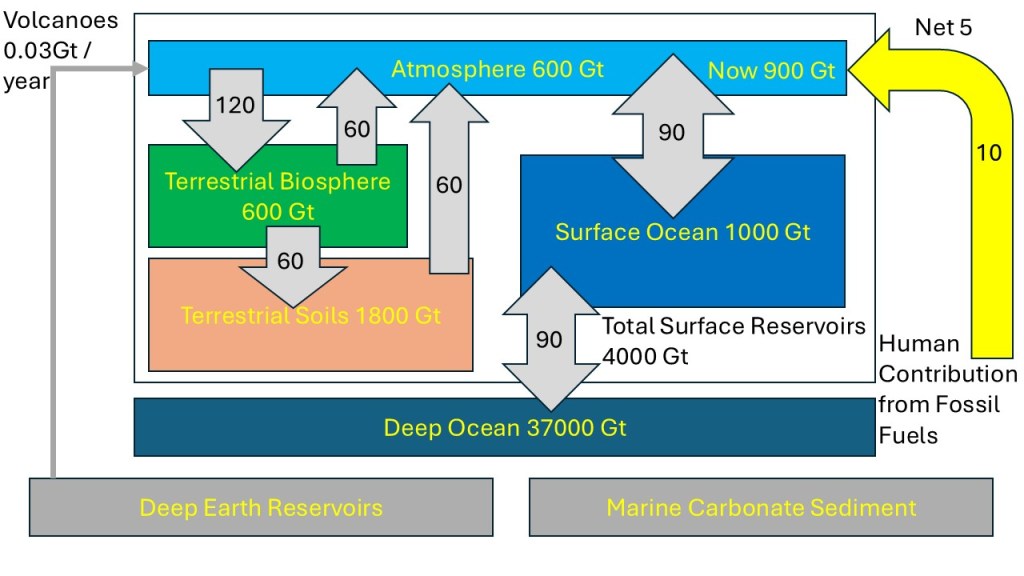
The carbon cycle in the picture shows that the terrestrial biosphere is absorbing 120 Gigatons of carbon from the atmosphere and emits 60 Gigatons to the atmosphere. It also adds 60 Gigatons of carbon to terrestrial soils. It also shows the Surface of the Ocean both emitting and absorbing 90 Gigatons of carbon to the atmosphere and both emitting and absorbing 90 Gigatons of carbon to the deep ocean. There are additional flows in the picture. It is complex but stable cycle. | Carbon Cycle Emissions Does Not Cause Global Warming
The picture above was drawn by me and is an adaptation of Figure 3.1 on page 31 in the book “The Physics of Climate Change by Lawrence M. Krauss”.

Regarding the picture above, the units are in Gigatons of carbon, i.e. the weight of the carbon atom. To get the numbers in Gigatons of carbon dioxide multiply all numbers by 3.67. The numbers in yellow inside the blocks correspond to how much carbon is stored in the system. The numbers without units in the grey arrows correspond to the number of Gigatons of carbon per year. I can add that Lawrence M. Krauss is not a climate scientist but a prominent theoretical physicist focusing on cosmology and quantum physics. However, he took a deep dive into the physics of climate change.
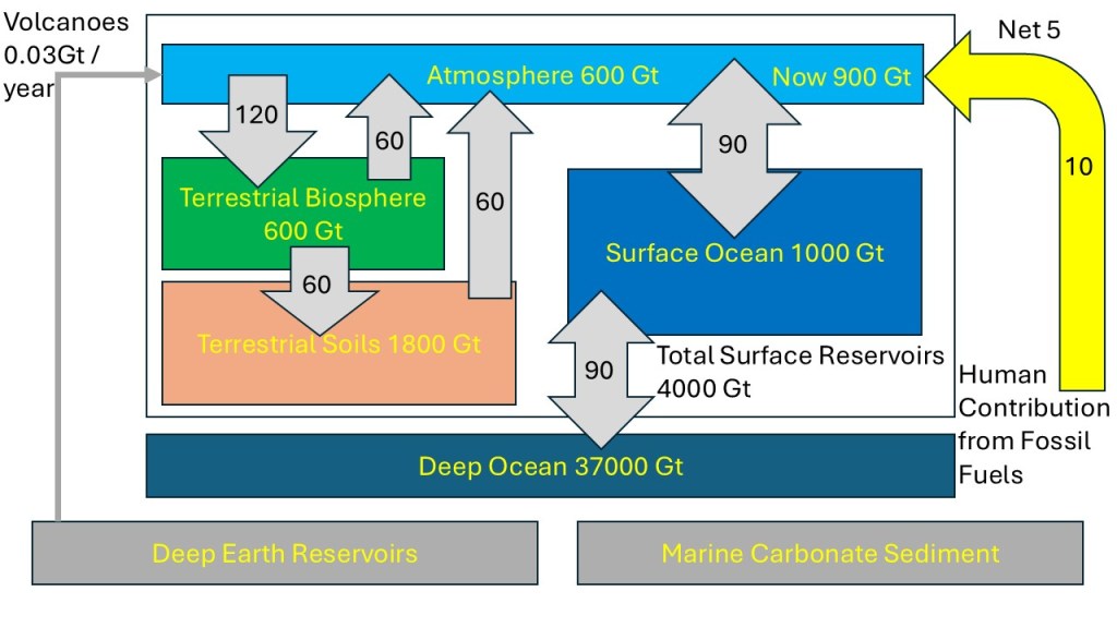
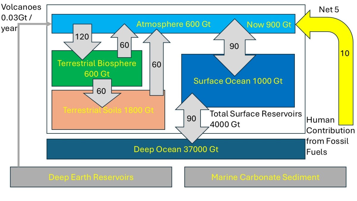
This picture is the same as above with the addition of our recent carbon emissions at 10 Gigaton. Oceans and other systems are absorbing some of it resulting in a net increase of 5 Gigaton per year.
This is the same picture as above, but I added the contribution from our recent additional carbon emissions such as the emissions from the burning of fossil fuels. This is depicted at far right in yellow. Since this is not part of the original carbon cycle the amount of carbon in the atmosphere grew from 600 Gigatons (pre-industrial) to 900 Gigatons.

As you can see in the picture above the amount of carbon stored in the atmosphere was 600 Gigaton originally and now we have increased it to 900 Gigaton. We are adding 10 Gigatons of carbon from our emissions, chiefly from burning fossil fuels, which correspond to 37 Gigatons of carbon dioxide. About half of this is absorbed by the ocean and other systems, resulting in a net addition of 5 Gigatons per year. The carbon dioxide added and stored in the atmosphere will be there for hundreds or thousands of years.

The existence of the carbon cycle and how it explains what is going on is an important fact that is widely misunderstood and therefore a surprising fact. You quite often see or hear claims such as “animal and human respiration emit a lot more carbon dioxide than our burning of fossil fuels, and therefore human caused global warming is BS”. The first part of that sentence is true, but the rest ignores the carbon cycle and the balance that has existed for many thousands of years. Therefore, this is a super fact.
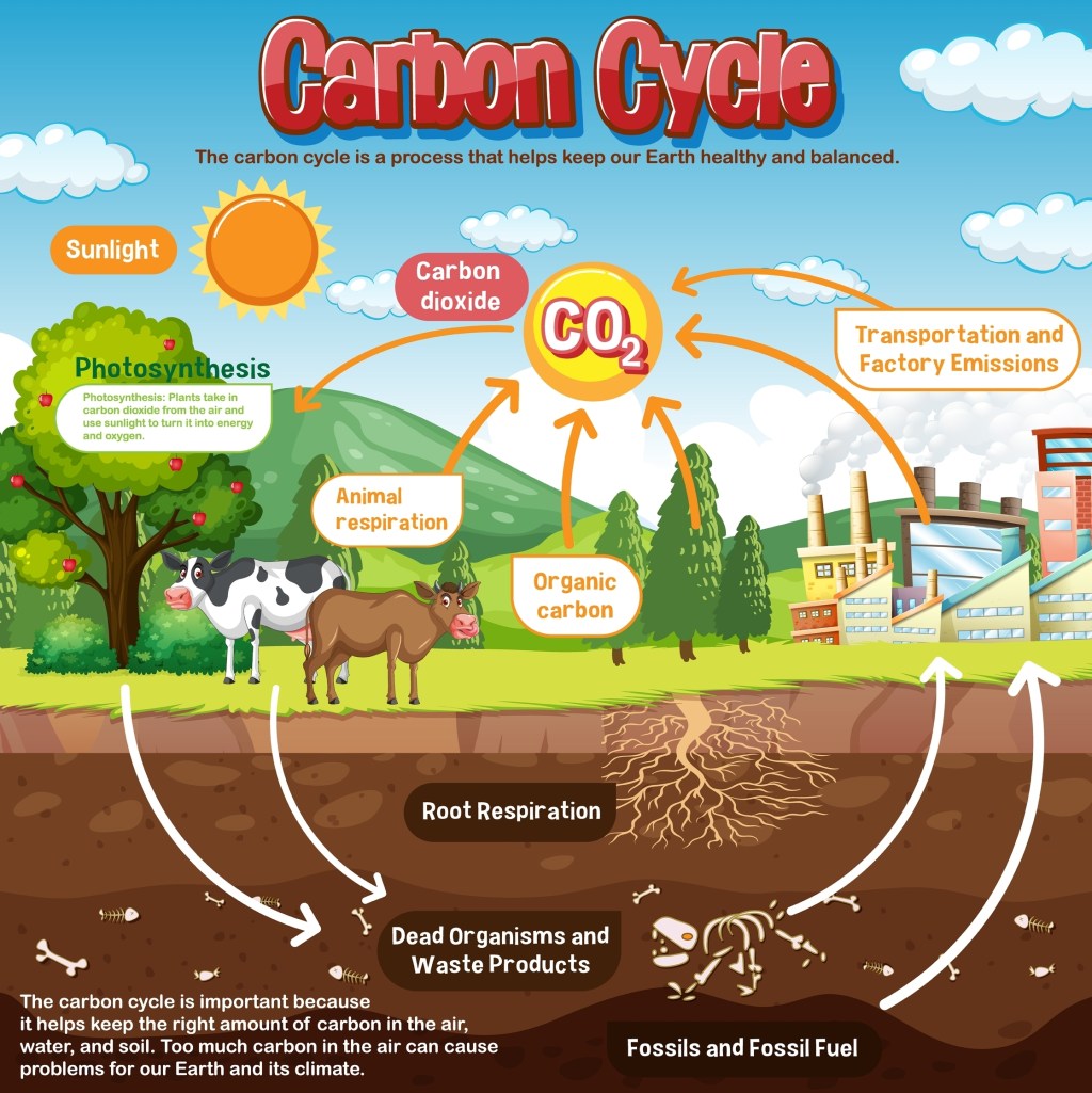
The diagram shows how carbon is emitted and absorbed between the various elements in nature and our planet. It shows animals, plants, the soil, and also emissions from factories. The text says “The Carbon Cycle is important because it helps keep the right amount of carbon in the air, water, and soil. Too much carbon in the air can cause problems for our Earth and its climate.” | Carbon Cycle Emissions Does Not Cause Global Warming
This illustration of  the Carbon Cycle is simplified but artistic. Shutterstock asset id: 2271978649 by GraphicsRF.com

More on the Carbon Cycle

This picture is the same as the one above where I included our recent emissions from burning fossil fuels.
Same as the picture above but notice the flows depicted by the arrows and the total amounts stored in each system.

The carbon cycle describes the process in which carbon atoms continually travel from the atmosphere to the Earth and then back into the atmosphere. In the picture above you can see that the atmosphere, the oceans, the biosphere, and the soil, as well as deep Earth reservoirs and Marine Carbonate Sediments are all absorbing and emitting carbon (dioxide). For example, the terrestrial biosphere absorbs 120 Gigatons of carbon per year, chiefly through photosynthesis, and emits 60 Gigatons of carbon into the atmosphere, via for example, animal / microbial / human respiration, rotting plants, and it adds another 60 Gigatons of carbon to terrestrial soils. 120 Gigatons of carbon correspond to 440 Gigatons of carbon dioxide.
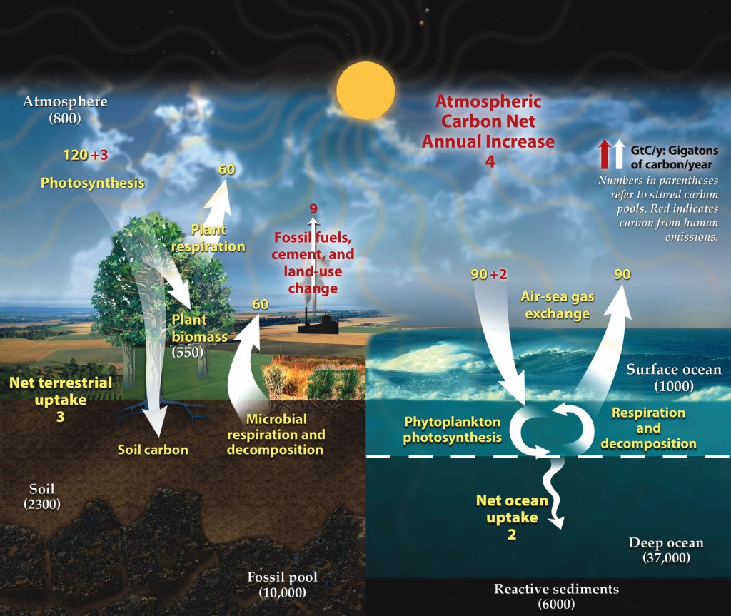
This is a fairly detailed picture of the carbon cycle from wikipedia. | Carbon Cycle Emissions Does Not Cause Global Warming
Carbon cycle schematic showing the movement of carbon between land, atmosphere, and oceans in billions of tons (gigatons) per year. Yellow numbers are natural fluxes, red are human contributions, and white are stored carbon. The effects of the slow (or deep) carbon cycle, such as volcanic and tectonic activity are not included. Diagram adapted from U.S. DOE, Biological and Environmental Research Information System., Public domain, via Wikimedia Commons.

The carbon cycle was relatively stable until we started burning massive amounts of fossil fuels. Our burning of fossil fuels emits 10 Gigatons of carbon (37 Gigatons of carbon dioxide) into the atmosphere. About 30% of this carbon is absorbed by the oceans. This slows the warming but causes ocean acidification, which is another dangerous problem. In total 50% of the carbon emissions are absorbed by oceans, the soil, the biosphere, etc., according to “The Physics of Climate Change by Lawrence M. Krauss”. This is why I wrote Net 5 Gigatons per year in the picture above. You can read more about the Carbon Cycle here and here.

Another thing to pay attention to in the diagrams above is that not only are volcanoes part of the carbon cycle, but their contribution to carbon emissions is tiny compared to our emissions, which contradicts the many false claims you see on social media. You can read about that in my post “Volcanoes emit a tiny fraction of carbon compared to humans”.

Conclusion

Many of our Planet’s systems (oceans, biosphere, terrestrial soil, atmosphere, etc.) emit (and absorb) more carbon dioxide than our burning of fossil fuels does. However, the fact that they are part of the long existing carbon cycle makes them irrelevant to the rapid and sudden global warming phenomenon that we are witnessing. The recent rapid Global Warming is happening, and it is caused by us, chiefly because of our burning of fossil fuels. I am illustrating this using the two bathtub pictures below.


The picture shows a glass bathtub half filled with water. There are a faucet and a drain with the same flow keeping the water level the same.
The stream of water from the faucet is the same as the stream from the drain keeping the water level steady. The bathtub is half full and stays half full. I generated the picture with the help of ChatGPT.
The picture shows a glass bathtub half filled with water. There are a faucet and a drain with the same flow keeping the water level the same. | Carbon Cycle Emissions Does Not Cause Global Warming
The stream of water from the faucet is faster than the stream from the drain so the water level increases. The additional amount from the faucet represents the carbon emissions we added. The bathtub is now 2/3 up and rising. I generated the picture with the help of ChatGPT.

Other super facts related to global warming


To see the other Super Facts click here

The US is the largest cumulative emitter of carbon

Super fact 43 : The United States has emitted more CO2 than any other country to date, around 400 billion tons since 1751. It is responsible for 25% of historical emissions. Click here.

But what about China? That is 12.7%, or around half. This is surprising information to many Americans, yet it is true, and therefore a super fact. In the US it is very common to blame China for our carbon emissions. In China they blame the US. In Europe they blame the US and China. Who is right? It turns out that the blame game is complicated and futile.

Carbon Emissions Around the World

Who should we blame the most for our carbon emissions?

In other words, if you want to blame another country for the carbon emissions, take your pick, well your cherry pick. Why should we do something about our carbon emissions when X is worse? Those who want no action on the global warming / climate change problem love the blame game. Like denial or despair, which are both irrational positions, the blame game hinders action. The blame game can also get very complicated and contentious.

The nine graphs are complex but show that among the nine countries/regions the United States currently has the highest emissions, followed by Canada, and the China, then South Africa, then the European Union, then comes the United Kingdom, and the World, and finally India and Kenya | The US is the largest cumulative emitter of carbon
The graph shows the fossil fuel emissions (in carbon dioxide equivalents) per capita from 1750 to 2023 for the World, the United States, Canada, China, European Union, India, South Africa, United Kingdom, and Kenya. Notice that the United Kingdom dominated the emissions in the 1700’s and 1800’s. Data source: Global Carbon Budget (2024); Population based on various sources (2024). The graph is from Our World in Data .

Note regarding the graph above: By clicking here you can find this graph and then select to display any set of countries or regions. Have fun experimenting.

Note regarding Fossil emissions: Fossil emissions measure the quantity of carbon emissions (CO2) emitted from the burning of fossil fuels, and directly from industrial processes such as cement and steel production. Fossil CO2 includes emissions from coal, oil, gas, flaring, cement, steel, and other industrial processes. Fossil emissions do not include land use change, deforestation, soils, or vegetation.

Overview of Cumulative Carbon Emissions

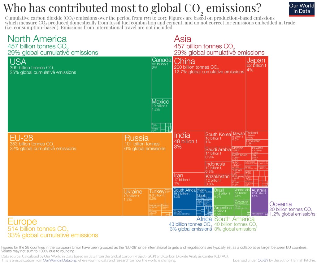
As you can see in the graph below the cumulative carbon emissions from 1751 to 2017 are 25% for the United States, 22% for the EU (28 countries), 12.7% for China, 6% for Russia, 4% for Japan, and 3% for India. If you count the entire continent of Europe, you get 33% for Europe.

The graph shows differently colored rectangles with the area of the rectangle corresponding to the cumulative carbon emissions. Each rectangle corresponds to a country or a region.
Figures for the 28 countries in the European Union have been grouped as the EU-28 since international targets and negotiations are typically set as a collaborative target between EU countries. Values may not sum up to 100% due to rounding. Data Source: Calculated by Our World in Data from the Global Carbon Project (GCP) and Carbon Dioxide Analysis Center (CDIAC). This is a visualization from Our World in Data, where you can find data and research on how the world is changing.
To see the other Super Facts click here

Developed nations have successfully reduced carbon emissions

Super fact 42 : The developed nations (rich countries) have reduced their carbon emissions since the 1990’s despite continued GDP growth, even if we take offshore production into account. In addition, many developing countries have succeeded in reducing their emissions as well. Other fast-growing developing countries have flattened or at least slowed their increase in carbon emissions. Many countries have decoupled economic growth from CO2 emissions. In other words, we do not need to increase carbon emissions or burn more fossil fuels to grow the economy.

This is good news as well as a surprise to many people who falsely believe that to grow the economy (grow GDP) you need to burn more fossil fuels and an increase in carbon emissions is inevitable if you want to grow the economy. The data shows otherwise. This is important news that is difficult to believe in for many people. It is a super fact.

Carbon Emissions and GDP

In the past carbon emissions were strongly correlated with national wealth. The wealthier a nation was the higher its carbon emissions were and as the economy grew so did the carbon emissions. This has not been true since the 1990’s. The developed nations of the world have continued growing their GDP whilst reducing their carbon emissions.

You may think that the reason is that we shipped much of our manufacturing overseas and that if you consider the consumers in the importing country responsible for the overseas emissions this decoupling of GDP and emissions would disappear. But you would be wrong. Even if you make the consumers in the importing country responsible for the emissions during production in the exporting country the emissions have gone down. One example taken from this article in Our World in Data is the United Kingdom.

In the graph below for the UK the GDP (adjusted for inflation) grew by 53.26% between 1990 and 2023 and the emissions were reduced by 57.66%. If make UK consumers 100% responsible for the emissions in China and India, etc., caused by the production of goods imported to the UK the reduction until 2022 was 38.59%. That is not as much but it is still impressive and demonstrates the decoupling between GDP growth and carbon emissions.

The graph shows three plotted graphs, a dark blue one showing GDP per capita, a light blue one showing UK carbon emissions per capita and a red one showing trade adjusted carbon emissions per capita. The GDP graph is increasing by more than 50% over 33 years and the CO2 emissions per capita graph is decreasing by almost 60% and the trade adjusted carbon emissions decline by almost 40% | Developed nations have successfully reduced carbon emissions
Data source: Data compiled from multiple sources by World Bank (2025); Global Carbon Budget (2024); Population based on various sources (2024). Note: GDP per capita is expressed in international dollars at 2021 prices. Graph taken from Our World in Data.

The text in the graph above is difficult to read so I’ve copied it below in larger text:

  • Consumption-based emissions: Consumption-based emissions are national or regional emissions that have been adjusted for trade. They are calculated as domestic (or ‘production-based’ emissions) emissions minus the emissions generated in the production of goods and services that are exported to other countries or regions, plus emissions from the production of goods and services that are imported. Consumption-based emissions = Production-based – Exported + Imported emissions.
  • Fossil emissions: Fossil emissions measure the quantity of carbon dioxide (CO2) emitted from the burning of fossil fuels, and directly from industrial processes such as cement and steel production. Fossil CO2 includes emissions from coal, oil, gas, flaring, cement, steel, and other industrial processes. Fossil emissions do not include land use change, deforestation, soils, or vegetation.
  • International dollars: International dollars are a hypothetical currency that is used to make meaningful comparisons of monetary indicators of living standards. Figures expressed in constant international dollars are adjusted for inflation within countries over time, and for differences in the cost of living between countries. The goal of such adjustments is to provide a unit whose purchasing power is held fixed over time and across countries, such that one international dollar can buy the same quantity and quality of goods and service no matter where or when it is spent. Read more in our article: What are Purchasing Power Parity adjustments and why do we need them?

Below is the same type of graphs for the United Kingdom as well as France, Germany, Sweden, United States and Finland. The numbers for these countries are as follows:

  • United Kingdom: GDP growth 53.26%, CO2 emissions reduction 57.66%, trade adjusted CO2 emissions reduction 38.59%.
  • France: GDP growth 39.74%, CO2 emissions reduction 40.64%, trade adjusted CO2 emissions reduction 28.82%.
  • Germany: GDP growth 49.04%, CO2 emissions reduction 46.72%, trade adjusted CO2 emissions reduction 33.95%.
  • Sweden: GDP growth 56.00%, CO2 emissions reduction 48.45%, trade adjusted CO2 emissions reduction 34.75%.
  • United States: GDP growth 68.05%, CO2 emissions reduction 29.25%, trade adjusted CO2 emissions reduction 17.04%.
  • Finland: GDP growth 45.69%, CO2 emissions reduction 50.54%, trade adjusted CO2 emissions reduction 42.79%.

Note these are emissions reduction numbers per capita (growth for GDP) not carbon emissions per capita. For example, the United States has three to four times larger carbon emissions per capita as, for example, Sweden or France.

All these graphs show the same trends as the UK graph.
Data source: Data compiled from multiple sources by World Bank (2025); Global Carbon Budget (2024); Population based on various sources (2024). Note: GDP per capita is expressed in international dollars at 2021 prices. Graph taken from Our World in Data.

Many Countries Have Reduced Their Carbon Emissions

However, the story does not end with these six countries or even with the developed world. The 30 graphs below all demonstrate significant reductions in carbon emissions as GDP is growing, demonstrating a decoupling between GDP growth and carbon emissions. Note that Azerbaijan’s GDP grew by 93% as its carbon emissions was reduced by 7% (all carbon emissions below are adjusted for trade).

This is 30 small graphs featuring a blue and red line. The blue line shows GDP growth since 1990 and the red line carbon emissions since 1990. All blue lines point up and all red lines point down | Developed nations have successfully reduced carbon emissions
Data sources: Global Carbon Project & World Bank. There are more countries that achieved the same, but only those countries for which data is available and for which each exceeded 5% are shown. The graphs are from Our World in Data <<Link-1>>. All carbon emissions in the graphs above are adjusted for trade.

The World’s Carbon Emissions Per Capita Has Flattened

World GDP per capita has increased by 83.54% since 1990 while carbon emissions per capita have grown by 9.48%. That may not be as impressive but note two things. That is still a decoupling between economic growth and if you look in the graph, you’ll see that carbon emissions were higher in 2008 to 2019. The curve has flattened and gone down a bit. Global Warming caused by our burning of fossil fuels may be the greatest environmental challenge in recorded history, but we are slowly and steadily turning things around. We are not doing it fast enough to avoid major damage to our eco systems and perhaps civilization, but we are still turning things around. If you have any doubts about global warming / climate change or that we are causing it click here for a summary of the evidence.

The graph shows two graphs. The dark blue one shows GDP growth per capita and the light blue the carbon emissions per capita.
Data source: Data compiled from multiple sources by World Bank (2025); Global Carbon Budget (2024); Population based on various sources (2024). The graph is taken from Our World in Data <<Link-1>>.

China’s Carbon Emissions

One reason the world’s carbon emissions per capita have not been reduced much despite the fact that so many countries have reduced their emissions is that the world’s largest emitter China, has grown their carbon emissions steadily since 1990. Between 1990 and 2023 China’s GDP per capita (and adjusted for inflation) grew by 1,245.28% and their emissions grew by 288.43% per capita. Remember that China has 1.4 billion people so that is a big carbon blast for the world.

However, before you blame China too much remember that China’s carbon emissions per capita is less than that of the United States and that of many other developed countries, and the country with the largest cumulative carbon emissions is the United States. China’s economic growth has been immense, and its immense population of 1.4 billion people explains its huge impact on the world’s carbon emissions.

Fortunately, it now appears that China’s emissions have finally peaked.

To see the other Super Facts click here

Eating Organic is not Necessarily Ecological

Super fact 31: The common perception that organic food is by default better for the environment or is an ideal way to reduce environmental impact is a misconception. Across several metrics, organic agriculture proves to be more harmful for the world’s environment than conventional agriculture.

There are things you can do as an individual to reduce your carbon footprint, use public transportation instead of driving, fly less, eat less read meat, don’t waste food, reduce your energy usage. There are straightforward actions you can take to reduce your use of water and avoid adding harmful pollution to the environment. However, as with eating locally grown food, eating organic food is often viewed as an environmentally friendly choice even though it often is not.

Organic farming is a method of growing food without using synthetic chemicals or genetically modified organisms (GMOs). Organic farming practices are intended to protect soil fertility, promote ecological balance, and reduce environmental impact. That’s all good. On the other hand, it should be noted that modern farming techniques, for example, using synthetic pesticides, have greatly increased cereal yield per acre and GMOs can reduce the use of toxic pesticides. It is complicated.

I consider this a super fact because it is often incorrectly assumed that eating organic food is the best choice for the environment.

Global Land Use

Before looking at the details of conventional farming versus organic farming lets look at global land use. In the figure below from Our World in Data you can see that agriculture already uses nearly half of all habitable land in the world. We cannot easily enlarge this percentage and therefore crop yield per acre is a very important factor to consider, and this is a great weakness for organic farming.

Also notice that 80% of agricultural land is used for livestock, meat, dairy and textile, but it only provides 17% global calorie supply. This second observation indicates that the type of food you eat may matter a lot more than whether it is produced via organic or conventional farming.

Earth’s surface is 29% land of which 76% is habitable land. Of that 45% is used for agriculture, of which 80% is used for livestock, meat, dairy and textiles and 16% is used for crops for food. livestock, meat, dairy and textiles provide 17% of the global calories supply and 38% of the global protein supply.
Global land-use graphics. Licensed under CC-BY by authors Hannah Ritchie and Max Roser (September 2023).

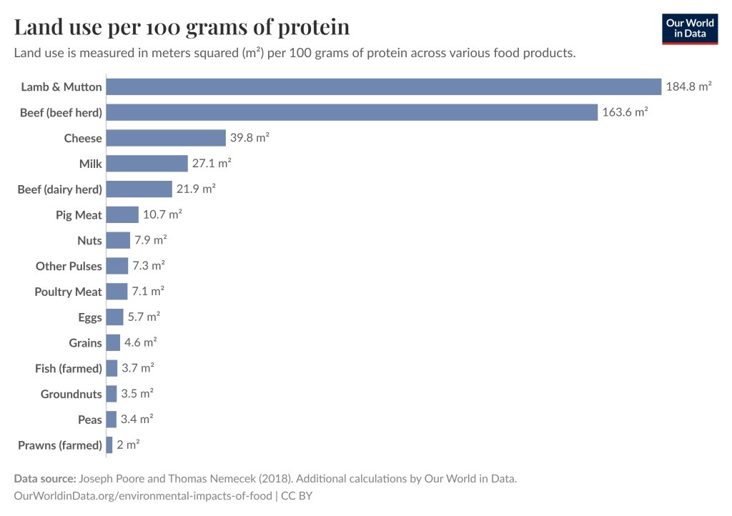
As you can see in the graph below, again from Our World in Data, the land used for producing 100 grams of protein varies enormously between different food groups. 100 grams of protein from lamb and mutton require on average 52.8 times as much land as 100 grams of protein from groundnuts. This graph does not make a distinction between organic farming and conventional farming, but it highlights the huge difference between different food sources. I’ll get to the difference between organic farming and conventional farming with respect to land use later in the post.

The graph shows that for 100 grams of protein you need on average 184.8 square meters for Lamb & Mutton, 163.6 square meters for beef, 39.8 square meters for cheese, 27.1 square meters for milk, 7.9 square meters for nuts, 4.6 square meters for grains, and 3.5 square meters for groundnuts. There are a few more items listed in the graph | Eating Organic is not Necessarily Ecological
Additional calculations by Our World in Data. OurWorldinData.org/environmental-impacts-of-food | CC BY

Agriculture and Greenhouse Gas Emissions

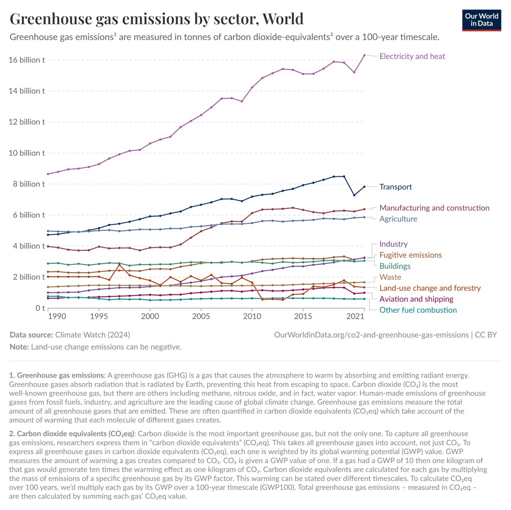
The next two graphs focus on the greenhouse gas emissions including those from agriculture. Electricity and Transport dominate both globally and in the United States, but globally agriculture comes in at 6 billion of the 40 billion tons of greenhouse gas emissions for 2021, which is 15%. For the United States agriculture comes in at 10.6% of greenhouse gas emissions for 2021. In other words, agriculture was not the largest contributor of greenhouse gas emissions but still an important factor.

The largest contributor of greenhouse gas emissions in the World is electricity and then comes Transport. After that comes manufacturing and construction, agriculture, industry, fugitive emissions, buildings, waste, land-use change and forestry, aviation and shipping, other fuel combustion | Eating Organic is not Necessarily Ecological
Data source : Climate Watch (2024). Note : Land use emissions can be negative. OurWorldinData.org/co2-and-greenhouse-gas-emissions| CC BY
The largest contributor of greenhouse gas emissions in the US is electricity and heat but it has gone down. Transport is number two. Then comes buildings, manufacturing and construction, fugitive emissions, agriculture, industry, waste, aviation and shipping, other fuel combustion, land-use change and forestry | Eating Organic is not Necessarily Ecological
Data source : Climate Watch (2024). Note : Land use emissions can be negative. OurWorldinData.org/co2-and-greenhouse-gas-emissions| CC BY

Finally, the contribution for different types of food. Notice that beef (beef herd) at 49.89kg is 188 times larger than the 0.26kg for nuts. 188 people eating nuts contribute as much to carbon emissions as one person eating beef.

The graphs show that beef (beef herd) generates 49.89 kilograms of carbon emissions per 100 gram of protein that it provides. For Lamb and mutton, it is 19.85 kilograms, for prawns 18.19 kilograms, for milk 9.5 kilograms, for eggs 4.21 kilograms, for grains 2.7 kilograms, for groundnuts 1.23 kilograms, for peas 0.44 kilograms and for nuts 0.26 kilograms | Eating Organic is not Necessarily Ecological
Greenhouse gas emissions per 100 grams of protein. Greenhouse gas emissions are measured in kilograms of carbon dioxide equivalents (see below). Data source: Poore and Nemecek (2018). OurWorldinData.org/co2-and-greenhouse-gas-emissions| CC BY

Carbon dioxide equivalents (CO2eq)

Carbon dioxide is the most important greenhouse gas, but not the only one. To capture all greenhouse gas emissions, researchers express them in “carbon dioxide equivalents” (CO2eq). This takes all greenhouse gases into account, not just CO2. To express all greenhouse gases in carbon dioxide equivalents (CO2eq), each one is weighed by its global warming potential (GWP) value. GWP measures the amount of warming a gas creates compared to CO2. CO2 is given a GWP value of one.

If a gas had a GWP of 10 then one kilogram of that gas would generate ten times the warming effect as one kilogram of CO2. Carbon dioxide equivalents are calculated for each gas by multiplying the mass of emissions of a specific gas by its GWP factor. This warming can be stated over different timescales. To calculate CO2eq over 100 years, we’d multiply each gas by its GWP over a 100-year timescale (GWP100). Total greenhouse gas emissions – measured in CO2eq – are then calculated by summing each gas’ CO2eq value.

Environmental Impact of Organic Versus Conventional Agriculture

At this point it should be clear that eating different types of food, nuts and vegetables versus red meat makes huge difference regarding the environment. How about organic versus conventional farming? Well, it is complicated. You have to take into account land use, greenhouse gas emissions, biodiversity, pesticide application, energy use and more.

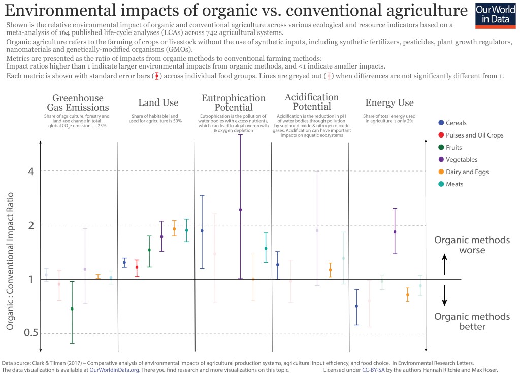
Clark and Tilman (2017) published a meta-analysis of results of published organic-conventional comparisons across 742 agricultural systems over 90 unique foods. The food groups consisted of cereals, pulses and oil crops, fruits, vegetables, dairy and eggs, and meats. As you can see in the resulting graph below organic agriculture is worse for the environment for most food groups with regards to land use, eutrophication potential, and acidification potential. The result is mixed with respect to greenhouse gas emissions and energy use.

It appears that it is best to choose organic pulses and fruits and choose non-organic for all other food products (cereals, vegetables, dairy and eggs, and meat). However, if your primary concern is whether the potato accompanying your steak is conventionally or organically produced, then your focus is arguably misplaced. Whether you go organic or non-organic the steak is much worse for the environment.

The graph shows the six food groups and their impact across greenhouse gas emissions, land use, eutrophication potential,  acidification potential and energy usage.
Shown is the relative environmental impact of organic and conventional agriculture across various ecological and resource indicators based on a meta-analysis of 164 published life-cycle analyses (LCAs) across 742 agricultural systems. Roughly, lower in the graph means organic is better and higher up in the graph means conventional farming is better. Data source: Clark & Tilman (2017) – Comparative analysis of environmental impacts of agricultural production systems, agricultural input efficiency, and food choice. In Environmental Research Letters. The data visualization is available at OurWorldinData.org. There you can find research and more visualizations on this topic. Licensed under CC BY-SA by the authors Hannah Ritchie and Max Roser.

Conclusion

In this post I present empirical evidence from reliable sources comparing organic to conventional agriculture in terms of environmental impact. Despite strong public perception of organic agriculture producing better environmental outcomes, conventional agriculture often performs better on environmental measures including land use, greenhouse gas emissions, and pollution of water bodies. There are, however, some contexts where organic agriculture may be better for the environment. In short it is complicated.

What really matters though is the type of food you eat, not whether it is organic or not. Another thing to note is that if you eat 300 steaks per year you will have a 100 times larger environmental impact compared to someone who eats 3 steaks per year. Quantity matters. This post was about environmental impacts. There are other considerations such as health, what you like, whom you want to support, etc.

To see the other Super Facts click here

Eating Locally is not Necessarily Ecological

Super fact 30: Eating locally is often promoted as an environmentally friendly choice, but that is not always the case.

Whether the food you eat is sustainable and environmentally friendly or not depends on a lot of factors including agricultural methods, whether greenhouse farming or monocropping was used, and whether the crop is natural to its environment. In addition, inefficient local transportation can result in higher emissions than faraway transport by ships and trains. If a crop is grown locally in greenhouses, the extra energy that is needed, and the resulting extra carbon emissions are often much larger than the emissions from the transport.

Cargo ship at sunset. Emissions from the transport of produce is not the main factor for emissions.
Photo by aries nha on Pexels.com

I consider this a super fact because it is often assumed that buying locally is the best choice for the environment. After all, transporting something across the world causes a lot of emissions, right? It turns out not to be that simple.

Articles on Transportation of Food in my French Book

The first time this issue was brought to my attention was in my French class. I am learning French, just as a hobby. There was an article in our French book on the transportation of food around the world “Notre planète ne tourne pas rond!”.

We read that cashews were grown in the Ivory Coast in Africa and then sent for peeling and cleaning in Brazil and then sent to France to be sold. The cashews travelled 10,000 kilometers or 6.250 miles. We read about cod that was caught in Norway then sent to China to be cut into filets and then sent to France to be sold. That cod travelled 15,000 kilometers. We all thought it was crazy, and very bad for the environment, so much unnecessary emissions from transportation. But we all learned a few new French words.

Then at our next class, we turned the page “Consommer local, vraiment bon pour la planète?” / “Consuming locally, really good for the planet?”. Wait what? The next article confused us since it stated that in many cases eating locally was bad for the environment, not good for the environment. Transporting the food around the globe might be good for the environment.

Incidentally, at the time I was reading “Not the End of the World, How we can be the first generation to build a sustainable planet” by Hannah Richie, the research director for “Our World in Data”. “Our World in Data” is a highly regarded free and open-source website that collects and analysis vetted statistics on a large range of topics. In that book she stated that the data showed that tomatoes imported to Sweden from Spain caused less carbon emission than tomatoes grown locally in Sweden.

The Problem with Locally Grown Tomatoes

This article from University of Southern Denmark claim that importing tomatoes from warm countries are better for the environment than buying locally. The reason being that when tomatoes are grown in an open field, the production emits an average of 80 kg CO2 per ton, but if the tomatoes are grown in a greenhouse, they emit up to 700 kg CO2 per ton. In northern countries it is common to grow tomatoes in greenhouses, especially when they are out of season. The long transport of the tomatoes causes much less emissions than that.

This scientific article analyses the issue a bit deeper and concludes that “that the distance travelled by the tomatoes is not the most important environmental burden”. Whether the tomatoes were grown in greenhouses or not matters a lot, but there are many other factors. In short, it is complicated.

Lots of fresh red tomatoes | Eating Locally is not Necessarily Ecological
Photo by Julia Nagy on Pexels.com

This study of local vs. imported tomato production in Canada concludes that locally grown tomatoes grown in greenhouses on average cause 1,070 grams of carbon emissions per kilo of tomatoes grown and tomatoes grown open field in Mexico cause 775 grams of carbon emissions per kilo of tomatoes, despite the 3,800-kilometer journey from Mexico to Ontario, Canada. The reason for the higher emissions for locally grown tomatoes is again that greenhouses use a lot of energy.

Naturally, this would change if you grew the tomatoes in season without using greenhouses. The article also notes that carbon emissions are not the only issue for sustainability. Water usage is another important factor.

The Problem with Locally Grown Vegetables and Fruits

Tomatoes are just one example. The same hold true for cucumbers, lettuce and salad greens, potatoes, bell peppers, hot peppers, green beans and other bean varieties, berries, pineapples, bananas, mangoes, other tropical fruits. In addition, some of these crops can deplete the soil and require large amounts of water, which can be bad if they are being cultivated in areas where water resources are already scarce such as growing avocados in California. In general, growing vegetables and fruits in their natural environment tends to be the most sustainable.

Fresh yellow bananas | Eating Locally is not Necessarily Ecological
Photo by Dom J on Pexels.com

The Problem with Locally Grown Apples

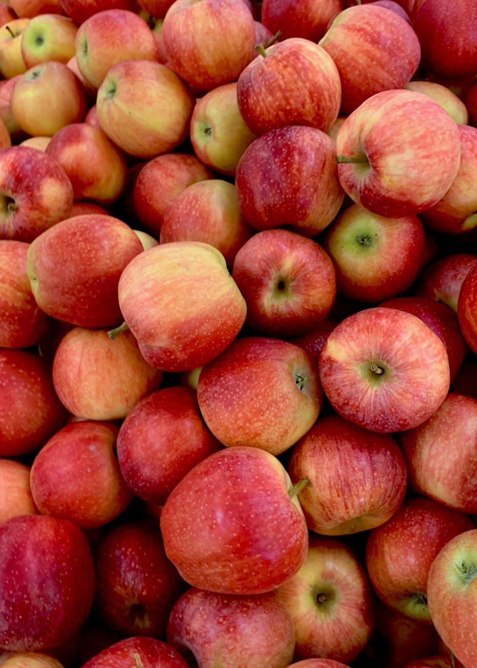
The problem with apples tends to be the opposite, geography wise. In warmer areas, they might require significant water resources or chemical inputs to thrive. Apples from cooler climates need less water and fewer chemicals, reducing their ecological impact.

Lots of apples | Eating Locally is not Necessarily Ecological
Photo by Pierpaolo Riondato on Pexels.com

Local versus Imported It’s Complicated

I should point out that growing locally sometimes being worse for the environment than importing does not mean that importing produce is better for the environment. It just means that it is complicated and that you need to make that determination on a case-by-case basis. The environment is also not the only concern. Another consideration is the protection of local farmers and the local economy.

My opinion is, instead of worrying a lot about local versus imported produce, it is better to focus on things that we know cause a lot of emissions. A dirty grid, coal power stations, a non-hybrid SUV with an internal combustion engine, unnecessary business trips, eating a lot of red meat, basically start with the low hanging fruit.

Eating Locally is not Necessarily Ecological
Photo by Janusz Walczak on Pexels.com
To see the other Super Facts click here