Super fact 46 : There are many serious threats to the environment that we need to take seriously. However, there are also many environmental success stories that we tend to forget about.
It is important to remember the environmental success stories because if we forget about them, it breeds despair, which in turn discourages people from acting and doing the right thing. Denial and Despair are two seemingly opposite emotional reactions that both hinder action on problems. I consider the existence of the many important environmental success stories a super fact because even though it is undeniably true that there are many environmental success stories, some truly amazing, it comes as a surprise to many.
Below I am listing six environmental success stories that I previously chose to be super facts. Super facts are important and true facts that are surprising and perhaps even shocking to many, or widely misunderstood, or disputed amongst the public, but not seriously disputed amongst the experts/scientists. Super facts are facts that are very special and that I think we should be aware of these facts. I should add that this is just a sample of environmental success stories. There are many more.
Super Fact 29:
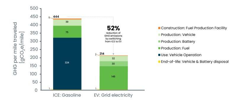
EV Cars Indeed Emit Less Carbon Pollution
EV Cars emit less pollution than Internal Combustion Engine Cars, even considering manufacturing, disposal and many EV Cars being charged by dirty grids. The basic reason for this is the much higher efficiency of EV cars. EV cars emit significantly less greenhouse gases than internal combustion engines even considering construction of fuel production facilities, production of the car, the battery, and the fuel, vehicle operation and disposal. For more information click here.
Super Fact 35:
Natural Disasters Kill Less People Now Than 100 Years Ago
Natural disasters kill a lot less people now compared to 100 years ago. That is despite a larger population and despite the fact that climate change has increased the frequency and intensity of many types of natural disasters. Surveys by Gap Minder show that this fact is quite surprising to people and therefore it is a super fact. To read more about this super fact click here.
The reason for the fewer deaths from natural disasters is not that there are fewer natural disasters. It is because we are now much better at predicting, handling and recovering from natural disasters. Our warnings systems, rescue systems and healthcare have improved significantly. The graph below from Gap Minder illustrates the decline in deaths from natural disasters.

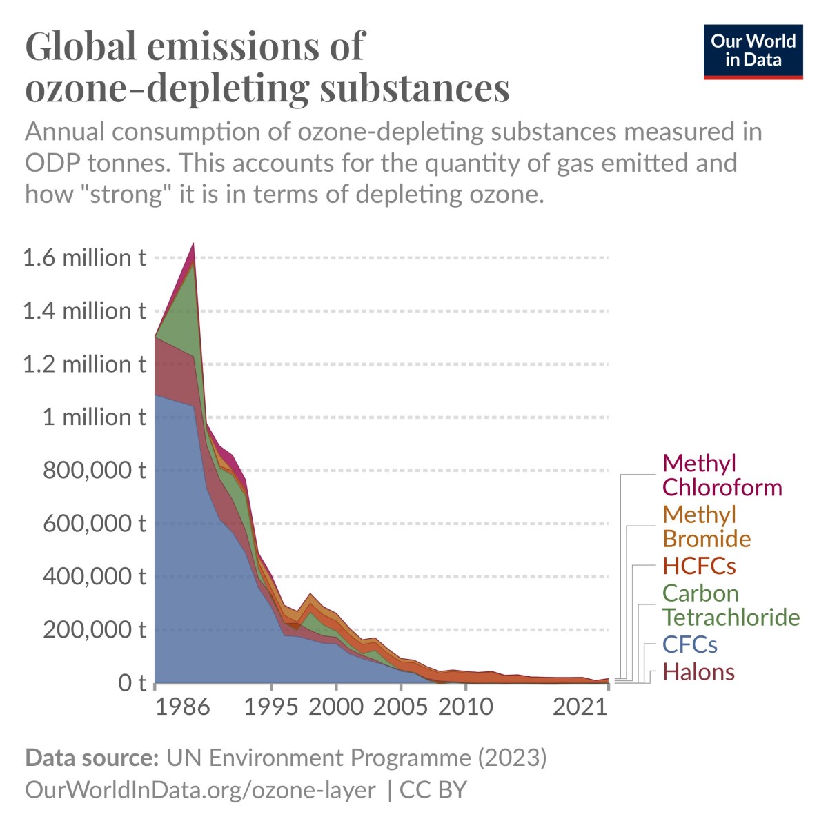
Super Fact 41:
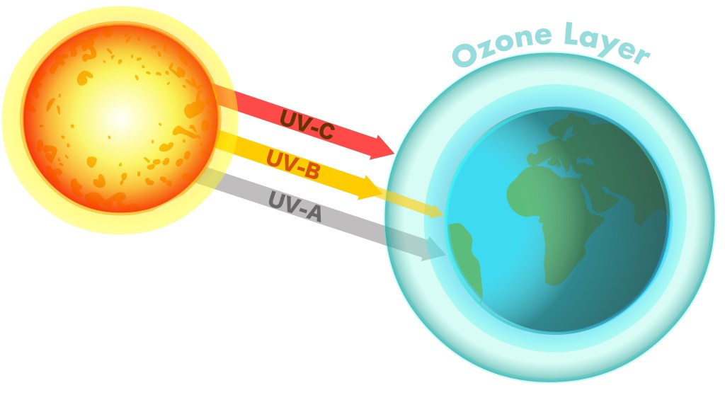
Emissions of ozone-depleting gases have fallen by 99 Percent
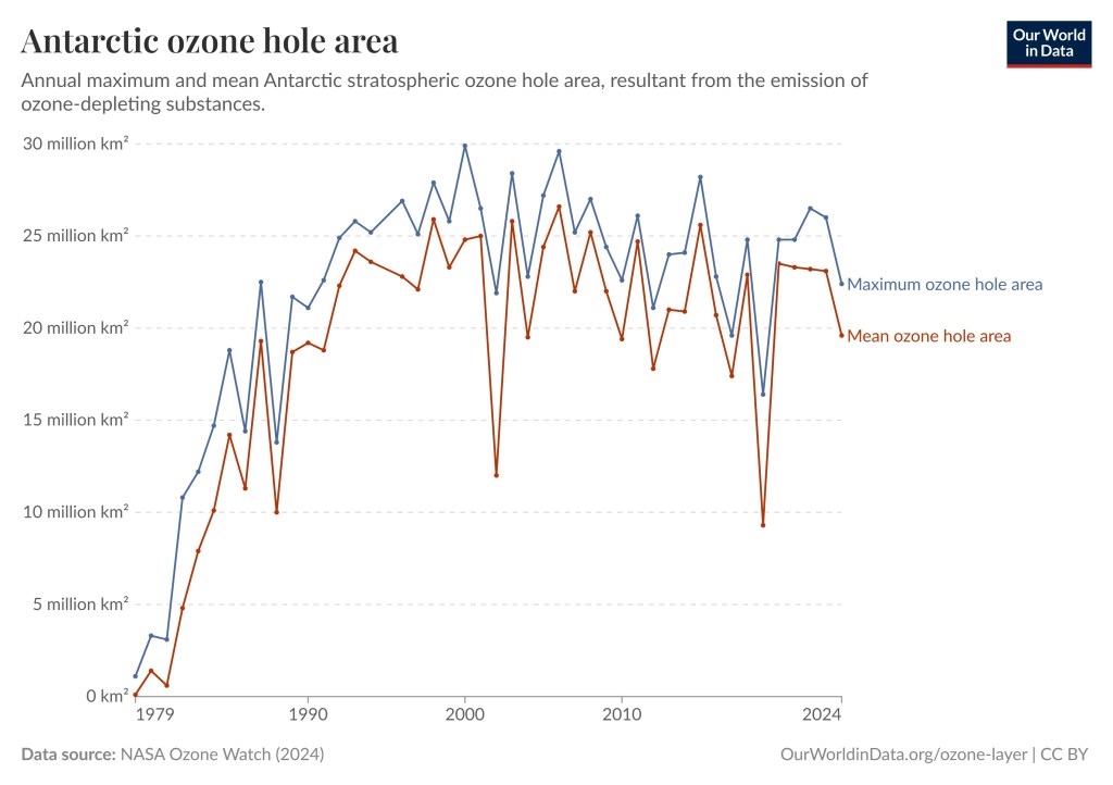
Largely thanks to the Montreal Protocol in 1987 the emissions of ozone-depleting gases have fallen by more than 99%, 99.7% to be exact, according to Our World in Data. This has resulted in the halt of the expansion of the ozone holes. The reduction in emissions of ozone-depleting gases is saving millions of lives every year. To read more about this astounding success click here.
The NIH estimate that the Montreal Protocol has prevented 443 million cases of skin cancer worldwide, 2.3 million skin cancer deaths, and 63 million cases of cataracts in the United States alone. Globally, it is estimated that the Protocol has saved an estimated 2 million people from dying from skin cancer each year. The graph below is taken from Our World in Data.

Super Fact 42:
Developed nations have successfully reduced carbon emissions
The developed nations (rich countries) have reduced their carbon emissions since the 1990’s despite continued GDP growth, even if we take offshore production into account. In addition, many developing countries have succeeded in reducing their emissions as well. Other fast-growing developing countries have flattened or at least slowed their increase in carbon emissions. Many countries have decoupled economic growth from CO2 emissions.
In other words, we do not need to increase carbon emissions or burn more fossil fuels to grow the economy. To read more about this promising development click here.

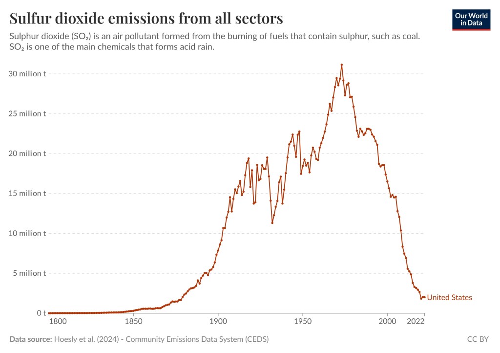
Super Fact 44:
Sulfur dioxide pollution has fallen by 95 percent in the US
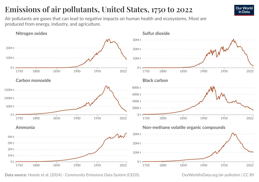
Sulfur dioxide pollution has fallen by approximately 95 percent in the US since the 1970s. This significant reduction is primarily due to regulations like the Clean Air Act. Global sulfur dioxide pollution has also fallen but not as much. To read more about this success story click here. If you visit the aforementioned link you will also see that there are many other pollutants that we have successfully curtailed.

Super Fact 45:
Deforestation has peaked
Deforestation peaked back in the 1980s, meaning that is when it was worst. Deforestation has not stopped but the rate of deforestation has slowed as a result of government policies, corporate initiatives, and international agreements.
Overall, we are still losing forests. We had a 47-million-hectare loss of forest in the last decade, which is very bad, but that is better than the 151-million-hectare loss of forest in the 1980s. For temperate forests we have succeeded in reversing deforestation, which means that temperate forests are now gaining forest. To read more about this topic and how government policies, corporate initiatives, and international agreements have slowed the rate of deforestation you can click here. This change in deforestation rate is illustrated by the graph below, which is taken from Our World in Data.