Measuring Alcohol by Volume in Home Brews

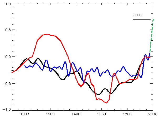
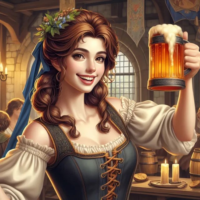
Image above by Kevin from The Beginning at Last

Measuring Alcohol by Volume in Home Brews
This is a submission for Kevin’s No Theme Thursday

Beer Styles

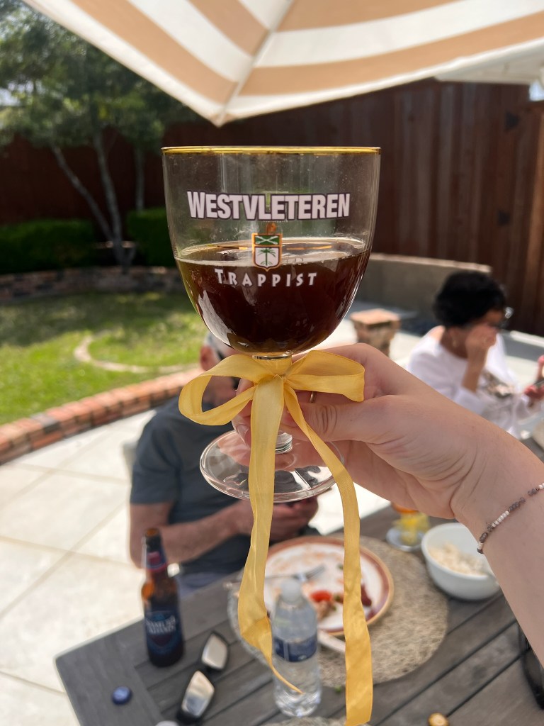
Look at that happy and friendly beer muse above. That is Kevin’s picture. Wouldn’t you like a beer? I like beer and I also brew beer at home. My dog Rollo loves it when I spill wort on the kitchen floor. The wort is what you have before fermentation. It is like a grainy sticky sweet soup, and he likes to lick it up. However, my wife does not like it when there’s sticky wort all over her kitchen floor and the stove. Everyone has their own perspective.

Our dark brown and white mini-Australian Shepherd is standing in the kitchen.
Rollo in the kitchen hoping for the wort to boil over or spill.
A beer garden gnome, a bottle of home brewed beer with a label saying Act on Climate Y’all and a glass of IPA with white foam. It is my homebrewed beer.
This is an IPA that I brewed at home, and it came out pretty good. Look how happy my beer garden gnome is.

Beer is one of the oldest alcoholic beverages in the world, dating back over 7,000 years to ancient Mesopotamia. There are more than 100 different styles of beer worldwide, with the main categories being lagers and ales. The beer advocate currently lists 120. Below are a few examples of Lagers and Ales.

Lagers : Pilsner, Märzen (Oktoberfest), Adjunct Lager, Pale Lager, Scwarzbier (a black lager), Bock.

Ales : IPA, Stout, Porter, Wheat Beer, Belgian Beer, Blonde Ale, Saison, Barley Wine, Lambic, Geuze

Brewing Beer at Home

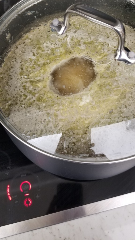
When you brew beer at home you start by boiling the wort. You boil water and you add the malts and the hops for the flavoring and the aroma at specific times. This all depends on the recipe you are following. Warning! The wort easily boils over. Then you cool the wort (I use an ice bath to do this), add the yeast, and you let it ferment, typically for a couple of weeks.

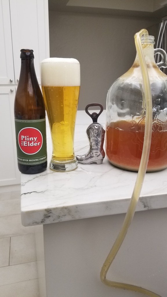
You can add various things for flavoring, such as whiskey infused wood chips if you want your beer to have a taste of whiskey and wood (yes, I have done that). Whiskey and wood are great added flavors in stouts. After the two weeks of fermentation, you add sugar and bottle the beer and let it ferment for a few weeks before you put it in the fridge.

A black pan filled with yellow-beige boiling wort
Boiling wort on the kitchen stove. It contains water, malts, hops, and maybe sugar or honey.

A few words about the bottling process. The bottling process below is using siphoning instead of pouring to achieve some filtering and to avoid splashing. Splashing can cause excessive oxidation which can ruin the beer the same way bananas turn brown. This seems to matter for New England style IPAs, but not so much for other beer styles (my observation).

Carboy with siphoning tubing on the right. Pliny the Elder bottle and beer glass on the left | Measuring Alcohol by Volume in Home Brews
Here I am bottling beer while drinking a renowned IPA called Pliny the Elder, one of the best India Pale Ales in the world.

Measuring the alcohol content in home brews

When you brew beer at home you don’t have the advanced equipment that breweries sometimes do so measuring the alcohol content is a challenge. However, you can do it with an indirect method using a hydrometer. I will explain how to do this. There are instruction booklets, books and online websites that explain how to do this, but I will keep it short and succinct.

During the fermentation process, yeast converts sugars into alcohol (and carbon dioxide). As the sugar is used up, the wort slowly becomes less dense. By measuring the density before and after fermentation (using the hydrometer), you can calculate how much alcohol is in the finished beer. In the beer world this is called measuring the gravity, not to be confused with the fundamental force of attraction between objects with mass. You can buy a hydrometer in a lot of places including Amazon.

Long white plastic measuring cup with a hydrometer | Measuring Alcohol by Volume in Home Brews
This is a measuring cup (left) and a hydrometer (right). Don’t worry about markings on the measure cup. It is the markings on the hydrometer that you use.
Hydrometer with lots of markings | Measuring Alcohol by Volume in Home Brews
Close up of a hydrometer.

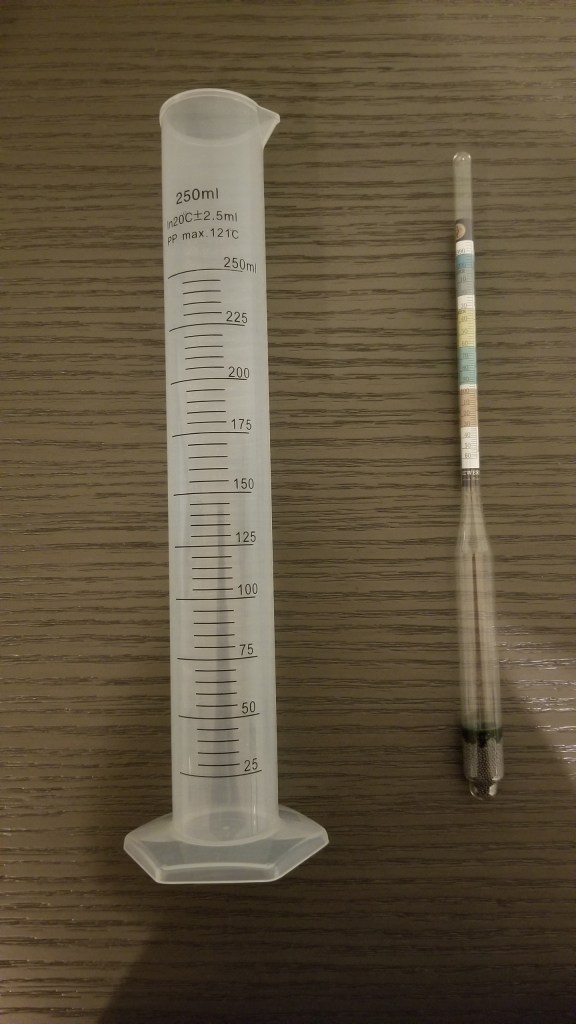
The density/gravity of water is used for reference as 1.000. To be exact, it also depends on the temperature, but for now we’ll ignore that. After the initial boil of the wort, and before you add the yeast, there is no alcohol in the wort. This is a good point to measure what is called original gravity (OG).

I should mention that you need to let the wort cool off before doing your measurement. The temperature at this point should be around room temperature, 72 degrees (60 to 75 degrees). Then after fermentation (in your container, carboy, whatever) you measure it again. This is called the final gravity (FG).

A long measuring cup with beer and a hydrometer in it | Measuring Alcohol by Volume in Home Brews
Original gravity/density Was 1.072. Final gravity/density was 1.018 (in picture).

I should add that after the fermentation in your container/carboy is done you add a little bit more sugar (called priming sugar), you bottle the beer, and you let it ferment a little bit more, which will add a little bit more alcohol as well as carbon dioxide. You want some carbon dioxide in the beer but not too much. This extra amount of alcohol is not accounted for using the final gravity. However, it is typically around 0.2% and if you wish to include it, you can just add that number.

Using the original gravity (OG) and the final gravity (FG) you can now calculate the ABV, Alcohol by Volume, by using the formula below. For this brew, an IPA (India Pale Ale), I got OG = 1.072 and FG = 1.018. Ideally FG is around 1.010, but for whatever reason I did not get there.

ABV = (OG – FG) x 131.25 = 0.054 x 131.25 = 7.1%

So that would be 7.3% with the bottle fermentation. That is a good enough measurement, but if you want precision, there is a more exact formula.

ABV = (76.08 x (OG – FG) / (1.775 – OG)) * (FG/0.794) = which in my case yields ABV = 7.23% which would yield 7.43% with the bottling. I can add the recipe predicted ABV = 7.5%. There are even more exact formulas that account for the temperatures at the points of measurement of original gravity and the final gravity. But that would be really nerdy.

To see the Super Facts click here

The Hockey Stick Graph is not Wrong

Superfact 26: The disputed Hockey Stick Graph showing that recent global warming is unprecedented in the context of the past thousand years has been shown to be correct.

The Mann, Bradley, and Hughes hockey stick curve published in 1998 in Nature and showing a sharp upturn in global temperatures in recent years as well as relatively flat temperatures in the previous 1,000 years, ignited a firestorm.

Initially some scientists criticized it for being wrong, and the rightwing media and think tanks, and especially politicians criticized the graph and even attacked the scientists involved accusing them of being frauds. Al Gore was harshly criticized for using the hockey stick in his documentary “an inconvenient truth”. There were congressional hearings, politicians intimidating scientists, fake scandals, threats, and lawsuits.

The propaganda campaign against the hockey stick graph succeeded in winning over the public and that included me. I was for the longest time convinced that the hockey stick graph was wrong and perhaps a fraud. I was wrong. I had been bamboozled just like large segments of the American public.

The scandal around the hockey stick curve and the related climate-gate (fake scandal) was used to question the entire concept of global warming / climate change. As you may know, the evidence clearly shows that global warming is happening and is caused by us.

It should be noted that the way Mann, Bradley, and Hughes implemented their statistical analysis was not 100% correct, but the discrepancy was very small and did not make a big difference. However, this discrepancy was very useful for their detractors.

The controversy led to an investigation resulting in the so-called North Report. The 2006 North Report published by the United States National Academy of Sciences endorsed the MBH studies with a few reservations.

Subsequent research has resulted in more than two dozen reconstructions, using various refined statistical methods and combinations of proxy records. They are not identical to the original hockey-stick graph but closely resemble it and consistently show a slow long-term cooling trend changing into relatively rapid warming in the 20th century.

Since there is now a scientific consensus supporting the hockey stick graph, it is important news, and a lot of people still have not gotten the memo or are refusing to believe it, I consider it a super fact.

Before The Hockey Stick Graph

Before the hockey stick curve there was a lot of talk about the medieval warm period and the little ice age. Many people used these periods to cast doubt on global warming claims by scientists. I should say that the climate scientists claim about global warming was not based on the temperature record for the last 1,000 years. It was because the observed recent uptick in average global temperatures was not expected naturally.

Their worries were based on the fact that our greenhouse gas emissions could explain the uptick whilst there was no climate cycle or natural phenomenon that could explain it. That combined with the fact that the manner in which the warming was happening (it’s fingerprint if you will) showed that it was our greenhouse gases causing it.

So, the comparably high temperatures during the medieval warm period and the very cold temperatures during the little ice age should not have mattered much. But as you can see in the graph below, the old temperature graphs could be used by global warming skeptics.

It should be noted that previous estimates for the temperatures during the medieval warm period and the little ice age were based insufficient data and guesstimates.

The graph below from the 1990 IPCC report shows three curves, a red, a blue and a black one, and a green extension to the blue from 1998 to 2007. The red graph shows a large bulge corresponding to the medieval warm period, a significant drop corresponding to the little ice age, and a minor uptick in recent temperatures. The blue curve shows a flattened medieval warm period with only a minor little ice age and sharper uptick in recent temperatures. The green extension stretching from 1998 to 2007 shows a significantly sharper uptick in temperatures. The black curve is an alternative temperature curve by Moberg.

As you can see the estimates for the average global temperatures during the medieval warm period and little ice age were too large. When the hockey stick curve came along (next graph), a propaganda tool was diminished, which led to the media storm.

The graph below from the 1990 IPCC report shows three curves, a red, a blue and a black one, and a green extension to the blue from 1998 to 2007 | The Hockey Stick Graph is not Wrong
The red line is from the 1990 IPCC report and shows what was believed at the time about temperatures during the last 1,000 years. The blue line is the (MBH) hockey stick graph from 1998. Graph taken from this page. William M. Connolley derivative work: Dave souza, CC BY-SA 3.0 <http://creativecommons.org/licenses/by-sa/3.0/&gt;, via Wikimedia Commons
Hockey stick curve going back 1,000 years. The recent uptick in global temperature is very sharp and very sudden | The Hockey Stick Graph is not Wrong
The so-called hockey stick curve depicting the last 1,000 years. The blue line is the first hockey stick curve ever created (by Michael Mann). He used proxy measurements such as tree rings, green-dots 30-year average, red temperature measurements. Wikimedia commons <<https://creativecommons.org/licenses/by-sa/4.0/deed.en>>. This graph is taken from this page.

Multiple Hockey Stick Graphs

As mentioned, various refined statistical methods and combinations of proxy records, has resulted in another couple of dozen hockey stick curves that largely agree with the original MBH hockey curve. Below are a few examples taken from various sources. The first two graphs below are taken from the real climate website, a website created by climate scientists.

IPCC 3rd Assessment Report

On the left is the original MBH 1998/1999 hockey stick curve extending back 1,000 years and, on the right, a more recent reconstruction extending back 2,000 years. The curves look like each other but the more recent one looks even more like a hockey stick | The Hockey Stick Graph is not Wrong
Side-by-side comparison of the (left) original Mann et al (1999) “Hockey Stick” reconstruction as featured in the Summary for Policy Makers of the IPCC 3rd Assessment report (2001) and the (right) longer, sharper “Hockey Stick” as featured in the Summary for Policy Makers of the IPCC 6th Assessment report (2021).

Eight Hockey Sticks by New Scientist

The graphics below are focused on the northern hemisphere. The top graph shows the 2001 IPCC hockey stick curve with data from thermometers (in red). Below that graph are eight more hockey stick curves plus a red dotted line corresponding to the instrumental record. This was compiled for New Scientist by Rob Wilson of the University of Edinburgh, UK.

The IPCC curve is at the top and below it is another graph containing eight hockey stick curves, Jones 1998 (red), Crowley 2000 (yellow), Briffa 2001 (black), Esper 2002 (purple), Huang 2004 (light blue), Moberg 2005 (black), Oerlemans 2995 (black), D'Arrigo 2006 (green).
The top graph shows the 2001 IPCC version of the hockey stick curve stretching back 1,000 years. The error bars (in grey) show the 95% confidence range. The blue line is from tree rings, corals, ice cores and historical records. All curves correspond to the departures in temperatures in centigrade from the 1961 to the 1990 average.

The Hockey Stick Wars

I also wanted to add a few examples related to the propaganda wars against the first hockey stick graph and its author Dr. Michael Mann and climate science in general. If you haven’t followed this topic, I can add that it did get intense.

On April 23, 2010, Virginia Attorney General Ken Cuccinelli issued a Civil Investigative Demand (CID) to the University of Virginia (UVA). The CID demanded that UVA provide every email, record, or document it had related to Dr. Mann from his time there from 1999 to 2005. This resulted in a strong reaction from the scientific community.

On 2 March 2012 the Supreme Court ruled that Cuccinelli as Attorney General had no legal authority to demand the records from the university. Dr. Mann was also severely harassed and received chilling death threats against himself as well as his family, as documented in his book “The Hockey Stick and the Climate Wars: Dispatches from the Front Lines”.

In February 2024, Michael Mann won a defamation lawsuit against conservative writers Rand Simberg and Mark Steyn (Mann v. Competitive Enterprise Institute). The jury awarded Mann $1 million in punitive damages and $1 in compensatory damages. The lawsuit was over blog posts written by Simberg and Steyn that accused Mann of manipulating data in his famous “hockey stick” graph. It was not so much about questioning the science but rather about the fact that they intentionally tried to ruin his reputation using false information.

For example, they were comparing him to the infamous pedophile Jerry Sandusky. Jerry Sandusky was a football coach at Penn State University and Dr. Michael Mann is a distinguished Professor of Atmospheric Science at Penn State.

To see the other Super Facts click here

The Special Theory of Relativity by David Bohm

The goal of this blog is to create a list of what I call super facts. Super facts are important and true facts that are nevertheless highly surprising to many, disputed among the public, or unnecessarily misunderstood. They are special facts that we all can learn something important from. However, I also make posts that are not super facts but feature other interesting information, such as this book review and book recommendation.

The Special Theory of Relativity by David Bohm

David Bohm a close colleague of Albert Einstein was one of the most interesting theoretical physicists of the 20th century. This book “The Special Theory of Relativity” is one of the most interesting and thorough introductory books on the Special Theory of Relativity that I have come across. It is a series of lectures on the topic. It features algebra, equations, and a little bit of differentials but not too much.

You may want to have some math, physics and some relativity under your belt before you tackle this book. In my estimate it is written for those who have taken high school AP physics and AP algebra, maybe calculus as well, or one or two college level physics classes and math classes (or more). It is probably too basic for professional physicists, but it is not written for laymen. I bought the paperback version.

  • Hardback –  Routledge; 1st edition (October 10, 1996), ISBN-10 : 0415148081, ISBN-13 : 978-0415148085, 256 pages, item weight : 13.6 ounces, dimensions : ‎ 5.75 x 0.75 x 9 inches. It is out of stock, and it costs $75.60 – $144.00 on US Amazon. Click here to order it from Amazon.com.
  • Paperback –  Publisher : Routledge; 1st edition (September 4, 2006), ASIN : 0415404258, ISBN-13 : 978-0415404259, 304 pages, item weight : 12 ounces, dimensions : 5.08 x 0.69 x 7.8 inches. It is out of stock, and it costs $12.36 – $17.21 on US Amazon. Click here to order it from Amazon.com.
  • Kindle –  Published : Routledge; 1st edition (September 29, 2015), ASIN : B009W3W6MG, 306 pages, it costs $10.10 – $13.77 on US Amazon. Click here to order it from Amazon.com.
The front cover of “The Special Theory of Relativity by David Bohm.”
Front cover of the paperback version of The Special Theory of Relativity by David Bohm. Click on the image to go to the Amazon page for the paperback version of the book.

Amazon’s Description of the Book

In these inspiring lectures David Bohm explores Albert Einstein’s celebrated Theory of Relativity that transformed forever the way we think about time and space. Yet for Bohm the implications of the theory were far more revolutionary both in scope and impact even than this. Stepping back from dense theoretical and scientific detail in this eye-opening work, Bohm describes how the notion of relativity strikes at the heart of our very conception of the universe, regardless of whether we are physicists or philosophers.

This is my five-star review for The Special Theory of Relativity

Note, I wrote this review in 2014, so it is relatively old, pun intended.

Lorentz Electrodynamics, Special Relativity, and our Perception of Reality

This book is a thorough and well written introduction to the “Special Theory of Relativity”. In addition to the basics of special relativity it covers the history of Special Relativity and it includes 60-pages of Lorentz Electrodynamics. The book also discusses Minkowski Diagrams, the Twin Paradox, relativistic Doppler effects, K-Calculus, and philosophy related to relativity. The book does not discuss General Relativity.

Bohm does not derive many formulas for electrodynamics, optics, quantum physics, thermodynamics, etc., and therefore this book does not resemble a textbook. Bohm’s focus is on a deeper understanding of the special theory of relativity itself, and on time and space.

He discusses perception of reality and includes discussions on child development, psychology and neurology related to perception, the meaning of the relational concepts in relativity, the structure of scientific revolutions (T.S. Kuhn), our perceptions of time and space, philosophy, and other related topics that cannot be classified as physics.

In K Calculus you draw the world lines of light pulses sent at constant intervals between different observers. Then you calculate what is essentially the Doppler factor K and uses it to explain what is going in relativity. In contrast the Lorentz transform is concerned with the space-time coordinates that you measure after taking into account that light have to travel a certain distance and that this takes time. Basically, the “actual time and space coordinates”.

K Calculus on the other hand is including both relativistic effects and the distance and time it takes for light to travel. K Calculus is thus not what you “measure” but what you “observe”. K Calculus makes it very easy to explain special relativity to an audience that is not strong in math and it also adds a new understanding to the special theory of relativity.

However, I see an inherent risk with K-Calculus in that it can end up fooling the student into believing that he understands relativity, for example, if a student incorrectly comes to believe that time dilation is some form of Doppler Effect.

Except for the fact that some of the mathematical derivations were unnecessarily complex I thought this book presented relativity lucidly, the philosophical discussions were insightful, and it added to my understanding of the topic. It should probably not be your first book on Special Relativity but it is a very good second book. I highly recommend it for those who want to think through the concepts of relativity a little deeper.

The back cover of "The Special Theory of Relativity by David Bohm"
Back cover of the paperback version of The Special Theory of Relativity by David Bohm. Click on the image to go to the Amazon page for the kindle version of the book.

To see the Super Facts click here

The Great Sun and Moon Spectacle

We are all in our places with sunshiny faces  ready to experience the astronomical event of the century, a spectacle that Mr. Sun, Sun, Golden Mr. Sun and the moon provided for us.

This is a submission for Kevin’s No Theme Thursday

The Great Sun and Moon Spectacle
Image by Kevin from The Beginning at Last

For us in Dallas, Texas, 2024 was the year when the sun and the moon put up an unforgettable spectacle for all of us to see. On April 8, 2024, the sun and the moon and earth lined up perfectly so that the moon fully covered the sun. We had a total solar eclipse, and we were lucky with the weather. I can add that experiencing a total solar eclipse is quite different from experiencing a partial or annular solar eclipse. I’ve experienced a partial solar eclipse as well and I can attest to the difference.

Unlike a partial eclipse, it gets dark during a total solar eclipse, the stars come out if the sky is clear like it was. The birds and the insects become quiet. It happens very suddenly, in just a few seconds. The total solar eclipse lasted four minutes.

The Motion of the Sun and the Moon

To understand what a solar eclipse is, the video below might help. What you see is the moon and the earth as seen from the sun’s viewpoint. We see earth all lit up by the sun, like a full moon, and we also see the moon lit up by the sun. 

In this situation, when the people on earth look up in the sky, they see the sun, but they don’t see the moon, even though it is there. It is a new moon, or a black moon if it happens twice in the same month. As the moon begins to partially cover the sun the shadows on the ground start looking different and if you use solar eclipse glasses you can see the sun disappearing and looking like a bright crescent, but it is still daylight and looking at the sun without eclipse glasses would just hurt your eyes.

Well, this is true until the sun is fully covered by the moon. When that happens, the light turns off and at that point it is safe to look at the sun without glasses. What you’ll see is a pitch-black circle in the sky surrounded by wispy faint lights. Those wispy faint lights are the sun’s corona.

Below is a youTube video showing an animation composed of actual satellite photos by NASA.


Solar Eclipse Preparation

I drank a very special beer for the occasion, a Trappist Belgian Strong Ale, or Quadruple, called Westvleteren 12 from Brouwerij Westvleteren (Sint-Sixtusabdij van Westvleteren).

A table set for five with a large parasol | The Great Sun and Moon Spectacle
Our patio table. The little brown packages contain AAS / ISO certified solar eclipse glasses.
My daughter holding a Westvleteren 12 glass with a bow. Grandpa and grandma sitting on chairs in the background | The Great Sun and Moon Spectacle
Our daughter holding a Westvleteren 12 glass with a bow. Grandpa and grandma in the background.
A mini-Australian Shepherd sitting on the patio floor | The Great Sun and Moon Spectacle
Rollo our mini-Australian Shepherd on the patio.

The Partial Eclipse Phase

It was partially cloudy during the partial eclipse, but we were able to get a good look at the eclipse as it progressed. As mentioned, to see the partial eclipse, you have to use good solar eclipse glasses. It is primarily for safety reasons, but it is also pointless to look at the sun during a partial eclipse. You won’t see the eclipse crescent because the powerful light from the sun overwhelms your view.

I had a little filter that was placed in front of my phone camera as I took a few pictures. Admittedly they were pretty bad. I have an old Samsung Galaxy S8+ but even using newer phones it is difficult to get decent photos of something like this.

The photo shows a shiny crescent on black background | The Great Sun and Moon Spectacle
Partial eclipse photo taken with my old Samsung Galaxy phone and a filter.

The Total Eclipse

At 1:40PM Dallas time the total solar eclipse happened and luckily it was not covered by clouds. At this point it suddenly got dark and it was safe to look straight at the sun without using the eclipse glasses. The total eclipse lasted four minutes. I have included a shutter stock photo below which closely represents what we actually saw. We saw a black circle and around the black circle was a wispy white fog like light. This was the sun’s corona and it shone with about the same power as the full moon. It kind of looked like a black hole.

Black circle surrounded by a wispy white fog like light. That’s the sun’s corona | The Great Sun and Moon Spectacle
Except for the black background this looks like what we saw with our eyes. The sky we had was dark, like twilight, but not black. Solar Eclipse Stock Photo ID: 2344355767 by aeonWAVE

The Stars and the Planet Venus

The photo shows the sun totally covered by the moon. It is very small in the photo. There is star like object, that’s Venus, a cloud and airplane contrail | The Great Sun and Moon Spectacle
Total solar eclipse photo that my daughter took. Can you find Venus?

Total Eclipse Photos

These eight pictures were taken with cell phones by my daughter Rachel, Denise Mosier-Wanken, and Margaret Weiss Bloebaum.

Did you see the total solar eclipse?


To see the Super Facts click here


Black Moon

Today, December 30, 2024, we are having what is called a Black Moon. In Europe it will be December 31.  This is not a super-fact post. Just some lighthearted information about the Black Moon phenomenon.

What is a Black Moon?

The most common definition is that it is the second new moon in a single calendar month. That’s what we are having now. During a new moon the moon is located between the sun and earth, which means that the night side of the moon is directed towards us. At night it is usually below the horizon and during the day you can’t see it.

However, there is one exception to that and that is when you are having a solar eclipse. In that case the moon is directly in front of the sun. It is an unusually well-placed new moon if you will. Here in Dallas, we had a total solar eclipse on April 8 this year. It was a remarkable experience. It turned daker, cooler, some stars and planets came out, including Venus, and the birds and insects stopped singing. I have included some photos from that event below. What you see is the dark side of the moon with the sun hiding behind it.

The sun is shaped like a moon crescent but bright.
I took this photo with my old Samsung 8+ phone before we had totality. Since the sun was still partially visible and bright I used a filter / a pair of glasses that I held in front of the phone.
There’s a black circle in the middle with a light around it, and an especially bright light on the right side | Black Moon
A friend Denise Mosier-Wanken took this photo with her phone. The sun is almost gone. The fuzzy fog like light around the black circle is the sun’s corona.
There’s a black circle in the middle with a light around it.
My daughter Rachel took this photo with her iPhone.
A professional solar eclipse photo with filter. Black Moon.
A professional solar eclipse photo with filter. What we saw with our eyes was something in between this photo and the photos we took. The corona in our photos is too big. This one is too small. Stock Photo ID: 2344355767 by aeonWAVE.

Alternative Definitions of a Black Moon

As mentioned, the most common definition of a black moon is that it is the second new moon in a single calendar month. However, there are other definitions:

  • A month with no full moon
  • A month with no new moon
  • The third new moon in a season with four new moons. A season is defined as the period between a solstice and an equinox and is roughly three months.

A New Moon is a Star Gazing Opportunity

Since there is no moon in the sky the night is a little bit darker. This makes a significant difference in places that are very dark and very far away from city lights. There is so much light pollution here in Dallas, so it doesn’t matter here. However, I still took out my little telescope and observed easy objects, such as Venus, Mars, Jupiter and its four Galilean moons.

Jupiter in the middle. It is a greenish speck with lines. It is surrounded by three white dots.
The three little dots are three of the four Galilean Moons. I roughly saw this in my telescope a couple of hours ago, but it is not my photo. Photo by Raoni Aldrich Dorim on Pexels.com

The Near Side and the Far Side of the Moon

The moon is always showing us the same side, the so-called near side. The far side, or the back side, you can only see from spacecrafts. Look at the photo below. The near side is on the left whilst the far side is on the right. During a new moon the near side (left) is dark, and the far side (right) is lit up by the sun. But again, you cannot see the far side (right), which is turned away from us.

During a full moon the near side (left) is lit up by the sun, and the far side (right) is dark. One interesting fact about the moon is that the near side (left) and the far side (right) are very different. The far side (right) not only looks different, it has a crust that is much thicker compared to the near side, and it is also densely cratered compared to the near side.

On the left is the near side of the moon and on the right the far side of the moon | Black Moon
The near side of the Moon and the far side of the Moon. Comparison between the two hemispheres of the Moon. Elements of this image were furnished by NASA. Stock Photo ID: 2157518223 by Claudio Caridi.

Below is a youTube video showing an animation composed of actual satellite photos by NASA.

In this video the near side of the moon is dark. It is a new moon and the people on earth don’t see the moon. The sun is behind us and lights up both earth and the far side of the moon (the side people on earth do not see), so that is what the space craft see.

Happy New Year

Finally, a Happy New Year to all of you from Rollo and me. He may not look that happy but that is because I am leaving over the New Years. We have a dog sitter though. For the same reason I will not be on-line tomorrow.

Our mini-Australian Shepherd is looking into the camera. He is looking a tad sad.
Happy New Year from Rollo

To see the Super Facts click here