The Extinction Rate is Much Higher Than the Natural Baseline Rate

Super fact 71 : Based on the fossil record today’s extinction rate is hundreds, or even thousands, of times higher than the natural baseline rate.

Animals included in the watercolor painting include Teratorm, Mammoth, Macrauchenia, Glyptodon, Smilodon, and Andrewsarchus. | The Extinction Rate is Much Higher Than the Natural Baseline Rate
Collection of watercolor prehistoric and now extinct animals isolated on a white background. Hand painted illustration of Ice Age. Asset id: 2169205593 by Ekaterina Glazkova

Estimating the extinction rate is a complicated task that requires some assumptions and estimations. This article from the National Library of Medicine use what it claims to be conservative estimates, which would tend to minimize evidence of an emerging mass extinction. Despite that fact the average rate of vertebrate species loss over the last century is up to 100 times higher than the extinction rate without/before humans (background rate). Other sources claim an extinction rate that is 1,000 or even 10,000 the background rate.

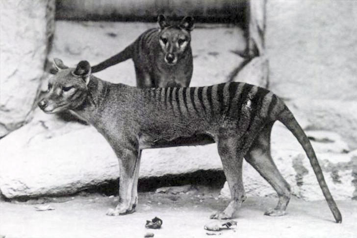
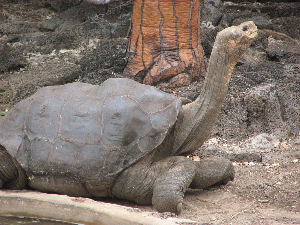
To put some specific numbers on what a high extinction rate means, scientists count 881 animal species are known to have gone extinct since around 1500. If we include animal species that scientists suspect might be extinct, that number shoots up to 1,473. You can read more on the issue here or here or here.

A black and white photo of Two Tasmanian Tigers. The Tasmanian Tigers had stripes on their back.
Two Tasmanian Tigers. The Tasmanian Tiger or Thylacine was hunted to extinction. Benjamin, the last Tasmanian Tiger, died in 1936 in the Beaumaris Zoo in Tasmania. Baker; E.J. Keller., Public domain, via Wikimedia Commons

What is clear is that the current extinction rate is much higher than what is typical and we humans are the cause. This came as a shock to me the first time I found out about it, and it is certainly an important topic, and therefore a super fact. It is true, surprising to many, and important.

Those who want to minimize the problem with the ongoing extinctions often point out that extinctions are a natural part of evolution and that throughout Earth’s history up to around 98% of all species that have ever existed are now extinct. In my opinion, that argument fails to consider the enormity of Earth’s four billion year natural history. A lot of evolution happened during that time.

Modern humans have only been around 300,000 years, or 0.0075% of that time, a tiny blip in time. Human civilization has only been around for 12,000 years, or 0.0003% of that time, an even tinier blip in time. Like comparing an ant head to a mile. Us having a large negative impact on the natural world in such an extremely short time is quite notable.

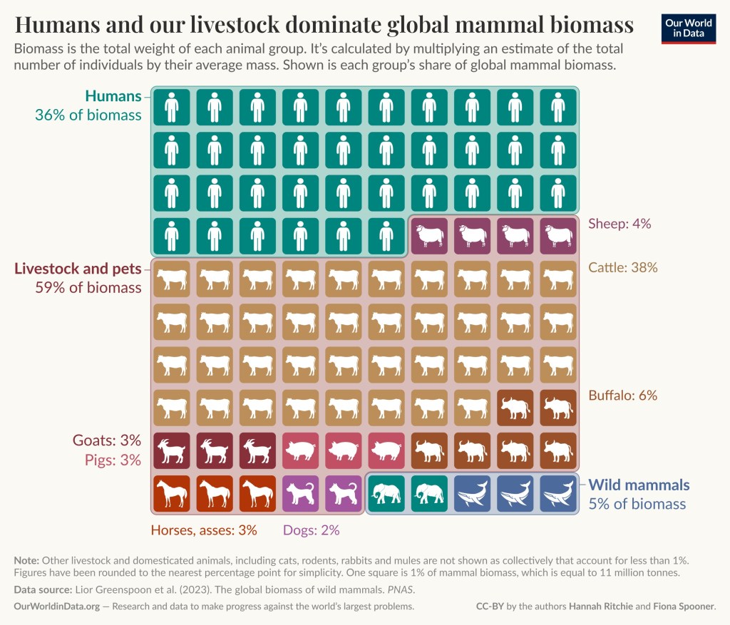
By considering the extinction rate you get a better idea of the scope of the problem. The fact that the extinction rate today is significantly higher than the expected natural rate and that the primary cause of modern extinctions is human impact as opposed to natural phenomena, makes it a case for concern. To read about a related issue, “The Wild Mammal Biomass Has Substantially Declined”, click here.

The color photo shows a close up of a giant tortoise. | The Extinction Rate is Much Higher Than the Natural Baseline Rate
Lonesome George at the Charles Darwin Research Station in 2006, the last known individual of his species of Galápagos tortoise. https://www.flickr.com/photos/mikeweston/, CC BY 2.0 <https://creativecommons.org/licenses/by/2.0&gt;, via Wikimedia Commons

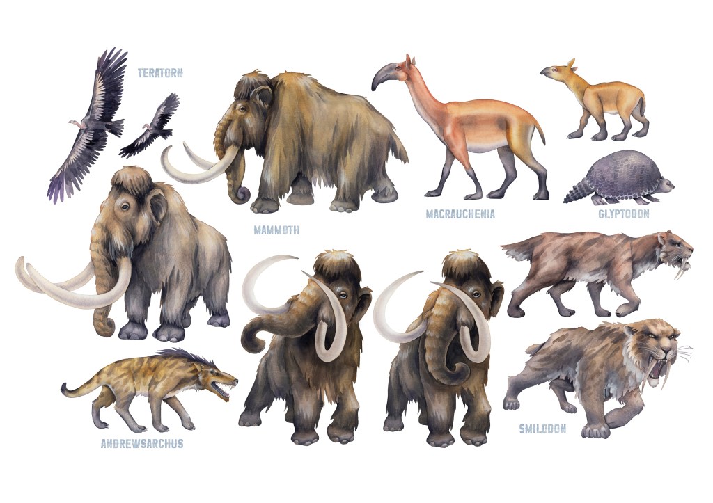
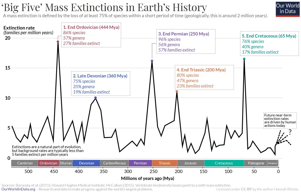
The Five Past Mass Extinction Events

Over the last 440 million years life on Earth has experienced five so called mass extinctions. A mass extinction event is when at least 75% of the world’s species are lost during a short period of time – geologically speaking. This period is not clearly defined but often defined to be two million years. Two million years may seem like a long time, but geologically speaking, it is a short time.

3D illustration showing two carnivorous dinosaurs and two large herbivores looking up at a burning asteroid.
Extinction of the dinosaurs when a large asteroid hits earth 66 million years ago. It was the last mass extinction event. Asset id: 2196200279 by funstarts33

The five mass extinction events were:

Below is an overview of the five big mass extinctions in Earth’s history. The graph is from Our World in Data.

The graph shows extinction rates going up and down with five tall peaks representing mass extinction events.
The Big Five Mass Extinctions in Earth’s History. A mass extinction is defined by the loss of at least 75% of species within a short period of time (geologically, this is around 2 million years). Extinctions are a natural part of evolution, but background rates are typically less than 5 families extinct per million years. Sources Barnosky et al (2011). Howard Hughes Medical Institute: McCallum (2015). Vertebrate biodiversity losses point to a sixth mass extinction. From Our World in Data.
A stunning AI generated illustration of a woolly mammoth standing on a snowy landscape during a vibrant sunset with northern lights in the sky. | The Extinction Rate is Much Higher Than the Natural Baseline Rate
Are We in the Middle of a Sixth Mass Extinction ?
A Glyptodon walking across an empty prairie.
3D illustration of a Glyptodon, also extinct, Asset id: 495169627

Biodiversity experts have estimated that about 30% (uncertainty range: 16–50%) of species have been globally threatened or driven to extinction since the year 1500. 30% globally threatened or extinct is not 75% that are actually extinct, but in just 500 years that looks like a quick start on a mass extinction. It should be noted that 500 years is just 0.025% of two million years. Issues such as deforestation, chiefly the result of replacing forests with agriculture, overexploitation, and global warming / climate change are driving extinctions and represent big biodiversity threats in the near future.

A northern white Rhino is grazing green grass at a zoo.
The Northern white rhino subspecies, the second-largest land mammal after elephants, has no hope of recovery after the last male died in 2018. Only a female and her daughter are left. The photo is of Angalifu, a male northern white rhinoceros at the San Diego Zoo Safari Park. Angalifu died of natural causes at the age of 44 on 14 December 2014. Sheep81, Public domain, via Wikimedia Commons.

This is why there is talk about the so called Holocene or Anthropocene extinction and it possibly being a sixth mass extinction, this one being human caused. It should be noted that there are credible sources that question whether we are at the cusp of a sixth mass extinction event.

Posting this on Thanksgiving Day may seem awkward. However, whether there will be a human caused sixth mass extinction or not depends on us, and it looks like more people want to protect our natural world. Many animals, such as the giant panda, bald eagle, the sea otter, black footed ferret, the Peregrine falcon, the blue whale, Rodrigues fruit bat, the Island night lizard, and the California condor, have been saved from extinction through conservation efforts like habitat restoration, anti-poaching laws, captive breeding programs, and reintroduction to the wild. Perhaps we are turning things around. We should give thanks to all who care.


To see the other Super Facts click here

The Wild Mammal Biomass Has Substantially Declined

Super fact 70 : Wild mammals have declined by 85% since the rise of humans even as the total mammal biomass has nearly tripled. The result is that only 4-5% of the total biomass of mammals are wild animals. The rest are humans and livestock.

Pie chart shows that Livestock, mostly cattle and pigs, corresponds to 60% of the mammal biomass, humans are 36%, and wild mammals are 4%. | The Wild Mammal Biomass Has Substantially Declined
Livestock, mostly cattle and pigs, corresponds to 60% of the mammal biomass, humans are 36%, and wild mammals are 4%. The data is taken from this article.

As stated, mammal biomass has declined by 85% since the rise of humans. This is despite a threefold increase in mammal biomass over the last 200 years. However, this increase is almost entirely due to the growth of human and livestock populations. The result is that only 4-5% of the total biomass of mammals are wild animals. Another result is that Earth’s wild land mammals now make up just 2% of the mammal kingdom. You can read more here, or here, or here, and more in depth here.

Humans are 36% of the mammal biomass, Sheep is 4%, Livestock and pets 59%, including 2% dogs, 3% pigs, goats 3%, cattle 38%, and buffalo 6%
Humans and our livestock dominate global mammal biomass. Biomass is the total weight of each animal group. It’s calculated by multiplying an estimate of the total number of individuals by their average mass. Shown is each group’s share of global mammal biomass. This graph is taken from Our World In Data.

I think this is a super fact because we know it is true, and this huge and extremely rapid change of Earth’s fauna (from a geological timescale) is certainly important, and yet I think it comes as a surprise to many people. I often see the argument that humans have been great for animals because there are many more of them and the mammal biomass has tripled. That argument leaves out the part about the increase in mammal biomass coming from domesticated animals while wild animals have been disappearing. One question that comes to mind is whether life at the cramped factory farm is better than the life as a wild animal.

Wild Mammal Biomass Data

Below are a couple of graphs displaying some additional information on wild mammal biomass.

The graph shows that even hoofed mammals is a big group consisting of 49% of the wild mammal biomass. Rodents are 16% and elephants are 8%, bats are 7%, Marsupials are 7%, and primates are 4%, carnivores 3%, rabbits 1%, and other mammals 4%.
The distribution of the world’s wild land mammal biomass. The graph is taken from Our World in Data.

Another thing to note is that the wild animal biomass is very concentrated to just a few species. Considering that there are between 6,500 and 6,800 recognized mammal species in the world, it is quite remarkable that only 10 species make up 40% of the mammal biomass.

White-tailed deer is 12%, Wild boar is 8%, African Savanna Elephant is 6%, Eastern gray kangaroo is 2%, Mule deer is 2%, Moose is 2%, Red Deer is 2%, European roe deer is 1.8%, Red Kangaroo is 1.8%, and the Common Warthog is 1.4%.| The Wild Mammal Biomass Has Substantially Declined
Just 10 species make up around 40% of wild mammal biomass on land. The graph is taken from Our World in Data.

Reasons for Decline of Wild Animal Biomass

This decline of wild mammal biomass is primarily caused by human activity, including hunting, habitat loss and degradation from agriculture and urbanization, climate change, and pollution. This human-driven extinction event is the result of a rapidly growing human population and its increased consumption of natural resources, leading to widespread disruption of ecosystems and dramatic declines in wild mammal populations. It should be mentioned that the extinction of large mammals such as mammoths, American mastodon, giant ground sloths and glyptodonts was likely aided by human hunting in prehistoric times. The largest mammals have always been at the greatest risk for extinction and that is still true today.

A stunning AI generated illustration of a woolly mammoth standing on a snowy landscape during a vibrant sunset with northern lights in the sky.
Woolly mammoth, now extinct, Asset id: 2571557381 by Wirestock Creators.
A Glyptodon walking across an empty prairie. | The Wild Mammal Biomass Has Substantially Declined
3D illustration of a Glyptodon, also extinct, Asset id: 495169627


To see the other Super Facts click here

Climate change worsens wildfires in the US

Super fact 52 : Climate change, including increased heat, extended drought, and a thirsty atmosphere, has been a key driver in increasing the risk and extent of wildfires in the United States, particularly the western United States during the last two decades. The number of Wildfire acres burned in the United States has significantly increased even though the number of wildfires has not. Another important factor is forest management.

The graph consists of blue bars corresponding to a year starting in 1983 with the last bar being 2020. The bars show the number of million acres burned per year in the US. In 1983 and 1984 the bars show between 1 and 2 million acres burned. The following three years more than 2 million acres were burned. From 2015 to 2020 the number of acres burned annually is between 5 and 10 million acres | Climate change worsens wildfires in the US
Wildfire acres burned in the United States. Number of acres of wildfire burned in a given year in the United States. This is shown from 1983 onwards, when consistent reporting began. Data source : National Interagency Fire Center (NIFC). Presented by OurWorldinData/natural disasters.

To some people this does not come as a surprise. However, due to the complexity of the issue combined with political spin, this is a surprise to me, or even something they refuse to believe. I’ve come across many people who are surprised to hear that there really is a connection between climate change and wildfires in regions of the world which are getting dryer and hotter due to climate change. There are also others who are surprised to hear about the complex picture and the importance of good forest management. In any case, since it is a surprising fact to many, and an important fact, I consider it a super fact.

As super fact 52 above states, Climate change is a key driver in the worsening of wildfires in the US, particularly in the American West. A 2016 study published in PNAS found that human-caused climate change caused over half of the documented increases in fuel aridity since the 1970s and doubled the cumulative forest fire area since 1984. I can add that we know that Climate Change, or if you call it Global Warming, is Happening and is Caused by us, primarily due to our burning of fossil fuels. I can also add that Scientists Agree that Global Warming is happening and that we are the Cause.

Wildfires and the Complex Statistical Picture

In general, you can’t look at wildfire statistics and draw conclusions without considering the context. Below are some considerations.

  • Wildfires are not started by climate change or poor forest management. They are started by lighting, falling powerlines, campfires that are not properly put out, and sometimes by arson. That doesn’t mean that climate change and poor forest management does not increase the risk and extent of wildfires.
  • Research organizations such as NOAA recognize that wildfire is a natural part of the western US ecosystem. However, climate change is significantly exacerbating the problem by creating conditions more conducive to intense and widespread wildfires.
  • Suppression of fire in certain ecosystems may in fact increase the likelihood that a wildfire will occur.
  • There are wildfires started intentionally to prevent future wildfires.
  • In the past, forests evolved with frequent, low-intensity fires that helped clear out underbrush. They can have ecological benefits. Therefore, the number of wildfires may not have increased over the last 100 years.
  • Local conditions and forest management have evolved through time complicating the wildfire statistics around the world.
  • In the past reporting was not always consistent.

That does not mean that we don’t know whether climate change worsens wildfires or not. Research organizations such as NASA, NOAA, NOAA (again), NOAA on LA fires , Ohio University, are all in agreement on the fact that Climate change has been a key driver in increasing the risk and extent of wildfires in the United States. Other organizations such as AccuWeather, Texas 2036, the Nature Conservancy, IFAW, American Progress, and the New York Times concurs.

The photo shows tree trunks on fire and professional firefighters extinguishing a large, high-priority part of a forest fire.
Highly skilled hotshot firemen crew working in a challenging remote area with flames reaching the treetops. Shutter stock asset id: 2258645599 by Gorodenkoff

Fix Our Forest Act

Climate change is a huge problem that is going to take decades to tackle and the whole world needs to be involved in that effort. However, we can quickly address wildfires here in the US, especially the American West by addressing the other half of the problem, forest management. There is currently a bill in congress called the Fix Our Forest Act that does that. It streamlines and enhances forest management based on the science. In the house of representatives, it has the number H.R.471 and in the Senate it is S.1642.

I was recently in Washington DC to do volunteer lobbying for these bills. You can read about it here.


To see the other Super Facts click here

The US Drug Overdose Epidemic is Extreme

Super fact 51 : In 1968 5,033 Americans died from a drug overdose. In 1978 5,506 Americans died from a drug overdose. In 1999 16,801 Americans died from a drug overdose. In 2022 107,941 Americans died from a drug overdose. 82,000 of those deaths involved opioids (about 76%). The number of people who died from an opioid overdose in 2022 was 10 times the number in 1999. More than half of all opioid deaths in the world were Americans despite being only 4.2% of the world population. The hardest hit demographic is white males.


Note the data in the super fact above is taken from Wikipedia, which in turn took it from CDC. However, the data across multiple sources look roughly the same (CDC / CDC, NIDA/NIH, Our world in Data, Wikipedia). I think this is a super fact. I should add that the statistics seem to have improved a little bit in 2023 and 2024.

I’ve posted about good super facts in this blog several times:

However, unfortunately there are also bad super facts, like this one.

The Severe Drug Overdose Epidemic in the US is a Super Fact

We recently went to the funeral for the young son (in his 20’s) of good friends of ours. He died from a drug overdose. The same thing happened to another friend of ours not too long ago. Despite all the talk about drugs, the war of drugs, and the “just say no campaign”, in the 1980’s I don’t remember this happening to people I knew when I was young, so I looked up the statistics. I knew we had an opioid epidemic with Fentanyl being the greatest culprit followed by Heroin. I just didn’t realize how severe it was and how American it was. This is important and shocking and the sources behind the data are reliable, which is why I consider this a super fact.

The United States Has by Far the Highest Death Rate from Opioids

If you play around with this graph from Our World in Data you will notice that the United States has a very high rate of deaths from drug overdoses, especially opioids, much higher than any other country. For example, take my home country Sweden, where 283 people died from opioid in 2021 (398 all drugs, data from IHME). Compare that with the United States, where 55,452 died from opioid in 2021 (70,893 all drugs, data from IHME). Adjust that for the population in each country you get a rate of 16.3 deaths per 100,000 inhabitants for the US and 2.7 deaths per 100,000 inhabitants for the Sweden. Sweden and the US are both open wealthy democracies in which certain opioids are legal for medical purposes but otherwise illegal. The graph below has slightly different numbers but notice that the year (2024) is different.

The picture shows a world map with the death rate from opioids for different countries shown in lighter to darker colors. United States out in dark brown with a death rate of 15.4. Canada also looks dark with a death rate of 6.9. Most of the rest of the world have a lighter color | The US Drug Overdose Epidemic is Extreme
Data source : Institute for Health Metrics and Evaluation (IHME), Global Burden of Disease (2024). The graph is taken from Our World in Data .

Some illustrative Graphics on Drug Deaths

The graphs below illustrate both the sharp rise in drug related deaths, especially opioids, as well as how hard hit the United States is compared to the rest of the world.

The graph shows a steep increase of deaths from opioids. Deaths from other drugs such as cocaine and amphetamine are relatively minor | The US Drug Overdose Epidemic is Extreme
The population of the United States is 340 million.
In this graph cocaine is the dominant cause of death. However, at less than 1,400 it is relatively minor compared to the deaths from opioids in the US | The US Drug Overdose Epidemic is Extreme
The population of South America is 438 million
This graph shows an increase in deaths from opiods, like the US graph, but it is more moderate.
The population of Europe is 744 million.
This graph is swinging up and then down, and does not show the strong upward trend that the US graph does.
The population of Asia is 4,800 million.
The graph shows a death rate per 100,000 of 21.4 for opioids, 17.8 for synthetic opioids such as fentanyl, 4.9 for prescription opioids, 4.1 for heroin, and 6.0 for cocaine | The US Drug Overdose Epidemic is Extreme
This graph shows the contribution to US deaths from specific drugs including synthetic opioids (Fentanyl), Heroin, prescription opioids, and cocaine. Notice that the vertical axis shows the death rate per 100,000 people and not the total number of deaths. Data source : US Centers for Disease Control and Prevention WONDER. Note: Opioids include prescription pain relief drugs, synthetic opioids, excluding methadone and other opioids such as heroin. The graph is taken from Our World in Data.


To see the other Super Facts click here

There are many environmental success stories

Super fact 46 : There are many serious threats to the environment that we need to take seriously. However, there are also many environmental success stories that we tend to forget about.

It is important to remember the environmental success stories because if we forget about them, it breeds despair, which in turn discourages people from acting and doing the right thing. Denial and Despair are two seemingly opposite emotional reactions that both hinder action on problems. I consider the existence of the many important environmental success stories a super fact because even though it is undeniably true that there are many environmental success stories, some truly amazing, it comes as a surprise to many.

Below I am listing six environmental success stories that I previously chose to be super facts. Super facts are important and true facts that are surprising and perhaps even shocking to many, or widely misunderstood, or disputed amongst the public, but not seriously disputed amongst the experts/scientists. Super facts are facts that are very special and that I think we should be aware of these facts. I should add that this is just a sample of environmental success stories. There are many more.

Super Fact 29:

EV Cars Indeed Emit Less Carbon Pollution

EV Cars emit less pollution than Internal Combustion Engine Cars, even considering manufacturing, disposal and many EV Cars being charged by dirty grids. The basic reason for this is the much higher efficiency of EV cars. EV cars emit significantly less greenhouse gases than internal combustion engines even considering construction of fuel production facilities, production of the car, the battery, and the fuel, vehicle operation and disposal. For more information click here.

The histogram graph shows that if you consider construction of facilities, manufacturing of vehicle and battery, production of fuel, vehicle operation as well as disposal the total average greenhouse gas emissions from EV cars is 52% less | There are many environmental success stories
Lifecycle greenhouse gas emissions comparison of average gasoline car and average EV. This graph is taken from the US Department of Energy.

Super Fact 35:

Natural Disasters Kill Less People Now Than 100 Years Ago

Natural disasters kill a lot less people now compared to 100 years ago. That is despite a larger population and despite the fact that climate change has increased the frequency and intensity of many types of natural disasters. Surveys by Gap Minder show that this fact is quite surprising to people and therefore it is a super fact. To read more about this super fact click here.

The reason for the fewer deaths from natural disasters is not that there are fewer natural disasters. It is because we are now much better at predicting, handling and recovering from natural disasters. Our warnings systems, rescue systems and healthcare have improved significantly. The graph below from Gap Minder illustrates the decline in deaths from natural disasters.

The graph shows 300 to 400 thousand annual deaths at the beginning of the 20th century, then 971 thousand annual deaths in the 1930’s, then it continuously gets lower until the annual deaths in the 2010 to 2016 period is 72 thousand deaths per year.
This graph from the Gap Minder article shows the annual deaths from natural disasters.

Super Fact 41:

Emissions of ozone-depleting gases have fallen by 99 Percent

Largely thanks to the Montreal Protocol in 1987 the emissions of ozone-depleting gases have fallen by more than 99%, 99.7% to be exact, according to Our World in Data. This has resulted in the halt of the expansion of the ozone holes. The reduction in emissions of  ozone-depleting gases is saving millions of lives every year. To read more about this astounding success click here.

The NIH estimate that the Montreal Protocol has prevented 443 million cases of skin cancer worldwide, 2.3 million skin cancer deaths, and 63 million cases of cataracts in the United States alone. Globally, it is estimated that the Protocol has saved an estimated 2 million people from dying from skin cancer each year. The graph below is taken from Our World in Data.

Gases visualized in the diagram are CFCs, Halons, HCFCs, Carbon Tetrachloride, Methyl Bromide, Methyl Chloroform. The diagram shows a peak around the end of 1980’s | There are many environmental success stories
The phase out of six ozone depleting gases. Data source UN Environment Program (2023).

Super Fact 42:

Developed nations have successfully reduced carbon emissions

The developed nations (rich countries) have reduced their carbon emissions since the 1990’s despite continued GDP growth, even if we take offshore production into account. In addition, many developing countries have succeeded in reducing their emissions as well. Other fast-growing developing countries have flattened or at least slowed their increase in carbon emissions. Many countries have decoupled economic growth from CO2 emissions.

In other words, we do not need to increase carbon emissions or burn more fossil fuels to grow the economy. To read more about this promising development click here.

The graph shows three plotted graphs, a dark blue one showing GDP per capita, a light blue one showing UK carbon emissions per capita and a red one showing trade adjusted carbon emissions per capita. The GDP graph is increasing by more than 50% over 33 years and the CO2 emissions per capita graph is decreasing by almost 60% and the trade adjusted carbon emissions decline by almost 40%.
Data source: Data compiled from multiple sources by World Bank (2025); Global Carbon Budget (2024); Population based on various sources (2024). Note: GDP per capita is expressed in international dollars at 2021 prices. Graph taken from Our World in Data.

Super Fact 44:

Sulfur dioxide pollution has fallen by 95 percent in the US

Sulfur dioxide pollution has fallen by approximately 95 percent in the US since the 1970s. This significant reduction is primarily due to regulations like the Clean Air Act. Global sulfur dioxide pollution has also fallen but not as much. To read more about this success story click here. If you visit the aforementioned link you will also see that there are many other pollutants that we have successfully curtailed.

The graph shows a steep increase towards the end of the 19th century with a peak in 1973, followed by a steep decline |There are many environmental success stories
US sulfur dioxide pollution since 1800. US Emissions peaked in 1973. Data Source: Hoesly et al (2024) – Community Emissions Data System (CEDS). This graph is taken from this page in Our World In Data.

Super Fact 45:

Deforestation has peaked

Deforestation peaked back in the 1980s, meaning that is when it was worst. Deforestation has not stopped but the rate of deforestation has slowed as a result of government policies, corporate initiatives, and international agreements.

Overall, we are still losing forests. We had a 47-million-hectare loss of forest in the last decade, which is very bad, but that is better than the 151-million-hectare loss of forest in the 1980s. For temperate forests we have succeeded in reversing deforestation, which means that temperate forests are now gaining forest. To read more about this topic and how government policies, corporate initiatives, and international agreements have slowed the rate of deforestation you can click here. This change in deforestation rate is illustrated by the graph below, which is taken from Our World in Data.

The graphs show that during the 1700’s and the first half of the 1800’s the loss of forests was 19 million acres per decade. From the mid-1800’s to 1920 it was roughly 30 million acres per decade and from the 1920 and on it was 115 million acres per decade until the 1980s and the first half of the 1990s when it was 151 million acres per decade. Since then, it has fallen and in the last decade forest loss was 47 million acres | There are many environmental success stories
Decadal losses in global forest over the last three centuries. Decadal forest loss is measured as the average net loss every ten years, in hectares. This deforestation minus increases in forest area through afforestation. There is no single dataset that applies consistent or transparent methodology for deforestation over centuries. Two different datasets are therefore shown: these still shown the overall development and transition of forestation from temperate to tropical areas, but magnitudes should not be combined at the crossover point. Data sources: Pre-1995 data from Williams (2006). The second series is based on data from UN FAO Global Forest Resources.

Note : I am going on a trip with family and will return next Tuesday (5/27). During this time will not do any blogging. I love comments but I will respond to comments when I come back.

To see the other Super Facts click here