The goal of this blog is to create a list of super facts. Important facts that are true with very high certainty and yet surprising, misunderstood, or disputed by many. This blog aims to be challenging, educational, and fun, without it being clickbait. I determine veracity using evidence, data from reputable sources and longstanding scientific consensus. Prepare to be challenged (I am). Intentionally seek the truth not confirmation of your belief.
Fire ants are small. They average 1/8 inch to 1/4 inch in length, or 3 to 6 millimeters. Mites are very small arachnids that are less than 1 millimeters. They are so small that they are difficult to see with the naked eye unless they are on a white sheet. However, amoebas are typically even smaller than mites. Most amoebas range from 10 to 500 micrometers in diameter. 500 micrometers is the same as half a millimeter. You typically need a microscope to see an amoeba. I should say that there are some large amoebas that are 2 millimeters.
Amoebas from Wikimedia commons. Attribution Respectively: NIAID, Cymothoa exigua, ja:User:NEON / User:NEON_ja, Jacob Lorenzo-Morales, Naveed A. Khan and Julia Walochnik, ja:User:NEON / User:NEON_ja, ja:User:NEON / User:NEON_ja, CC BY-SA 4.0 <https://creativecommons.org/licenses/by-sa/4.0>, via Wikimedia Commons
Microscopic Things
If you want to go even smaller, much smaller, we can enter the microscopic world. Bacteria are microscopic, single-celled organisms with sizes typically ranging from 0.5 to 5 micrometers in length and 0.2 to 1 micrometer in width. That means that bacteria are around 100 times smaller than amoebas. Well, if you consider length. If you consider the volume that is a million times smaller. Comparing an amoeba to a bacterium is like comparing a horse to a small cicada. You certainly need a microscope to see bacteria.
If you think bacteria are small, I can tell you that viruses are even smaller. Viruses typically range in size from 20 to 300 nanometers in diameter. 1000 nanometers is 1 micrometer. A small corona virus (SARS-CoV-2) is 50 nanometers, which is 20 times smaller (in diameter) than a bacterium that is 1 micrometer in size and 100 times smaller (in diameter) than a bacterium that is 5 micrometers. Again, a horse to a medium size insect.
Atoms are much smaller than viruses. This reddit user calculated that there are roughly 52 million atoms in a normal sized covid virus (100 nanometers). Also keep in mind that there is a lot of space between atoms. The size of a hydrogen atom is 0.1 nanometer or 100 picometer. Comparing a hydrogen atom to a normal sized covid virus is like comparing a flea to a horse. If you consider volume, you could fill a normal sized covid virus with 1 billion hydrogen atoms.
You cannot see an atom using a regular microscope. You must use specialized microscopes that don’t rely on visible light to see atoms, such as scanning tunneling microscopes and electron microscopes. So, in summary, a hydrogen atom is to a normal sized covid virus like a flea is to a horse, and a normal sized covid virus is to a 100 micrometers amoeba (small sized amoeba) like a flea is to a horse.
Below is an illustration of a Helium atom, which is the next element after Hydrogen. A Hydrogen atom has one electron and one proton and possibly one or two neutrons. A stable Helium atom has two electrons and two protons and one or two neutrons.
Illustration of a Helium atom. It has two electrons and a nucleus with two protons and two neutrons in the middle. The two electrons are depicted as clouds because they don’t have an exact position. Attribution : User:Yzmo, CC BY-SA 3.0 <http://creativecommons.org/licenses/by-sa/3.0/>, via Wikimedia Commons
Subatomic Things
But let’s go smaller, much smaller. A hydrogen atom is gigantic in comparison to subatomic particles. Most of the mass in an atom is concentrated in the nucleus, which consists of protons, neutrons, quarks and gluons, and quark pairs called mesons. The size of an atomic nucleus varies, but it typically ranges from 1.6 femtometers (1.6 x 10⁻¹⁵ meters) for a proton to about 15 femtometers for the heaviest atoms.
I should say this is difficult to estimate so take this with a grain of salt. In any case that makes the hydrogen atom about 100,000 times wider than the nucleus in its middle. If the hydrogen atom was 100-meter giant ball the nucleus in the middle would be just 1 millimeter (half the size of a flea). That is despite the fact that the vast majority (+99.95%) of the mass of the atom is in the nucleus. In this case, we are not comparing a flea to a horse, but a flea to a mountain. A mountain of mostly empty space with a super massive flea at its center. The YouTube video below explains the details.
Strings Are Extremely Small
However, the smallest things there are, might be strings. Strings, in the context of physics, are one-dimensional, extended objects that are thought to be the fundamental building blocks of the universe. These strings vibrate at different frequencies giving rise to elementary subatomic particles. Strings are thought to be about 10^-35 meters, which is 100,000,000,000,000,000,000 times smaller than the atomic nucleus described above. Comparing a string to a nucleus would be like comparing the hydrogen atom to a ball, or a giant star, containing one billion planet earths. I should mention that string theory has not been experimentally confirmed.
That is small, very small, extremely small, as small as it can get.
This post is not a super fact since it features a lot of facts and not all of them confirmed or exact.
Super fact 54 : Satellites currently handle a very small percentage of global internet traffic, estimated at about 1%. The vast majority of internet traffic is carried by undersea cables.
I consider this a super fact because it is surprising, true and not trivia. It is an important fact since most of us use internet every day. It is a very common belief that satellites handle most of the global internet traffic, or at least a very large portion of it. I should say that a few years ago I thought so myself.
Stock Illustration ID: 1372134458 by Boris RabtsevichSubmarine underwater communication fiber optic cable on deep seabed. Asset id: 2175977719 by Dragon Claws
How Much Internet Traffic is Handled by Satellites
I should say that I did not find a lot of sites that answered this question, but all of the sites that I found gave similar answers such as, less than 1%, 1.5%, 1-2%, very little, etc.
I started out by asking ChatGPT this question “How much of internet communication does Satellites handle?” The answer I got was that Satellites handle a relatively small percentage of global internet traffic — typically less than 1–2% — with most of the world’s internet communication carried through undersea fiber optic cables and terrestrial infrastructure (like cell towers and wired broadband). Wikipedia states that satellites handle less than 5% – to an estimate of even 0.5%. I should add I do not rely on ChatGPT, SGE or Gemini, or Wikipedia for this blog but I take hints from them.
The reason satellite internet is used less is because satellite internet is significantly more expensive to use than traditional wired connections. In addition, satellites have higher latency (delay) compared to fiber optic cables, and less bandwidth (data capacity). Satellite internet is primarily used in remote areas where other forms of internet access are unavailable. Satellite internet is also used for military and government operations, as well as maritime and aviation connectivity. However, satellite internet is improving so this may change in the future. This is a comparison between satellite internet and optical fiber.
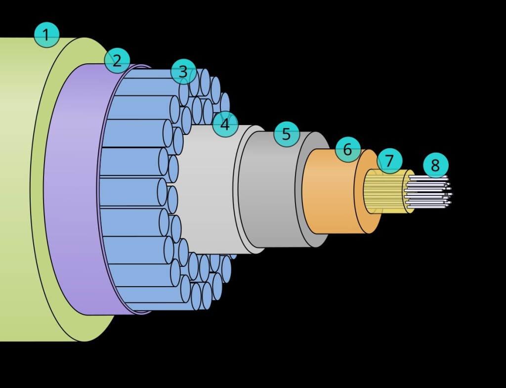
Photo by SpaceX on Pexels.comThis is a cross section of submarine fiber optic cable. Picture by Oona Räisänen (User:Mysid), Public domain, via Wikimedia Commons.
The layers in the picture of the submarine communications cable above are (from outside to inside): (1) Polyethylene (2) Mylar tape (3) Stranded steel wires (4) Aluminum water barrier (5) Polycarbonate (6) Copper or aluminum tube (7) Petroleum jelly (8) Optical fibers.
Super fact 53 : The Euler number denoted e, is an irrational number, which like the number pi is extremely important in mathematics. In addition, the relationship between the Euler number and pi; seemingly unrelated numbers, is quite amazing, especially if you throw the imaginary number: i = square root of -1 into the mix. Euler’s formula e^ix = cos(x) + isin(x), where x is degrees expressed in radians, is mind blowing to say the least. Radians means that 180 degrees is replaced by pi, and 90 degrees is replaced by pi/2, etc. A simpler special case, but equally amazing is Euler’s identity e^ix = -1, or e^ix + 1 =0. This is amazing math assuming you understand it.
As I said all this is amazing, mind blowing if you will, if you understand it, which is why I will try to explain it. Why I consider this a super fact is because when you first encounter the Euler number and the Euler formula, and you somewhat understand what it means, it is likely to be a mind-blowing experience. Those among you who have studied higher math, AP math classes in high school, or college level math are probably familiar with what I am about to describe, so your mind may not be blown. By the way you pronounce Euler like “Oiler”.
Euler’s formula in cyber space with grid 3d illustration, Asset id: 1636161301 by Giggle2000
Euler’s Number and Pi Two Irrational Numbers
Pi is the number you get when you divide the distance around a circle (the circumference) by the distance across the middle (the diameter). The Euler number is a bit more complicated to explain. I will do that next. Both pi and the Euler number are irrational numbers, which means that when written as a decimal, the number neither terminates nor repeats. As I mentioned, both pi and the Euler number are extremely important numbers in math. Perhaps the Euler should have its own day, just like pi has its own day (March 14). Maybe we should start celebrating Euler number day on February 7.
The first 20 decimals of pi and of the Euler number.
Exponents
Before I explain what, the Euler number is, I need to explain what an exponent is. If you multiply a number by itself x number of times, then x is the exponent. If you multiply two by itself four times 2*2*2*2, called 2 raised to 4, then 4 is the exponent. By the way the answer is 2^4 = 16 (called 2 raised to 4 is 16). I hope the illustration below will explain it.
Overview of exponents.
And finally, before explaining what the Euler number is I should also mention what a factorial is. The factorial of a number is the product of all positive integers less than or equal to that number. The factorial of 5 is denoted 5! and is 1*2*3*4*5 = 120. Also, the factorial of 0 or 0! = 1 (per definition).
Definition of the Euler Number
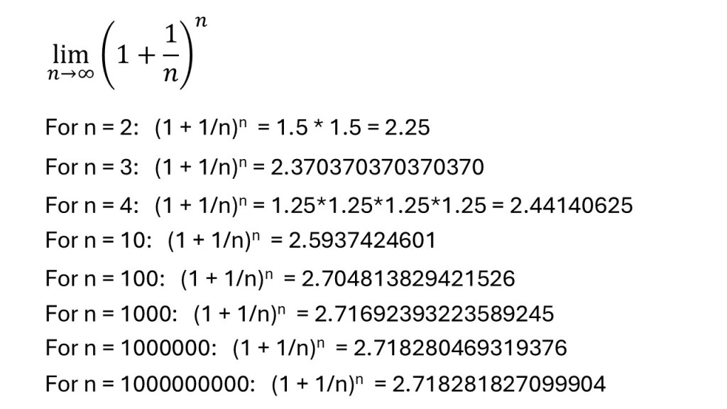
One more thing I need to explain before I go ahead with the definition for the Euler number is what is meant by allowing a number n in a formula to go towards infinity (limit –> infinity). Let’s say you have a formula that contains the number n. If the value of the formula does not change much as n becomes very large than it might be approaching a specific number as n approaches infinity. You say that it approaches a limit. I am trying to illustrate this in the picture below.
As the number n gets bigger the formula stops getting bigger and instead approaches a limit. When n approaches infinity that will be a very specific number. Which number do you think it is?The definition of Euler’s number plus an infinite series sum that is also the same as Euler’s number.Definition of the Euler’s constant in two different ways, Asset id: 1227561829, by benjaminec.
Euler’s Number in Calculus
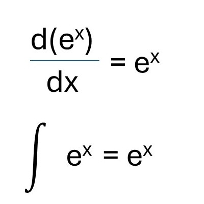
As I mentioned, Euler’s number shows up in mathematics in a lot of places. It is an extremely useful number with some amazing properties and that includes calculus. However, explaining functions and calculus may be going a bit too far, so I am just going to simply state that the derivate of e^x is just e^x and the indefinite integral, or the anti-derivative of e^x is e^x. In other words, differentiation / integration does not change this function. It also means that the slope of the curve is the same as the curve itself. Among all the infinite number of functions this is only true for e^x.
Differentiation and integration does not change the function e^x.
Trigonometric Functions
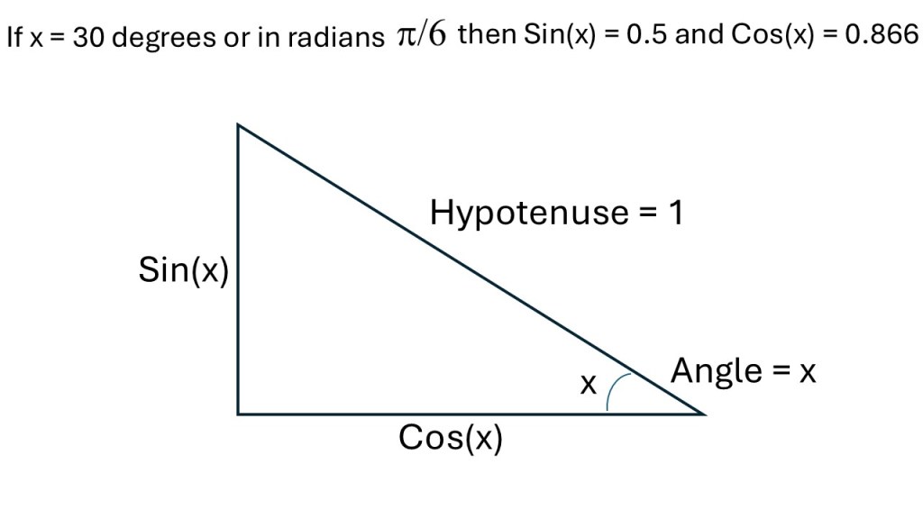
Next, I would like to launch into Euler’s formula. However, before I do that, I need to explain what trigonometric functions and imaginary numbers are. The trigonometric function sin(x) is the ratio of the length of the side opposite to a given angle to the length of the hypotenuse. In other words, if the hypotenuse is equal to 1, then sin(x) is the length of the opposite side to the given angle. The trigonometric function cos(x) is the ratio of the side of the triangle adjacent to the angle divided by the hypotenuse. In other words, if the hypotenuse is equal to 1, then cos(x) is the length of the adjacent side to the given angle.
Sin and cos are always between 1 and -1. ‘x’ is often expressed in degrees going from 0 to 360 (or 0 to 90 in a right-angled triangle). However, there is another way to express angles in triangles and that is radians. In this case the number pi corresponds to 180 degrees, pi/2 corresponds to 90 degrees, pi/4 corresponds to 45 degrees, etc. Euler’s formula uses trigonometric functions, but it only works if you use pi instead of degrees. Pi and Euler’s number have a special relationship. Sin and cos are illustrated in the picture below.
Illustration of the trigonometric functions sin(x) and cos(x).
Imaginary Numbers
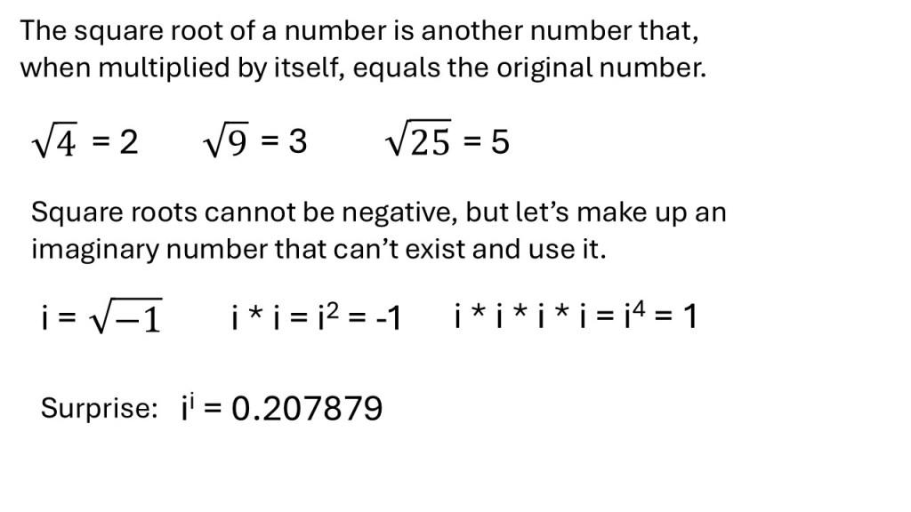
The last thing I need to explain before demonstrating Euler’s formula is imaginary numbers. The square root of a number is another number that, when multiplied by itself, equals the original number. For example, the square root of 4 is 2, because 2 * 2 = 4. The square root of 9 is 3, because 3 * 3 = 9. As long as you deal with real numbers, square roots must be positive numbers because you cannot multiply two numbers and get a negative number. -2 * -2 is 4, not -4.
However, that did not stop some mathematicians from making up a square root that was negative. This imaginary number is the square root of -1 and is referred to as i, yes just i, for imaginary. So, what’s the point of making up numbers that can’t exist? Well, it turned out to be quite useful and you can manipulate imaginary numbers to result in real numbers. For example, if you multiply the imaginary number i by itself i*i you get -1. If you multiply i by itself four times, in other words i^4, or i raised to 4, you get 1. Even more impressively, i raised to i, or i^i, is a real number. i^i = 0.207879… This is illustrated in the picture below.
Imaginary numbers illustrated
Eulers Formula
Without giving the proof, or any detailed explanations, below is Euler’s identity and Euler’s Formula (e^ix = cos(x) + isin(x)). Notice the mix of Euler’s number, pi, the trigonometric functions using radians (based on pi), and the imaginary number. Well, likely mind-blown, if you have not seen it already and you understood this post up to here.
Euler’s identity and Euler’s formula.Euler’s formula illustrated in the complex plane. Asset id: 2345669209 by Sasha701
If you want to see how you prove Euler’s Formula check out this youTube video.
If you want to learn more about the importance of Euler’s number in sommon and useful mathematics, check out this youTube video.
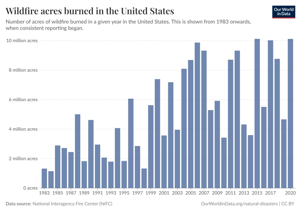
Super fact 52 : Climate change, including increased heat, extended drought, and a thirsty atmosphere, has been a key driver in increasing the risk and extent of wildfires in the United States, particularly the western United States during the last two decades. The number of Wildfire acres burned in the United States has significantly increased even though the number of wildfires has not. Another important factor is forest management.
Wildfire acres burned in the United States. Number of acres of wildfire burned in a given year in the United States. This is shown from 1983 onwards, when consistent reporting began. Data source : National Interagency Fire Center (NIFC). Presented by OurWorldinData/natural disasters.
To some people this does not come as a surprise. However, due to the complexity of the issue combined with political spin, this is a surprise to me, or even something they refuse to believe. I’ve come across many people who are surprised to hear that there really is a connection between climate change and wildfires in regions of the world which are getting dryer and hotter due to climate change. There are also others who are surprised to hear about the complex picture and the importance of good forest management. In any case, since it is a surprising fact to many, and an important fact, I consider it a super fact.
In general, you can’t look at wildfire statistics and draw conclusions without considering the context. Below are some considerations.
Wildfires are not started by climate change or poor forest management. They are started by lighting, falling powerlines, campfires that are not properly put out, and sometimes by arson. That doesn’t mean that climate change and poor forest management does not increase the risk and extent of wildfires.
Research organizations such as NOAA recognize that wildfire is a natural part of the western US ecosystem. However, climate change is significantly exacerbating the problem by creating conditions more conducive to intense and widespread wildfires.
Suppression of fire in certain ecosystems may in fact increase the likelihood that a wildfire will occur.
In the past, forests evolved with frequent, low-intensity fires that helped clear out underbrush. They can have ecological benefits. Therefore, the number of wildfires may not have increased over the last 100 years.
Local conditions and forest management have evolved through time complicating the wildfire statistics around the world.
Highly skilled hotshot firemen crew working in a challenging remote area with flames reaching the treetops. Shutter stock asset id: 2258645599 by Gorodenkoff
Fix Our Forest Act
Climate change is a huge problem that is going to take decades to tackle and the whole world needs to be involved in that effort. However, we can quickly address wildfires here in the US, especially the American West by addressing the other half of the problem, forest management. There is currently a bill in congress called the Fix Our Forest Act that does that. It streamlines and enhances forest management based on the science. In the house of representatives, it has the number H.R.471 and in the Senate it is S.1642.
I was recently in Washington DC to do volunteer lobbying for these bills. You can read about it here.
It is a long post. Just read the parts that seem interesting to you.
I am a member of a non-partisan volunteer organization called the Citizens Climate Lobby (CCL) which seeks to create political will for a livable future. At one point I was quite skeptical and doubtful of global warming or climate change or climate disruption whatever you like to call it. The reason was that I almost exclusively read and watched rightwing news media such as world-net-daily (tended to push conspiracy theories), Newsmax and Fox News.
I believed in the concept of global warming / greenhouse effect, it is basic science after all, but I thought that it was exaggerated and politicized and that it was promoted and distorted by left-wing agendas. I incorrectly believed that there was no scientific consensus on the issue. I also bought into the false narrative that this was about environmentalist ideology, politics, or even a sort of environmentalist religion, and not a real and serious problem. My disdain for environmentalists, my ideology, and my gut feelings certainly aided the propaganda in misleading me. In addition, I read a lot by Björn Lomborg and Patrick J. Michaels and I believed them.
I joined CCL because I had been so wrong, at the same time as I felt that I had finally learned something substantial about the subject, that the topic is important, and I also liked that CCL is non-partisan.
As the name Citizens Climate Lobby suggests we do a lot of lobbying. It is not the kind of paid lobbying that is done by professionals and that is often associated with money. We are average constituents, average voters, with no money, who are visiting our legislators to give them information and opinions on legislation we support or don’t support. Since we are non-partisan, we visit both Democrats and Republican offices. We just had a CCL conference in Washington DC on Sunday, Monday and Tuesday. We were 800+ volunteers who visited 400+ Congressional offices in Washington DC on Tuesday July 22nd. That is why I have not been online much for about a week.
Roughly half of the CCL volunteers at 8:00AM on Tuesday July 22nd. The others were sleeping in but joined us later. In the background you see the Capitol.
On Tuesday I visited three Texas Congressmen, including Senator Ted Cruz (R, TXJR), Congresswoman Beth Van Duyne (R, TX24), and Congressman Marc Veasey (D, TX33). We also had a zoom call with Congressman John Carter’s (R, TX31) office (the fourth meeting). I am the CCL liaison for Senator Cruz’ office and I was the one who organized our visit, from our side. It was a brief visit with Senator Cruz and a substantial discussion with a couple of his staff. Ted Cruz does not always agree with us, but we had a friendly and interesting meeting, and he and his staff appreciated us being there. Below I have included three photos from my three Tuesday meetings.
Senator Cruz hosts a Texas Tuesday Coffee for Constituents in Washington, DC on July 22, 2025. (Official U.S. Senate photo by Rebecca Hammel) Ted Cruz is standing in the back between the flags. I am in the front row, second from the right wearing a blue suit. We are twelve people.CCL volunteers meeting with a legislative aide, Isabel de Antonio, working for congresswoman Beth Van Duyne, Republican, Texas district 24 (that’s where I live). Isabel de Antonio is the one wearing a white shirt. I am standing on the far left. Eric, a CCL volunteer, is taking the photo and is not in the picture.CCL volunteers meeting with a legislative aide, Mike Burnside, working for congressman Mark Veasey, Democrat, Texas district 33. We also had a constituent and liaison representing 192 CCL volunteers in TX33 call into the meeting. Mike Burnside is the one wearing a white shirt. I am standing second from the left.
Overview of the Five Asks
With this post I wanted to show our Asks, so that readers know what we ask from our politicians. I do not expect anyone to read the CCL handouts below. I am including them to illustrate how we approach legislation. Don’t worry about the details. Trust me, the actual bills are even longer (the poor staffers of the politicians must read it). I can add that our Vice President of Government Affairs (CCL employee), Jennifer Tyler, was the Deputy Chief of Staff and Legislative Director for the Republican Congressman John Katko (NY-24). Having been a prominent leader in the Republican Party she is able to craft legislative Asks that not only appeal to Democrats but to Republicans as well.
I can add that CCL has a small staff consisting of highly educated people including climate scientists and policy experts. The CCL board features prominent climate scientists and prominent politicians and economists. George W. Schulz, Ronald Reagan’s Secretary of State, was (well is as an honorary member) on the CCL board but he passed away. I also think that CCL volunteers tend to be more nerdy than average. A lot of our volunteers are scientists, physicians, brain surgeons, engineers, PhDs, psychologists, authors, artists, businessmen, business owners, oil executives, etc., but naturally everyone is welcome. We are a well-informed volunteer organization and as a result both Democratic and Republican offices see us as a great resource for information and ideas.
These were our six Asks. As you can see, not all of them apply to both parties. One Ask is only for Republicans because Democrats are already fully onboard. One Ask is only for Democrats because the Republicans are already fully onboard. Another Ask is only for Republicans because there’s no chance Democrats will support it (but Republicans have more votes). In other words, an emissions and pollution reducing mix of Asks that overall is bipartisan.
Support the Clean Energy Transition – Fund Key Clean Energy Programs in FY26 Appropriations – Democrats + Republicans.
Support the Clean Energy Transition – Fix Clean Energy Tax Credit Implementation – Republicans only, because Democrats are already full onboard.
Support the Clean Energy Transition – Advance Smart Permitting Reform for Energy Projects – Democrats + Republicans but different handouts.
Support H.R. 471, the Bipartisan Fix Our Forests Act – Democrats only because Republicans already fully onboard.
Support S. 1462, the Bipartisan Fix Our Forests Act – Democrats + Republicans.
Support Foreign Pollution Tariff Legislation – Republicans only, because we know Democrats are against it.
Funding Clean Energy Research
Fund Key Clean Energy Programs in FY26 Appropriations was the first part of three parts for our primary Ask : Support the Clean Energy Transition. The 2025 Budget Reconciliation Bill (One Big Beautiful Bill) cuts funding from two research organizations, the Office of Energy Efficiency and Renewable Energy (EERE) and the Advanced Research Projects Agency (ARPA-E). ARPA by the way is a prominent research organization, it is, for example, responsible for the creation of the internet. The reason we are asking to restore some of the funding for these organizations is because the world is moving towards clean energy and recently China has aggressively invested in clean energy. Cutting research in this area is a recipe for getting behind.
Clean Energy Tax Credits
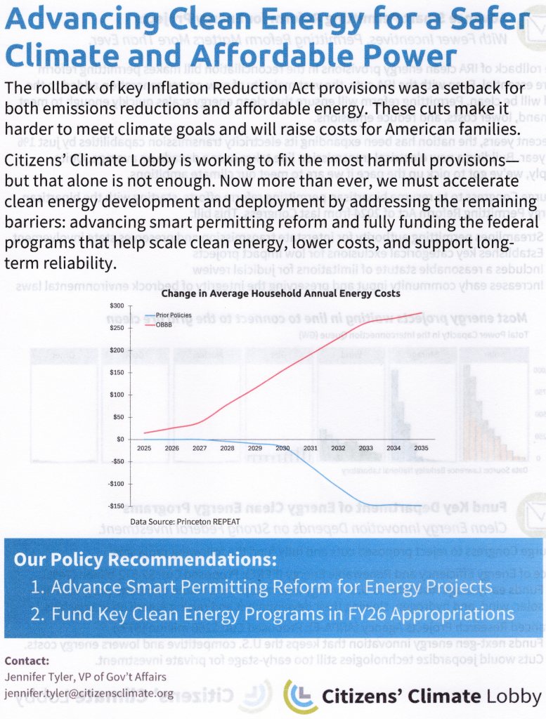
The Clean Energy Tax Credits were significantly cut in the Budget Reconciliation Bill. It was specifically provision 48E, investment credits for wind and solar, 45Y, tax credits for wind and solar, 25C, tax credits for home efficiency improvements, such as insulation, energy efficient doors and windows, etc., that were cut. I should say that the 48E and 45Y for other types of clean energy, such as Nuclear, Geothermal, Hydro, and Biofuels, stayed, which we are grateful for.
The reason we are asking to restore some of the tax credits for wind and solar, is not that they need the tax credits to survive. Wind and solar energy are very cheap, and they are doing very well. However, they are prominent sources of clean energy and removal of the tax credits will significantly increase the energy cost for consumers, as you can see in the graph below. The loss of the credits will also result in the loss of jobs and investments in projects already underway. A list of the effected investments and projects in the US listed per congressional district can be seen in this link. Since virtually all Democrats already support the restoration of the clean energy tax/investment credits, we are only asking this from Republicans. Admittedly this is a tough one for them.
Smart Permitting Reform for Energy Projects
The third part of the Primary Ask is Smart Permitting Reform for Energy Projects. What many people don’t realize is that what is holding clean energy back the most is not the cost or time for building wind and solar. That is relatively easy. The big obstacle is getting permits to build the energy plants and permits to build transmission lines needed to bring the electricity to our homes. In both cases the process is typically at least ten years. However, by cutting red tape and streamlining the process it could be reduced to around a year.
This applies not only to wind and solar but to all types of energy, which is why Republicans tend to support permitting reform. Since most of the new energy coming online is wind and solar, and they often replace dirty coal, thus reducing emissions, we strongly support permitting reform. We have done the research, so we know that this is a very good way to reduce emissions. In this case we formulated the Ask differently for Republicans and Democrats.
Primary Asks Sheets
Our primary Asks for Republicans. We are asking the same thing from Democrats and Republicans, but the presentation is different. Notice that in both cases we are pointing out that the removal of the Clean Energy Tax Credits for Wind and Solar in the 2025 Budget Reconciliation Bill (One Big Beautiful Bill) will increase costs for consumers. In the Republican version we are pointing out that not funding research into clean energy will put us behind the rest of the world, especially China, which is aggressively pursuing development in clean energy.Second page of primary Asks for Republicans.Our primary Asks for Democrats. Notice that in this case we are not asking them to fix the Clean Energy Tax Credit Implementation. The reason being that they are already 100% behind it.Second page of primary Asks for Democrats
Fix Our Forest Act
Our first Secondary Ask is Support H.R. 471, the Bipartisan Fix Our Forests Act, when it Comes Back to the House. To explain, it was voted on in the house, sent to the Senate where they made some changes, so it needs to be voted on again in the house. This is an Ask that we reserved for Democrats. It was not because we thought Republicans wouldn’t like it but because they had already voted Yes for it unanimously. We know the Republicans like it. However, we needed to make sure the Democrats who were less favorable of it would not turn against it, which is why we are asking them to vote yes on it.
To explain what the bill is about, scientists have concluded that climate change and poor forest management are both making wildfires worse, at least in the United States. Out of control wildfires in turn make climate change worse. Climate change will take several decades to fix and requires the whole world to act. However, improving forest management we can do today for ourselves. To read the full text of the original house bill click here. To read the full text of the Senate version of the bill (S.1462) click here.
This is the house version H.R.471 of the Fix Our Forest Act. It already has full Republican support in the house, so we are only asking Democrats to support it.This is the Senate version S.1462 of the Fix Our Forest Act. We are asking both Republican and Democratic Senators to support it.
Foreign Pollution Fee
The Foreign Pollution Fee Act S.1325 (full text in link) was introduced in the Senate by Senator Lindsey Graham (R). This is a resolution that if it becomes law would greatly reduce carbon emissions around the world, and yet it is pretty much only supported by Republicans. It might come as a surprise that there is a pro-climate resolution that’s almost entirely Republican, but it happens sometimes. Our goal is to get close to unanimous Republican support and with the help of a few moderate Democrats get it passed.
Some background, China emits more carbon pollution than any country on earth. On the other hand, there are 1.4 billion people in China and per capita they emit only half that of the United States, which comes in at number two with respect to total emissions. In addition, the United States is the country that has emitted the most carbon emissions over time. On the other hand, the US emissions are going down, unlike China’s, and more importantly in this context, certain products such as steel, aluminum, fossil fuels, etc., are produced creating a lot more emissions in China than in the US, which has cleaner manufacturing. For example, one ton of steel produced in China or Russia result in four times as much carbon emissions as the same ton of steel produced in the US. It is not fair to cleaner US manufacturers to import products from dirty manufacturers without taking into account the cost of pollution to all of us.
Make “Filthy Pollution Havens” Pay at the Border. Support Foreign Pollution Tariff Legislation.
Washington DC Congressional Buildings
The congressional buildings are the three buildings that are part of the house of representatives, Rayburn, Longworth, and Cannon, and the three Senate buildings, Russel, Dirksen and Hart. I encircled them in red in the map below. If you are visiting several offices, there is going to be a lot of walking. Therefore, women should bring a comfortable pair of shoes in a backpack in addition to nice shoes for inside the buildings.
I can add that the offices in Rayburn are bigger and nicer than the offices in Longworth and Cannon, and Rayburn has the main nice cafeteria. Longtime congressman tends to have their offices in Rayburn. The same is true for the Senate. Russel has the nicest offices and the best cafeteria, and the long-time Senators tend to be in Russel. Ted Cruz is in Russel 167. He has a great office.
This is a map of the Congressional buildings. The three houses of representatives’ buildings, Rayburn, Longworth and Cannon, are towards the bottom encircled by a red line. The three Senate buildings, Russel, Dirksen and Hart are towards the top left encircled by a red line.
In case you are interested, this is the full text of the 2025 Reconciliation Budget Bill H.R.1. The nickname for the bill is One Big Beautiful Bill. Warning, it is very big. Beautiful is a matter of opinion.
My Super Fact List
This is not a super fact post. Just an informational post. If you want to see my list of super facts, click the link below.