Super fact 45 : Deforestation peaked back in the 1980s, meaning that is when it was worst. Deforestation has not stopped but the rate of deforestation has slowed as a result of government policies, corporate initiatives, and international agreements.
The rate of global deforestation has slowed significantly since the 1980s. Overall we are still losing forests. We had a 47-million-hectare loss of forest in the last decade, which is very bad, but that is better than the 151-million-hectare loss of forest in the 1980s. For temperate forests we have succeeded in reversing deforestation and temperate forests are now gaining forest. To read more about how government policies, corporate initiatives, and international agreements have slowed the rate of deforestation you can click here, or here, or here.

This is a super fact because we get a lot of bad news about deforestation, and we should, it is still a big problem. However, we are making progress and because of our negativity bias as well as that of the media, we tend to miss the story about the progress. Therefore, the fact that we are making progress comes as a surprise to many people.

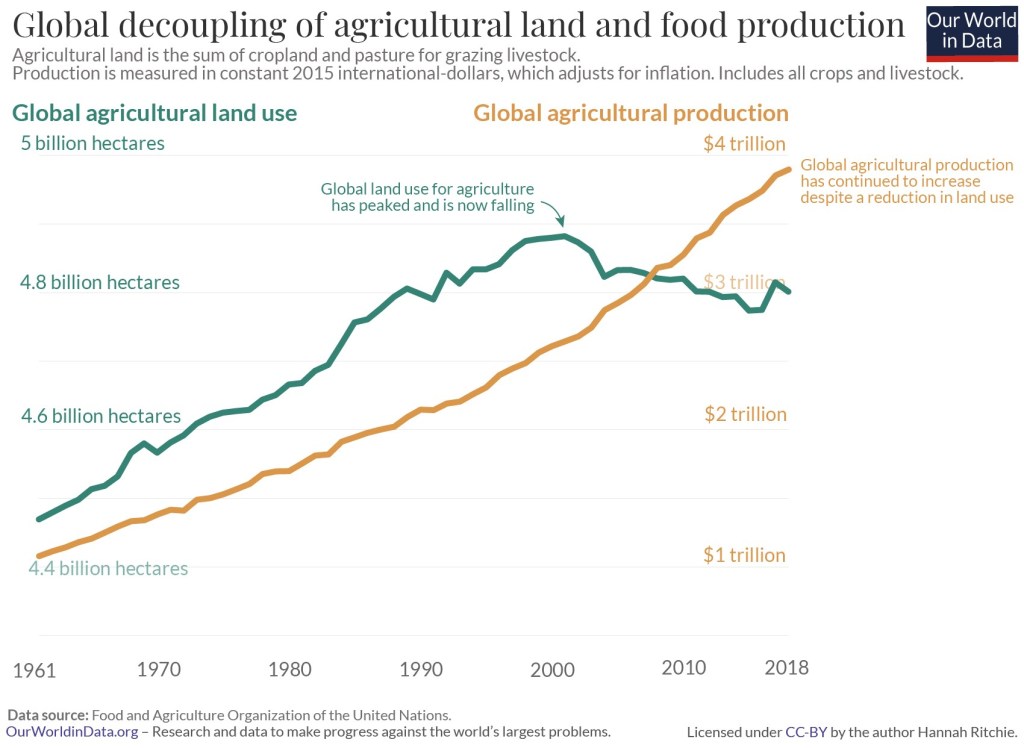
Peak Agricultural Land
There is one aspect to this story which both explains part of the reduction in deforestation but also provides additional hope for the future and that is that even though the world produces more food than ever, the amount of land we use for doing that is falling. Global land use for agriculture has peaked and is now falling. There has been a global decoupling of agricultural land and food production. I should explain that agricultural land is the total amount of arable land that is used to grow crops, and pasture used to raise livestock. That global land use for agriculture has peaked is illustrated in the graph below.
There are more trees now than 35 years ago (there’s a catch)
Another related good news story is that there are more trees in the world today than there were 35 years ago. A lot of the losses of forest in tropical areas have been compensated for by gains in Europe, North America and Asia. For example, tree planting programs in places like China have added a lot of trees as well as forests. In addition to tree planting programs climate change resulting in northern latitudes warming has resulted in temperate forests expanding.
However, this story is not as good as it sounds. There is a huge catch and that is that there is an important distinction between tree cover and forest cover. Tree cover refers to the total area covered by trees, while forest cover specifically refers to areas where trees form a forest ecosystem. Tree cover has increased but as you can guess from the graph above depicting global deforestation, the forest cover continues to decrease.
In addition, a lot of trees were planted for industrial timber plantations, mature oil palm estates and other specifically planted forests. These add to the global tree cover but not necessarily to biodiversity. Not all tree planting is equal.
So even though having more trees compared to 35 years ago is a good thing, it may not be as great as it sounds and does not contradict the fact that deforestation continues. This is important to point out because there are those who attempt to use the fact that we now have more trees to make the case that the talk about deforestation is a hoax. Don’t fall for that.
Summary
The good news is that even though deforestation is still happening the rate of it has slowed down. It peaked in the 1980s. This slowdown is largely due to government policies, corporate initiatives, and international agreements. An additional circumstance that aids in slowing deforestation is that the amount of land we use for agriculture is falling and we have passed peak land use for agriculture. Another positive situation is that we now have more trees than 35 years ago.
However, it is important to point out that does not mean that deforestation has been reversed. Tree cover and forest cover are not the same thing. The benefit of this is limited even though it is still a good thing to have more trees.
Environmental Success Stories
Aside from the success in reducing the rate of deforestation there is additional surprising, as well as good news regarding the environment.
- Emissions of ozone-depleting gases have fallen by 99 Percent. This is a very important one that is saving millions of lives every year (preventing skin cancer).
- Natural Disasters Kill Less People Now Than 100 Years Ago. We have gotten much better at protecting lives in natural disasters and less people die in natural disasters despite the increase in frequency, severity and cost of certain natural disasters.
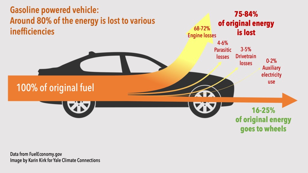
- EV Cars Indeed Emit Less Carbon Pollution. Due to misinformation spread about EVs this comes as a surprise to many.
- Developed nations have successfully reduced carbon emissions.
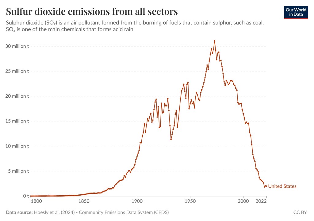
- Sulfur dioxide pollution has fallen by 95 percent in the US.