Child mortality has declined Globally yet Five Million Children Die Annually

Super fact 137 : Child mortality has sharply declined in all world regions. Despite that fact, five million children die every year. Most of these deaths are preventable.
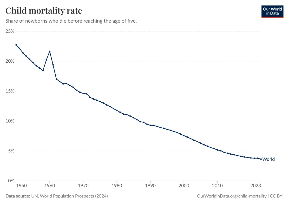
The graph shows the child mortality rate steadily declining curve going from 22.7% in 1950 to 3.6% in 2023. There is a significant uptick in 1960. | Child mortality has declined Globally yet Five Million Children Die Annually
Child mortality rate worldwide. Share of newborns who die before reaching the age of five. Data source: UN, World Population Prospects (2024) – Learn more about this data. OurWorldinData.org/child-mortality | CC BY

The graph above shows the probability a newborn would die before reaching the age of five if the year’s age-specific mortality rates stayed unchanged. It is not the share of an actual cohort that has been observed dying. As you can see, the child mortality worldwide has gone from 22.7% in 1950 to 3.6% in 2023. That is more than a sixfold improvement. The significant uptick in child mortality in 1960 is because of the Great Leap Forward in China.

The graph below shows that the sharp decline in child mortality exists across all regions of the world. The graph depicts the child mortality rate for Africa, Asia, Oceania, Latin America and the Caribbean, Northern America, Europe and the whole world. You can play around with the graph and select your own regions and countries by clicking here. Note that Africa is the region with the worst numbers. However, the decline in child mortality still goes from 32.7% in 1950 to 6.3% in 2023, a fivefold decline.
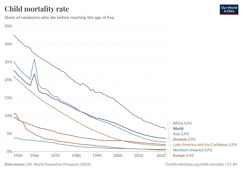
The graph shows the child mortality rate from 1950 to 2023 for Africa, Asia, Oceania, Latin America and the Caribbean, Northern America, Europe and the whole world. The graphs have different colors. The decline in child mortality for Africa goes from 32.7% in 1950 to 6.3% in 2023, a fivefold decline.
Child mortality rate. Share of newborns who die before reaching the age of five. Data source: UN, World Population Prospects (2024). OurWorldinData.org/child-mortality | CC BY

If you look further back in time the numbers are not as accurate, but they are a lot more impressive. In the maps below you can see that the child mortality rate in the 1800 is estimated to be between 30% and 60% everywhere in the world. If you look at the bottom map, you’ll see that the countries that are the worst off with respect to the child mortality rate in 2015 have a child mortality rate of 14%. That means that the worst off country in the 21st century is much better off than any of the countries were in the 1800. You can read more about this map and related information here.
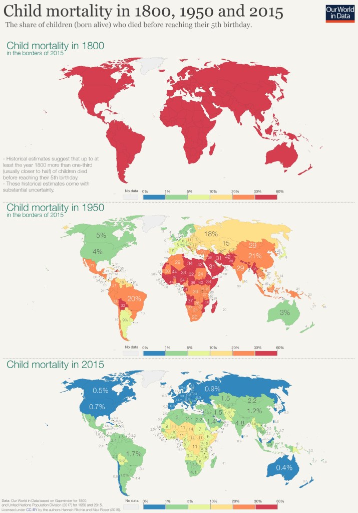
The picture includes three world maps with the continents and countries outlined. They correspond to 1800, 1950 and 2015 respectively. The different colors indicate the child mortality rate. The worst child mortality rate is between 30% and 60% and is indicated in red. The top map for 1800 is all red. The map for 1950 features some countries in Africa that are red. In 2015 there are not countries indicated in red. | Child mortality has declined Globally yet Five Million Children Die Annually
Child mortality in 1800, 1950 and 2015. The share of children (born alive) who died before reaching their 5th birthday. Data: Our World in Data based on Gapminder for 1800, and United Nationas Population Division (2017) for 1950 and 2015. Licensed under CC-BY by the authors Hannah Ritchie and Max Roser (2019).

However, a child mortality rate of 3.6% still means that nearly five million children die every year before the age of five. The UN estimates that 990 million children have died globally since 1950. Most of these deaths are preventable. Infectious diseases and birth disorders (primarily preterm births and neonatal suffocation) dominate deaths among children under five. The impressive and almost steady decline in the child mortality rate across all regions in the world is a positive but surprising and important fact.

However, the fact that despite the success in reducing the child mortality rate five million children still die, and those deaths are preventable is a surprising but less positive fact. That’s why I consider this a super fact.

Look at the bottom half on the following page for details about the original sources.

Additional Child Mortality Rate Graphs and Maps
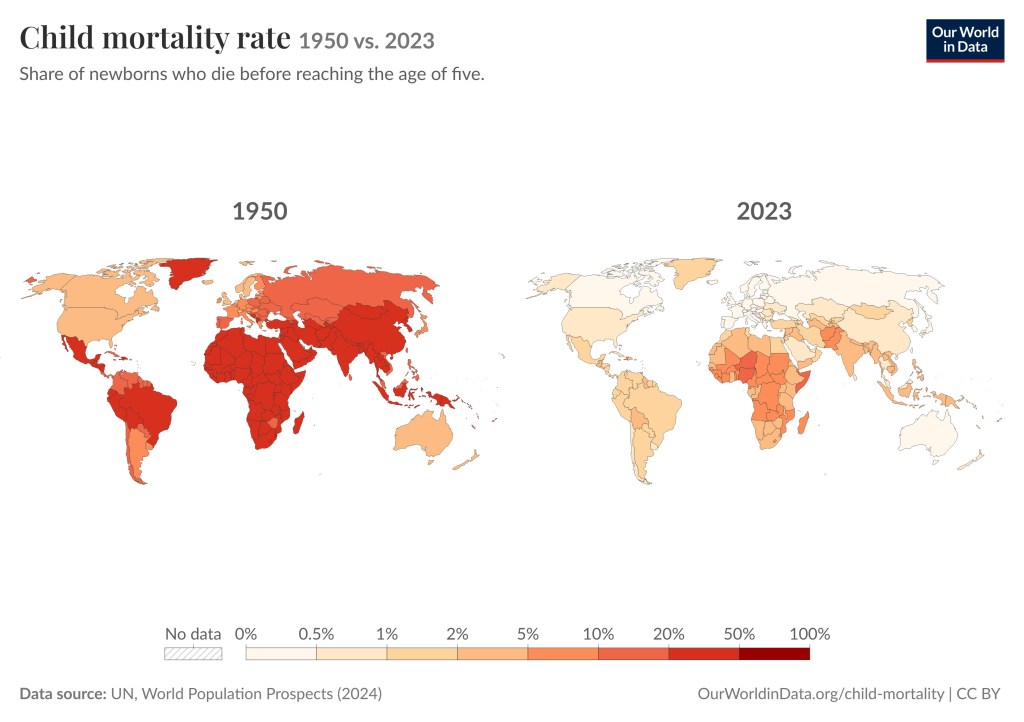
The pictures show two world maps side by side. The map on the left is for 1950 and the map on the right is for 2023. Red in the map indicates a child mortality rate between 20% and 50%. In the map for 1950 most of Africa, south and east Asia, and Latin America are red. No country is red in the 2023 map.
Child mortality rate 1950 vs. 2023. Share of newborns who die before reaching the age of five. Data source: UN, World Population Prospects (2024) OurWorldinData.org/child-mortality | CC BY
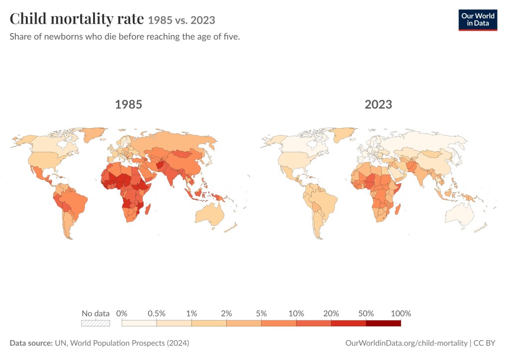
The pictures show two world maps side by side. The map on the left is for 1985 and the map on the right is for 2023. Red in the map indicates a child mortality rate between 20% and 50%. In the map for 1985 a few countries in Africa are red. No country is red in the 2023 map. | Child mortality has declined Globally yet Five Million Children Die Annually
Child mortality rate 1985 vs. 2023. Share of newborns who die before reaching the age of five. Data source: UN, World Population Prospects (2024) OurWorldinData.org/child-mortality | CC BY

In the graph below notice that Japan shows a decline in the child mortality rate from 9% in 1950 to 0.2% in 2023, which is quite impressive.
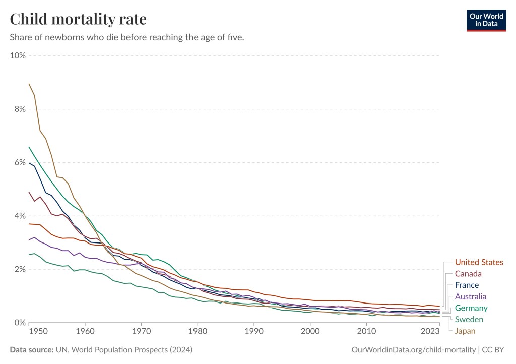
Japan shows a decline in the child mortality rate from 9% in 1950 to 0.2% in 2023. However, all graphs show a significant decline in the child mortality rate.
Child mortality rate in selected developed countries from 1950 to 2023, including the United States, Canada, France, Australia, Germany, Sweden and Japan. Share of newborns who die before reaching the age of five. Data source: UN, World Population Prospects (2024) OurWorldinData.org/child-mortality | CC BY
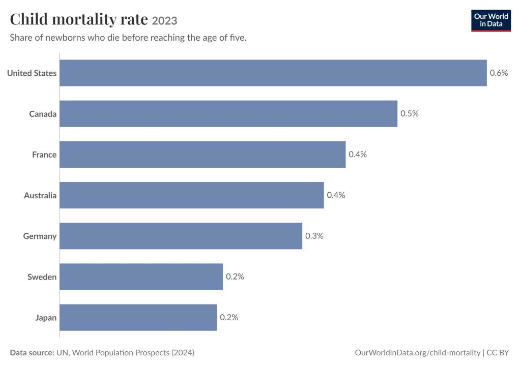
United States (0.6%), Canada (0.5%), France (0.4%), Australia (0.4%), Germany (0.3%), Sweden (0.2%) and Japan (0.2%).
Child mortality rate in selected developed countries in 2023, including the United States, Canada, France, Australia, Germany, Sweden and Japan. The child mortality rate is represented as bar graphs. Share of newborns who die before reaching the age of five. Data source: UN, World Population Prospects (2024) OurWorldinData.org/child-mortality | CC BY
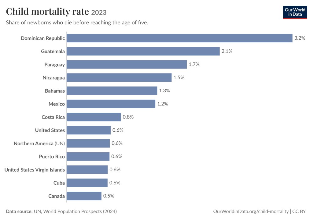
The bar graph shows the child mortality rate for North American countries in 2023. From best to worst, Canada 0.5%, Cuba 0.6%, United States Virgin Islands 0.6%, Puerto Rico 0.6%, Northern America 0.6%, United States 0.6%, Costa Rica 0.8%, Mexico 1.2%, Bahamas 1.3%, Nicaragua 1.5%, Paraguay 1.7%, Guatemala 2.1%, Dominican Republic 3.2%
Child mortality rate in North American countries 2023. Share of newborns who die before reaching the age of five. Data source: UN, World Population Prospects (2024 OurWorldinData.org/child-mortality | CC BY

The Death of Five Million Children

Five million children die every year — what do they die from?

44% died from infectious diseases including pneumonia, influenza, covid-19, malaria, rotavirus, cholera,  typhoid, hepatitis, encephalitis, measles, whooping cough, and meningitis, STDs, tuberculosis, and HIV/AIDS. It may come as a surprise that 118,000 children died from measles in 2023 and 95,600 children died from whopping cough in 2023.

42% died from birth disorders including preterm birth, neonatal asphyxia, heart abnormalities, neonatal sepsis, etc. The remaining 14% were cardiovascular diseases, digestive diseases, genetic blood disorders, malnutrition, cancers, accidents such as drowning and transport accidents. You read the details and check the graphics here.

Related Super Facts


To see the other Super Facts click here

Poverty and child mortality has been sharply reduced worldwide

Superfact 7 : Poverty and child mortality has been sharply reduced worldwide.

Extreme poverty as well as child mortality has been sharply reduced the world over. The countries that are the worst-off today are still better off than the countries that were doing the best at the beginning of the 19th century. Over the last 20 years extreme poverty and child mortality has continued to decline sharply.

In Hans Rosling’s book Factfulness, “Ten Reasons We’re are Wrong About the World – and Why Things Are Better Than You Think”, the author presented a quiz that he wanted the reader to take before reading the book. Below is the third question of the quiz. I should say that Hans Rosling posed this and other questions to thousands of people around the world.

In the last 20 years, the proportion of the World population living in extreme poverty has…

  • A. Almost doubled
  • B. Remained more or less the same
  • C. Almost halved

The correct answer is C. Almost halved. Around 7% of the quiz takers got the right answer. Around 5% in the United States got it right. That the proportion of the World population living in extreme poverty halved in 20 years is a true fact. This is also an important fact about the world. Despite that most people got it wrong. In fact, monkeys randomly picking answers would do better (33%). I did pretty well on this quiz, but since I was reading the book and the book’s title is “Ten Reasons We’re are Wrong About the World – and Why Things Are Better Than You Think”,  I got some help just looking at the front cover. In any case, I think this fact qualifies as a super fact, as do the other fact below (There has been a steep decline in child mortality).

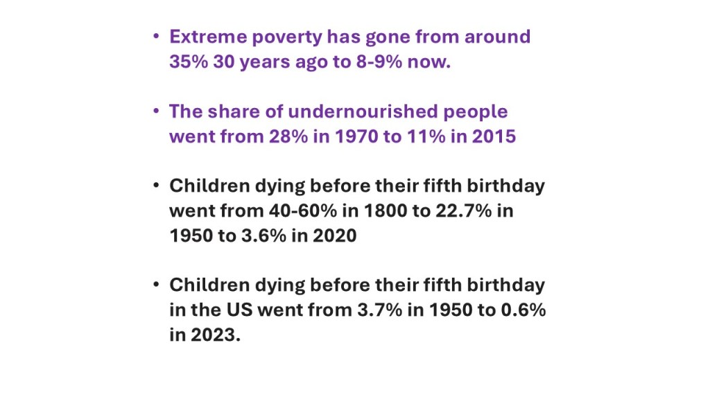
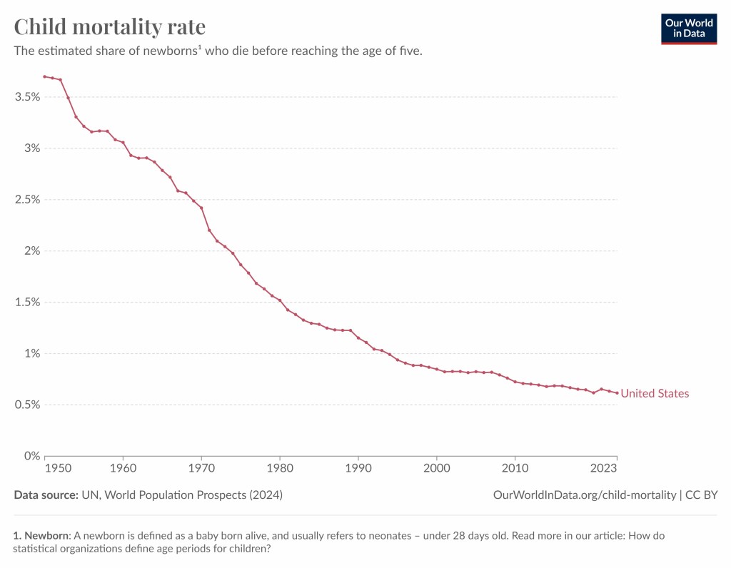
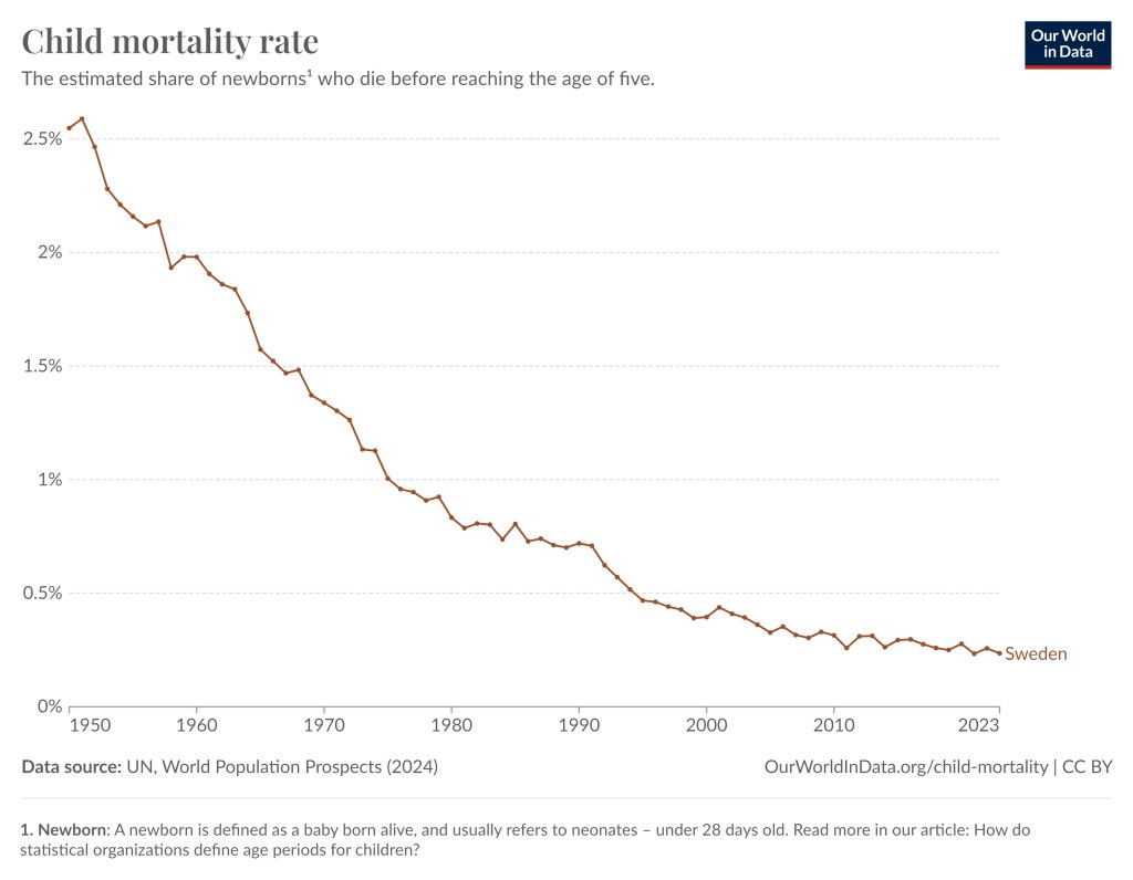
This picture feature five statements (1) Extreme poverty has gone from around 35% 30 years ago to 8-9% now. (2) The share of undernourished people went from 28% in 1970 to 11% in 2015. (3) Children dying before their fifth birthday went from 40-60% in 1800 to 22.7% in 1950 to 3.6% in 2020. (4) Children dying before their fifth birthday in the US went from 3.7% in 1950 to 0.6% in 2023.
These are selected facts from the data.

There has been a steep decline in extreme poverty

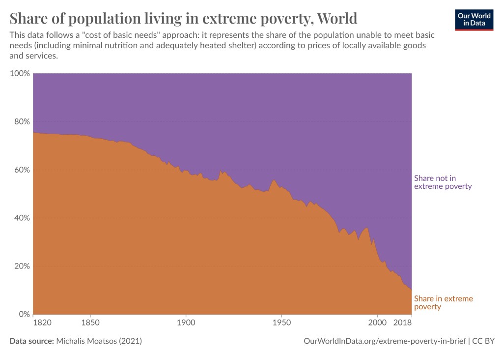
According to the World Bank and Our Data World in Data, an organization which makes data in databases easily accessible to public, extreme poverty went from almost 80% 200 years ago, 60% 100 years ago, about 45% 50 years ago, 34.3% 30 years ago, 23.6%  20 years ago, 8.4% in 2019, then it went up to 9% during the covid epidemic but it seems to be back down to a bit above 8% again. See the graph below as well as the two linked articles in this paragraph.

I should say that extreme poverty is (by the UN, World Bank, etc.) “a condition characterized by severe deprivation of basic human needs, including food, safe drinking water, sanitation facilities, health, shelter, education and information” and is currently defined to be below $2.15. In 2011 it was below $1.90.

The graph shows share living in extreme poverty in brown and share not living in extreme poverty in purple. The graph begins in 1820 at ends in 2018.
This graph from Our World In Data shows a steep decline in extreme poverty over time. Click on the picture to visit the original article.

Other related statistics mentioned in Hans Rosling’s book is that the share of undernourished people went from 28% in 1970 to 11% in 2015. That is despite the earth’s growing population. Related to this is that cereal yield per hectare went from 1.4 ton in 1961 to 4 ton in 2014. This is due to modern agricultural techniques. The share of people with water from protected sources went from 58% in 1980 to 88% in 2015. This statistic was taken from WHO, UNICEF, the World Bank and FAO (the UN Food and Agriculture Organization).

There has been a steep decline in child mortality

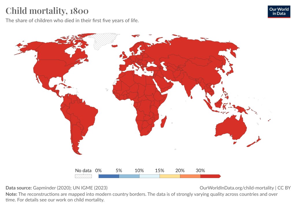
According to Hans Rosling’s book the percent of children dying before their fifth birthday went from 44% in 1800 to 4% in 2016. To get a more complete picture see these articles from Our World In Data, article1, article2, as well as the graph below. For most of humanities existence virtually all societies suffered a child mortality rate between 40% and 60%, but that changed drastically over the last 100 years.

This graph is a world map showing the child mortality rate in different countries as indicated by colors. All countries are red, meaning it is above 30%.
Child mortality rate worldwide in 1800. Some of the data are estimates and may not be reliable. Data sources are UN IGME and Gapminder (an organization similar to Our World In Data).
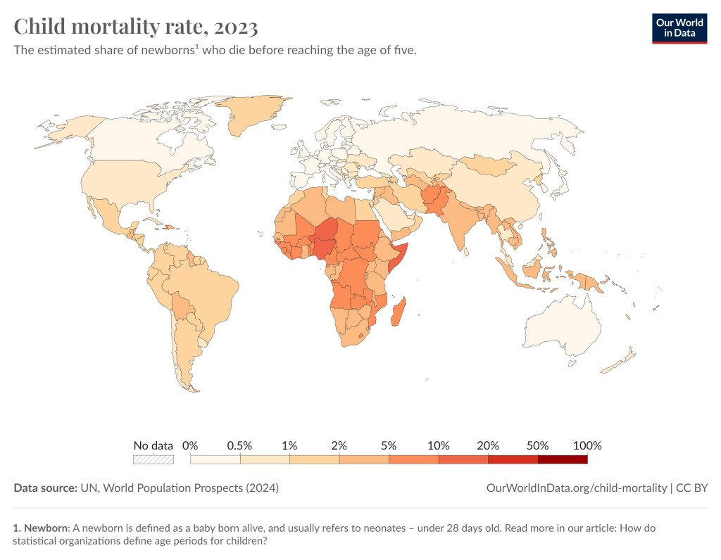
This graph is a world map showing the child mortality rate in different countries as indicated by colors. Niger has the highest child mortality rate of 11.6% and Iceland the lowest at 0.2%.
Child mortality rate worldwide in 2023. Niger has the highest child mortality rate of 11.6% and Iceland the lowest at 0.2%.
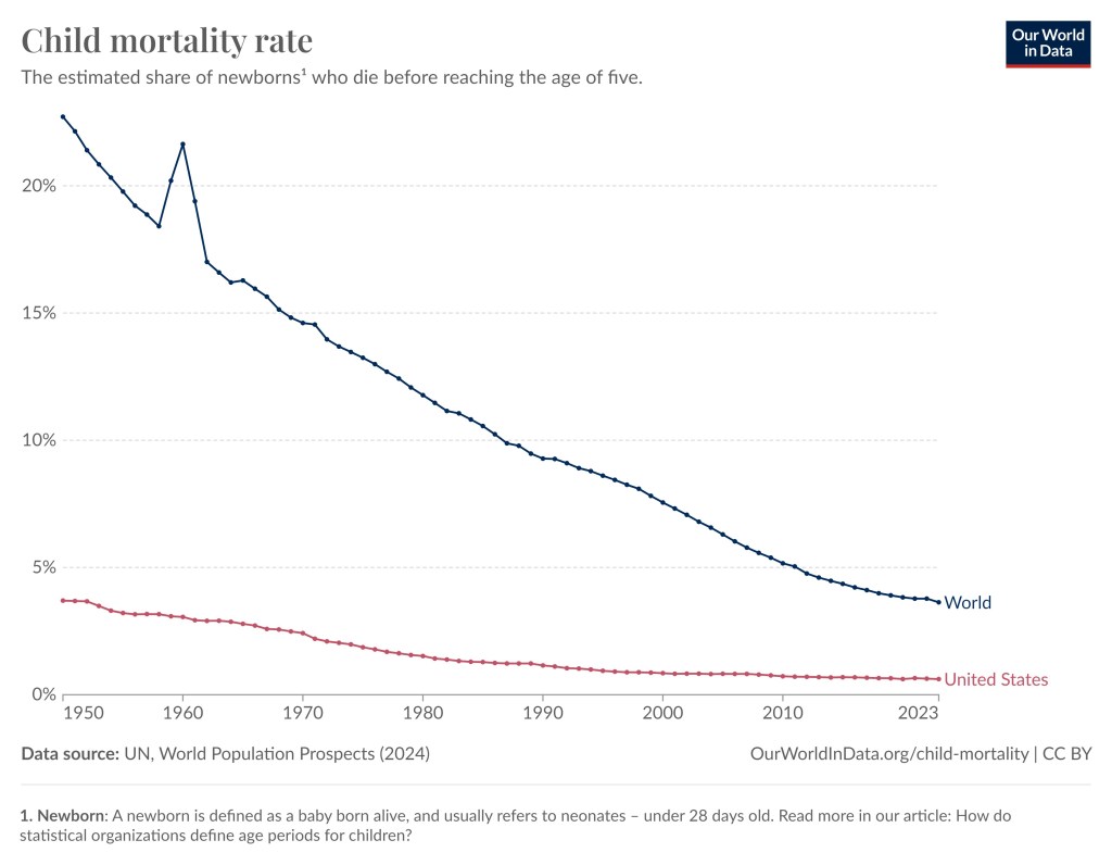
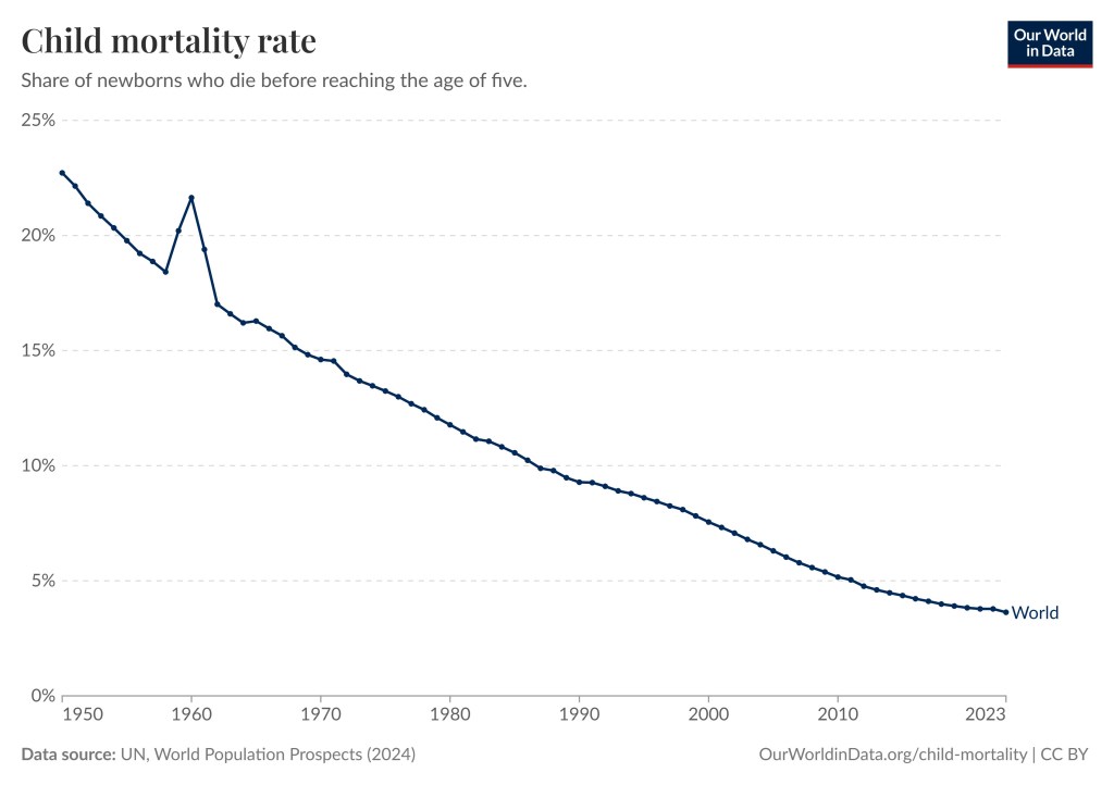
This graphics contain two graphs one for the world (blue) and for the United States (red) | Poverty and child mortality has been sharply reduced worldwide
Child mortality in in the world since 1950. The spike you see around the end of 1950 to 1960 is the great leap forward famine in China. In 1950 the child mortality rate was 22.7% and 2023 the child mortality rate was 3.6%.

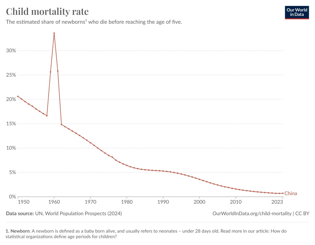
Below is the child mortality rate since 1950 for a few selected countries.

The red graph is showing a decline from 20% in 1950 to 0.7% in 2023 with a spike of almost 40% around 1960 | Poverty and child mortality has been sharply reduced worldwide
Child mortality in China since 1950. The large spike you see around the end of 1950 to 1960 is the great leap forward famine. 15 to 55 million died from starvation. In 2023 the child mortality rate was 0.7%.
The graph shows a steady decline from 3.7% in 1950 to 0.6% in 2023. The decline of the graph is slower towards the end | Poverty and child mortality has been sharply reduced worldwide
Child mortality in the United States since 1950 (3.7%). In 2023 the child mortality rate was 0.6%.
The graph shows a steady decline from 2.6% in 1950 to 0.2% in 2023 | Poverty and child mortality has been sharply reduced worldwide
Child mortality in Sweden since 1950 (2.6%). In 2023 the child mortality rate was 0.2%.


To see the other Super Facts click here