The goal of this blog is to create a list of super facts. Important facts that are true with very high certainty and yet surprising, misunderstood, or disputed by many. This blog aims to be challenging, educational, and fun, without it being clickbait. I determine veracity using evidence, data from reputable sources and longstanding scientific consensus. Prepare to be challenged (I am). Intentionally seek the truth not confirmation of your belief.
Today, June 6 is the National Day of Sweden (or the Independence Day of Sweden). Gustav Vasa, or Gustav I, Sweden’s hero king and the father of modern Sweden, was elected king of Sweden on June 6th, 1523. This was after the Swedish War of Liberation from Denmark 1521 to 1523. Gustav rose to lead the Swedish War of Liberation following the Stockholm Bloodbath, where his father was executed. Gustav Vasa or Gustav I was King of Sweden from 1523 until his death in 1560. Since I am originally Swedish (now living in Texas) June 6 is a significant date for me.
This picture is how I imagine Gustav Vasa at his coronation. BTW this is a submission for Kevin’s No Theme ThursdayThis is how I imagine Gustav Vasa’s marriage to Catherine of Saxe-Lauenburg on September 24th, 1531. This picture is also from Kevin’s No Theme Thursday
Depictions of Gustav Vasa
Kevin’s pictures above were, like I said, how I imagine Gustav Vasa. The depictions below might be closer to the truth.
Painting of Gustav I Vasa. Fashion was somewhat different back in the day.Portrait of Gustav Vasa (from Wikipedia Commons).
The Kalmar Union
In 1397 a union was formed between Denmark, Norway and Sweden called the Kalmar Union (Kalmar is a city a Sweden). The Kalmar Union came to be dominated by Denmark and there were occasional rebellions. During Gustav’s childhood, parts of the Swedish nobility tried to make Sweden independent. Gustav’s father Erik Johansson Vasa was part of that nobility.
After some problematic interactions with Denmark and the Danish King Christian II, King Christian massacred 100 Swedish nobles, November 7-9, 1520, on Stortorget in Stockholm, including Gustav’s father. In 1521 Gustav led a rebellion (or a civil war) against Denmark, which ended in the deposition of King Christian II from the throne of Sweden, effectively ending the Kalmar Union. I can add that King Christian is called Christian the Tyrant in Sweden and Christian the good in Denmark.
Sweden and Denmark has had a complicated history that included a lot of hostilities and eleven wars, but you wouldn’t know it if you looked at the situation today. There hasn’t been a war between Sweden and Denmark in more than 180 years and Swedes and Danes get along very well. However, it is best not to bring up the past. That is probably true for marriages as well.
Denmark vs Sweden. The yellow and blue flag is the Swedish flag. Red and white is the Danish. Shutterstock Stock Photo ID: 1114320377 by Hasanov Jeyhun.
Gustav Vasa’s Burial Place
Gustav Vasa died on September 29, 1560, and is buried together with three of his wives (while only two are engraved) in the Cathedral of Uppsala. Uppsala is an old city north of Stockholm famous for its Viking graves/mounds. During the Viking era Uppsala was the religious center of Sweden. Later as Sweden became Christian it remained the religious center of Sweden, however, the Viking temple in old Uppsala was replaced by a Christian church. Uppsala hosts one of the most prominent Universities in the world and it also happens to be where I studied Engineering Physics.
The largest cathedral in Sweden, Uppsala Domkyrka. This is where Gustav I Vasa is buried. Gustav I is arguably Sweden’s most prominent king.Inside Uppsala Domkyrka.The tomb of Gustav I Vasa in Uppsala Domkyrka. In the background is my son and his wife.
Photos from Sweden
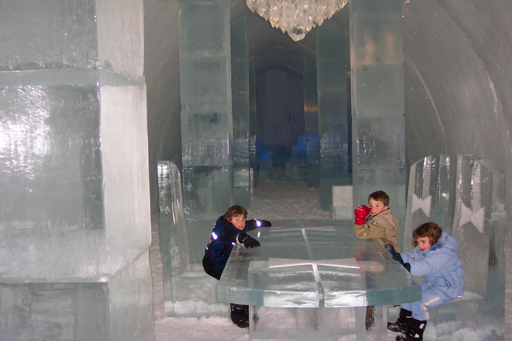
I am a fan of Leonberger dogs, and this is a photo of the only Swedish Leonberger I met personally. Her name was Amie. We met her at an interesting place, at the top of a north Swedish mountain called Skule Mountain (Skull Mountain).One of the interesting tourist attractions in northern Sweden is the Ice Hotel in Jukkasjärvi . The ice hotel in Jukkasjärvi is the first/original and largest ice hotel in the world. My kids at the lobby of the ice hotel in northern Sweden.
Sweden has a king (Carl XIV), and he owns a couple of big castles. This is my kids with the guard in front of the Winter Castle in Stockholm.Drottningholm, one of the Royal Palaces in Sweden. It was built in the 1660’s and inspired by Versailles.A photo of the Vasa ship from the bottom floor. My son is standing on the right in a green and black shirt.The Swedish Royal family. The two people in the middle are Queen Silvia and King Carl XVI Bernadotte. To the right of the king is the future monarch of Sweden princess Victoria and to the left of Queen Silvia is her husband. The others are their other two children and their spouses.Finally, the Swedish Flag (Wikimedia Commons). All other photos above are mine
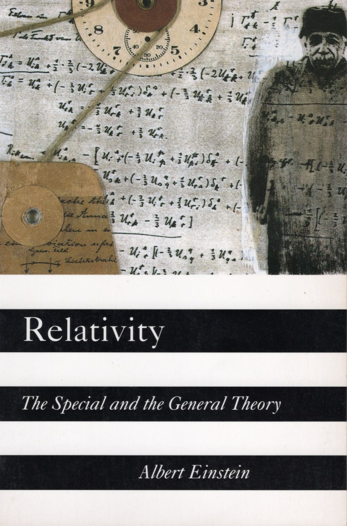
This is not a super fact post but another kind of fact-oriented post. It is a book review for a book that I find interesting, Relativity: The Special and the General Theory by Albert Einstein. Yes, the book was written by Albert Einstein in 1916 and translated into English in 1920. It is written for laymen, average readers, and despite being more than 100 years old (well this reprint is from 1995) it does not feel outdated.
I should say that I wrote my review decades ago and Amazon has hidden about 900 of the oldest reviews including mine. So, you can no longer find it. Luckily, I still had it, but I cannot provide a link to it. The book comes in formats, hardcover (2024), paperback (1995), Kindle (2014), Audio (2009). I bought the paperback version.
Publisher : Independently published (July 29, 2024), ASIN : B0DBQVVJVQ, ISBN-13 : 979-8334454118, 109 pages, item weight : 7.8 ounces, dimensions : 6 x 0.47 x 9 inches, Translator : Robert W. Lawson, it costs $12.33 on US Amazon. Click here to order it from Amazon.com.
Paperback – Publisher : Crown (June 6, 1995), ASIN : 0517884410, ISBN-13 : 978-0517884416, 208 pages, item weight : 8 ounces, dimensions : 5.2 x 0.5 x 8 inches, it costs $7.89 on US Amazon. Click here to order it from Amazon.com.
Kindle – Publisher : Amazon Kindle Direct Publishing (February 23, 2014), ASIN : B004M8S53U, 126 pages, it costs $0.99 on US Amazon. Click here to order it from Amazon.com.
Audiobook – Publisher : HighBridge, a division of Recorded Books (November 14, 2009), ASIN : B002XGLDAA, Listening Length : 2 hours and 14 minutes, it costs $12.09 on US Amazon. Click here to order it from Amazon.com.
Front cover of Relativity: The Special and the General Theory by Albert Einstein. Click on the image to go to the Amazon page for the paperback version of the book.
Amazon’s Description of Relativity by Albert Einstein
This book was originally written in German by Albert Einstein in 1916 and later translated to English by Robert W. Lawson in 1920. In Einstein’s own words, “The present book is intended, as far as possible, to give an exact insight into the theory of Relativity to those readers who, from a general scientific and philosophical point of view, are interested in the theory, but who are not conversant with the mathematical apparatus of theoretical physics. It is an easy-to-understand collection of the ideas of one of the greatest scientists of the twentieth century including the idea he is most known for, the theory of relativity.
Redesigned inside and out to have a fresh, appealing look, this new edition of a classic Crown Trade Paperback is a collection of Einstein’s own popular writings on his work and describes the meaning of his main theories in a way virtually everyone can understand.
Below is my review for Relativity: The Special and the General Theory by Albert Einstein. First, I should mention that the book is divided into two sections, one for the Special Theory of Relativity and another for the General Theory of Relativity. In addition, there are five short appendices. The five appendices are not written for layman and require at least high school mathematics.
Relativity Explained by Einstein himself
I found it very interesting to read an explanation of the theories of relativity by the developer of those theories. However, it is important to remember that the inventors of science theories aren’t always the best ones to explain them. Isaac Newton is a prime example.
Another thing to remember is that today there are a lot of books and online graphics that use clever pedagogic techniques and visualizations to assist you in understanding these theories, and naturally this book does not contain any of that.
This book was originally written in 1916 and updated in 1920 and since then it has been reprinted/edited several times (as this book is an example of). I should say that the General Theory of Relativity had just been published so there weren’t much else out there for laymen at the time.
I’ve already read many good books on relativity, and I believe I understand special relativity pretty well, but my understanding of general relativity is partial. I did not buy this book to understand relativity. The reason I bought this book was to gain another perspective on the subject. If you just want to learn and understand relativity, I recommend Relativity Visualized by Lewis Carroll Epstein instead.
“Relativity: The Special and the General Theory” features no derivations of the formulas in relativity (except in the appendix) and no visualizations demonstrating relativistic effects and phenomena. The book is focused on the conceptual foundations of relativity and physics.
For example, what are Geometrical propositions, what does it mean to measure the length of a rod, or the time of an event, what do we mean by speed, what is simultaneity, what is the difference between what we observe and what we measure, etc? Einstein spends one and a half page explaining addition of velocities in classical-pre-relativistic kinematics (w = v + u) and what assumptions that are inherent with the approach. In that sense the book is quite philosophical, which is what I meant by “another perspective”. The book covers both the Special Theory of Relativity and the General Theory of Relativity. However, the sections on the General Theory of Relativity are quite short and very introductory.
There are some issues with the book. In appendix 1 Einstein (I presume) derives the Lorentz transforms. However, it is not, in my opinion, the best derivation from a pedagogical standpoint and it also had typos in it. As far as I can tell the formula on page 50 is wrong unless what Einstein means with the “m” is “additional relative mass” and not actual “mass” as stated.
The book features an addition written in 1920 where he is discussing an ad hoc modification to his theory that he had previously made but it turned out to be unnecessary (related to cosmology). The language is also very old fashioned. On the other hand, this kind of stuff makes you feel as if you travel back in time to when the theories of relativity were being churned out.
I don’t recommend the book for learning the theories of relativity but overall I liked the book. It focuses very much on basic concepts and near philosophical aspects of time, space and relativity. The book presents a valuable perspective if you already understand what the theories of relativity are about.
Back cover of Relativity: The Special and the General Theory by Albert Einstein. Click on the image to go to the Amazon page for the hardback version of the book.
Super fact 46 : There are many serious threats to the environment that we need to take seriously. However, there are also many environmental success stories that we tend to forget about.
It is important to remember the environmental success stories because if we forget about them, it breeds despair, which in turn discourages people from acting and doing the right thing. Denial and Despair are two seemingly opposite emotional reactions that both hinder action on problems. I consider the existence of the many important environmental success stories a super fact because even though it is undeniably true that there are many environmental success stories, some truly amazing, it comes as a surprise to many.
Below I am listing six environmental success stories that I previously chose to be super facts. Super facts are important and true facts that are surprising and perhaps even shocking to many, or widely misunderstood, or disputed amongst the public, but not seriously disputed amongst the experts/scientists. Super facts are facts that are very special and that I think we should be aware of these facts. I should add that this is just a sample of environmental success stories. There are many more.
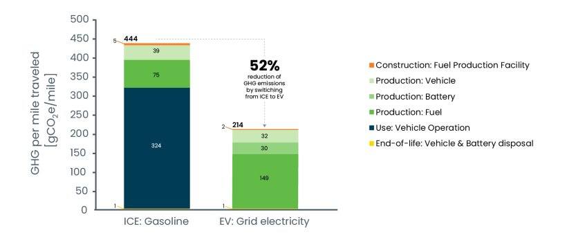
EV Cars emit less pollution than Internal Combustion Engine Cars, even considering manufacturing, disposal and many EV Cars being charged by dirty grids. The basic reason for this is the much higher efficiency of EV cars. EV cars emit significantly less greenhouse gases than internal combustion engines even considering construction of fuel production facilities, production of the car, the battery, and the fuel, vehicle operation and disposal. For more information click here.
Lifecycle greenhouse gas emissions comparison of average gasoline car and average EV. This graph is taken from the US Department of Energy.
Natural Disasters Kill Less People Now Than 100 Years Ago
Natural disasters kill a lot less people now compared to 100 years ago. That is despite a larger population and despite the fact that climate change has increased the frequency and intensity of many types of natural disasters. Surveys by Gap Minder show that this fact is quite surprising to people and therefore it is a super fact. To read more about this super fact click here.
The reason for the fewer deaths from natural disasters is not that there are fewer natural disasters. It is because we are now much better at predicting, handling and recovering from natural disasters. Our warnings systems, rescue systems and healthcare have improved significantly. The graph below from Gap Minder illustrates the decline in deaths from natural disasters.
This graph from the Gap Minder article shows the annual deaths from natural disasters.
Emissions of ozone-depleting gases have fallen by 99 Percent
Largely thanks to the Montreal Protocol in 1987 the emissions of ozone-depleting gases have fallen by more than 99%, 99.7% to be exact, according to Our World in Data. This has resulted in the halt of the expansion of the ozone holes. The reduction in emissions of ozone-depleting gases is saving millions of lives every year. To read more about this astounding success click here.
The NIH estimate that the Montreal Protocol has prevented 443 million cases of skin cancer worldwide, 2.3 million skin cancer deaths, and 63 million cases of cataracts in the United States alone. Globally, it is estimated that the Protocol has saved an estimated 2 million people from dying from skin cancer each year. The graph below is taken from Our World in Data.
The phase out of six ozone depleting gases. Data source UN Environment Program (2023).
Developed nations have successfully reduced carbon emissions
The developed nations (rich countries) have reduced their carbon emissions since the 1990’s despite continued GDP growth, even if we take offshore production into account. In addition, many developing countries have succeeded in reducing their emissions as well. Other fast-growing developing countries have flattened or at least slowed their increase in carbon emissions. Many countries have decoupled economic growth from CO2 emissions.
In other words, we do not need to increase carbon emissions or burn more fossil fuels to grow the economy. To read more about this promising development click here.
Data source: Data compiled from multiple sources by World Bank (2025); Global Carbon Budget (2024); Population based on various sources (2024). Note: GDP per capita is expressed in international dollars at 2021 prices. Graph taken from Our World in Data.
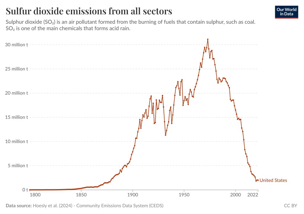
Sulfur dioxide pollution has fallen by 95 percent in the US
Sulfur dioxide pollution has fallen by approximately 95 percent in the US since the 1970s. This significant reduction is primarily due to regulations like the Clean Air Act. Global sulfur dioxide pollution has also fallen but not as much. To read more about this success story click here. If you visit the aforementioned link you will also see that there are many other pollutants that we have successfully curtailed.
US sulfur dioxide pollution since 1800. US Emissions peaked in 1973. Data Source: Hoesly et al (2024) – Community Emissions Data System (CEDS). This graph is taken from this page in Our World In Data.
Deforestation peaked back in the 1980s, meaning that is when it was worst. Deforestation has not stopped but the rate of deforestation has slowed as a result of government policies, corporate initiatives, and international agreements.
Overall, we are still losing forests. We had a 47-million-hectare loss of forest in the last decade, which is very bad, but that is better than the 151-million-hectare loss of forest in the 1980s. For temperate forests we have succeeded in reversing deforestation, which means that temperate forests are now gaining forest. To read more about this topic and how government policies, corporate initiatives, and international agreements have slowed the rate of deforestation you can click here. This change in deforestation rate is illustrated by the graph below, which is taken from Our World in Data.
Decadal losses in global forest over the last three centuries. Decadal forest loss is measured as the average net loss every ten years, in hectares. This deforestation minus increases in forest area through afforestation. There is no single dataset that applies consistent or transparent methodology for deforestation over centuries. Two different datasets are therefore shown: these still shown the overall development and transition of forestation from temperate to tropical areas, but magnitudes should not be combined at the crossover point. Data sources: Pre-1995 data from Williams (2006). The second series is based on data from UN FAO Global Forest Resources.
Note : I am going on a trip with family and will return next Tuesday (5/27). During this time will not do any blogging. I love comments but I will respond to comments when I come back.
Super fact 45 : Deforestation peaked back in the 1980s, meaning that is when it was worst. Deforestation has not stopped but the rate of deforestation has slowed as a result of government policies, corporate initiatives, and international agreements.
The rate of global deforestation has slowed significantly since the 1980s. Overall we are still losing forests. We had a 47-million-hectare loss of forest in the last decade, which is very bad, but that is better than the 151-million-hectare loss of forest in the 1980s. For temperate forests we have succeeded in reversing deforestation and temperate forests are now gaining forest. To read more about how government policies, corporate initiatives, and international agreements have slowed the rate of deforestation you can click here, or here, or here.
Amazon rainforest illegal deforestation landscape. Aerial view of trees cut and burned to make land for agriculture and cattle pasture in Amazonas, Brazil. Asset id: 2471967219 by PARALAXIS
This is a super fact because we get a lot of bad news about deforestation, and we should, it is still a big problem. However, we are making progress and because of our negativity bias as well as that of the media, we tend to miss the story about the progress. Therefore, the fact that we are making progress comes as a surprise to many people.
Decadal losses in global forest over the last three centuries. Decadal forest loss is measured as the average net loss every ten years, in hectares. This deforestation minus increases in forest area through afforestation. There is no single dataset that applies consistent or transparent methodology for deforestation over centuries. Two different datasets are therefore shown: these still shown the overall development and transition of forestation from temperate to tropical areas, but magnitudes should not be combined at the crossover point. Data sources: Pre-1995 data from Williams (2006). The second series is based on data from UN FAO Global Forest Resources Assessments. The graph comes from Our World in Data – Research and data to make progress against the world’s largest problems.
Peak Agricultural Land
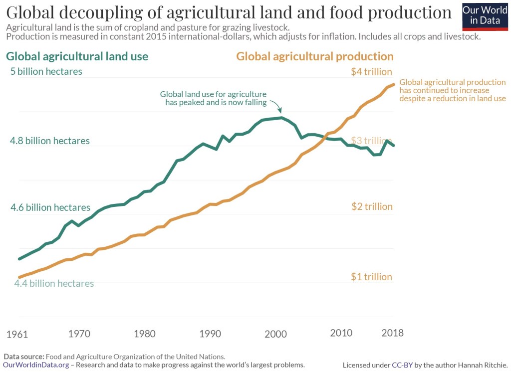
There is one aspect to this story which both explains part of the reduction in deforestation but also provides additional hope for the future and that is that even though the world produces more food than ever, the amount of land we use for doing that is falling. Global land use for agriculture has peaked and is now falling. There has been a global decoupling of agricultural land and food production. I should explain that agricultural land is the total amount of arable land that is used to grow crops, and pasture used to raise livestock. That global land use for agriculture has peaked is illustrated in the graph below.
Global decoupling of agricultural land and food production. Agricultural land is the sum of cropland and pasture for grazing livestock. Production is measured in constant 2015 international dollars, which adjusts for inflation. Includes all crops and livestock. Data source: Food and Agriculture Organization of the United Nations. Our World in Data – Research and data to make progress against the World’s largest problems.
There are more trees now than 35 years ago (there’s a catch)
Another related good news story is that there are more trees in the world today than there were 35 years ago. A lot of the losses of forest in tropical areas have been compensated for by gains in Europe, North America and Asia. For example, tree planting programs in places like China have added a lot of trees as well as forests. In addition to tree planting programs climate change resulting in northern latitudes warming has resulted in temperate forests expanding.
However, this story is not as good as it sounds. There is a huge catch and that is that there is an important distinction between tree cover and forest cover. Tree cover refers to the total area covered by trees, while forest cover specifically refers to areas where trees form a forest ecosystem. Tree cover has increased but as you can guess from the graph above depicting global deforestation, the forest cover continues to decrease.
In addition, a lot of trees were planted for industrial timber plantations, mature oil palm estates and other specifically planted forests. These add to the global tree cover but not necessarily to biodiversity. Not all tree planting is equal.
So even though having more trees compared to 35 years ago is a good thing, it may not be as great as it sounds and does not contradict the fact that deforestation continues. This is important to point out because there are those who attempt to use the fact that we now have more trees to make the case that the talk about deforestation is a hoax. Don’t fall for that.
Summary
The good news is that even though deforestation is still happening the rate of it has slowed down. It peaked in the 1980s. This slowdown is largely due to government policies, corporate initiatives, and international agreements. An additional circumstance that aids in slowing deforestation is that the amount of land we use for agriculture is falling and we have passed peak land use for agriculture. Another positive situation is that we now have more trees than 35 years ago.
However, it is important to point out that does not mean that deforestation has been reversed. Tree cover and forest cover are not the same thing. The benefit of this is limited even though it is still a good thing to have more trees.
Environmental Success Stories
Aside from the success in reducing the rate of deforestation there is additional surprising, as well as good news regarding the environment.
Natural Disasters Kill Less People Now Than 100 Years Ago. We have gotten much better at protecting lives in natural disasters and less people die in natural disasters despite the increase in frequency, severity and cost of certain natural disasters.
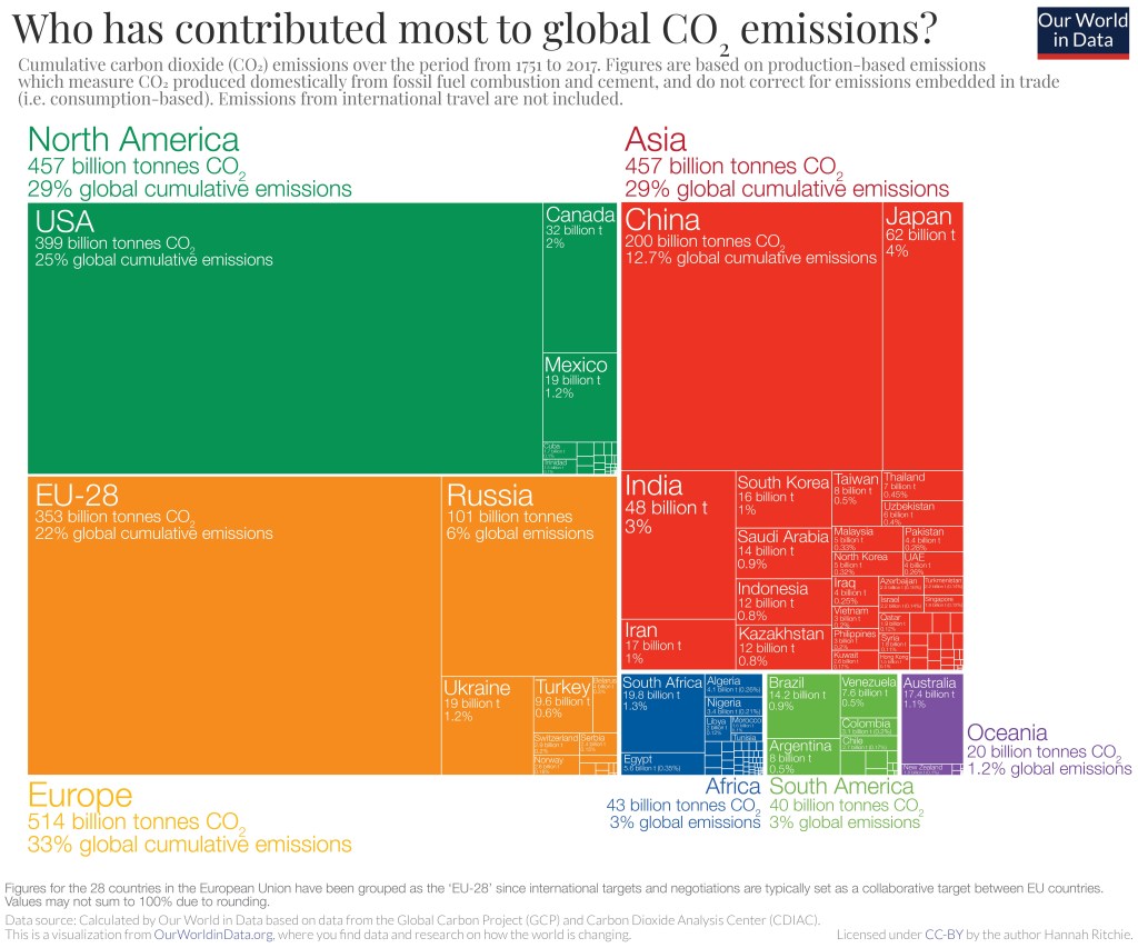
Super fact 43 : The United States has emitted more CO2 than any other country to date, around 400 billion tons since 1751. It is responsible for 25% of historical emissions. Click here.
But what about China? That is 12.7%, or around half. This is surprising information to many Americans, yet it is true, and therefore a super fact. In the US it is very common to blame China for our carbon emissions. In China they blame the US. In Europe they blame the US and China. Who is right? It turns out that the blame game is complicated and futile.
Carbon Emissions Around the World
Who should we blame the most for our carbon emissions?
On the other hand, the US carbon emissions per capita (14.3 ton) is considerably larger than that of China (8.4 ton). China has 1.4 billion people after all and the US only 340 million people.
On the other hand, China used to be very poor and is quickly catching up to our standard of living with the help of fossil fuels, just like the western world once did.
It should also be noted that the countries that are emitting the most carbon emissions per capita are several smaller developing (third world) countries including Palau, Qatar, Kuwait, Brunei, New Caledonia, Bahrain, United Arab Emirates, Trinidad and Tobago, Gibraltar, Saudi Arabia, Oman, etc.
On the other hand, according to this analysis presented in the Guardian, the Netherlands has the highest per capita historical emissions, followed by the UK in second place. The analysis calculates the national cumulative emissions from 1850 per person, based on today’s population, among countries with populations of at least 1 million.
In other words, if you want to blame another country for the carbon emissions, take your pick, well your cherry pick. Why should we do something about our carbon emissions when X is worse? Those who want no action on the global warming / climate change problem love the blame game. Like denial or despair, which are both irrational positions, the blame game hinders action. The blame game can also get very complicated and contentious.
The graph shows the fossil fuel emissions (in carbon dioxide equivalents) per capita from 1750 to 2023 for the World, the United States, Canada, China, European Union, India, South Africa, United Kingdom, and Kenya. Notice that the United Kingdom dominated the emissions in the 1700’s and 1800’s. Data source: Global Carbon Budget (2024); Population based on various sources (2024). The graph is from Our World in Data .
Note regarding the graph above: By clicking here you can find this graph and then select to display any set of countries or regions. Have fun experimenting.
Note regarding Fossil emissions: Fossil emissions measure the quantity of carbon emissions (CO2) emitted from the burning of fossil fuels, and directly from industrial processes such as cement and steel production. Fossil CO2 includes emissions from coal, oil, gas, flaring, cement, steel, and other industrial processes. Fossil emissions do not include land use change, deforestation, soils, or vegetation.
Overview of Cumulative Carbon Emissions
As you can see in the graph below the cumulative carbon emissions from 1751 to 2017 are 25% for the United States, 22% for the EU (28 countries), 12.7% for China, 6% for Russia, 4% for Japan, and 3% for India. If you count the entire continent of Europe, you get 33% for Europe.
Figures for the 28 countries in the European Union have been grouped as the EU-28 since international targets and negotiations are typically set as a collaborative target between EU countries. Values may not sum up to 100% due to rounding. Data Source: Calculated by Our World in Data from the Global Carbon Project (GCP) and Carbon Dioxide Analysis Center (CDIAC). This is a visualization from Our World in Data, where you can find data and research on how the world is changing.