
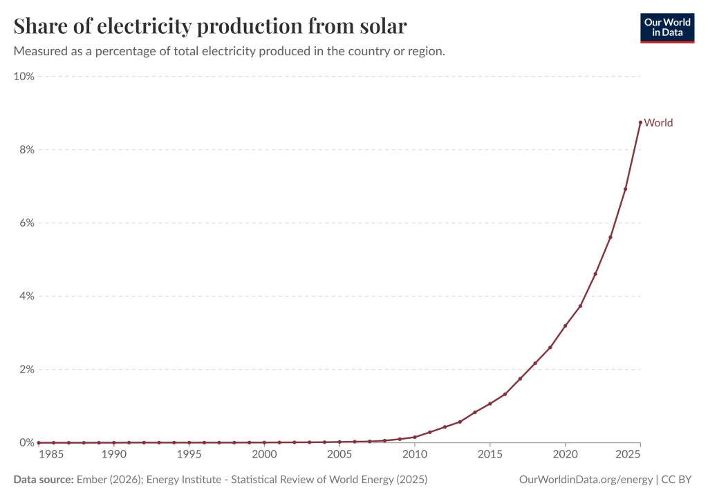
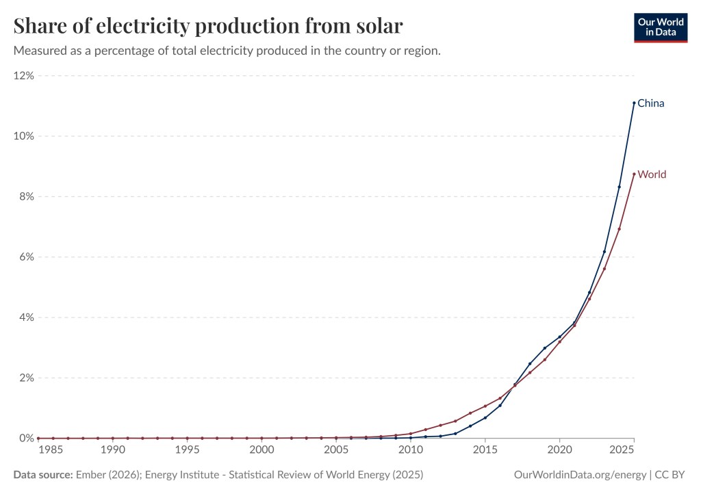
Superfact 117: The share of electricity generated from Solar Power in the world has grown from essentially 0% in the year 2000, 0.15% in 2010, to 3.19% in 2020, and to 8.75% in 2025. Both wind and solar energy are expanding fast around the world, but solar energy is a strong latecomer to the energy scene.

In the year 2000 less than 0.01% of the world’s electricity was generated by solar. In 2005 it was 0.02%, in 2010 it was 0.15%, in 2015 it was 1.07%, 2020 it was 3.19%, in 2025 it was 8.75%. Can you guess what will it will be in 2030? The United States may be behind the rest of the world with respect to wind power and EVs, but it closely follows the rest of world when it is about solar. You can play around with the graph below and select different countries by clicking here.
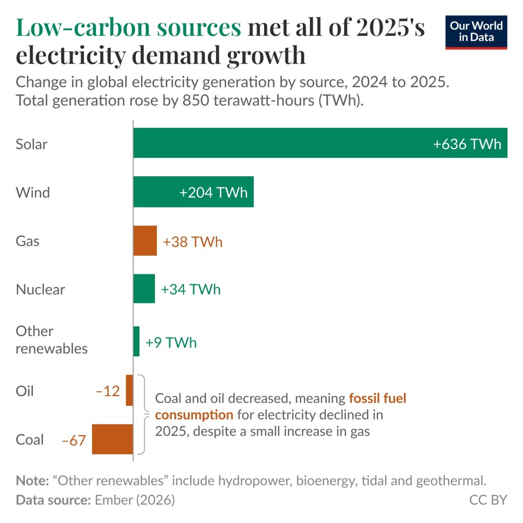
New solar panel technology such as Perovskite Solar cells is being developed. The price of lithium-ion batteries has fallen by 99% since 1991 and by 82% in the last ten years. New battery technology such as sodium-ion batteries is being developed. One advantage of sodium-ion batteries is that they function exactly like a lithium-ion battery but replace lithium with abundant sodium ions to carry the electric charge. The evolving battery technology makes it easier to store power from solar during the night. SolarPower Europe project that the global solar fleet will more than double by 2030. In other words, the future looks bright for solar power, and that pun was intended.

Solar Power as a Share of Electricity Generation Around the World
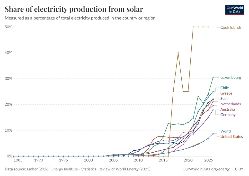
For solar, the United States follows the rest of the world closely. Some countries have a higher percentage, such as the Cook Islands – 50%, Luxembourg – 30.52%, Chile – 25.06%. If you wish you can take a closer look here, or here, and you can play around with the different graphs. You can pick millions of combinations of countries and regions. For illustrative purposes I am showing some combinations below.

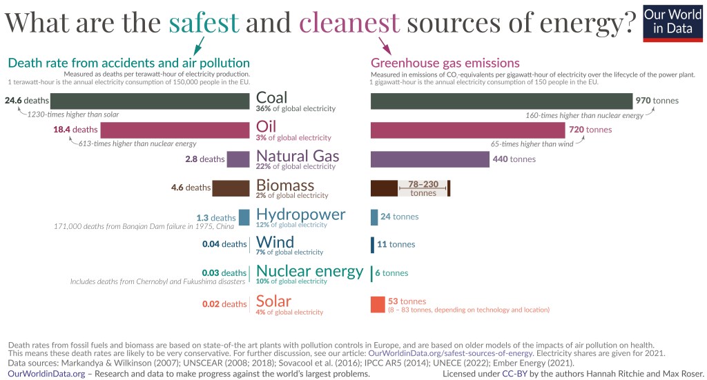
How Clean and Safe is Solar Energy ?
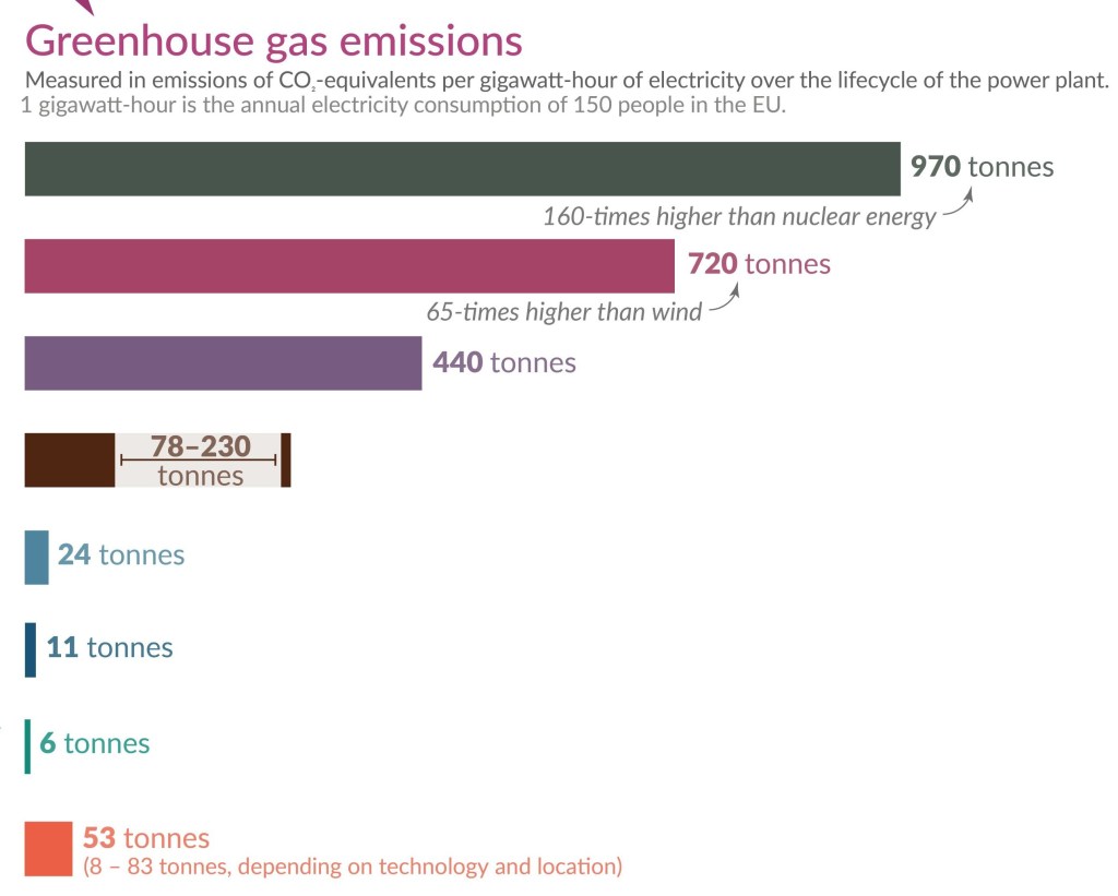
You sometimes come across claims that renewable energy isn’t really clean energy. The truth is that renewable energy such as wind, solar, etc., is much cleaner than gas, oil, and coal. These energy sources are also much safer and using them saves a lot of lives. As you can see, among the eight energy sources depicted solar is the safest, and among the cleanest. Coal has 1,230 times higher death rate than solar. According to the Energy Policy Institute at the University of Chicago Chinese citizens can expect to live on average 2.2 years longer than they would have a decade ago, due to the sharp drop in pollution. This is thanks to the increased use of EVs and renewables such as solar.
Below are two pictures corresponding to zoom-in of the graph above.

Important Climate and Energy Facts
As I said, the misinformation about climate science has bamboozled a lot of people. We know that climate change / global warming is happening. We have also known for several decades that the current climate change / global warming is not natural. It is caused by us, chiefly due to the burning of fossil fuels. Yet many non-scientists dispute it.
The scientific evidence is conclusive, but a lot of people know very little about the evidence. It includes satellites directly measuring our greenhouse gases trapping heat, the upper troposphere is cooling whilst the lower atmosphere is warming, showing that the heating is from greenhouse gases, the unnatural speed of the warming is another piece of evidence, isotope studies, climate models, etc. Below are fourteen super facts related to climate science and clean energy.
- (16) Wind power is providing more than a quarter of Texas Power
- (17) Wind power is not a major cause of bird death
- (25) Global Warming is Happening and is Caused by us
- (26) The Hockey Stick Graph is not Wrong
- (34) Scientists Agree that Global Warming is happening and that we are the Cause
- (52) Climate change worsens wildfires in the US
- (77) Landman Lies
- (87) Wind Energy is Indeed Clean Energy
- (91) Without carbon dioxide the Earth would freeze
- (96) Nuclear Energy is Relatively Clean and Safe
- (99) Carbon Capture and Storage an Unfulfilled Promise
- (100) The Unfolding Clean Energy Revolution
- (106) IPCC Did Not Backtrack on Global Warming Being Human Caused
- (107) EVs are Replacing the Internal Combustion Engine
To see the other Super Facts click here


Interesting article, Thomas!
LikeLiked by 1 person
Thank you so much Alex
LikeLike
I find the misinformation about climate science quite shocking, and probably wouldn’t have even realized if I hadn’t read your blog, Thomas! It’s great that solar is the safest energy source and seems to be expanding fast around the world.
LikeLiked by 1 person
Thank you so much Ada. Yes solar has been expanding very quickly lately worldwide. I agree, the misinformation about climate science is quite shocking. It is very bold and blatantly false. Make the lie big as they say. The disinformation is mostly on social media and it is currently also coming from our own administration (US administration). Those are not good sources for scientific information but it is unfortunately what a lot people read/listen to and believe. I call it disinformation because it is typically intentional.
LikeLike
I love that Elon Musk is putting his data centers in space so they can access this unlimited supply of energy.
LikeLiked by 1 person
I did not know that. But that sounds like a very interesting development.
LikeLiked by 1 person
Understand, that is probably several years off though he is the only one who could launch enough satellites to make that happen (as far as I know).
LikeLiked by 1 person
It sounds like a very interesting project, even though it has somewhat of a feel os SkyNet, but I will look it up and learn about it. I should say that I read an article that stated that the Japanese were planning to build giant solar reflectors in space to power solar power back on earth by concentrating the sun beams. That’s another massive space project.
LikeLiked by 1 person
That is interesting. They have a strong space program by world standards.
LikeLiked by 1 person
Yes I read that they are already building satellites for Space-Based Solar Power (SBSP) and the Shimizu Corporation are planning to build a 6,800-mile continuous belt of solar panels around the Moon’s equator to capture uninterrupted sunlight and beam it to Earth. But it sounds a bit ambitious. I wonder how realistic it is.
LikeLiked by 1 person
All these stats are so interesting. Thank you for another informative piece, Thomas.
LikeLiked by 1 person
Thank you so much for your kind words Esther.
LikeLiked by 1 person
Solar is great. My brother put it on his roof in New Hampshire a few years ago. I think now it has paid for itself. I think he said the electric company pays him to buy his over supply. Not sure I got that right.
On climate change it is happening but the crazies fall on this “even the scientists don’t believe it now” what they fail to see is they all agree it is happening, what they fail to say is that the scientists don’t all agree on the exact time of how it continues, the largest impact or areas, what can be the fallout. They all have different ideas but never did they say the data is wrong.
LikeLiked by 1 person
That is good for him. I don’t have solar myself but I know people that get paid from their electric company buying their over supply. I don’t think it applies to all roof solar. I think you have to install some special thing for it, but I know you can do it. You are right the scientific consensus is that climate change / global warming is happening and that we are the cause of the current and unnaturally fast global warming, chiefly because of our burning of fossil fuels. Very few scientists question those facts because the evidence for both points are overwhelming. The details about exactly how fast it is going and what the consequences will be in the future are more complicated. First of all, it depends on our future emissions. The people who make that claim you refer to “even the scientists don’t believe it now” are not only wrong, they are probably dishonest too, because it is so easy to look up using google.
LikeLiked by 1 person
Cook islands and Luxembourg are small places but kudos to them for their achievement. As an Australian, my country should be doing much better and I expert a sharp rise in the solar reliance in the next few years as the government is subsidising battery storage. Most of our solar is domestic rooftop, and the total electricity for the state of South Australia is powered 75% from solar and increasing. Even so, Chile’s stats are remarkable! Thanks for sharing this info and debunking some of the misinformation.
LikeLiked by 1 person
It seems Australia is doing relatively good with respect to solar and your numbers for South Australia are amazing. I should say I am pretty sure roof top solar is not included in my numbers and graphs. I think it is just solar for the grid. So I guess the numbers are even better for many countries where roof top solar is common.
LikeLike
Then that makes even better stats. Almost all urban rooftop solar here is connected to the grid. We hear rumours that the data centres have their eyes on new locations in rural Australia – due to the amount of solar energy they could produce. However, there is very little water out there – so who misses out if they take it all?
LikeLiked by 1 person
Yes the data centers need both a lot of power and a lot of water, and that is a problem in dry places. Here in Texas where I live, data centers have become very controversial for that reason.
LikeLiked by 1 person
Very impressive – more solar panels in South Africa, please!
LikeLiked by 1 person
Thank you Chris. Yes I saw South Africa was slightly behind the rest of the world with respect to solar despite being a very sunny nation as I understand.
LikeLiked by 1 person
Yep, that’s right, but getting there.
LikeLiked by 1 person
That is good
LikeLiked by 1 person
The graphs are so helpful, Thomas, and the statistics are remarkable. I’m glad the US isn’t totally backsliding. I thought it would be worse based on the current political preference for fossil fuels. The evolving battery technology is encouraging. My husband and I have some portable panels and a lithium battery for camping, and they work great, but they’re small-scale. Thanks for the informative post, my friend. I hope you’re having a wonderful summer.
LikeLiked by 2 people
Yes that is a very good point Diana. We are backsliding a lot on wind power. The administration is paying billions (of our tax money) to companies domestic and foreign to shut down wind projects that are already being built here in the US. Basically, they get paid for doing nothing. That is a bribe, and against the law since it is congress that should be in charge of such decisions. But that’s where we are. However, so far solar has avoided the worst of the administrations anti-renwable stance. Portable panels for camping sounds really cool. Yes we are having a wonderful summer. I hope you are having a wonderful summer too, despite the challenges you are facing.
LikeLike
So important! Thank you!
LikeLiked by 1 person
Thank you so much Lori
LikeLike
Thanks for the great article about solar power, Thomas. I’ve been seeing solar power arrays popping up in Arizona and New Mexico. It seems a good use of land that gets a lot of sunshine. In Tucson, particularly, there are a number of parking lots where solar arrays are placed over the parking spaces. They provide shade for the parking spaces while also generating power, which seems a smart thing to do.
LikeLiked by 2 people
Thank you so much David. Yes I think putting solar panels over parking spaces sounds like a really smart idea. Solar panels supplying the grid has expanding a lot in Texas too. In 2025, solar power supplied 14% of the total electricity generated on the ERCOT grid. ERCOT is the Texas grid, which is a pure free market grid.
LikeLiked by 2 people
Lulu: “We have got lots of solar panels up on our roof to help with our electric bill! Dada says now if they could only afford a battery storage system and an electric car and to replace the gas stove with an electric stove, that would be even better …”
LikeLiked by 2 people
Lulu your Dada is doing really well and is being conscientious.
LikeLiked by 1 person
An encouraging overview of the rapid growth of solar power. Solar energy has expanded from almost nothing to a major source of global electricity, making clean energy more affordable and accessible. Combined with better battery technology, it offers a safer, cleaner, and more sustainable future while helping reduce climate change. Thank you for sharing these important insights.
LikeLiked by 2 people
Yes you are so right Anowar, and thank you so much for your kind and encouraging words.
LikeLiked by 1 person