The goal of this blog is to create a list of super facts. Important facts that are true with very high certainty and yet surprising, misunderstood, or disputed by many. This blog aims to be challenging, educational, and fun, without it being clickbait. I determine veracity using evidence, data from reputable sources and longstanding scientific consensus. Prepare to be challenged (I am). Intentionally seek the truth not confirmation of your belief.
Super fact 35: Natural disasters kill a lot less people now compared to 100 years ago. That is despite a larger population and despite the fact that climate change has increased the frequency and intensity of many types of natural disasters.
This is a super fact because surveys, such as this questionnaire from Gap Minder, show that the vast majority of the public (90%) believe that deaths from natural disasters have increased or stayed the same. Gap Minder is a Swedish highly respected non-profit founded by Hans Rosling that promotes increased use and understanding of statistics. Our World in Data (OWID), a renowned scientific online publication focusing on large global problems largely took its inspiration for Gap Minder and Hans Rosling.
The reason for the fewer deaths from natural disasters is not that there are fewer natural disasters, on the contrary, it is because we are now much better at predicting, handling and recovering from natural disasters. Our warnings systems, rescue systems and healthcare have improved significantly.
The graphics in this article from BBC show that the frequency of natural disasters has increased, and that the cost of natural disasters has increased, and yet the number of deaths has decreased.
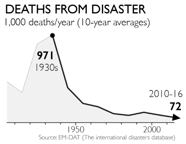
The graph below comes from the Gap Minder article. It shows the annual deaths from natural disasters in ten-year intervals starting with 1930. In the 1930’s there were 971 thousand deaths per year from natural disasters and during the period 2010 to 2016 there were 72 thousand deaths per year from natural disasters, an improvement by more than 13 times.
However, it should be noted that there was a huge flood in China 1931 causing an estimated 3 million deaths, and it skews the numbers for the 1930’s interval.
Originally, I set the headline for this super fact to be “10 Times more people died from natural disasters a hundred years ago” but I changed it to “Natural Disasters Kill Less People Now Than 100 Years Ago” because I realized that the 1930’s peak is an outlier because of the 1931 flood. I don’t want my headlines to be click bait.
This graph from the Gap Minder article shows the annual deaths from natural disasters in ten-year intervals starting with 1930. The trend is down.
This does not mean that we should not worry about the increase in frequency and intensity of natural disasters from climate change. First of all, there are no warning systems and healthcare available for Koalas and Elephants, secondly cost matters, and thirdly there is no guarantee that we can keep improving our ability of predicting, handling and recovering from natural disasters enough to match the accelerating risks for natural disasters.
What People Believe Regarding Disaster Deaths
The Gap Minder article above report on a question survey conducted by Gap Minder. They asked large groups of people in 14 countries the following multiple-choice question “How did the number of deaths per year from natural disasters change over the last hundred years?” The choices were:
A. More than doubled
B. Remained more or less the same
C. Decreased to less than half
Most people answered A, a lot
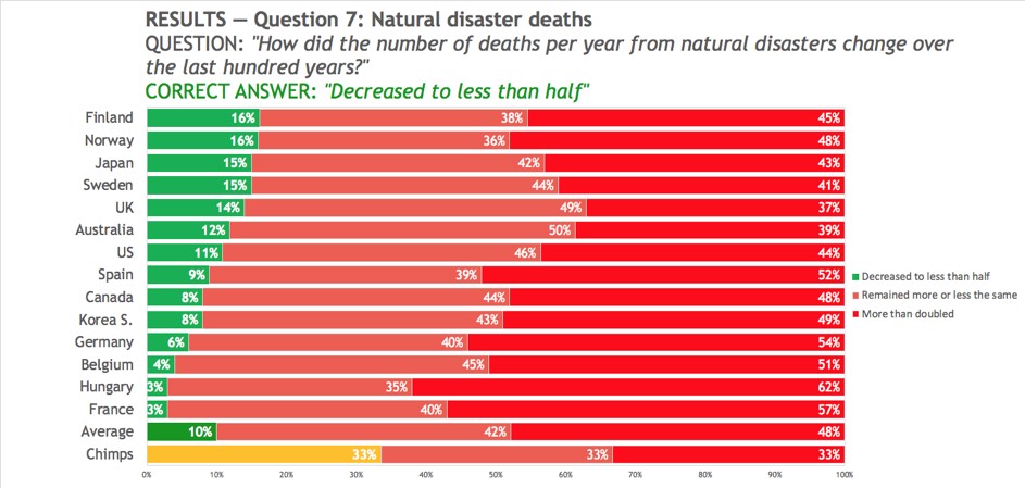
of people answered B, but only 10% got the correct answer C, decreased to less than half. In other words, if chimpanzees had answered this question by randomly picking an answer, they would have done better than people. This is why I consider this a super fact. Below is a graphics taken from the Gap Minder article that shows how people in different countries responded.
The histogram graphics above show the answers to the question “How did the number of deaths per year from natural disasters change over the last hundred years?” The correct answer “decreased to less than half” (in green) was rarely picked. The graphics is taken from the Gap Minder article mentioned.
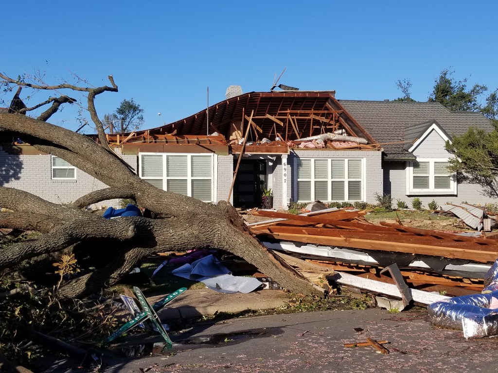
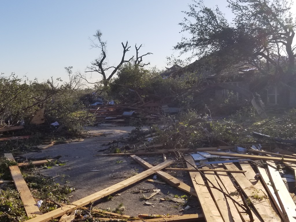
EF3 Tornado in Dallas
In October 2019 an EF3 tornado ripped through our neighborhood. It left a 2-3 miles long trail of destruction. Roofs were lifted off houses, cars and buses were flown around, hundreds of houses were destroyed, bricks were flying around in the wind, trees were uprooted, and tree branches were flying around, and pieces of concrete crashed into buildings and hit steel fences so forcefully that it bent even quarter inch thick steel fences.
Unlike many of our neighbor’s houses, our house stood, but our chimney was smashed by a piece of concrete coming off a neighbor’s house, we had to replace our roof, our garage door, the wiring in the attic, our fence and my grill flew around in the yard. The amazing thing was that no one in the neighborhood died.
Why did no one die? Was it maybe because no one was outside walking the dog, or driving around, because everyone had received the alarm on their mobile phone about the approaching tornado and was therefore sheltering inside in a safe place? Imagine the same thing happening in the 1930’s.
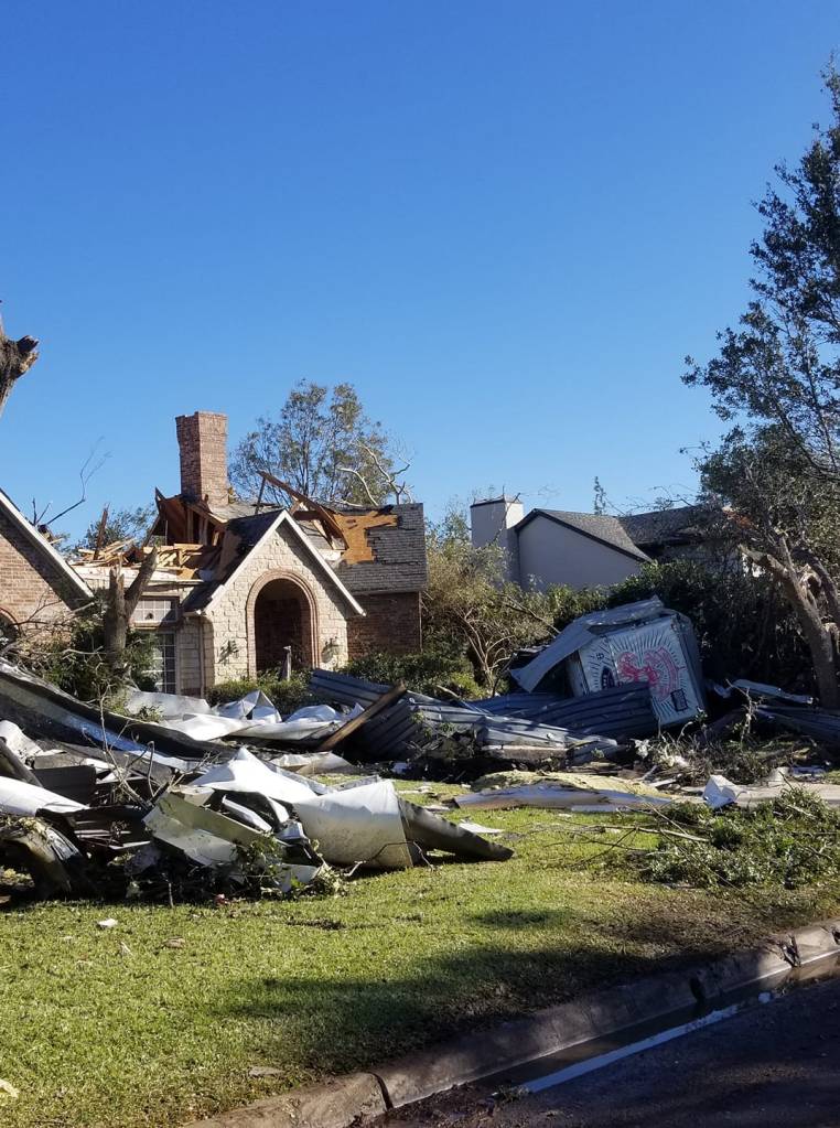
Below are a few photos from that day and here are two links with more photos, link-1 , link-2. On the five-year anniversary of this event NBC news interviewed me about this event. To see the interview click here . My interview is at one minute and ten seconds.
NBC used this photo. A neighbor’s house the morning of October 21st, 2019. Again, click on the image, or here, to see the interview. My interview is at one minute and ten seconds.Another neighbor’s house. This house was about 100 yards from our house. It took a direct hit from the tornado.Another house in our neighborhood.
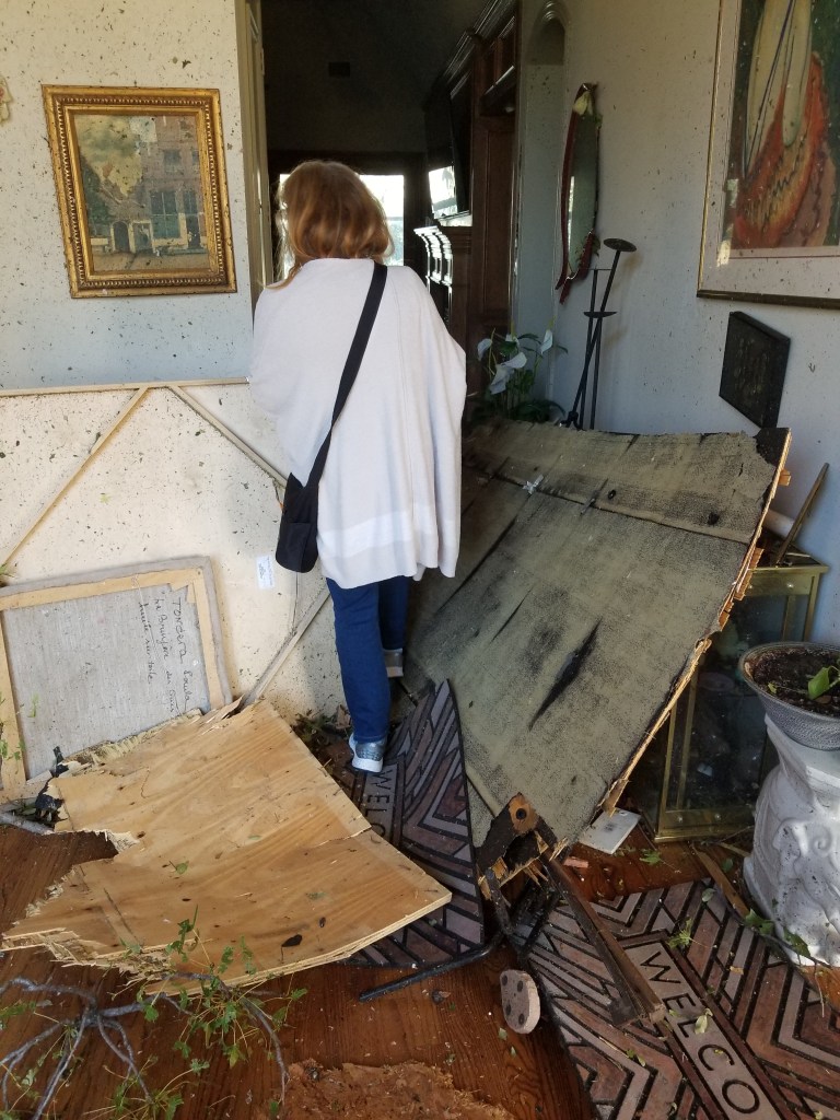
My wife Claudia asked me to go check on her parents. I drove about 50-100 yards when a neighbor’s roof lying across the road stopped me. I turned around but this time I was stopped by a large pile of trees lying across the street. So, I started walking, but this time I was stopped by a group of firemen telling me that it was too dangerous to be outside. They told me to go back home, and I did. The next day we were able to visit her parents and below is what we saw.
Inside my wife Claudia’s parents’ house. This was the morning after. In the photo we are walking into their house to check on them (that’s my wife).
Super fact 34: Climate Scientists agree that Global Warming or if you call it Climate Change is happening, and that it is caused by us primarily because of our burning of fossil fuels. There is a long-standing scientific consensus on these two facts because the evidence is conclusive. Typically, studies show an agreement of at least 97% or 98% among climate scientists.
This is a super fact because surveys show that this is not what the public believes and yet it is true. The public incorrectly believes that there is a large disagreement among scientists on this topic. A note, to understand why the evidence is conclusive as to why global warming is happening and is caused by us click here.
Note : I will use the term “global warming” in this review. Whether you call the phenomenon climate change, climate disruption, or global heating, is not important.
The Scientific Consensus
This extensive survey from 2013 of 12,000 climate papers (papers published over two decades) by Dana Nuccitelli and Cook, etc., concluded that 97.1% of climate scientists endorsed the consensus position that humans are causing global warming.
They also did a science author self-rating which concluded that 97.2% of climate scientists endorsed the consensus position that humans are causing global warming. Another conclusion from the survey was that the consensus had increased from around 90%, perhaps less, in the early 1990’s.
A later review of six independent, peer-reviewed studies examining the scientific consensus about global warming have concluded that between 90% and 100% of climate scientists are convinced human-caused global warming is happening. A more recent study (2021) found that as many as 98% of climate scientists are convinced global warming is happening and is human-caused. Numerous other surveys have concluded the same thing.
People’s Beliefs About Global Warming
This 2024 survey from Yale University show that most Americans (61%) understand that global warming is mostly human caused. By contrast, 28% think it is caused mostly by natural changes in the environment. Most Americans (58%) <<Link-6>> understand that most scientists think global warming is happening. This percentage has trended generally upward since this survey began in 2008. By contrast, about one in five (22%) think there is a lot of disagreement among scientists about whether global warming is happening.
The green graph corresponds to “most scientists think global warming is happening (%).” The black graph corresponds to “there is a lot of disagreement among scientists (%)”. The yellow graph corresponds to “Most scientists think global warming is NOT happening (%)”. Graph taken from the Yale Program on Climate Change Communication.
However, only one in five Americans (20%) understand that nearly all climate scientists (more than 90%) think that human-caused global warming is happening. The aforementioned Dana Nuccitelli refers to this in his book Climatology versus Pseudoscience as the consensus gap. Again, this large discrepancy between public perception and reality makes the consensus gap a super fact. Research has shown that this discrepancy has a large impact on people’s other beliefs regarding global warming.
The question was, To the best of your knowledge what percentage of climate scientists think that human-caused global warming is happening? Graph taken from the Yale Program on Climate Change Communication.
Why is there a Consensus Gap?
In his book Climatology versus Pseudoscience Dana Nuccitelli explains that a relatively small group of so-called climate skeptics, or more accurately called climate contrarians have received a lot of attention from media. Even though their science is bad, and they’ve published their error ridden papers in obscure or discredited journals, and the fact that their predictions have failed repeatedly many times over, they have had an enormous influence on public discourse. Conservative politicians, and many talk show hosts are blindly devoted to their falsehoods, whilst real scientists are being attacked.
It is not just rightwing media who are using them for their purposes, but mainstream media are giving the contrarians undue attention as well. Sensationalism is one issue. A science contrarian claiming that all the climate scientists are wrong, and that he is the only one who finally got it right is a lot more interesting of a story than a repeat of the consensus. Another issue is false balance. Journalist should not feel that they must give equal time to evidence-based science and nonsense, but that is often the case. To read my review of this book click here.
The Oregon Petition
I am mentioning the Oregon petition because I fell for it myself. The Oregon petition was an official looking petition circulated by climate contrarians, claiming that there is no evidence that human-caused global warming will cause catastrophic heating of earth’s atmosphere and disruption of earth’s climate, and that adding more carbon dioxide to the atmosphere would even be beneficial for plants and animals. It got an impressive number of signatures, 32,000 after some years.
However, it turned out that the signatories rarely had climate expertise, and were not scientists, and the survey listed many falsified names such as the names of the Spice Girls and several fictional characters. Less than 200 of the signatories were climate researchers.
It was a con, but it was touted in a lot of media as the truth. I saw it over and over and I believed it. I was later surprised to learn that it was a con and that a scientific consensus existed on global warming / climate change. Learning that I had been bamboozled on this matter was one of the red flags that prompted me to start doing some fact checking on the issue global warming.
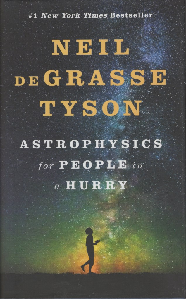
The goal of this blog is to create a list of what I call super facts. Important facts that are known to be true and yet they are surprising, shocking or disputed among non-experts. In a sense it is myth busting. However, it is not the only type of posts I do. This is a review for a popular book on Astrophysics called “Astrophysics for People in a Hurry” by Neil De Grasse Tyson. It is a New York Times best seller and the #1 best seller in Astronomy & Astrophysics on Amazon. It has almost 37,000 ratings/reviews on Amazon and more 194,000 reviews/ratings on Goodreads.
Below is a list of the four formats in which it comes on Amazon.
Hardcover – Publisher : W. W. Norton & Company; First Edition (May 2, 2017), ASIN : 0393609391, ISBN-10 : 9780393609394, ISBN-13 : 978-0393609394, 224 pages, item weight : 2.31 pounds, dimensions : 7.3 x 4.8 x 0.9 inches, it costs $6.21 – $13.26 on US Amazon. Click here to order it from Amazon.com.
Kindle – Publisher – W. W. Norton & Company (May 2, 2017), ASIN : B01MAWT2MO, 222 pages, it costs $9.00 on US Amazon. Click here to order it from Amazon.com.
Audiobook – Publisher : Blackstone Audio Inc (May 2, 2017), ASIN : B06XB2PX7G, it costs $10.20 on US Amazon. Click here to order it from Amazon.com.
Audio CD – Publisher : Blackstone Publishing; Unabridged edition (May 2, 2017), ISBN-10 : 1538408015, ISBN-13 : 978-1538408018, it costs $24.95 on US Amazon. Click here to order it from Amazon.com.
Front cover of the book Astrophysics for People in a Hurry. Click on the image to go to the Amazon page for the hardcover version of the book.
Amazon’s Description of Astrophysics for People in a Hurry
Over a year on the New York Times bestseller list and more than a million copies sold.
The essential universe, from our most celebrated and beloved astrophysicist.
What is the nature of space and time? How do we fit within the universe? How does the universe fit within us? There’s no better guide through these mind-expanding questions than acclaimed astrophysicist and best-selling author Neil deGrasse Tyson.
But today, few of us have time to contemplate the cosmos. So Tyson brings the universe down to Earth succinctly and clearly, with sparkling wit, in tasty chapters consumable anytime and anywhere in your busy day.
While you wait for your morning coffee to brew, for the bus, the train, or a plane to arrive, Astrophysics for People in a Hurry will reveal just what you need to be fluent and ready for the next cosmic headlines: from the Big Bang to black holes, from quarks to quantum mechanics, and from the search for planets to the search for life in the universe.
This is my four-star review for Astrophysics for People in a Hurry
The reason I gave the book four stars instead of five is because I felt that if you have an interest in the topic, you will have heard it all before. However, in retrospect that might not be a good reason to deduct a star. After all, the book seems to be targeting people who do not know much about the subject and thus will not have heard it all before.
Quick and Entertaining Overview of Astrophysics
I’ve read a number of Neil DeGrasse Tyson’s books and I love them. This book is a compressed version of what he has been explaining in other books. If you’ve already read a number of Neil De Grasse books, or perhaps other popular science Astrophysics books such as those by Stephen Hawking, you will not find much new in this book. However, I think it is a brief but good summary of Astrophysics written for a layman. It is 208 pages, each page having about half as much text per page as a typical popular science book. It is an easy and fairly quick read.
He briefly explains the Big Bang, physical laws, spectra, nebulae, the speed of light, very briefly relativity and quantum physics, the cosmic background radiation, galaxies, gravitational lensing, dark matter, dark energy, neutron stars, the composition of the solar system and exoplanets. He covers a lot of ground quickly and he makes it easy to understand without simplifying so much that it becomes misleading. This book is exactly what the title says. However, as I mentioned, if you’ve read a lot on the topic already, especially if it is Neil DeGrasse Tyson’s books, you’ve seen it before. I still think it was very enjoyable though and I still learned something new. He is a very entertaining author.
Front cover of the book Astrophysics for People in a Hurry. Click on the image to go to the Amazon page for the hardcover version of the book.
Super fact 33: Actions such as eating locally, buying organic produce, using paper straws, and recycling can be good for the environment but can also be worse for the environment and these actions often have a much smaller positive impact than alternative rarely considered actions. What are popular actions for the environment is often different from what is effective.
I consider this a super fact because the beliefs regarding what is good for the environment and what is bad for the environment and what has a significant impact and what has not, are often based on popular trends and culture rather than knowledge. We need to educate ourselves. Following trends is not the answer to good stewardship of the planet.
This content was generated by an Artificial Intelligence (AI) system. Asset id: 2531547331
Is Locally Grown Food Really Better for the Environment?
As I explained in this post eating locally is not necessarily ecological. Agricultural products that are grown off season or in non-native environments are often grown in greenhouses, which require a lot of energy and generate significantly more emissions than shipping the produce across oceans would. This is especially true for crops like tomatoes, cucumbers, mangoes and bananas, that require warmer climates to be grown in open fields.
From pexels.com by Julia Nagy.
In some cases, the crop requires significant water resources or chemical inputs to thrive and may not be suitable for warmer climates, for example, apples. Some crops, like avocados or almonds require a lot of water but despite that they are grown in dry places like California (80% of California’s freshwater is used for agriculture). From an environmental perspective it would be better to grow these crops in a suitable environment and then transport them.
Is Eating Organic Really Good for the Environment?
As explained in this post eating organic is not necessarily ecological. Despite strong public perception of organic agriculture producing better environmental outcomes, conventional agriculture often performs better on environmental measures including land use, greenhouse gas emissions, and pollution of water bodies. There are, however, some contexts where organic agriculture may be better for the environment.
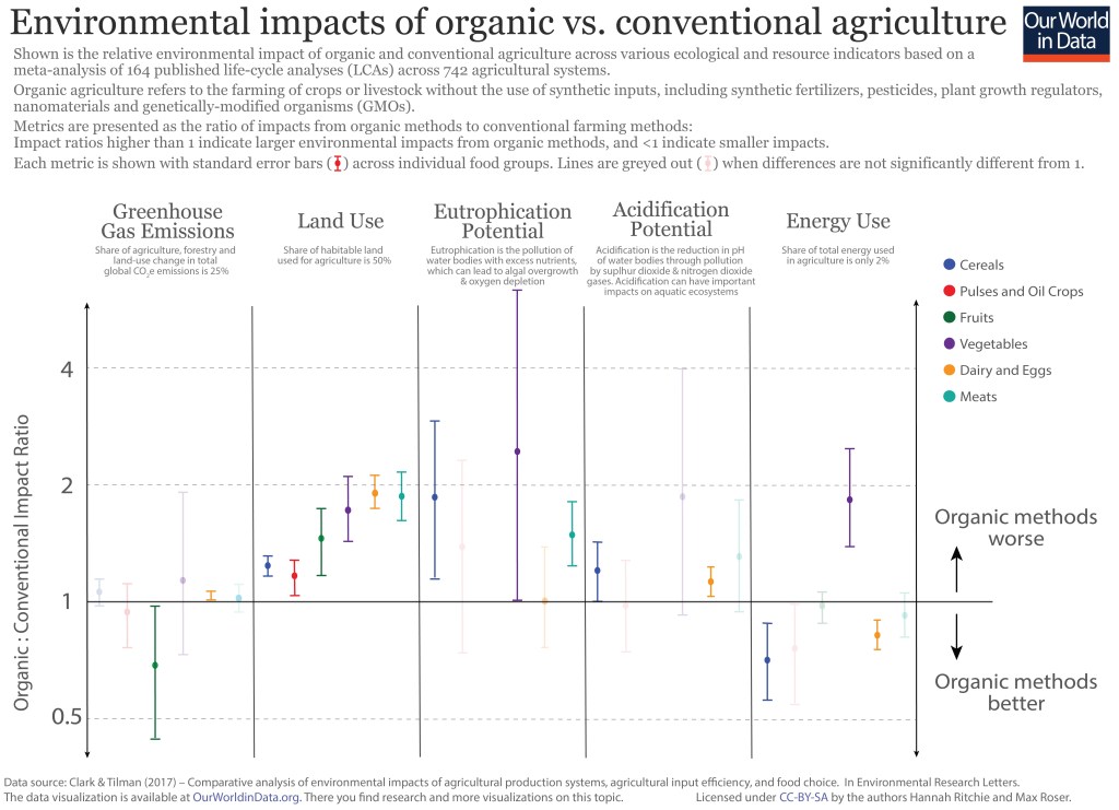
The graph below gives an overview of the environmental impact of various types of crops grown organically and conventionally. As you can see organic crop often require double as much land compared to conventionally grown crops. It is complicated.
Shown is the relative environmental impact of organic and conventional agriculture across various ecological and resource indicators based on a meta-analysis of 164 published life-cycle analyses (LCAs) across 742 agricultural systems. Roughly, lower in the graph means organic is better and higher up in the graph means conventional farming is better. Data source: Clark & Tilman (2017) – Comparative analysis of environmental impacts of agricultural production systems, agricultural input efficiency, and food choice. In Environmental Research Letters. The data visualization is available at OurWorldinData.org<<Link-10>>. There you can find research and more visualizations on this topic. Licensed under CC BY-SA by the authors Hannah Ritchie and Max Roser.
What really matters though is the type of food you eat, not whether it is organic or not. For example, beef (from beef herd) causes emissions 188 times larger than nuts do for the same amount of protein provided. Another thing to note is that if you eat 300 steaks per year you will have a 100 times larger environmental impact from your meat eating compared to someone who eats 3 steaks per year. You don’t have to become a vegetarian to have a smaller environmental impact but quantity matters.
Is Recycling Important?
The common perception that recycling is one of the best things you can do for the environment is not correct. Its impact is often not very large and if not done properly it can be counterproductive. If you throw a greasy pizza box in the recycling, you can ruin the entire batch.
Surveys across 21,000 adults in 30 countries showed that the two actions among twelve that people believed saved the most greenhouse gases were recycling (59%) and upgrading lightbulbs (36%). As it turns out, those two saved the least greenhouse gases among the twelve options. The option saving the most greenhouse gases among the 12 was giving up an SUV, which saved 18 times as much greenhouse gases as recycling. 17% of respondents picked that one.
According to Our World in Data (and the book Not the End of the World page 114<<Link-6>>), which is based on this research, giving up an average SUV for a sedan would save 3.6 metric ton, or 22.5% of the carbon emissions for the average American. Switching to a plant-based diet would save 2.2 metric ton per person, or 13.8%. Recycling comes in at a savings of 0.2 metric tons according to the same data. EPAs estimates are slightly higher but still low in comparison.
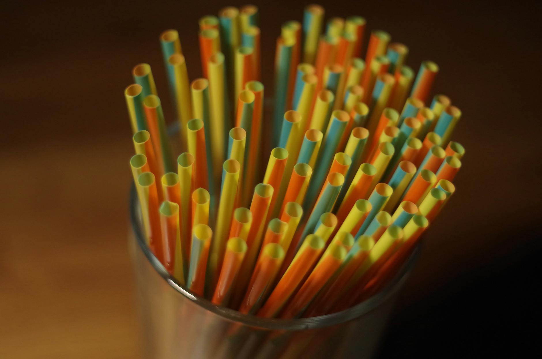
Plastic straws versus paper straws
Producing a plastic straw requires 39 kilojoules of energy and produces 1.5 grams of carbon dioxide emissions. However, producing a paper straw requires 96 kilojoules of energy and produces 4.1 grams of carbon dioxide emissions. So, plastic straws are better for the environment from that perspective. However, this could be compared to a typical passenger vehicle, which emits about 4.6 metric tons of CO2 per year according to EPA. That corresponds to more than 3 million plastic straws and more than one million paper straws.
According to the same article the average passenger vehicle emits about 400 grams of CO2 per mile. So, driving just one mile corresponds to hundreds of plastic straws and paper straws.
One advantage of paper straws is that they are easier to recycle, at least under ideal circumstances. Unfortunately, they often get soggy, and recycling plants don’t want that so they often throw them out. Another advantage is that paper straws decompose and don’t end up in our ocean.
However, not only are straws very small items, most of the plastic pollution in the ocean does not come from north America(1%) or Europe (1%). Paper straws versus plastic straws seem like a complex riddle but it may not be an important one. Whether you drive more or drive less is probably a lot more important.
Plastic bags versus paper bags
As with plastic straws versus paper straws plastic bags versus paper bags is a complicated question. From an environmental perspective they both have advantages and disadvantages. Plastic bags are less carbon intensive to produce, are easier to reuse several times, and the production of plastic bags require on average four times less energy than the production of paper bags.
On the other hand, paper bags are decomposable and easier to recycle. However, the chemicals and fertilizers used in producing paper bags create additional harm to the environment. It is a complicated question.
Plastic Ocean pollution. Whale Shark filter feeds in polluted ocean, ingesting plastic. Asset id: 1120768061 by Rich Carey
Having a Significant and Positive Impact on the Environment
Some of the allegedly sustainable practices and actions mentioned above are counter productive and others have a very small effect, for example, carbon emissions savings that are a few grams. According to the “Our World Data” and the book “Not the End of the World” page 114, a compilation of data research, some actions that you can take that will significantly reduce carbon emissions are (savings in metric tons per year, for flight it is per trip):
Giving up an SUV 3.6 tons
Go car free (average car) 2.4 tons
Switch to plant-based diet 2.2 tons
Avoid transatlantic flights 1.6 tons
Buy green energy 1.5 tons
Switch to electric car (from average sedan) 1.2 tons
Switch from electric car to none 1.2 tons
Avoid medium flight 0.6 tons (1,700 miles each way going and returning)
Laundry in cold water 0.25 tons
Hand-dry clothing 0.2 tons
Recycle 0.2 tons
Upgrade light bulbs 0.1 tons
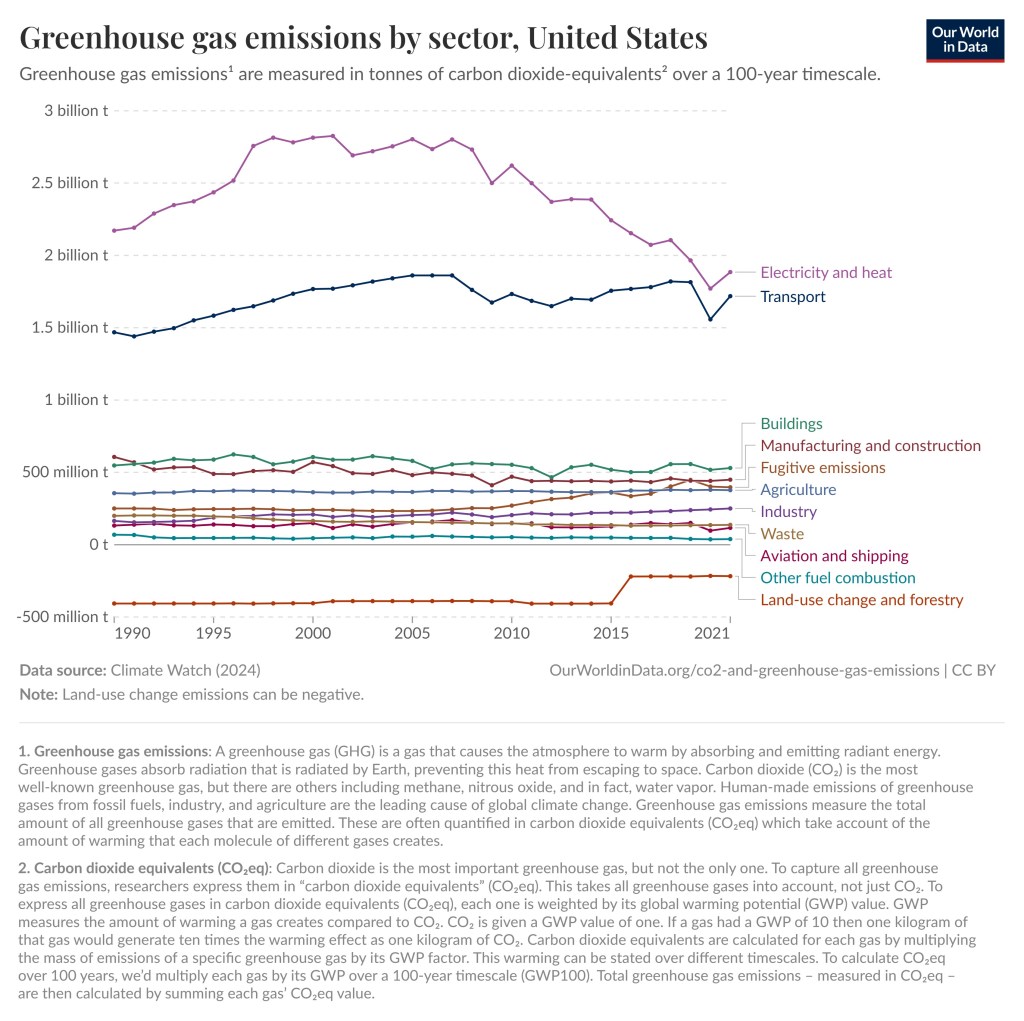
As you can see in the graphs below, the largest contributor of greenhouse gas emissions in the World and in the United States is electricity and heat. Unfortunately, the composition of the electric grid is something we as consumers have very little control over. We can save energy, get solar panels for our roof, or buy our electricity from green energy companies, but we cannot easily change the composition of the grid. Energy companies and politicians must do that.
However, we can make our voices heard by calling and writing to our representatives. This might be the single most impactful action that you as an individual can take. Your congressman, senator, or state legislator will probably not read your letter. They have hundreds of thousands or millions of constituents and get lots of letters every day. What is likely to happen is that a staff member will skim the letter and note the concern in a database.
Just make sure that your letter is politely written so it does not go in the wastebasket. Also make sure that you are a constituent. Writing to Ted Cruz when you live in Florida is not going to have an impact. They are interested in finding out what the concerns of their constituents are and according to staff members and other information I have come across, this really has an impact.
Data source : Climate Watch (2024). Note : Land use emissions can be negative. OurWorldinData.org/co2-and-greenhouse-gas-emissions| CC BYData source : Climate Watch (2024). Note : Land use emissions can be negative. OurWorldinData.org/co2-and-greenhouse-gas-emissions| CC BY
Conclusion
The survey mentioned above showed that among the twelve environmental actions an individual could take, the one with the second to smallest positive impact was the one that the majority thought had the biggest positive impact, despite it having a relatively tiny impact. The actions that could really make a huge difference were hardly considered.
We, the public, are very bad at determining what is good or bad for the environment and what has a significant and positive impact or not, even though the data is out there and we easily can look it up. Maybe the biggest positive impact one could have on the environment is to look up the facts and get better educated.
This picture reminded me of our trip to Australia and all the kangaroos and other marsupials we encountered. This is a submission for Kevin’s No Theme Thursday.
There Are Three Types of Mammals
Placentals, Monotremes, and Marsupials
All mammals are warm-blooded, have fur, and produce milk. However, there are three main types of mammals, placentals, monotremes, and marsupials, distinguished by how they give birth. Placentals give birth to well-developed young, and they nourish their young in the uterus through the placenta. Examples include gorillas, humans, whales, rodents, tigers, and bats. Monotremes lay soft-shelled eggs. Examples include the platypus and the echidna.
Then we have Marsupials, which give birth to small and underdeveloped young. Most female marsupials have pouches. Examples include kangaroos, wallabies, wombats, possum, opossum, Tasmanian devils, and koalas. Below is a kid friendly overview of the three types of mammals.
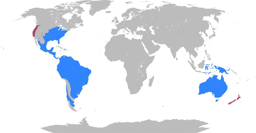
Marsupials on Three Continents
Close to 70% of the 334 extant marsupial species are concentrated on the Australian continent, including mainland Australia, Tasmania, New Guinea, and nearby islands. The remaining 30% are distributed across the Americas, primarily in South America. The Virginia opossum is the only marsupial native to the United States, but it is quite common. For example, we have lots of them in our neighborhood in Dallas. It should also be noted that there are a lot of marsupial fossils in Antarctica, which means that marsupials once lived there.
This map shows the distribution of marsupials. Blue indicates places in which marsupials are native and purple where they have been introduced. The image is from Wikipedia commons created by Michal Klajban under https://creativecommons.org/licenses/by/4.0/.
DNA evidence supports a South American origin for marsupials, with Australian marsupials arising from a single Gondwanan migration of marsupials from South America, across Antarctica, to Australia. These continents were connected and part of the supercontinent Gondwana back then. The ancestors of the marsupials, the metatherians split from placentals around 100 million to 120 million years ago during dinosaur times.
Bamboozled by an Opossum
We’ve found opossums in our house, behind our laundry machine. We’ve seen them along the street, on lawns in the neighborhood and we’ve seen them climb trees. They are pretty common in our neighborhood. It should be noted that they are not possums even though they are sometimes called that. Possums is an Australian relative to the Opossum.
One day when my wife and I were out walking the dogs we saw an opossum lying on the alleyway behind our house. He looked dead. However, when I checked, he was warm and appeared to be alive even though he was unconscious. We put him in a box containing a soft blanket and took him to the veterinary. We were willing to pay for any treatment or surgeries needed. At the veterinarian he woke up and they later placed him in a nature sanctuary. We did not need to pay anything.
Later on, we learned that when an opossum is threatened or harmed, they will “play possum“. They mimic the appearance and smell of a dead animal. This response is involuntary, like fainting, and not a conscious act. That might have been what was going on. So, I might have been bamboozled by an opossum. Bamboozlement seems to be the story of my life. Luckily, he was a male and the veterinary said it looked like he had been hit by a car, so us taking him to the veterinary probably did not do much harm. However, the “playing possum” thing is something to keep in mind with these animals.
Australia and our Photos of Marsupials
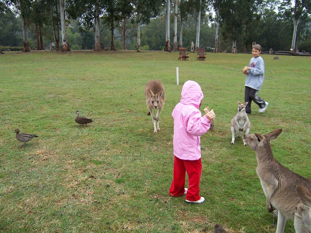
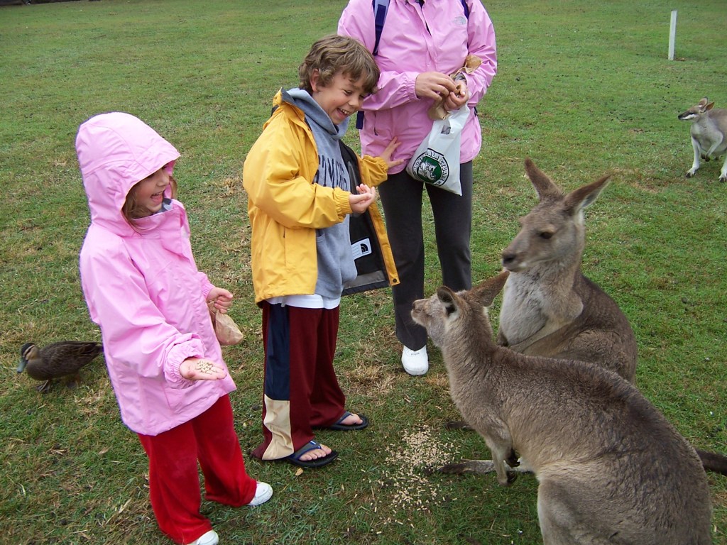
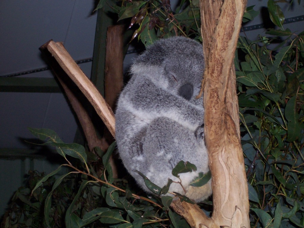
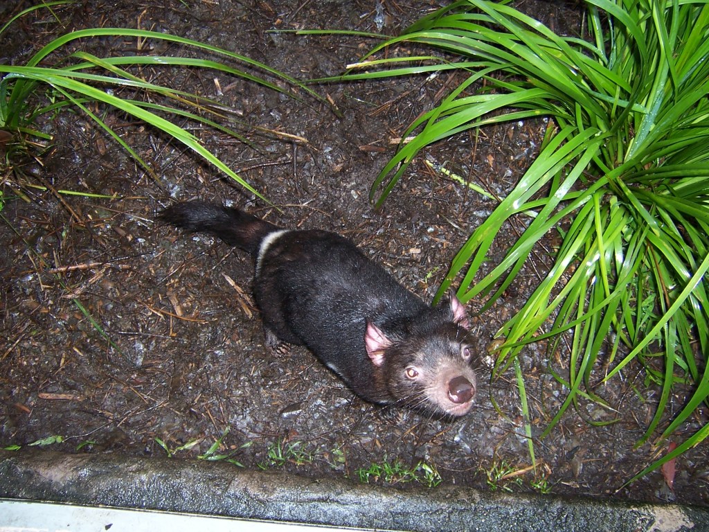
When our kids were young, we traveled to Australia where we encountered a lot of marsupials in the wild, in nature preserves and at zoos We encountered a lot of kangaroos but also wombats, koalas, and Tasmanian Devils. I can add that checking out kangaroos and other marsupials was not the only thing we did in Australia. We also spent a week in Great Barrier Reef where we did snorkel and scuba diving.
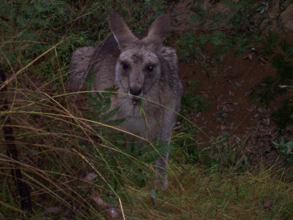
The first picture below was from our visit to the Blue Mountains. We stopped to have lunch, and I decided to go and take a leak. As I approached a bush, I heard some noise and when I looked behind the bush, I saw that there was a kangaroo behind it. What you see in the picture below is what I saw. The kangaroo was just two yards away. He seemed to be as startled as I was, and we stared at each other for a few seconds. I had my camera hanging around my neck, so I decided to take a photo. Then he hopped away. I am so glad I did not pee on his lunch.
A surprise encounter with a kangaroo in the wild. I am so glad I did not pee on his lunch.Our oldest son and daughter feeding small kangaroos (or wallabies) at a nature preserve outside Brisbane, Australia.Our younger son and daughter feeding small kangaroos at a nature preserve outside Brisbane, Australia. They are laughing because one of the kangaroos grabbed the entire bag of food and then spilled it.A small kangaroo/wallaby is sniffing my camera (at the same nature preserve).
Note : Koalas are often called Koala bears, but they are not bears.
A Koala sleeping in a tree at Brisbane Zoo.Our daughter holding a Koala at Brisbane Zoo.A Tasmanian Devil at the Brisbane Zoo.Wombat at Brisbane Zoo
One interesting fact about Wombats is that they produce cubic shaped poop. This makes the poop stackable, and the wombats use it to mark their territory and attract mates.