Half the World’s Population Live within a 2 Percent Circle

Super fact 57 : Half the World’s Population live within a circle that covers 2% of the world’s surface, or 10% of earth’s land area. This circle is often referred to as the “Valeriepieris Circle” or Yuxi Circle, and it is centered on southeast Asia.

This circle, has a radius of a bit more than 2,000 miles, and encompasses densely populated areas of East and South Asia, including major population centers like China, India, and Indonesia. The original Valeriepieris Circle was created by a teacher named Ken Myers in 2013 and was larger (radius 2,500 miles) than the more optimized circle created in 2015. In 2015, Singaporean professor Danny Quah—with the aid of an intern named Ken Teoh created a significantly smaller circle (radius 2,050 miles) that included half the world’s population. 4.2 billion people live in the Valeriepieris Circle, which is 5.6 times as many people as in Europe and 12.4 times as many people as in the Unites States.

I consider this a super fact because it is true, it is an important fact, and it is a surprising fact to those of us who have not come across this information before. It is an important fact because it impacts how we view our world. The circle is located far away from Europe and North America, in a part of the world that is rising quickly economically. The people in this highly populated circle have different cultures, music, literature and religions from the US and Europe. They speak different languages, and they play different sports, well soccer (the real football) is international but not as common in the Valeriepieris Circle as in Europe or South America.

Those among us who live outside of this circle, for example, in the United States or Europe, probably need to pay more attention to this half of world. Especially, if you live in the United States, it is easy to believe that the world is about us. The existence of this circle demonstrates that this view is not a realistic view.

This is a world map showing all the continents with the colors of the Valeriepieris Circle inverted. It should be noted that the circle is quite small compared to the whole world | Half the World’s Population Live within a 2 Percent Circle | The original 2013 map by Ken Myers, with the interior of the circle.
The original 2013 map by Ken Myers, with the interior of the circle. Half as many people live inside the circle as outside the circle. However, it is larger and less optimized compared to the circle from 2015 below. This circle is NASA, Public domain, via Wikimedia Commons
This is a special geometric projection of planet earth showing the Valeriepieris Circle at the center. The proportion of the circle (yellow circle) and the whole earth is proportional, and the circle is obviously much smaller | Half the World’s Population Live within a 2 Percent Circle | Danny Quah's 2015 circle, on a Lambert azimuthal equal-area projection.
Danny Quah’s 2015 circle, on a Lambert azimuthal equal-area projection. It should be noted that the fraction of the area of the circle to that of the globe is equal to its equivalent on Earth. Again, half as many people live inside the circle as outside the circle. From Wikipedia cmglee, jimht at shaw dot ca, CC BY-SA 4.0 <https://creativecommons.org/licenses/by-sa/4.0&gt;, via Wikimedia Commons.

Population of Southeast Asia

The countries that are part of the Valeriepieris Circle are, for example,

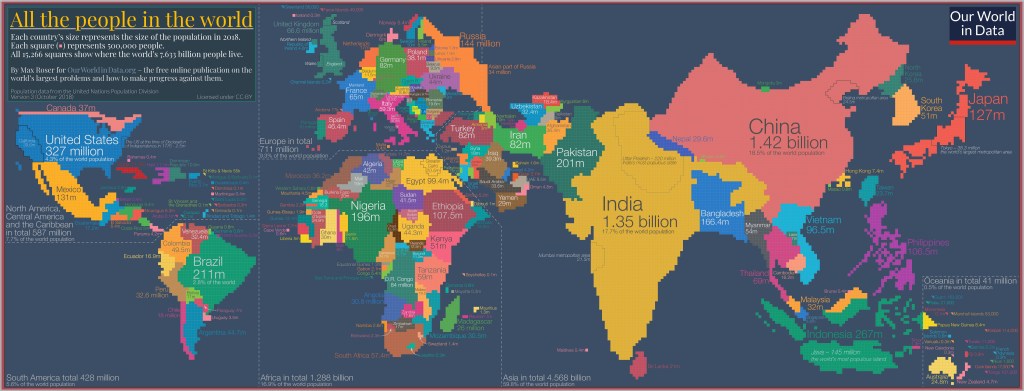
The map shows the countries in Southeast Asia as relatively large, especially, China and India. Almost the entire right-hand side of the map is filled with Southeast Asian countries making it easy to understand how just around 20 Southeast Asian countries can correspond to half the world’s population.
Each country’s size represents the size of the population in 2018. Each little square represents 500,000 people. All 15,266 squares show where the world’s 7,633 billion peopls lived in 2018 (now the world population is 8,244 billion people). Image from our World in Data. By Max Roser for OurWorldinData.org – the free online publication on the world’s largest problems and how to make progress against them.

Population Statistics

Most people know that in recent centuries the world population has grown almost exponentially but is now projected to level off sometime around the middle of this century. Europe is an interesting example. A thousand years ago Europe’s share of the world population was around 14.5%. Then came the scientific revolution and the industrial revolution and by 1900 it was 25%. As other countries around the world became industrialized Europe’s share of the world population shrunk, even though the population of Europe kept increasing, just slower. Now Europe’s share of the world population is 9%.

As countries become wealthier their population growth tends to slow down, not just in Europe, but around the world. The world’s population growth is illustrated by the image from Our World in Data below (starting 5,000 years ago, ending the year 2000) and the six minute YouTube video below from the American Museum of Natural History (starting 100,000 years ago and ending the year 2100). The YouTube video also shows the projected population decline beyond the year 2050.

Twelve maps depicting earth’s population distribution  (population per square kilometer) at different twelve different times in history. The times are 3000BC, 2000BC, 1000BC, 1AD, 500AD, 1000AD, 1500AD, 1600AD, 1700AD, 1800AD, and 2000AD | Half the World’s Population Live within a 2 Percent Circle
Population per square kilometer. Source of the original visualization Klein Goldewijk, Beusen and Janssen (2010). Long term dynamic modeling of global population and built-up area in a spatially explicit way: HYDE 3.1. In the Holocene 20(4) 565-573. The original visualization was adapted by OurWorldinData.org


A somewhat related super fact is – Poverty and child mortality has been sharply reduced worldwide.

Next Super fact coming up is : Time is the fourth dimension


To see the other Super Facts click here

The Bermuda Triangle the Big Non-Mystery

Super fact 56 : The Bermuda Triangle mystery is a myth. There is not a higher risk of disappearances in the Bermuda Triangle. To be specific, disappearances do not occur in the so-called Bermuda Triangle, or Devils Triangle, with any higher frequency than in other comparable regions of the ocean. The “mystery” of the Bermuda Triangle is largely a manufactured one, perpetuated by sensationalized accounts that often misrepresent the facts and downplay the role of natural hazards like storms.

The number of ships and aircraft reported missing in the Bermuda Triangle is not significantly greater, proportionally speaking, than in any other part of the ocean. The U.S. Coast Guard, along with NOAA, the U.S. Navy, Lloyds of London who pays out insurance for ships and aircraft lost/missing at sea, and other organizations do not recognize the Bermuda Triangle as a unique or mysterious geographic hazard. They emphasize that this is a highly traveled area where the losses are consistent with natural phenomena such as strong storms, the Gulf Stream, human error, and poor navigation, rather than any mysterious forces.

Considering all this, the number of disappearances and accidents is what you’d expect. The Bermuda Triangle isn’t any more mysterious than the Greenland square, the New Zeeland circle, or the Azores Octagon, that I just made up. I consider this a super fact because it is very likely true, and yet surprising to many people who are convinced that there really is a mystery. Furthermore, it is important because it is such a well-known myth.

The Bermuda triangle has one corner in Bermuda, one in Puerto Rico and one around Miami, Florida | The Bermuda Triangle the Big Non-Mystery
The Bermuda Triangle: It is approximately defined as a triangle Florida, Bermuda, and Puerto Rico. There is no exact definition. Alphaiosderivative work: -Majestic-, Public domain, via Wikimedia Commons.

Bermuda Triangle Mysteries

Just because the risk of disappearances of planes and ships is not higher in the Bermuda Triangle, does not mean that there aren’t mysterious disappearances and mysterious phenomenon occurring in the Bermuda Triangle. Some notable disappearances are USS Cyclops (1918), Flight 19 (1945), Star Tiger and Star Ariel (1948–1949), and the Witchcraft (1967). However, there are mysteries and mysterious phenomena occurring all around the world.

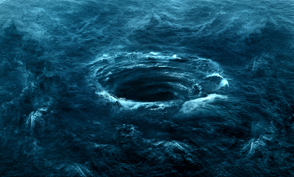
One of the mysterious phenomena occurring in the Bermuda Triangle is ocean swirls, and rogue waves, and methane burps might be another problem, but it is far from unique to the Bermuda triangle, and there are no magnetic anomalies in the Bermuda triangle as often alleged.

Ocean swirls frequently occur all over the world with some famous hotspots for ocean swirls by the coasts of Japan, Norway, Italy, Scotland, and Maine, USA. The ocean swirls in the Bermuda triangle might be due to movement of water between landmasses and/or the Gulf stream, but this is under investigation. There are no known giant or permanent ocean swirls in the Bermuda triangle.

A giant deep ocean swirl in the middle of the blue ocean.
Ocean swirl allegedly in the Bermuda Triangle Asset id: 1158148882 by PHOTO JUNCTION

As mentioned, another mysterious phenomenon is methane bubbling to the surface of the ocean. However, as can be seen in the maps in this National Geographic blog post the source of these methane burps of death aren’t typical to the Bermuda triangle. The methane hydrate field in the first map of the National Geographic blog post is mostly outside of the Bermuda triangle stretching from Cuba and up along the Florida coast. The second map, the world map, shows that these methane hydrate fields exist all around the world.

Our Honeymoon in Bermuda

Below are some old photos from our honeymoon in Bermuda in August of 1991.


To see the other Super Facts click here

United States, Europe and the Pacific Ocean Are Bigger Than You Might Think

Superfact 11: United States, Europe and the Pacific Ocean Are Bigger Than You Might Think

  • The area of the United States is around 9,8 million square kilometers
  • The area of continental United States is around 8.1 million square kilometers
  • The area of Europe is around 10.2 million square kilometers
  • Earth’s total land area is 148.9 million square kilometers
  • The area of the Pacific Ocean is 165.3 million square kilometers
  • The area of the whole earth is 510 million square kilometers

The United States

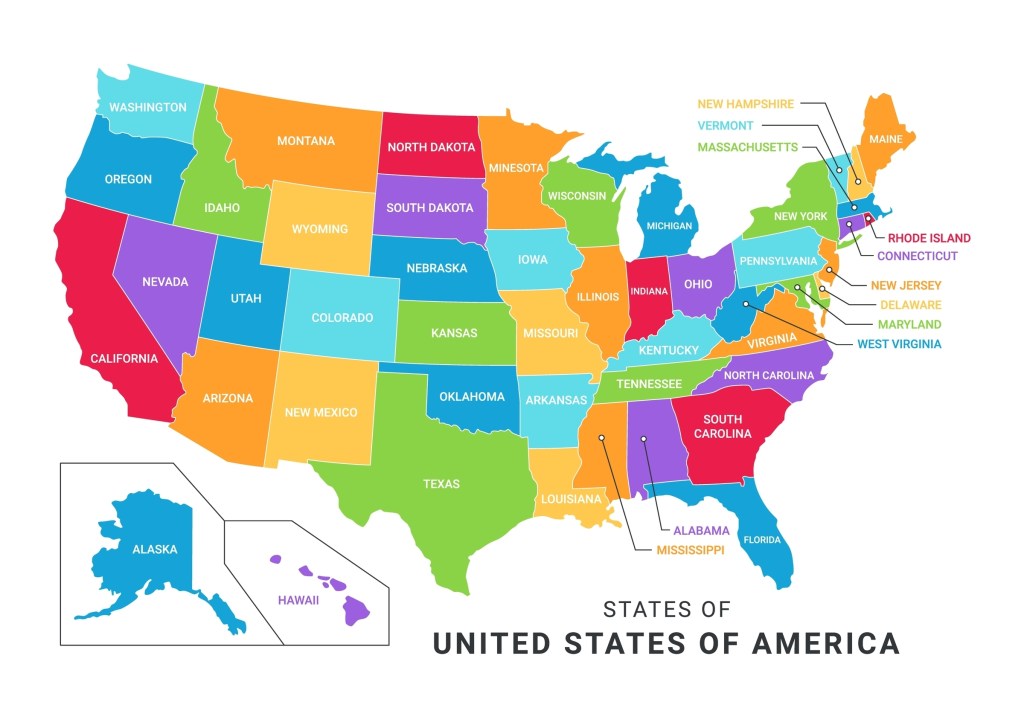
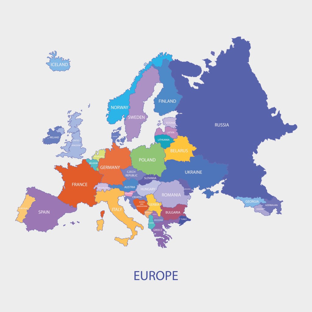
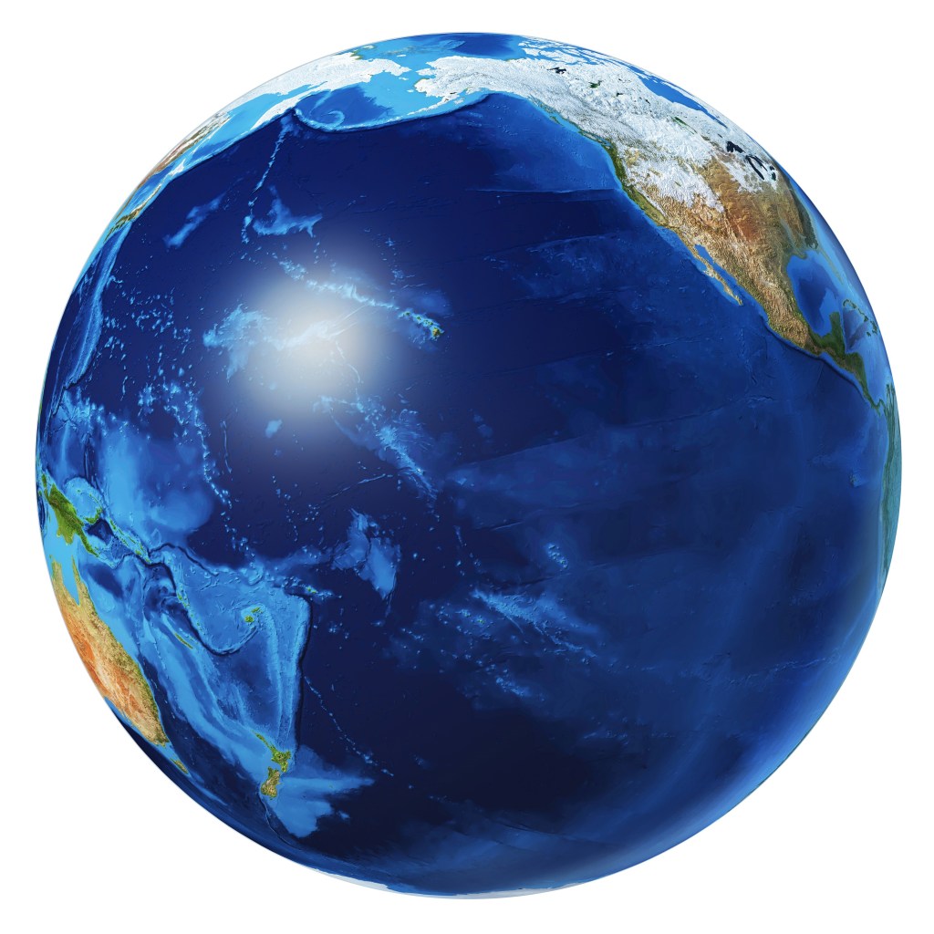
The United States is much bigger than many Europeans think. Europe is much bigger than many Americans think. Many of us don’t realize that one of the five oceans, the Pacific Ocean, is one third of earth’s entire surface and cover a larger area than all landmass on earth. Since so many of us are surprised to hear these facts and they are not under dispute among experts, they constitute a super-fact, or a few super-facts in my opinion.

The map of the states in the United States are shown in various colors. It should be noted that some states are quite large and some quite small | United States, Europe and the Pacific Ocean Are Bigger Than You Might Think
Map of the United States. Alaska and Hawaii are not to scale. Alaska is double as big as Texas. Stock Vector ID: 2247501877 by HazimAlfi.

Some time ago I was talking to a Swedish friend of mine who told me something along the lines of “the United States isn’t so big as they say. We drove through half a dozen states in an afternoon.” I asked her, “which states?” It turns out that was the New England states, Maine, New Hampshire, Massachusetts, Rhode Island, Connecticut, and finally New Jersey and New York (New York city). You can do that drive in an afternoon, but you cannot drive through Texas in an afternoon, not even in a day.

The distance from Texarkana to El Paso is 1,300 kilometers and takes more than 12 hours to drive on the highway without stopping. I’ve come across many Europeans who underestimate the size of the United States. The mistake they make is that they don’t realize that while some US states are small, other states are much bigger. Just look at the map.

A to scale map of Europe with the countries having different colors. It should be noted that some countries are quite large and some quite small | United States, Europe and the Pacific Ocean Are Bigger Than You Might Think
Political map of Europe (including European Russia) Stock Vector ID: 319593110 by okili77.

Europe

Interestingly Americans often make the same mistake about Europe. I quite often hear Americans claim that distances are so small in Europe. You can drive through a country in a couple of hours and the language changes. It’s a trope that seems to be repeated every time Europe is discussed on social networks.

Today, as I was talking to a friend of mine about our recent trip to Sweden and Norway, my friend told me that it was good that distances in Europe were so short so we could easily travel between the places I was telling him about. He was more than surprised to hear that was not the case.  The distance between where we were Sweden and Norway was too large for anything other than planes considering we only had 10 days.

The distance from Malmö in southern Sweden to Karesuando in northern Sweden is more than 1,900 kilometers and takes more than 21 hours to drive without stopping. In fact, by area, Sweden is bigger and longer than California. 

The Pacific Ocean

Last but not least. Earth has seven continents (Asia, Africa, North America, South America, Antarctica, Europe, and Australia), and five oceans (the Arctic, Atlantic, Indian, Pacific, and Southern (Antarctic) Oceans). But just one ocean, the Pacific Ocean cover a third of earth’s entire surface. This may come as a surprise to many. See the globe photorealistic 3d illustration below.

Earth globe photorealistic 3d illustration, on white background. Pacific Ocean view. Clipping path included. Without clouds.
Earth Pacific Ocean view Stock Illustration ID: 1617553012 by Matis75.

To see the other Super Facts click here