The goal of this blog is to create a list of super facts. Important facts that are true with very high certainty and yet surprising, misunderstood, or disputed by many. This blog aims to be challenging, educational, and fun, without it being clickbait. I determine veracity using evidence, data from reputable sources and longstanding scientific consensus. Prepare to be challenged (I am). Intentionally seek the truth not confirmation of your belief.
Category: Super fact
This post is about a super-fact. The goal of this blog is to create a list of facts or insights that are important and not trivia, known to be true, and yet highly surprising, shocking, amazing, or widely disputed amongst the public but not disputed among the scientists or experts in the relevant fields. However, not all of my posts are super-facts. This category distinguishes posts that are super-facts.
Superfact 11: United States, Europe and the Pacific Ocean Are Bigger Than You Might Think
The area of the United States is around 9,8 million square kilometers
The area of continental United States is around 8.1 million square kilometers
The area of Europe is around 10.2 million square kilometers
Earth’s total land area is 148.9 million square kilometers
The area of the Pacific Ocean is 165.3 million square kilometers
The area of the whole earth is 510 million square kilometers
The United States
The United States is much bigger than many Europeans think. Europe is much bigger than many Americans think. Many of us don’t realize that one of the five oceans, the Pacific Ocean, is one third of earth’s entire surface and cover a larger area than all landmass on earth. Since so many of us are surprised to hear these facts and they are not under dispute among experts, they constitute a super-fact, or a few super-facts in my opinion.
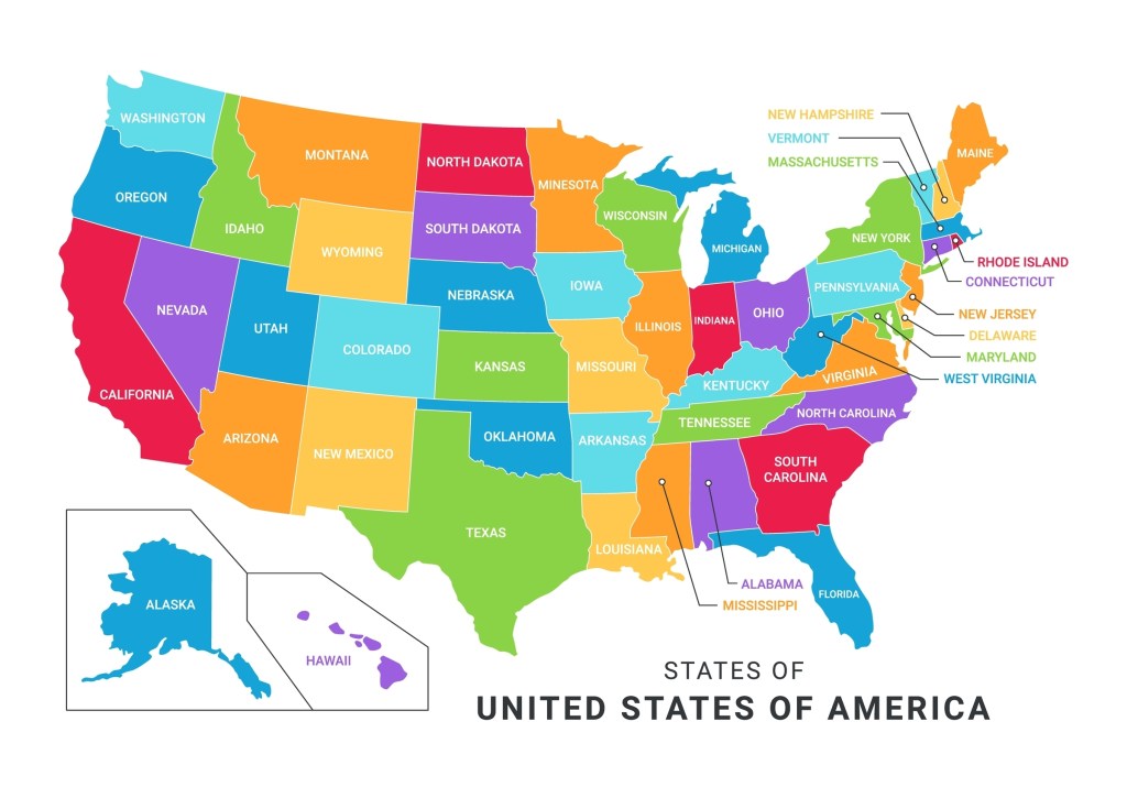
Map of the United States. Alaska and Hawaii are not to scale. Alaska is double as big as Texas. Stock Vector ID: 2247501877 by HazimAlfi.
Some time ago I was talking to a Swedish friend of mine who told me something along the lines of “the United States isn’t so big as they say. We drove through half a dozen states in an afternoon.” I asked her, “which states?” It turns out that was the New England states, Maine, New Hampshire, Massachusetts, Rhode Island, Connecticut, and finally New Jersey and New York (New York city). You can do that drive in an afternoon, but you cannot drive through Texas in an afternoon, not even in a day.
The distance from Texarkana to El Paso is 1,300 kilometers and takes more than 12 hours to drive on the highway without stopping. I’ve come across many Europeans who underestimate the size of the United States. The mistake they make is that they don’t realize that while some US states are small, other states are much bigger. Just look at the map.
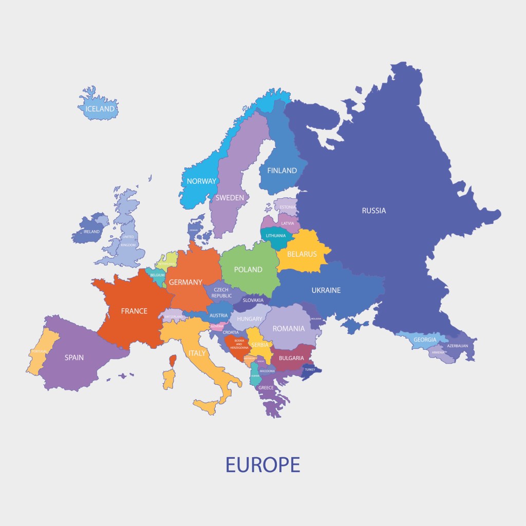
Political map of Europe (including European Russia) Stock Vector ID: 319593110 by okili77.
Europe
Interestingly Americans often make the same mistake about Europe. I quite often hear Americans claim that distances are so small in Europe. You can drive through a country in a couple of hours and the language changes. It’s a trope that seems to be repeated every time Europe is discussed on social networks.
Today, as I was talking to a friend of mine about our recent trip to Sweden and Norway, my friend told me that it was good that distances in Europe were so short so we could easily travel between the places I was telling him about. He was more than surprised to hear that was not the case. The distance between where we were Sweden and Norway was too large for anything other than planes considering we only had 10 days.
The distance from Malmö in southern Sweden to Karesuando in northern Sweden is more than 1,900 kilometers and takes more than 21 hours to drive without stopping. In fact, by area, Sweden is bigger and longer than California.
The Pacific Ocean
Last but not least. Earth has seven continents (Asia, Africa, North America, South America, Antarctica, Europe, and Australia), and five oceans (the Arctic, Atlantic, Indian, Pacific, and Southern (Antarctic) Oceans). But just one ocean, the Pacific Ocean cover a third of earth’s entire surface. This may come as a surprise to many. See the globe photorealistic 3d illustration below.
Earth Pacific Ocean view Stock Illustration ID: 1617553012 by Matis75.
The matter in our bodies and our planet was formed by fusion in the cores of distant stars and then spread across the Universe by supernova explosions. This matter was later incorporated in second and third generation stars like our sun and its planets.
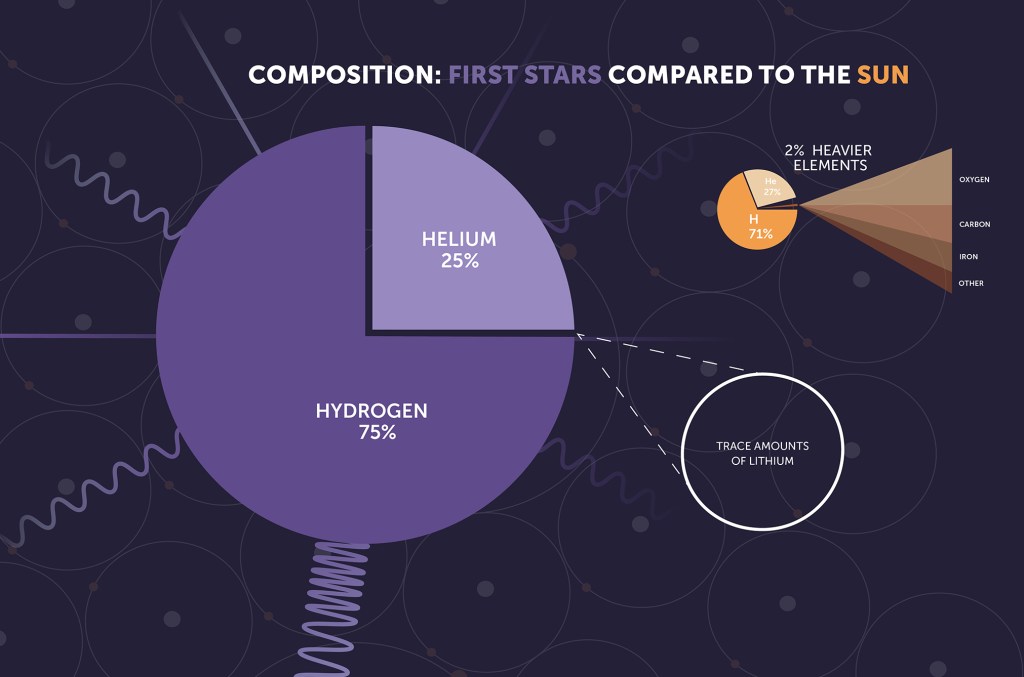
What do I mean by “We are Star Dust”? Let me explain. The first stars in the Universe were made of 75% hydrogen and 25% helium and trace amounts of Lithium, just like the entire Universe at the time. There were no heavier elements that could form planets or other solid celestial bodies. These early stars tended to be large and heavier elements like carbon, oxygen, and iron were formed by fusion in the cores of these stars.
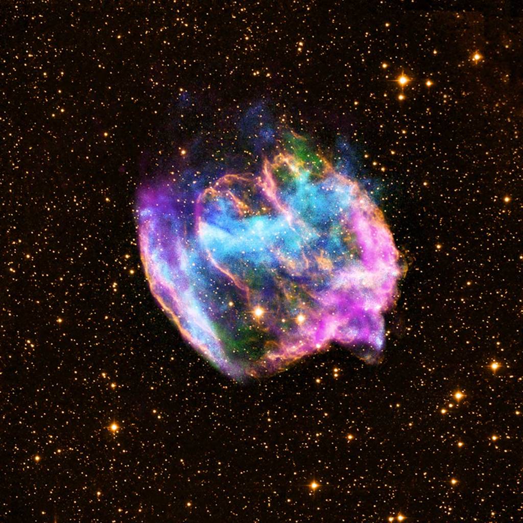
Many of the first stars, called first generation stars, ended their lives in massive supernova explosions and the dusty remains of these explosions, including the metals formed in their cores, became the building blocks of the stars we see today. These second and third generation stars have planets and other smaller solid objects orbiting them, formed from the gas and dust (star dust) left over from the supernova explosions. So, we are star dust. The atoms formed inside the first-generation stars are now within us.
The first-generation stars consisted of 75% hydrogen and 25% helium and trace amounts of Lithium. A second or third generation star like our sun is still mostly hydrogen and helium but also many other elements. The rocky planets circling the sun are mainly elements heavier than hydrogen and helium. Image credit NASA, ESA, CSA, STScI.Remnants of a recent supernova W49B, 26,000 light years away. Credit: X-ray: NASA/CXC/MIT/L.Lopez et al.; Infrared: Palomar; Radio: NSF/NRAO/VLA.
For those who know astronomy this may be basic information, but I’ve met many people who are unfamiliar with this information, and they are quite often surprised and astonished. That is why I consider this information a super fact. I can add that this process, the birth and death of first-generation stars, the supernova explosions, the disbursal of the matter, which later clump together to form new stars and rocky planets as well, takes many millions of years.
This is an Illustration of a supernova. Stock Vector ID: 2109918599 by Varunyuuu.
A Refresher
For those who need a refresher of things like stars and planets and galaxies. Our sun is a star, a third-generation star. It is much bigger than our Earth. If Earth is the size of a small pea or a caper, then the sun would be the size of a beach ball. However, our sun is not a big star, and it is only one star among between 100 and 400 billion stars in our galaxy the Milky Way.
Many galaxies including our own are disc shaped or look like spirals. If you imagine a dust storm cloud in which there are a thousand dust particles per cubic foot, each representing a star. Then this dust cloud would be 100 to 400 feet thick, and a thousand feet wide and long. I can add that there are between 100 billion to 2 trillion galaxies in the visible Universe. Also, the Universe is much bigger than the visible Universe and might be infinitely large.
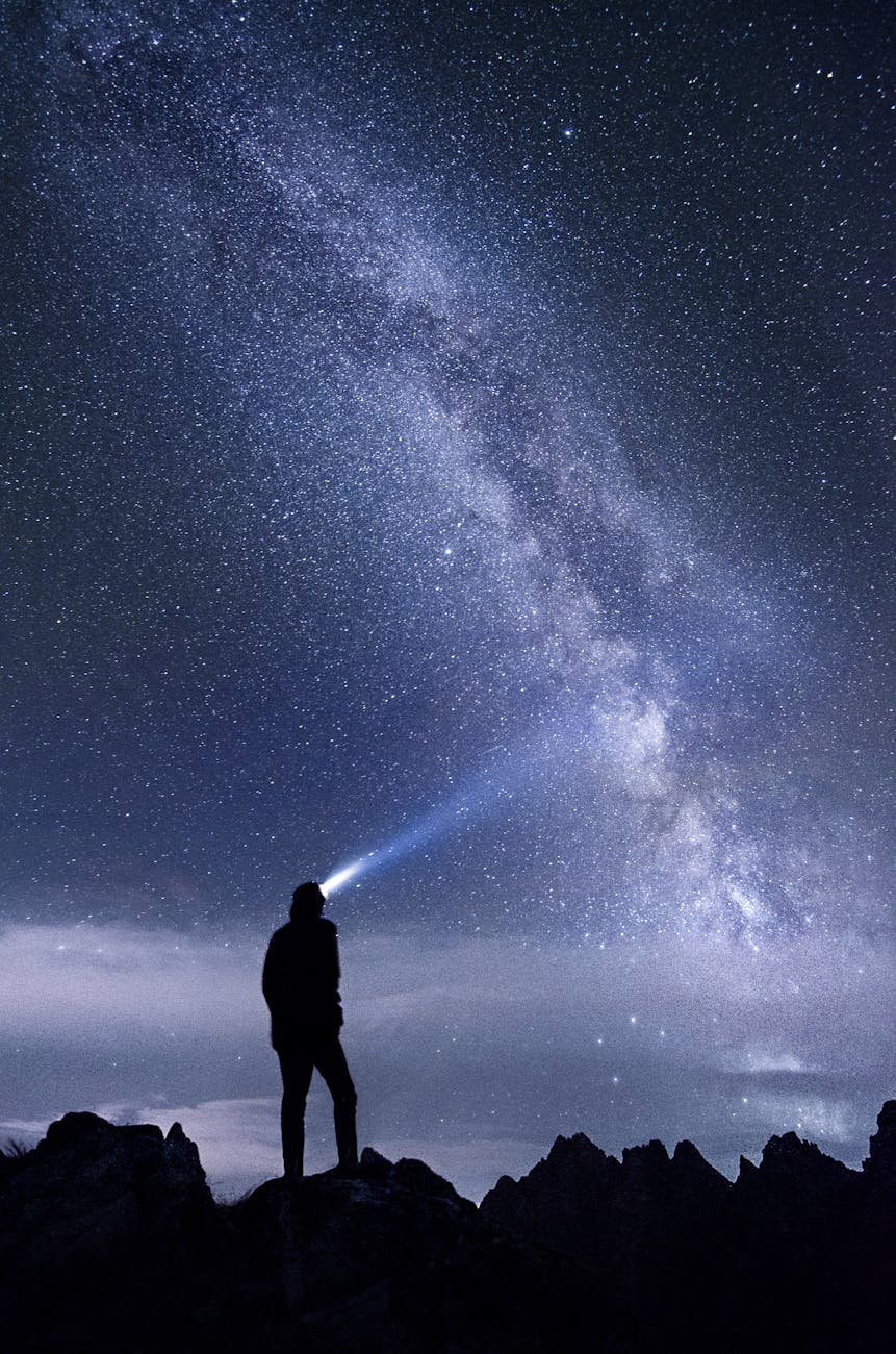
A glimpse of our milky way galaxy. Photo by Stefan Stefancik on Pexels.com
As mentioned, orbiting around our sun there are planets, dwarf planets, moons, planet rings, asteroids, comets, meteoroids, interplanetary dust, etc. The star closest to the sun is Proxima Centauri, which is 4.24 light-years away, but it is too small to be seen. The stars that are visible in the night sky tend to be large stars that are not too far away.
Here in Dallas where I live you can typically see 15 stars with the naked eye, and you cannot see the Milky Way. That’s because of the light pollution. In northern Sweden where I grew up you could see 3,000 stars, our galaxy the Milky Way, as well as the Andromeda Galaxy on a clear night with the naked eye.
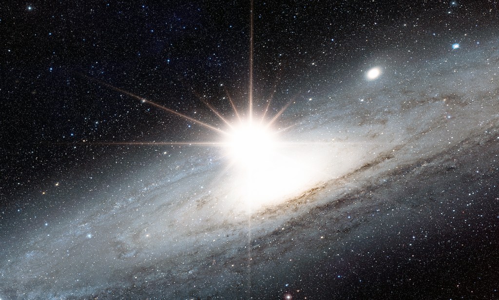
In 1885 a supernova explosion was recorded in the Andromeda Galaxy. Below is a constructed photo showing how it might have looked like if we had had better equipment back then. Notice that the supernova explosion is essentially outshining the entire galaxy. We are the result of the gases and dust spread by such explosions. You can also read more here.
Supernova explosion in the center of the Andromeda galaxy “Elements of this image furnished by NASA” It is essentially an enhanced photo of a supernova explosion in a neighboring galaxy. Stock Photo ID: 2495486227 by muratart.
Superfact 9 : We are living in relatively peaceful times
Despite all the wars going on, the world was filled with a lot more war and violence in the past. Despite the grim news reports we are living in relatively peaceful times.
If I asked you, what are the two biggest wars going on the world today (as of September 2024), you would probably say that it is the Russia / Ukraine war and the Israel / Gaza war. Well, unless you are really well informed, it would come as a surprise that there are more devastating wars going on in the world. For example, there is currently a big civil war going on in Sudan that began in April 2023.
According to the latest issue of the Economist perhaps 150,000 people have been slaughtered in this civil war, and 10 million people have fled their homes, and a famine is emerging that could kill 2.5 million people by the end of the year. This war is likely to destabilize neighboring countries and is sponsored by Russia and Middle Eastern states. It’s likely the biggest crisis in the world but most likely you’ve never heard of it.
In the recent Tigray war in Ethiopia between 162,000 and 600,000 people were killed according to Wikipedia. The Tigray war is mostly over, but the point I am trying to make is that you probably have never heard of it. You cannot use the impressions given by the amount of media attention a conflict gets to decide on how severe it is. You’ve got to check the statistics and compare, and the statistics might be quite unintuitive if you have relied on media attention as a metric.
What was the most devastating war in the 19th century?
So, to the next question. What was the most devastating war in the 19th century? If you say the American civil war, you are not correct (estimated 650,000+ deaths). A somewhat better answer is the Napoleonic wars (and estimated 4 million deaths). But none of the answers are correct. The Taiping rebellion in China was the worst. Estimates of the conflict’s death toll range between 20 and 30 million people. Some estimates say 100 million, which would make it the most devastating war in human history.
But did you hear about it? Again, you’ve got to check the statistics, and not rely on your impressions. I am saying this because the claim that deaths from wars and violence have declined over the last few decades is a quite unintuitive claim and yet it is true. That’s why it is a super fact.
Taiping Rebels at Shanghai China in 1853-54. ‘Small Swords’ refers to daggers used by warriors or martial artists in close combat. 19th century print. Stock Illustration ID: 237232531 by Everett Collection.
As this article in the Our World In Data states “While every war is a tragedy, the data suggests that fewer people died in conflicts in recent decades than in most of the 20th century. Countries have also built more peaceful relations between and within them.”. It should be noted that even though killing has never been as efficient as it is in the present, in the past a lot of civilians died from famine and disease resulting from the wars.
For example, the Spanish flu following World War I killed between 25 to 50 million people. I should say those numbers are typically not included in the deaths from World War I. The number of deaths from World War I are estimated at 20 million. 10 million combatants and 10 million civilians.
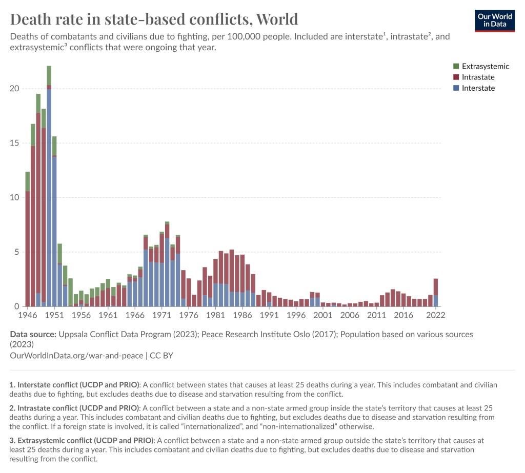
Death rate from wars since 1946. The uptick in 2022 is largely due to the Ethiopian Tigray war with 162,000–600,000 killed and the invasion of Ukraine, which US and BBC estimates at more than 200,000 deaths (but estimates from most other sources are less).
One problem with this kind of statistics is that the estimates vary, especially with respect to civilian causalities. In addition, very big wars lasting a few years create very bumpy graphs with large spikes making it harder to identify trends.
However, by listing estimated war deaths of the biggest wars, genocides and democides since the 1800’s you can see that deaths from this type of violence have overall been reduced over the last few decades. A note, democides are mass killings of civilians but are not necessarily directed at an ethnic group (democide include genocide).
The links below are mostly from Encyclopedia Britannica, but also from Wikipedia, the Census bureau, and a couple of other sources.
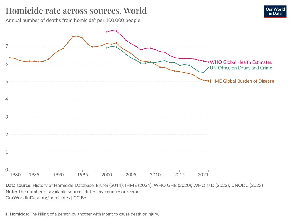
As I said, the numbers are estimates and not hard data, especially with respect to civilian casualties. However, you can see a trend going from several conflicts with numbers in the tens of millions before 1950, then numbers in millions until 2000/2007 and then during the last couple of decades the numbers have been less than a million. This does not cover homicide rates but even in that case we can see a reduction even though it is less distinct.
In this graph we can see that homicide rate worldwide has been reduced somewhat since the mid 1990’s. This graph is also taken from the Our World in Data website and they in turn used various databases from UN, WHO, etc.
Also remember that in the past there were a lot less people on earth, so relatively speaking a million deaths was a lot bigger number back then. In summary, despite all the wars going on, our world is less violent than it used to be.
Superfact 8 : US Violent Crime Nearly Cut in Half Since 1990
Despite all the news reports about rampant crime, the US violent crime rate has fallen to half of what it was in the early 1990’s.
I’ve known for a while that violent crime in the US has been going down substantially since 1990. However, quite often when I mention this people refuse to believe it. When I visit NextDoor, the hyperlocal social networking service for neighborhoods, I see people complaining about rising crime, and especially rising violent crime. The news media and the newspapers are filled with violent crime stories, murders, mass shootings, assaults, rape, and robberies. It seems to be getting worse and worse. We are living in scary times, aren’t we?
The Better Angels of our Nature
A couple of years ago I bought a book by Steven Pinker with the title The Better Angels of our Nature, why violence has declined, which contradicted the violence is getting worse narrative. In the book he claims that violence is trending down worldwide and that includes US violent crime.
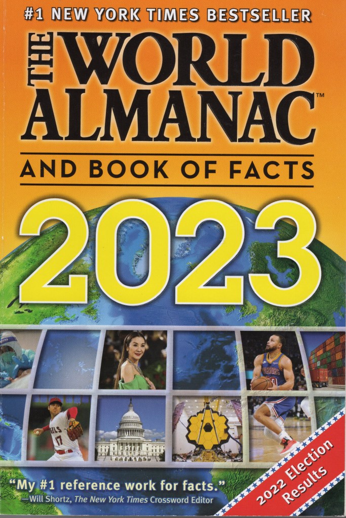
In 1987 I received a Christmas present from the parents of a fellow student whom I had been tutoring. I was an exchange student to the United States from Sweden at the time. The Christmas present in question was the World Almanac of 1987. I loved it and ever since I’ve bought the World Almanac every year. If you open the pages for crime statistics in the United States in the World Almanac you see the same thing, violent crime in the US is declining.
The World Almanac and Book of Facts 2023.
Statistics
Below is what the World Almanac 2023 says about the violent crime rate per 100,000 residents in the United States (page 114). The data sources were : Federal Bureau of Investigation, U.S. Department of Justice, Uniform Crime Reporting Program, Crime in the United States 2020. I also included property crimes in the last column to show that non-violent crimes have declined as well.
Year
All violent crime
Murder and nonnegligent manslaughter
Rape
Robbery
Aggravated assault
All property crime (non-violent)
1990
729.6
9.4
41.1
256.3
422.9
5,073.1
1995
684.5
8.2
37.1
220.9
418.3
4,590.5
2000
506.5
5.5
32.0
145.0
324.0
3,618.3
2005
469.0
5.6
31.8
140.8
290.8
3,431.5
2008
458.6
5.4
29.8
145.9
277.5
3,214.6
2011
387.1
4.7
27.0
113.9
241.5
2,905.4
2014
361.6
4.4
26.6
101.3
229.2
2,574.1
2016
386.6
5.4
30.0
102.9
248.3
2,451.6
2017
383.8
5.3
30.7
98.6
249.2
2,362.9
2018
370.4
5.0
31.0
86.1
248.2
2,209.8
2019
368.6
5.1
31.4
81.8
250.4
2,130.6
2020
387.8
6.5
27.6
73.9
279.7
1,958.2
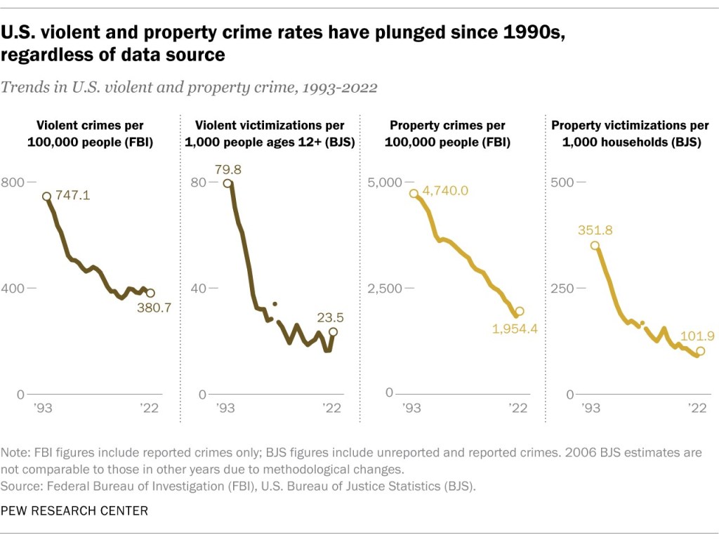
The graph below is taken from this article from the Pew Research Center tells the same story. The graph. It shows that the US violent crime rate has nearly halved since the 1990’s. There is a slight uptick in crime for the years 2020 and 2021 but according to this PBS article the downward trend has continued in 2022 and 2023.
The four graphs show that both violent crime and property crime has declined since 1990. Click on the picture to see the Pew Research article it is taken from.
Since this is a surprising fact that some does not even want to acknowledge (in my experience) I consider this a super fact.
Do you feel it is hard to believe that violent crime in the US has been declining over the last few decades?
Superfact 7 :Poverty and child mortality has been sharply reduced worldwide.
Extreme poverty as well as child mortality has been sharply reduced the world over. The countries that are the worst-off today are still better off than the countries that were doing the best at the beginning of the 19th century. Over the last 20 years extreme poverty and child mortality has continued to decline sharply.
In Hans Rosling’s book Factfulness, “Ten Reasons We’re are Wrong About the World – and Why Things Are Better Than You Think”, the author presented a quiz that he wanted the reader to take before reading the book. Below is the third question of the quiz. I should say that Hans Rosling posed this and other questions to thousands of people around the world.
In the last 20 years, the proportion of the World population living in extreme poverty has…
A. Almost doubled
B. Remained more or less the same
C. Almost halved
The correct answer is C. Almost halved. Around 7% of the quiz takers got the right answer. Around 5% in the United States got it right. That the proportion of the World population living in extreme poverty halved in 20 years is a true fact. This is also an important fact about the world. Despite that most people got it wrong. In fact, monkeys randomly picking answers would do better (33%). I did pretty well on this quiz, but since I was reading the book and the book’s title is “Ten Reasons We’re are Wrong About the World – and Why Things Are Better Than You Think”, I got some help just looking at the front cover. In any case, I think this fact qualifies as a super fact, as do the other fact below (There has been a steep decline in child mortality).
These are selected facts from the data.
There has been a steep decline in extreme poverty
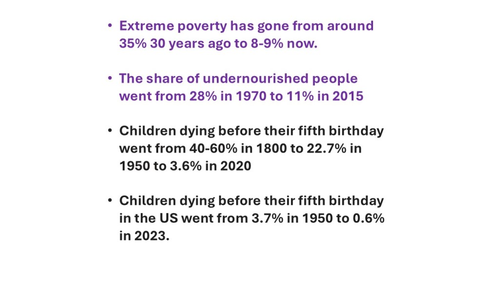
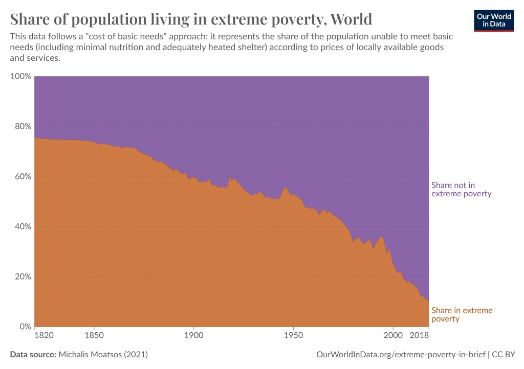
According to the World Bank and Our Data World in Data, an organization which makes data in databases easily accessible to public, extreme poverty went from almost 80% 200 years ago, 60% 100 years ago, about 45% 50 years ago, 34.3% 30 years ago, 23.6% 20 years ago, 8.4% in 2019, then it went up to 9% during the covid epidemic but it seems to be back down to a bit above 8% again. See the graph below as well as the two linked articles in this paragraph.
I should say that extreme poverty is (by the UN, World Bank, etc.) “a condition characterized by severe deprivation of basic human needs, including food, safe drinking water, sanitation facilities, health, shelter, education and information” and is currently defined to be below $2.15. In 2011 it was below $1.90.
This graph from Our World In Data shows a steep decline in extreme poverty over time. Click on the picture to visit the original article.
Other related statistics mentioned in Hans Rosling’s book is that the share of undernourished people went from 28% in 1970 to 11% in 2015. That is despite the earth’s growing population. Related to this is that cereal yield per hectare went from 1.4 ton in 1961 to 4 ton in 2014. This is due to modern agricultural techniques. The share of people with water from protected sources went from 58% in 1980 to 88% in 2015. This statistic was taken from WHO, UNICEF, the World Bank and FAO (the UN Food and Agriculture Organization).
There has been a steep decline in child mortality
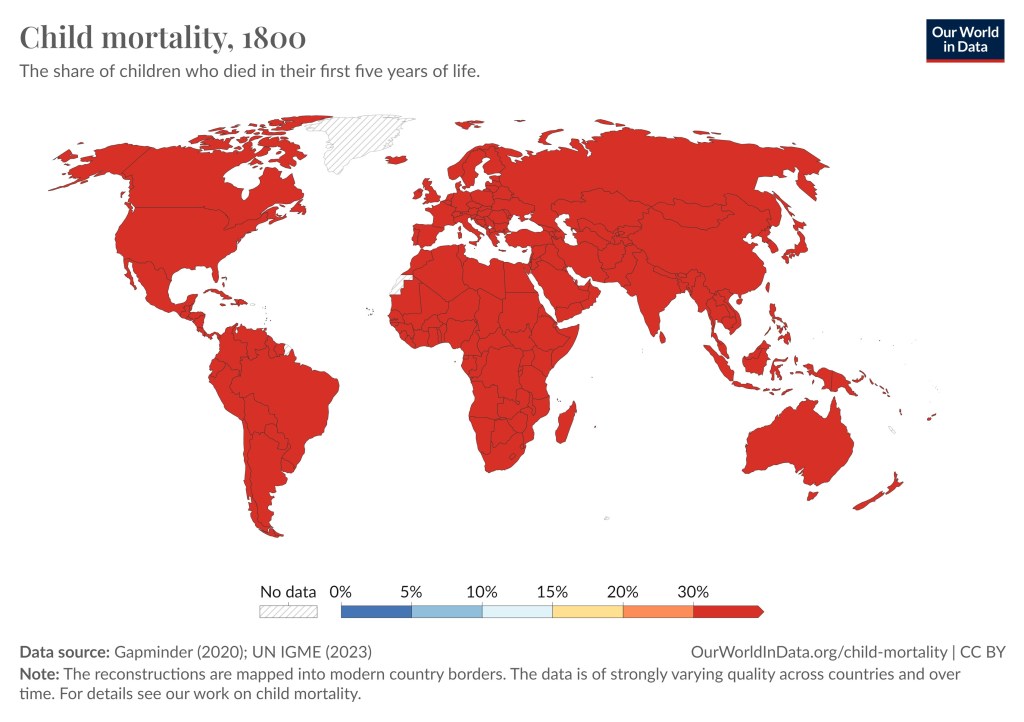
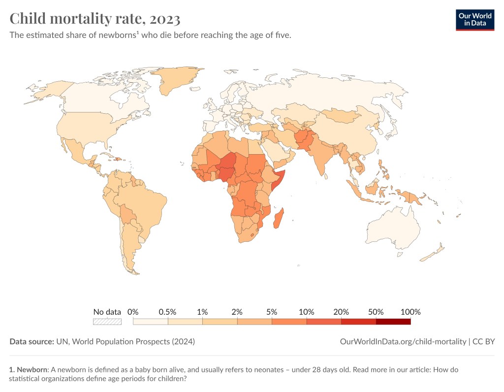
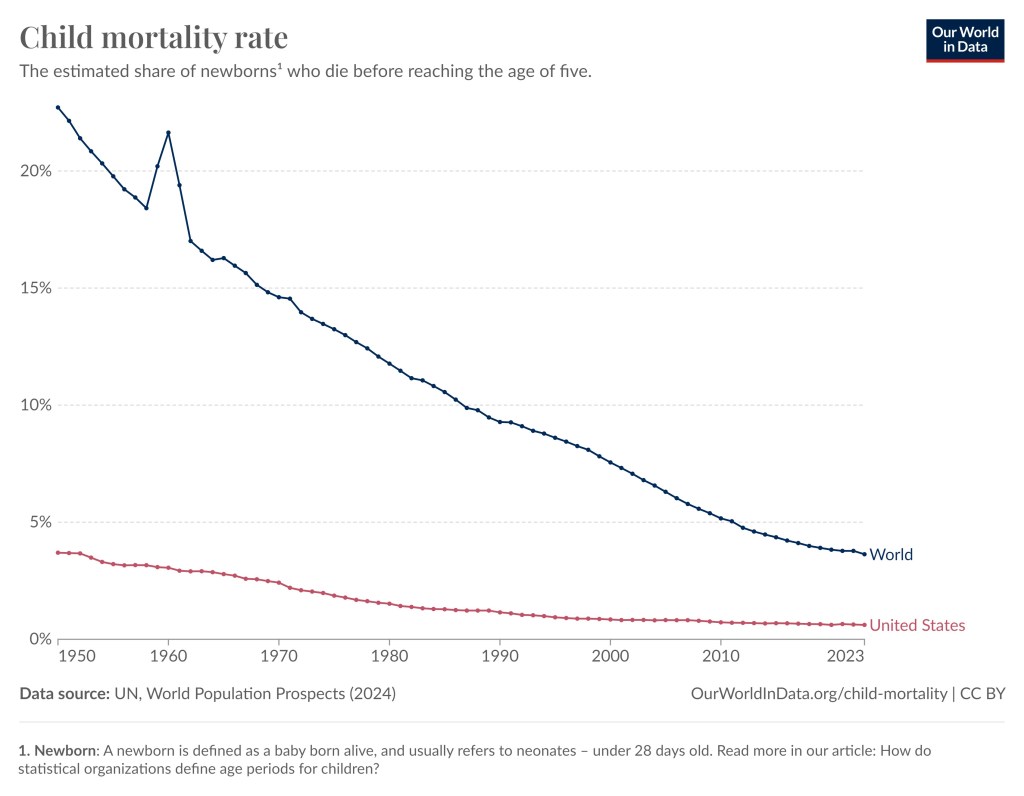
According to Hans Rosling’s book the percent of children dying before their fifth birthday went from 44% in 1800 to 4% in 2016. To get a more complete picture see these articles from Our World In Data, article1, article2, as well as the graph below. For most of humanities existence virtually all societies suffered a child mortality rate between 40% and 60%, but that changed drastically over the last 100 years.
Child mortality rate worldwide in 1800. Some of the data are estimates and may not be reliable. Data sources are UN IGME and Gapminder (an organization similar to Our World In Data).Child mortality rate worldwide in 2023. Niger has the highest child mortality rate of 11.6% and Iceland the lowest at 0.2%.Child mortality in in the world since 1950. The spike you see around the end of 1950 to 1960 is the great leap forward famine in China. In 1950 the child mortality rate was 22.7% and 2023 the child mortality rate was 3.6%.
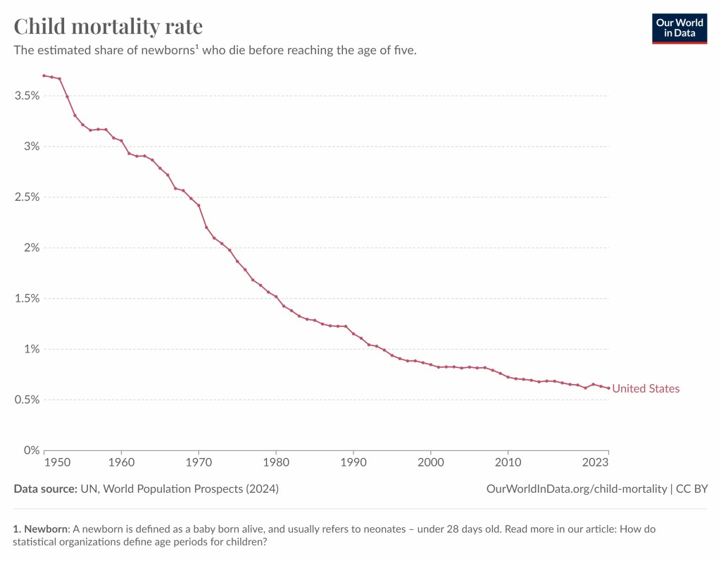
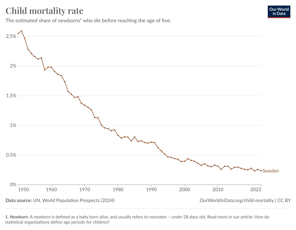
Below is the child mortality rate since 1950 for a few selected countries.
Child mortality in China since 1950. The large spike you see around the end of 1950 to 1960 is the great leap forward famine. 15 to 55 million died from starvation. In 2023 the child mortality rate was 0.7%.Child mortality in the United States since 1950 (3.7%). In 2023 the child mortality rate was 0.6%.Child mortality in Sweden since 1950 (2.6%). In 2023 the child mortality rate was 0.2%.




 Super Facts