Developed nations have successfully reduced carbon emissions

Super fact 42 : The developed nations (rich countries) have reduced their carbon emissions since the 1990’s despite continued GDP growth, even if we take offshore production into account. In addition, many developing countries have succeeded in reducing their emissions as well. Other fast-growing developing countries have flattened or at least slowed their increase in carbon emissions. Many countries have decoupled economic growth from CO2 emissions. In other words, we do not need to increase carbon emissions or burn more fossil fuels to grow the economy.

This is good news as well as a surprise to many people who falsely believe that to grow the economy (grow GDP) you need to burn more fossil fuels and an increase in carbon emissions is inevitable if you want to grow the economy. The data shows otherwise. This is important news that is difficult to believe in for many people. It is a super fact.

Carbon Emissions and GDP

In the past carbon emissions were strongly correlated with national wealth. The wealthier a nation was the higher its carbon emissions were and as the economy grew so did the carbon emissions. This has not been true since the 1990’s. The developed nations of the world have continued growing their GDP whilst reducing their carbon emissions.

You may think that the reason is that we shipped much of our manufacturing overseas and that if you consider the consumers in the importing country responsible for the overseas emissions this decoupling of GDP and emissions would disappear. But you would be wrong. Even if you make the consumers in the importing country responsible for the emissions during production in the exporting country the emissions have gone down. One example taken from this article in Our World in Data is the United Kingdom.

In the graph below for the UK the GDP (adjusted for inflation) grew by 53.26% between 1990 and 2023 and the emissions were reduced by 57.66%. If make UK consumers 100% responsible for the emissions in China and India, etc., caused by the production of goods imported to the UK the reduction until 2022 was 38.59%. That is not as much but it is still impressive and demonstrates the decoupling between GDP growth and carbon emissions.

The graph shows three plotted graphs, a dark blue one showing GDP per capita, a light blue one showing UK carbon emissions per capita and a red one showing trade adjusted carbon emissions per capita. The GDP graph is increasing by more than 50% over 33 years and the CO2 emissions per capita graph is decreasing by almost 60% and the trade adjusted carbon emissions decline by almost 40% | Developed nations have successfully reduced carbon emissions
Data source: Data compiled from multiple sources by World Bank (2025); Global Carbon Budget (2024); Population based on various sources (2024). Note: GDP per capita is expressed in international dollars at 2021 prices. Graph taken from Our World in Data.

The text in the graph above is difficult to read so I’ve copied it below in larger text:

  • Consumption-based emissions: Consumption-based emissions are national or regional emissions that have been adjusted for trade. They are calculated as domestic (or ‘production-based’ emissions) emissions minus the emissions generated in the production of goods and services that are exported to other countries or regions, plus emissions from the production of goods and services that are imported. Consumption-based emissions = Production-based – Exported + Imported emissions.
  • Fossil emissions: Fossil emissions measure the quantity of carbon dioxide (CO2) emitted from the burning of fossil fuels, and directly from industrial processes such as cement and steel production. Fossil CO2 includes emissions from coal, oil, gas, flaring, cement, steel, and other industrial processes. Fossil emissions do not include land use change, deforestation, soils, or vegetation.
  • International dollars: International dollars are a hypothetical currency that is used to make meaningful comparisons of monetary indicators of living standards. Figures expressed in constant international dollars are adjusted for inflation within countries over time, and for differences in the cost of living between countries. The goal of such adjustments is to provide a unit whose purchasing power is held fixed over time and across countries, such that one international dollar can buy the same quantity and quality of goods and service no matter where or when it is spent. Read more in our article: What are Purchasing Power Parity adjustments and why do we need them?

Below is the same type of graphs for the United Kingdom as well as France, Germany, Sweden, United States and Finland. The numbers for these countries are as follows:

  • United Kingdom: GDP growth 53.26%, CO2 emissions reduction 57.66%, trade adjusted CO2 emissions reduction 38.59%.
  • France: GDP growth 39.74%, CO2 emissions reduction 40.64%, trade adjusted CO2 emissions reduction 28.82%.
  • Germany: GDP growth 49.04%, CO2 emissions reduction 46.72%, trade adjusted CO2 emissions reduction 33.95%.
  • Sweden: GDP growth 56.00%, CO2 emissions reduction 48.45%, trade adjusted CO2 emissions reduction 34.75%.
  • United States: GDP growth 68.05%, CO2 emissions reduction 29.25%, trade adjusted CO2 emissions reduction 17.04%.
  • Finland: GDP growth 45.69%, CO2 emissions reduction 50.54%, trade adjusted CO2 emissions reduction 42.79%.

Note these are emissions reduction numbers per capita (growth for GDP) not carbon emissions per capita. For example, the United States has three to four times larger carbon emissions per capita as, for example, Sweden or France.

All these graphs show the same trends as the UK graph.
Data source: Data compiled from multiple sources by World Bank (2025); Global Carbon Budget (2024); Population based on various sources (2024). Note: GDP per capita is expressed in international dollars at 2021 prices. Graph taken from Our World in Data.

Many Countries Have Reduced Their Carbon Emissions

However, the story does not end with these six countries or even with the developed world. The 30 graphs below all demonstrate significant reductions in carbon emissions as GDP is growing, demonstrating a decoupling between GDP growth and carbon emissions. Note that Azerbaijan’s GDP grew by 93% as its carbon emissions was reduced by 7% (all carbon emissions below are adjusted for trade).

This is 30 small graphs featuring a blue and red line. The blue line shows GDP growth since 1990 and the red line carbon emissions since 1990. All blue lines point up and all red lines point down | Developed nations have successfully reduced carbon emissions
Data sources: Global Carbon Project & World Bank. There are more countries that achieved the same, but only those countries for which data is available and for which each exceeded 5% are shown. The graphs are from Our World in Data <<Link-1>>. All carbon emissions in the graphs above are adjusted for trade.

The World’s Carbon Emissions Per Capita Has Flattened

World GDP per capita has increased by 83.54% since 1990 while carbon emissions per capita have grown by 9.48%. That may not be as impressive but note two things. That is still a decoupling between economic growth and if you look in the graph, you’ll see that carbon emissions were higher in 2008 to 2019. The curve has flattened and gone down a bit. Global Warming caused by our burning of fossil fuels may be the greatest environmental challenge in recorded history, but we are slowly and steadily turning things around. We are not doing it fast enough to avoid major damage to our eco systems and perhaps civilization, but we are still turning things around. If you have any doubts about global warming / climate change or that we are causing it click here for a summary of the evidence.

The graph shows two graphs. The dark blue one shows GDP growth per capita and the light blue the carbon emissions per capita.
Data source: Data compiled from multiple sources by World Bank (2025); Global Carbon Budget (2024); Population based on various sources (2024). The graph is taken from Our World in Data <<Link-1>>.

China’s Carbon Emissions

One reason the world’s carbon emissions per capita have not been reduced much despite the fact that so many countries have reduced their emissions is that the world’s largest emitter China, has grown their carbon emissions steadily since 1990. Between 1990 and 2023 China’s GDP per capita (and adjusted for inflation) grew by 1,245.28% and their emissions grew by 288.43% per capita. Remember that China has 1.4 billion people so that is a big carbon blast for the world.

However, before you blame China too much remember that China’s carbon emissions per capita is less than that of the United States and that of many other developed countries, and the country with the largest cumulative carbon emissions is the United States. China’s economic growth has been immense, and its immense population of 1.4 billion people explains its huge impact on the world’s carbon emissions.

Fortunately, it now appears that China’s emissions have finally peaked.

To see the other Super Facts click here

Peace Is Boring News

Do you remember the Oklahoma Brouhaha? The thirty-year war between Episcopalians and Baptists in Oklahoma. It began in 1970, and thousands of people were killed. The Baptist Republican Army committed terrorist attacks that killed thousands of Episcopalians.

The US Army was called in to establish peace, but it was seen as an occupation and only made things worse. People were dying in Oklahoma but also in Texas, Arkansas and Louisiana. The Governor of Texas was complaining about all the Oklahoma terrorism and wanted to close the border with Oklahoma.

Oh, you don’t remember? Were you asleep during history class? No don’t worry, it is not a super fact you didn’t know about. The Oklahoma Brouhaha never happened. I made that up.

Yesterday I started talking to my daughter about The Troubles, the war between Catholics and Protestants in Northern Ireland that started in 1968 and lasted for more than 30 years. I don’t remember how the discussion started.

My daughter knows history well, much better than most adults I know, but she had still not heard about The Troubles. Her face looked like yours would if you thought I was serious about the Oklahoma Brouhaha. How could this have happened so recently in a peaceful, prosperous and beautiful European country known for its friendly and happy people, great pubs, cute gnomes, and fairy tales?

I can add that an acquaintance of mine survived a bombing of a hotel by the Irish Republican Army (IRA) in 1984. He frequently talked about it. Another acquaintance of mine used to be a member of the IRA. Therefore, I have a small personal connection to it.

Black and white photo showing a young girl crossing the street as an armed soldier is hunkered down behind her. There is big wall with text written on it saying, “Dangerous Wall keep Clear.”
West Belfast, Northern Ireland,UK; February, 1994; Girl running with plate of chips past wall where two IRA Volunteers were killed by British soldiers Shutterstock Asset id: 1951602385, Editorial credit: RORY NUGENT.com

I on the other hand was flabbergasted that she did not know about The Troubles. But it makes sense. Half my life I was watching the news every day about the war between Catholics and Protestants in Northern Ireland (on Swedish TV), but once peace was achieved, and Gerry Adams and Ian Paisley shook hands, I didn’t hear a peep about it ever again. How could someone in their 20s know about it?

Peace is Boring News

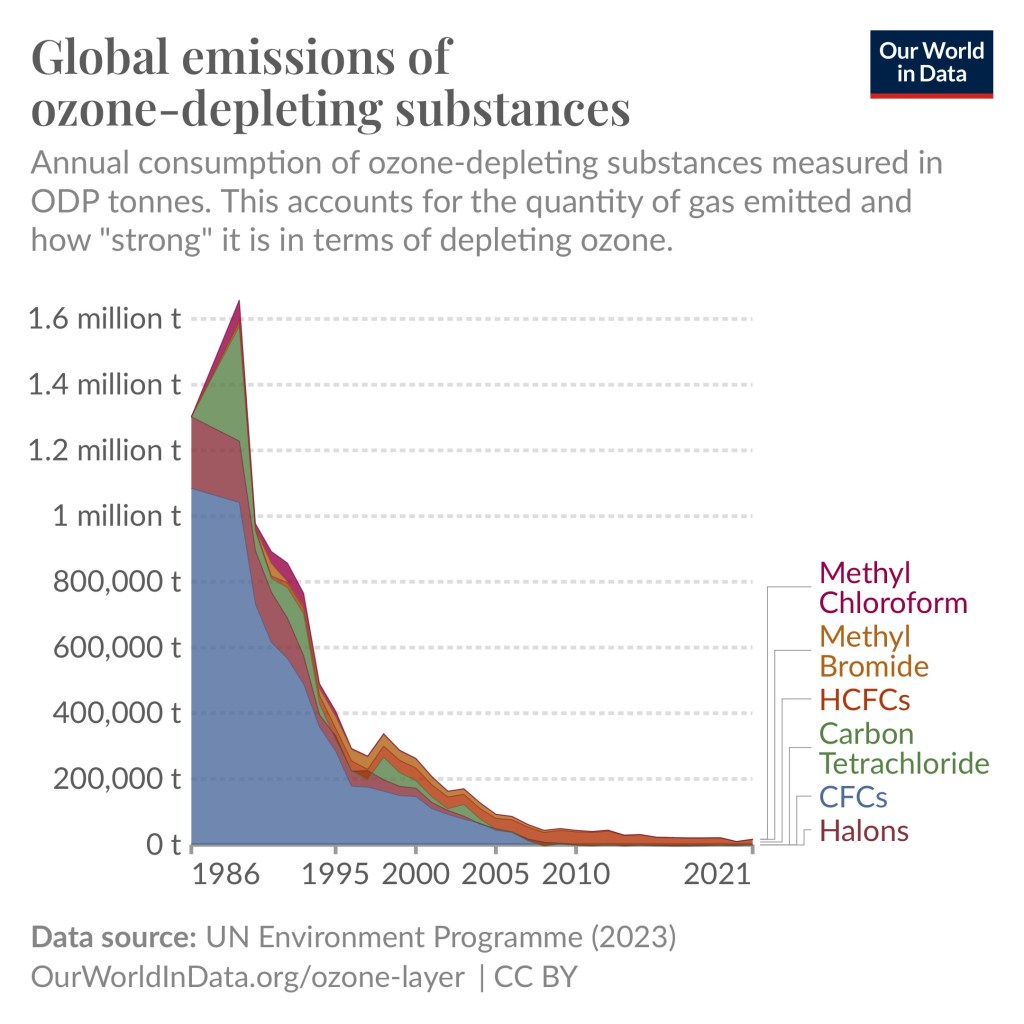
Peace is boring News. Peace is not even news. No news is good news. The same goes for other topics, such as the environment. Environmental disasters and environmental threats are news, and it should be, but an environmental problem that has been solved is no longer news and will be forgotten. One example of that is the super fact post I made yesterday “By 2018 the emissions of ozone-depleting gases had fallen by 99.7 percent”. What else have we forgotten about?

Gases visualized in the diagram are CFCs, Halons, HCFCs, Carbon Tetrachloride, Methyl Bromide, Methyl Chloroform. The diagram shows a peak around the end of 1980’s | Peace Is Boring News
The phase out of six ozone depleting gases. Data source UN Environment Program (2023).

I guess my point is first of all, we forget, and secondly, that it is important to remember that bad news gets attention because it is interesting. Therefore, it is important to remember that there’s a lot of good out there that we forget about.

Below is a youTube video showing Irish comedian David Tynan O’Mahony (born in Dublin), stage name Dave Allen, making fun of Reverend Ian Paisley. Reverend Ian Paisley was a hell and brimstone preacher who agitated against Catholics (it was hate speech), not just in Northern Ireland, but against all Catholics.

For example, he called the pope the anti-Christ. I should add that Ian Paisley and Gerry Adams the leader of the political wing of the Irish Republican Army (Sinn Féin) eventually shook hands in 2007 and came to an agreement. The tone was much different then, but that was long after this YouTube video was made.

The video below is not inflammatory, just very funny. I should mention that as Dave Allen is imitating Ian Paisley it sounds like he is saying “naatching of teeth”. That is “gnashing of teeth” in a north Irish accent. The ending is priceless with perfect comedic timing and effect. The video is 2 minutes and 42 seconds long.

I have one more video if you are interested. It is the Cranberries singing “Zombie” a famous song about the war in Northern Ireland. My daughter knew this song. She just didn’t realize that the song was about the war in Northern Ireland.


To see the Super Facts click here

Natural Disasters Kill Less People Now Than 100 Years Ago

Super fact 35: Natural disasters kill a lot less people now compared to 100 years ago. That is despite a larger population and despite the fact that climate change has increased the frequency and intensity of many types of natural disasters.

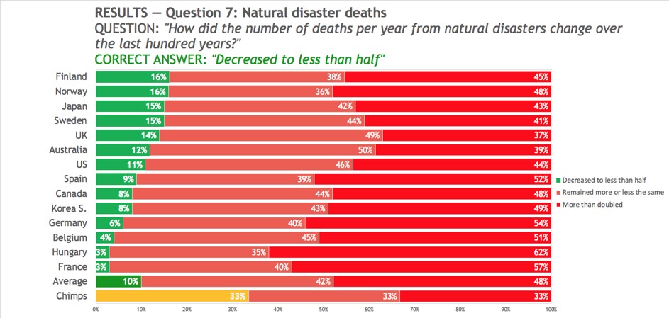
This is a super fact because surveys, such as this questionnaire from Gap Minder, show that the vast majority of the public (90%) believe that deaths from natural disasters have increased or stayed the same. Gap Minder is a Swedish highly respected non-profit founded by Hans Rosling that promotes increased use and understanding of statistics. Our World in Data (OWID), a renowned scientific online publication focusing on large global problems largely took its inspiration for Gap Minder and Hans Rosling.

The reason for the fewer deaths from natural disasters is not that there are fewer natural disasters, on the contrary, it is because we are now much better at predicting, handling and recovering from natural disasters. Our warnings systems, rescue systems and healthcare have improved significantly.

The graphics in this article from BBC show that the frequency of natural disasters has increased, and that the cost of natural disasters has increased, and yet the number of deaths has decreased.

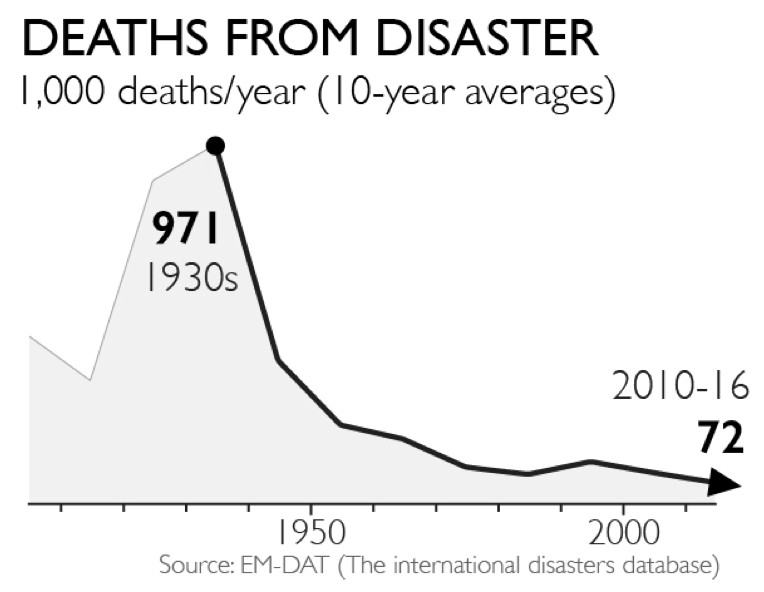
The graph below comes from the Gap Minder article. It shows the annual deaths from natural disasters in ten-year intervals starting with 1930. In the 1930’s there were 971 thousand deaths per year from natural disasters and during the period 2010 to 2016 there were 72 thousand deaths per year from natural disasters, an improvement by more than 13 times.

However, it should be noted that there was a huge flood in China 1931 causing an estimated 3 million deaths, and it skews the numbers for the 1930’s interval.

Originally, I set the headline for this super fact to be “10 Times more people died from natural disasters a hundred years ago” but I changed it to “Natural Disasters Kill Less People Now Than 100 Years Ago” because I realized that the 1930’s peak is an outlier because of the 1931 flood. I don’t want my headlines to be click bait.

The graph shows 300 to 400 thousand annual deaths at the beginning of the 20th century, then 971 thousand annual deaths in the 1930’s, then it continuously gets lower until the annual deaths in the 2010 to 2016 period is 72 thousand deaths per year | Natural Disasters Kill Less People Now Than 100 Years Ago
This graph from the Gap Minder article shows the annual deaths from natural disasters in ten-year intervals starting with 1930. The trend is down.

This does not mean that we should not worry about the increase in frequency and intensity of natural disasters from climate change. First of all, there are no warning systems and healthcare available for Koalas and Elephants, secondly cost matters, and thirdly there is no guarantee that we can keep improving our ability of predicting, handling and recovering from natural disasters enough to match the accelerating risks for natural disasters.

What People Believe Regarding Disaster Deaths

The Gap Minder article above report on a question survey conducted by Gap Minder. They asked large groups of people in 14 countries the following multiple-choice question “How did the number of deaths per year from natural disasters change over the last hundred years?” The choices were:

  • A. More than doubled
  • B. Remained more or less the same
  • C. Decreased to less than half

Most people answered A, a lot

of people answered B, but only 10% got the correct answer C, decreased to less than half. In other words, if chimpanzees had answered this question by randomly picking an answer, they would have done better than people. This is why I consider this a super fact. Below is a graphics taken from the Gap Minder article that shows how people in different countries responded.

There are 16 bars divided into three colors, green for the correct answer – “decreased to less than half”, orange for “remained more or less the same”, and red for “more than doubled”.  The 16 bars correspond to 14 countries, one for the average (10%), and one for random answers by chimpanzees (all 33.3%). The 14 countries are Finland, Norway, Japan, Sweden, UK, Australia, US, Spain, Canada, South Korea, Germany, Belgium, Hungary, and France | Natural Disasters Kill Less People Now Than 100 Years Ago
The histogram graphics above show the answers to the question “How did the number of deaths per year from natural disasters change over the last hundred years?” The correct answer “decreased to less than half” (in green) was rarely picked. The graphics is taken from the Gap Minder article mentioned.

EF3 Tornado in Dallas

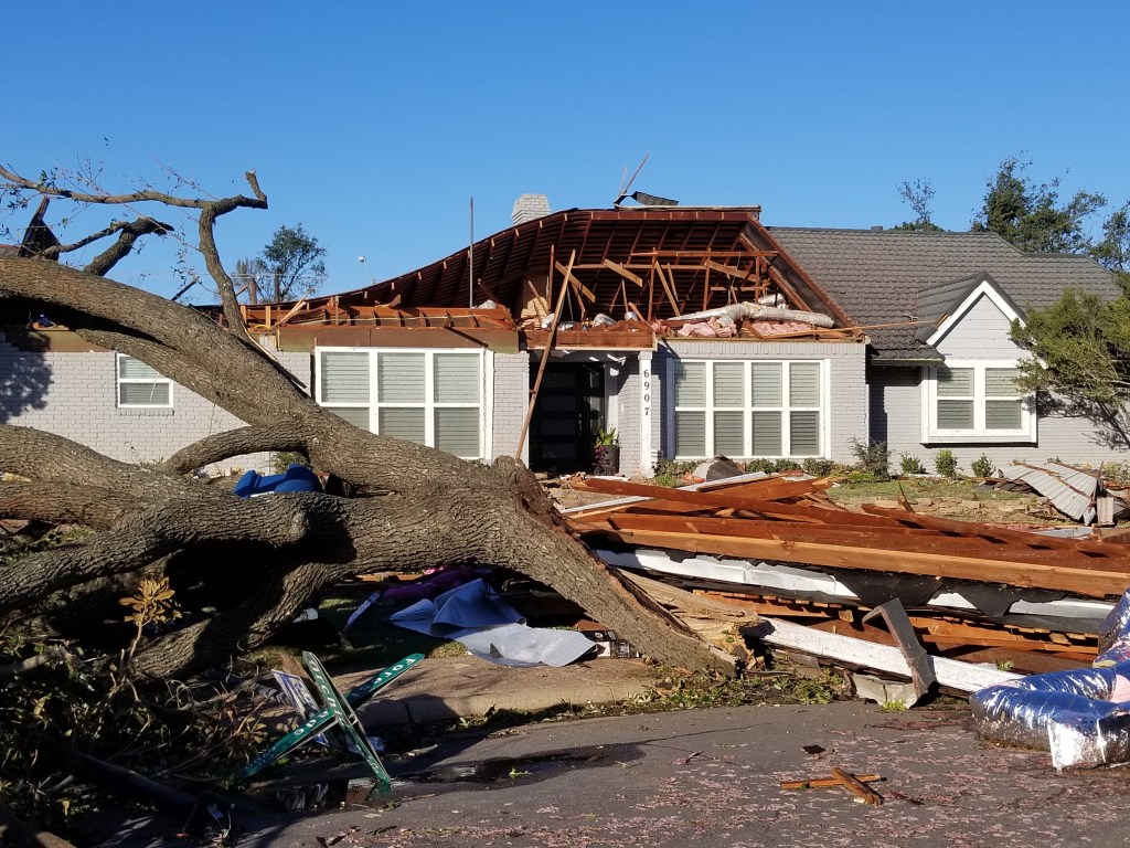
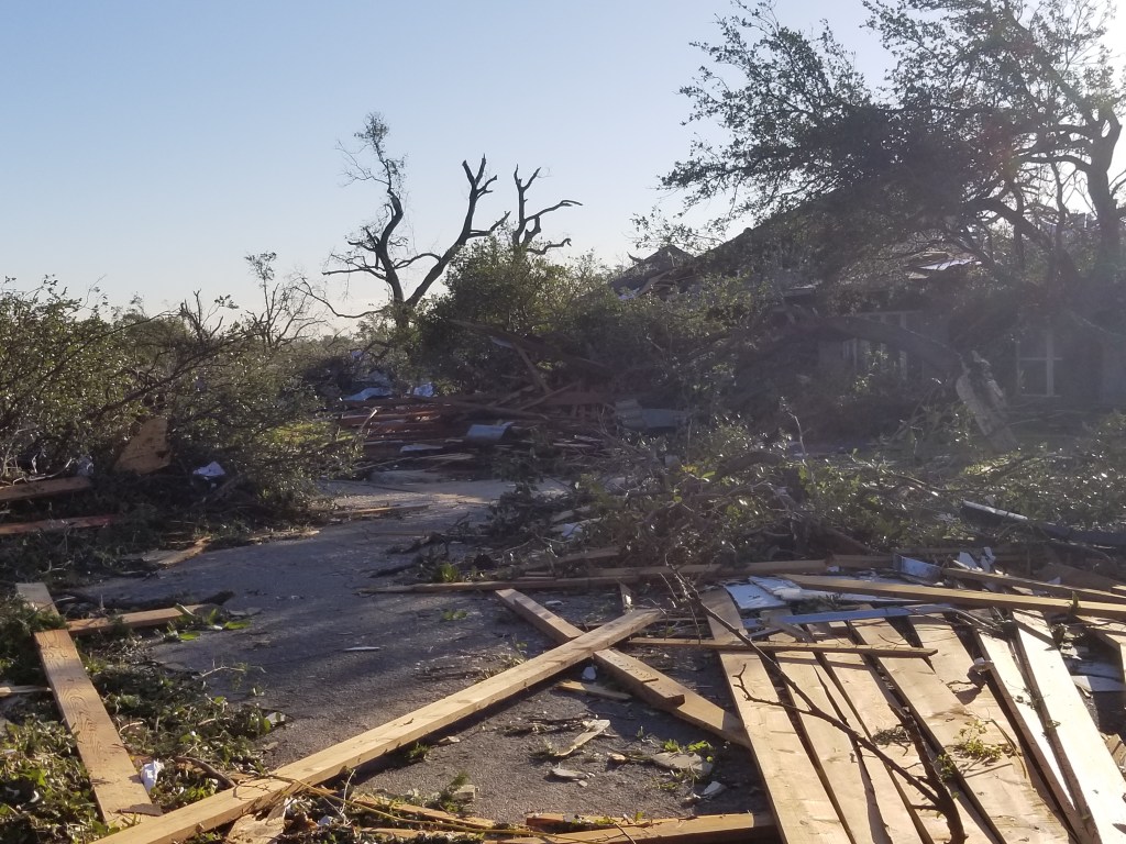
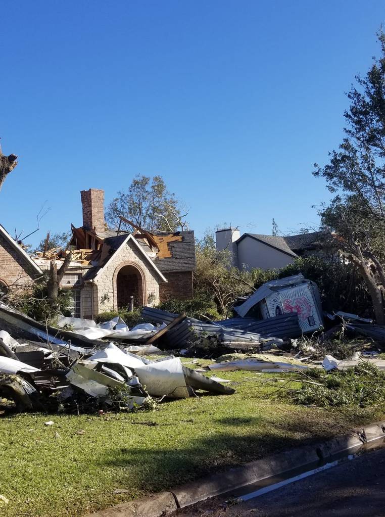
In October 2019 an EF3 tornado ripped through our neighborhood. It left a 2-3 miles long trail of destruction. Roofs were lifted off houses, cars and buses were flown around, hundreds of houses were destroyed, bricks were flying around in the wind, trees were uprooted, and tree branches were flying around, and pieces of concrete crashed into buildings and hit steel fences so forcefully that it bent even quarter inch thick steel fences.

Unlike many of our neighbor’s houses, our house stood, but our chimney was smashed by a piece of concrete coming off a neighbor’s house, we had to replace our roof, our garage door, the wiring in the attic, our fence and my grill flew around in the yard. The amazing thing was that no one in the neighborhood died.

Why did no one die? Was it maybe because no one was outside walking the dog, or driving around, because everyone had received the alarm on their mobile phone about the approaching tornado and was therefore sheltering inside in a safe place? Imagine the same thing happening in the 1930’s.

Below are a few photos from that day and here are two links with more photos, link-1 , link-2. On the five-year anniversary of this event NBC news interviewed me about this event. To see the interview click here . My interview is at one minute and ten seconds.

A neighbor’s house with the roof ripped off after the EF3 Tornado in Texas.
NBC used this photo. A neighbor’s house the morning of October 21st, 2019. Again, click on the image, or here, to see the interview. My interview is at one minute and ten seconds.
The photo shows a severely damaged house and lots of debris consisting of wood and trees and tree branches after the EF3 Tornado in Texas.
Another neighbor’s house. This house was about 100 yards from our house. It took a direct hit from the tornado.
This photo shows a house that is completely destroyed after the EF3 Tornado in Texas | Natural Disasters Kill Less People Now Than 100 Years Ago
Another house in our neighborhood.

My wife Claudia asked me to go check on her parents. I drove about 50-100 yards when a neighbor’s roof lying across the road stopped me. I turned around but this time I was stopped by a large pile of trees lying across the street. So, I started walking, but this time I was stopped by a group of firemen telling me that it was too dangerous to be outside. They told me to go back home, and I did. The next day we were able to visit her parents and below is what we saw.

The photo shows my wife Claudia walking into a house with debris everywhere after the EF3 Tornado in Texas.
Inside my wife Claudia’s parents’ house. This was the morning after. In the photo we are walking into their house to check on them (that’s my wife).
To see the other Super Facts click here

Freedom to Roam and Concentric Circles

Image above by Kevin from The Beginning at Last

Water surrounded by trees, what looks like coniferous forest. There are circular ripples on the water with drops falling into the lake in the middle | Freedom to Roam and Concentric Circles
This picture reminded me of the Swedish lakes I used to swim in. This is a submission for Kevin’s No Theme Thursday

Freedom to Roam Everywhere

When I was a kid, I used to roam around a lot, in the forest and on the mountains, and I liked to swim and fish in the rivers and the famous deep lakes in the Swedish countryside. Sweden has 97,500 lakes larger than 2 acres and many of them are deep lakes with clean and clear water surrounded by forests, typically coniferous forests. A small deep clean forest lake is referred to as a “tjärn”. I can add that there are no alligators or venomous water snakes in Swedish lakes.

Sweden offers a type of freedom that is rare in the world, and it does not exist in the United States and certainly not in Texas where I live. It is the freedom to roam or more specifically allemansrätten. Whether the land is public or private you have the right to roam, to hike, to camp, to swim, to pick wild berries, to pick wild mushrooms, to fish, and no one can stop you. Landowners are not allowed to tell you to get off their land and they cannot put up fences to stop you or animals from roaming on their land. Everyone has the right to roam and swim everywhere. It is a freedom Swedes love, and if you one day come to experience it you will know why.

My son letting of a swing tire. There are ripples on the lake beneath him. You can see trees on the other side of the lake.
My son is jumping off a tire swing and into a “tjärn” in northern Sweden.

Allemansrätten

The Swedish freedom to roam or allemansrätten, is a right for all people to travel over private land in nature, to temporarily stay there and, for example, pick wild berries, mushrooms, flowers and certain other plants. It is important to point out that you must respect the landowner’s property. You can pick wild berries but not anything the landowner is growing. You cannot destroy or break things or start fires, use ATVs, cut branches off trees, etc. You also need to stay 70 meters or 230 feet away from any dwelling.

As a landowner in Sweden, you can buy land and use it for farming and forestry, and you have the right to prevent people from damaging or stealing your crops. You can buy land for mining, and you have the right to your proceeds and the right to prevent people from stealing from your mines. In addition, people don’t have the right to get close to your house. However, you do not have the right to prevent anyone from roaming on your land.

Other countries with similar laws are Norway, Finland and Iceland. Limited forms of allemansrätten exist in Austria, Germany, Estonia, France, the Czeck Republic, and Switzerland. In the United States, where  allemansrätten does not exist, 63% of all land is private and in Texas 93% of all land is private. Since there is no law in the US protecting your freedom to roam there is noticeably something missing, especially if you are an outdoors person.

Concentric Circles

In addition to evoking my memories of Swedish lakes and allemansrätten, Kevin’s picture tickles my mathematical sense, specifically regarding concentric circles. Concentric circles are beautiful, dreamy, and interesting mathematical phenomena. I could watch concentric circles in the water all day long.

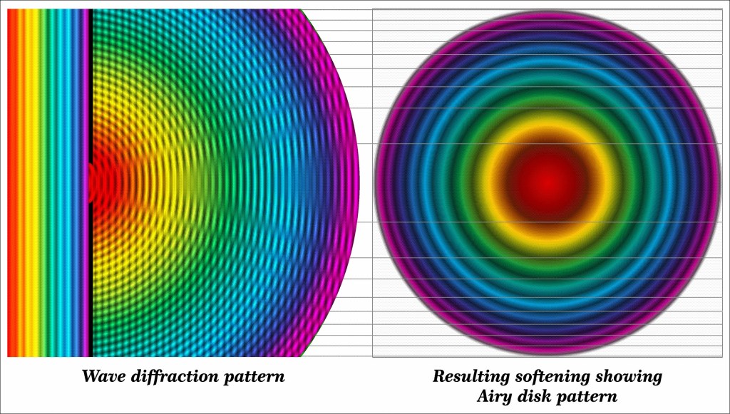
When you jump and play in a lake, when raindrops fall on a lake or a pond you’ll see concentric circles. You see concentric circles on a tree stumps, when you cut an onion, some flower petals, spiderwebs, etc. Concentric circles are everywhere in nature. Light can create concentric circles due to diffraction called an airy disk. Gravitational waves originating from, for example, two black holes colliding create 3D gravitational concentric circles/spheres traveling at the speed of light through space.

Concentric circles are very common in nature. You can see them in Kevin’s picture above. You can see them below my son as he falls into the Swedish lake, and you can see them in the pictures of light below. Whenever waves originate at a point and spread outward you get concentric circles.

There are many kinds of waves, water waves, sound waves, surface waves, seismic waves (earthquakes), mechanical waves, light are waves, electromagnetic waves, matter is both particles and waves, gravitational waves, and they can all make concentric circles. If the waves are moving outward with the same velocity in all directions, you will get equidistant concentric circles.

A real Airy disk created by passing a red laser beam through a 90-micrometre pinhole aperture with 27 orders of diffraction | Freedom to Roam and Concentric Circles
A real Airy disk created by passing a red laser beam through a 90-micrometre pinhole aperture with 27 orders of diffraction. Bautsch, CC0, via Wikimedia Commons
A computer generated an Airy disk from diffracted white light. The colorful light circles come from the hole in the left wall | Freedom to Roam and Concentric Circles
A computer generated an Airy disk from diffracted white light. The colorful light circles come from the hole in the left wall. Asset id: 1973771255 by Fouad A. Saad.
To see the Super Facts click here

We are living in relatively peaceful times

Superfact 9 : We are living in relatively peaceful times

Despite all the wars going on, the world was filled with a lot more war and violence in the past. Despite the grim news reports we are living in relatively peaceful times.

If I asked you, what are the two biggest wars going on the world today (as of September 2024), you would probably say that it is the Russia / Ukraine war and the Israel / Gaza war. Well, unless you are really well informed, it would come as a surprise that there are more devastating wars going on in the world. For example, there is currently a big civil war going on in Sudan that began in April 2023.

According to the latest issue of the Economist perhaps 150,000 people have been slaughtered in this civil war, and 10 million people have fled their homes, and a famine is emerging that could kill 2.5 million people by the end of the year. This war is likely to destabilize neighboring countries and is sponsored by Russia and Middle Eastern states. It’s likely the biggest crisis in the world but most likely you’ve never heard of it.

Photo by Pixabay on Pexels.com

In the recent Tigray war in Ethiopia between 162,000 and 600,000 people were killed according to Wikipedia. The Tigray war is mostly over, but the point I am trying to make is that you probably have never heard of it. You cannot use the impressions given by the amount of media attention a conflict gets to decide on how severe it is. You’ve got to check the statistics and compare, and the statistics might be quite unintuitive if you have relied on media attention as a metric.

What was the most devastating war in the 19th century?

So, to the next question. What was the most devastating war in the 19th century? If you say the American civil war, you are not correct (estimated 650,000+ deaths). A somewhat better answer is the Napoleonic wars (and estimated 4 million deaths). But none of the answers are correct. The Taiping rebellion in China was the worst. Estimates of the conflict’s death toll range between 20 and 30 million people. Some estimates say 100 million, which would make it the most devastating war in human history.

But did you hear about it? Again, you’ve got to check the statistics, and not rely on your impressions. I am saying this because the claim that deaths from wars and violence have declined over the last few decades is a quite unintuitive claim and yet it is true. That’s why it is a super fact.

Illustration of Chinese warriors preparing outside a fortified city.
Taiping Rebels at Shanghai China in 1853-54. ‘Small Swords’ refers to daggers used by warriors or martial artists in close combat. 19th century print. Stock Illustration ID: 237232531 by Everett Collection.

As this article in the Our World In Data states “While every war is a tragedy, the data suggests that fewer people died in conflicts in recent decades than in most of the 20th century. Countries have also built more peaceful relations between and within them.”. It should be noted that even though killing has never been as efficient as it is in the present, in the past a lot of civilians died from famine and disease resulting from the wars.

For example, the Spanish flu following World War I killed between 25 to 50 million people. I should say those numbers are typically not included in the deaths from World War I. The number of deaths from World War I are estimated at 20 million. 10 million combatants and 10 million civilians.

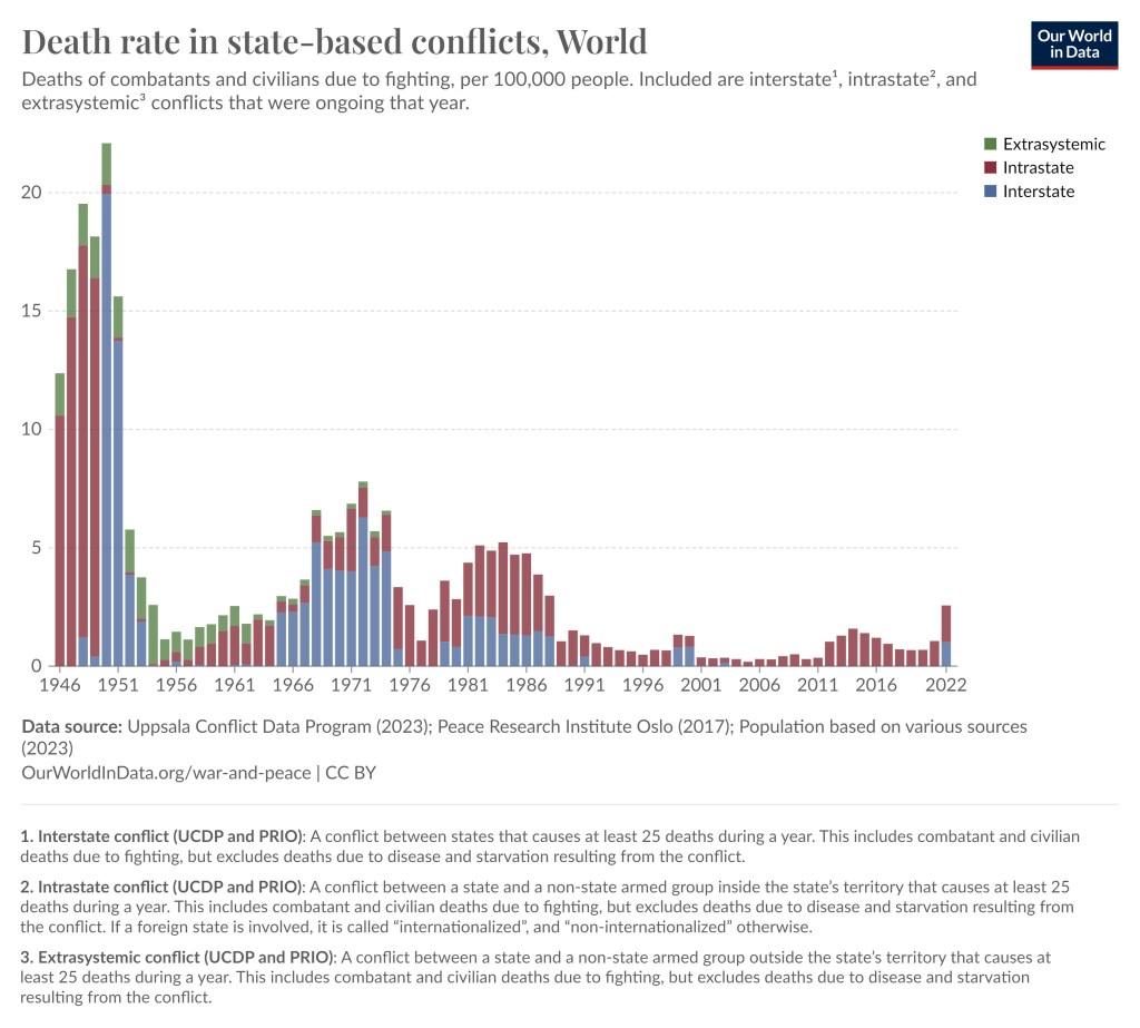
The graph is in histogram format with the biggest bins 1946 to 1952, then a couple of more upticks with smaller bins in more recent times.
Death rate from wars since 1946. The uptick in 2022 is largely due to the Ethiopian Tigray war with 162,000–600,000 killed and the invasion of Ukraine,  which US and BBC estimates at more than 200,000 deaths (but estimates from most other sources are less).

One problem with this kind of statistics is that the estimates vary, especially with respect to civilian causalities. In addition, very big wars lasting a few years create very bumpy graphs with large spikes making it harder to identify trends.

However, by listing estimated war deaths of the biggest wars, genocides and democides since the 1800’s you can see that deaths from this type of violence have overall been reduced over the last few decades. A note, democides are mass killings of civilians but are not necessarily directed at an ethnic group (democide include genocide).

The links below are mostly from Encyclopedia Britannica, but also from Wikipedia, the Census bureau, and a couple of other sources.

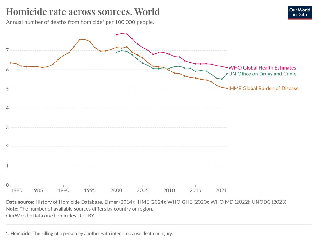
As I said, the numbers are estimates and not hard data, especially with respect to civilian casualties. However, you can see a trend going from several conflicts with numbers in the tens of millions before 1950, then numbers in millions until 2000/2007 and then during the last couple of decades the numbers have been less than a million. This does not cover homicide rates but even in that case we can see a reduction even though it is less distinct.

The graph features three curves (1) from WHO global health estimates (2) UN office on drugs and crime (3) IHME Global Burden of Disease.
In this graph we can see that homicide rate worldwide has been reduced somewhat since the mid 1990’s. This graph is also taken from the Our World in Data website and they in turn used various databases from UN, WHO, etc.

Finally, you can also take a look at this post “US Violent Crime Nearly Cut in Half Since 1990” and this article from pew research that includes a graph showing that the US violent crime rate has nearly halved since the 1990’s.

Also remember that in the past there were a lot less people on earth, so relatively speaking a million deaths was a lot bigger number back then. In summary, despite all the wars going on, our world is less violent than it used to be.


To see the other Super Facts click here