Orbital Cycles are not the Cause of the current Global Warming

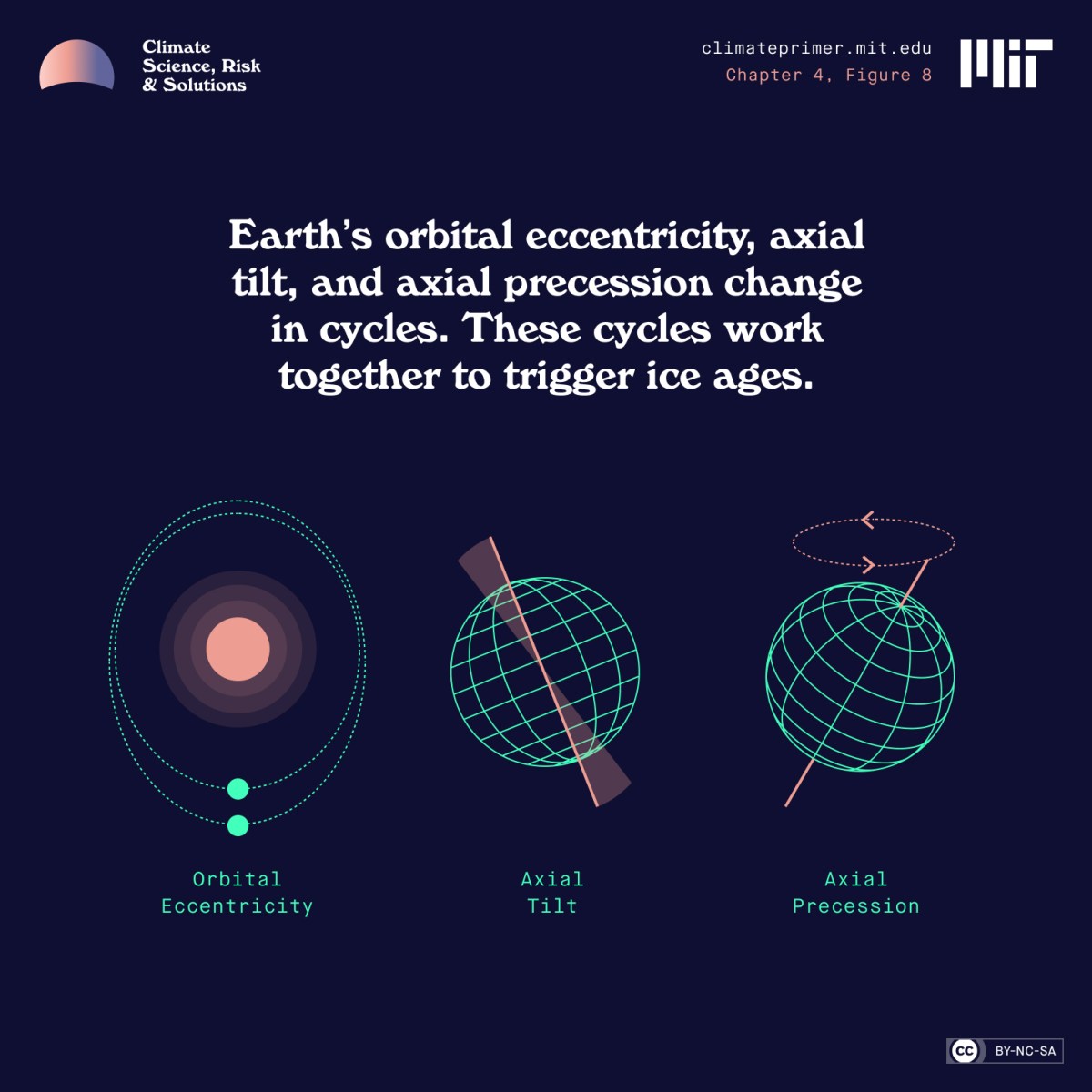
Superfact 122: We know that the current global warming, or if you call it Climate Change, or Climate Disruption, is caused by us primarily because of our burning of fossil fuels. It is not “natural causes”, and it is not orbital cycles, so called Milankovitch cycles. These orbital cycles include changes in orbital eccentricity, axial tilt, and axial precession.
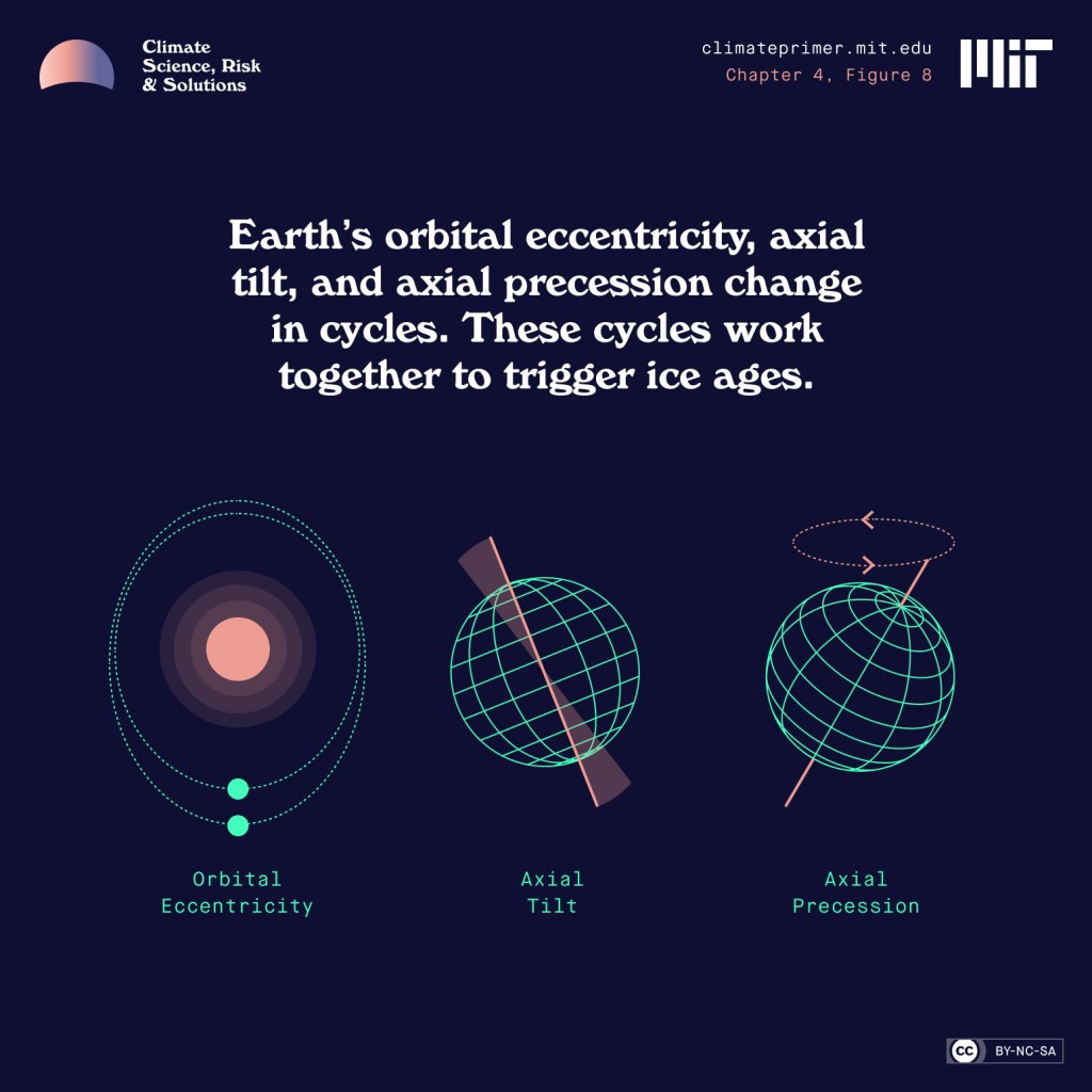
Three illustrated orbital cycles. On the left orbital eccentricity, in the middle is the axial tilt and on the right axial precession. | Orbital Cycles are not the Cause of the current Global Warming
Illustration of Milankovitch cycles from MIT’s Climate Primer.

The evidence that the current rapid global warming is chiefly caused by our burning of fossil fuels is extensive and for all practical purposes conclusive. One of the steps towards understanding this evidence is understanding why no known natural cause of climate change can explain the current warming, and that includes orbital cycles. Therefore, this post is just one small step towards preparing you for the evidence that the current rapid global warming is chiefly caused by us. However, there is a lot of disinformation around this specific topic.
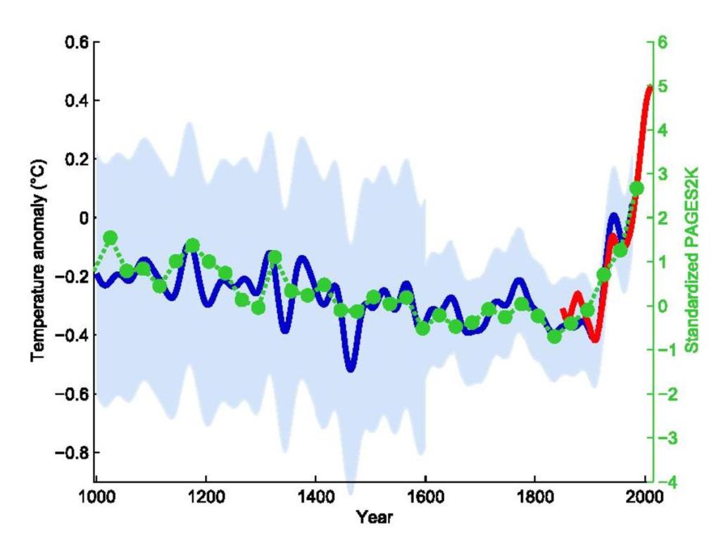
Hockey stick curve going back 1,000 years. The recent uptick in global temperature is very sharp and very sudden.
The so-called hockey stick curve depicting the last 1,000 years. The blue line is the first hockey stick curve ever created (by Michael Mann). He used proxy measurements such as tree rings, green-dots 30-year average, red temperature measurements. Wikimedia commons <<https://creativecommons.org/licenses/by-sa/4.0/deed.en>>. This graph is taken from this page.
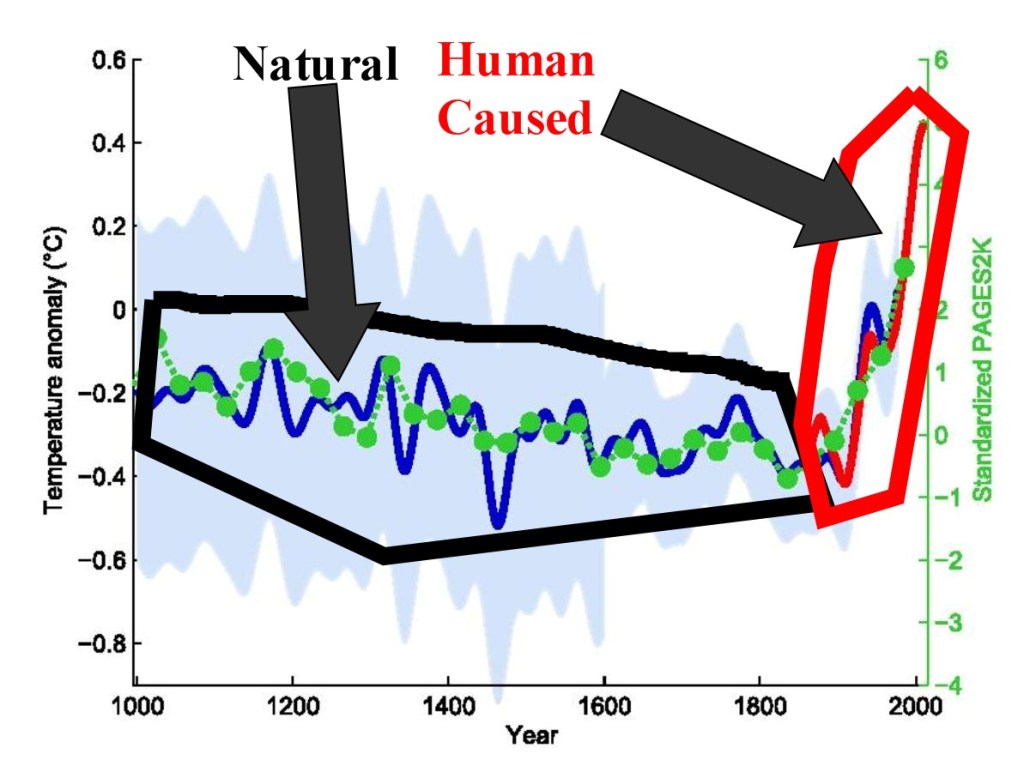
Again, hockey stick curve going back 1,000 years. This time human causes and natural causes are indicated with a black respective a red shape. | Orbital Cycles are not the Cause of the current Global Warming
The so-called hockey stick curve depicting the last 1,000 years. In this graph I have indicated what part of the graph is climate change caused by natural causes respective climate change caused by human causes.

Very briefly; Earth’s orbital cycles, called the Milankovitch cycles are largely responsible for the ice ages, but they are not responsible for the current warming because the current warming is too rapid for the orbital cycles to be the cause, and the way the warming is happening is incompatible with how a warming caused by Milankovitch cycles would have happened. In addition, according to the Milankovitch cycles we should be cooling, not warming.

I am considering this a super fact because a lot of people have been fooled by the disinformation on this topic, and there is also a lot of gaslighting from less than reputable organizations and from politicians. They have bamboozled a lot of people. About 15 years ago, I was bamboozled by the disinformation myself. That was before I took the time to try to understand the topic. Understanding a topic, and understanding the evidence makes all the difference, and that is why climate scientists are near unanimous the world over that climate change / global warming is both real and caused by us.

Ask yourself, why would the climate scientists and the atmospheric physicists around the world, including scientists at NASA and NOAA, not investigate orbital cycles and other natural causes for climate change as a possible cause for our current warming? They are the experts on orbital cycles and past climate after all. We know that orbital cycles are not the cause of the current global warming, and this is important to know. Therefore, I think it is a super fact.

What Are Orbital Cycles?

One type of important type of climate forcing that’s been the cause behind the multiple ice ages that we’ve had over the last two million years are earth’s orbital cycles, or the Milankovitch cycles. There are primarily three orbital cycles, orbital eccentricity, change in axial tilt, and axial precession. Could they explain the current warming? No, they can’t because they are too slow, we are currently in a cycle that should be cooling the planet, and the way orbital cycles would warm the planet if they were responsible for the warming is very different from what we are witnessing.

Changes in Eccentricity

Earth’s orbit is not a perfect circle. Earth’s orbit varies from nearly circular to slightly elliptical and this change can cause climate change. This shift in Earth’s orbit takes place over periods of about 100,000 and 400,000 years. Click on the video from NASA below for an illustration of Earth’s eccentricity.

Changes in Obliquity (Tilt)

The angle Earth’s axis of rotation is tilted as it travels around the Sun is known as obliquity. Obliquity is why Earth has seasons. Over the last million years, it has varied between 22.1 and 24.5 degrees with respect to Earth’s orbital plane. The greater Earth’s axial tilt angle, the more extreme our seasons are. In addition, a larger tilt angle favor periods of deglaciation. The changes of Earth’s obliquity have a period of 41,000 years. Click on the video from NASA below for an illustration of the changes in obliquity.

Axial Precession (Wobble)

Earth wobbles slightly as it rotates, like a slightly off-center spinning top. The axis of Earth’s wobble changes slowly and is called axial precession. The corresponding cycle spans 25,771.5 years, or approximately 26,000 years. Click on the video from NASA below for an illustration of the changes in axial precession.

Video Explaining Earth’s Orbital Cycles

The video below from PBS gives an explanation and overview of earth’s three orbital cycles.


Orbital cycles are far too Slow to Cause the Rapid Global Warming Happening Today

The changes in Earth’s orbit and tilt operate over 20,000+ to 100,000-year periods, making Orbital Cycles unable to drive the sharp temperature spikes seen in a single century.
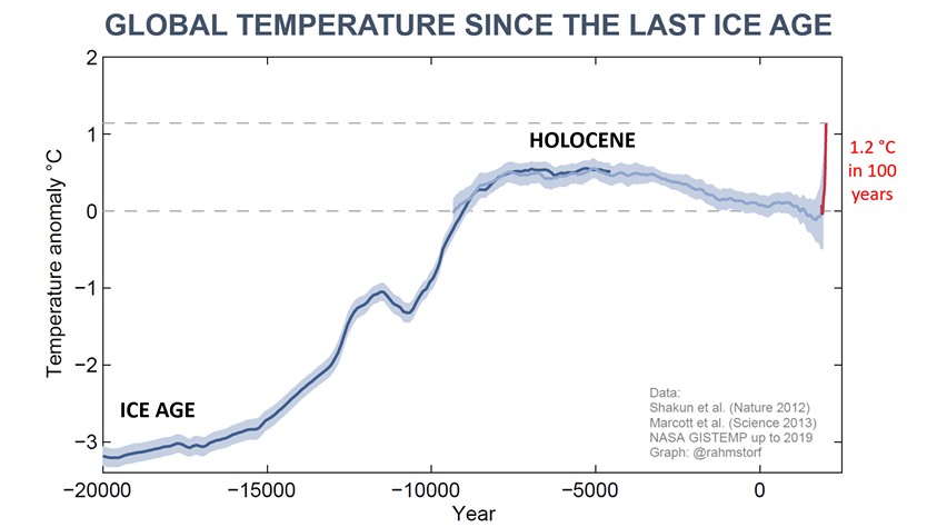
The graph shows the temperature since the last ice age. There is a maximum temperature about 6,000 years ago, then a cooling and then a sharp uptick in temperature.
Global temperature going back twenty thousand years, a hockey stick graph. Notice the stable temperature during the last 10,000 years, coinciding with the development of human civilization, and also notice the sudden sharp increase at the end. Orbital cycles can’t explain that, and it certainly does not look natural.

Orbital Cycles Predict Slow Cooling, not Rapid Heating

About 6,000 years ago Earth’s temperature was a bit warmer than it is today largely due to the climate fluctuations caused by orbital cycles. The warm period in the beginning of the Holocene epoch is referred to as the Holocene climatic optimum. Natural causes for climate change caused Earth’s temperature to slowly cool off until the recent very sudden uptick in average global temperatures.
Orbital Cycles are not the Cause of the current Global Warming
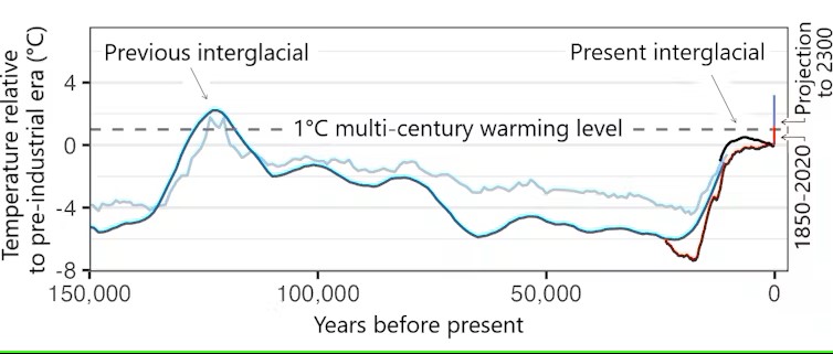
Temperature record for the last 150,000 years. Notice the sharp uptick towards the end. This picture is taken from this article.
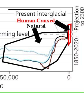
The graph shows wild swings over the last 50,000 years and then a very sharp uptick at the end, which as indicated in the graph is caused by us.
Temperature record for the last 50,000 years. Notice the sharp uptick towards the end. I have circled natural and human caused causes for the climate change. This picture is taken from this article.

Below is a video that explains in greater detail why orbital cycles cannot explain the current warming. You can also read more about it here.

The Cooling of the Upper Atmosphere Tells Us the Current Warming is not Caused by Orbital Cycles or the Sun

Yes, the cooling of the upper atmosphere (specifically the stratosphere above the troposphere) is a key sign that current global warming is not caused by Milankovitch cycles or changes in the sun. Instead, observations show a warming lower layer (troposphere) and a cooling upper layer, which is the exact “fingerprint” of human-caused greenhouse gases. Other evidence that the warming is caused by greenhouse gases and not orbital cycles or the sun is the distribution of the warming across the globe and over time.

A Couple of Videos

The video below is a short one-minute overview of the causes behind global warming.

The video below from NASA is a bit longer, 13 minutes, but it gives a more detailed overview. Click here to see the page from where this is coming from.


Conclusion

We know that Orbital Cycles are not responsible for the current rapid global warming because Orbital Cycles operate on tens of thousands of years or hundreds of thousands of years, not a couple of centuries.

We know that Orbital Cycles are not responsible for the current rapid global warming because the effects of Orbital Cycles are slowly cooling Earth, not warming it.

We know that Orbital Cycles are not responsible for the current rapid global warming because if it was orbital cycles (or the sun) the upper atmosphere would not be cooling and the temperature increases would be distributed differently across Earth and distributed differently with respect to time.


Other super facts related to global warming


To see the other Super Facts click here

High Wet-bulb Temperatures the Mass Killer in Heat Waves

Superfact 119: Heat waves are becoming significantly more frequent, intense, and longer-lasting globally due to human-caused climate change. The combination of a high temperature and humidity can create a high so called wet-bulb temperature that you cannot survive unless you can find a way to cool down. High humidity and heat can make it impossible to cool off through sweating, which rapidly leads to heatstroke. It is estimated that this kills about 500,000 people annually.

A wet-and-dry hygrometer featuring a wet-bulb thermometer. | High Wet-bulb Temperatures the Mass Killer in Heat Waves
A wet-and-dry hygrometer featuring a wet-bulb thermometer. Crossmr, CC BY-SA 3.0 https://creativecommons.org/licenses/by-sa/3.0, via Wikimedia Commons.

Imagine that it is a hot and humid day, but you want to go for a hike for a few hours. It is 104 degrees (40 Celsius) and humid, but you don’t know how humid. You are concerned about the Wet-bulb temperature. You use the Wet Bulb calculator and you find out that a relative humidity of 70% will yield a Wet-bulb temperature of 35 Celsius, which is deadly. You won’t survive that. A relative humidity of 45% will yield a Wet-bulb temperature of 30 Celsius, which is very dangerous but survivable for a healthy person.

How would you find out how big the risk is? The wet-bulb thermometer above is in Japanese and pretty cryptic but Amazon has wet-bulb thermometers that you can easily understand. Here is another one also on Amazon. I promise, I am not trying to sell Web-bulb thermometers for Amazon. I am just pointing out that we may need to start paying attention to Wet-bulb temperatures and perhaps buying these products as heat waves are becoming significantly more frequent, more intense, and longer-lasting due to our burning of fossil fuels.

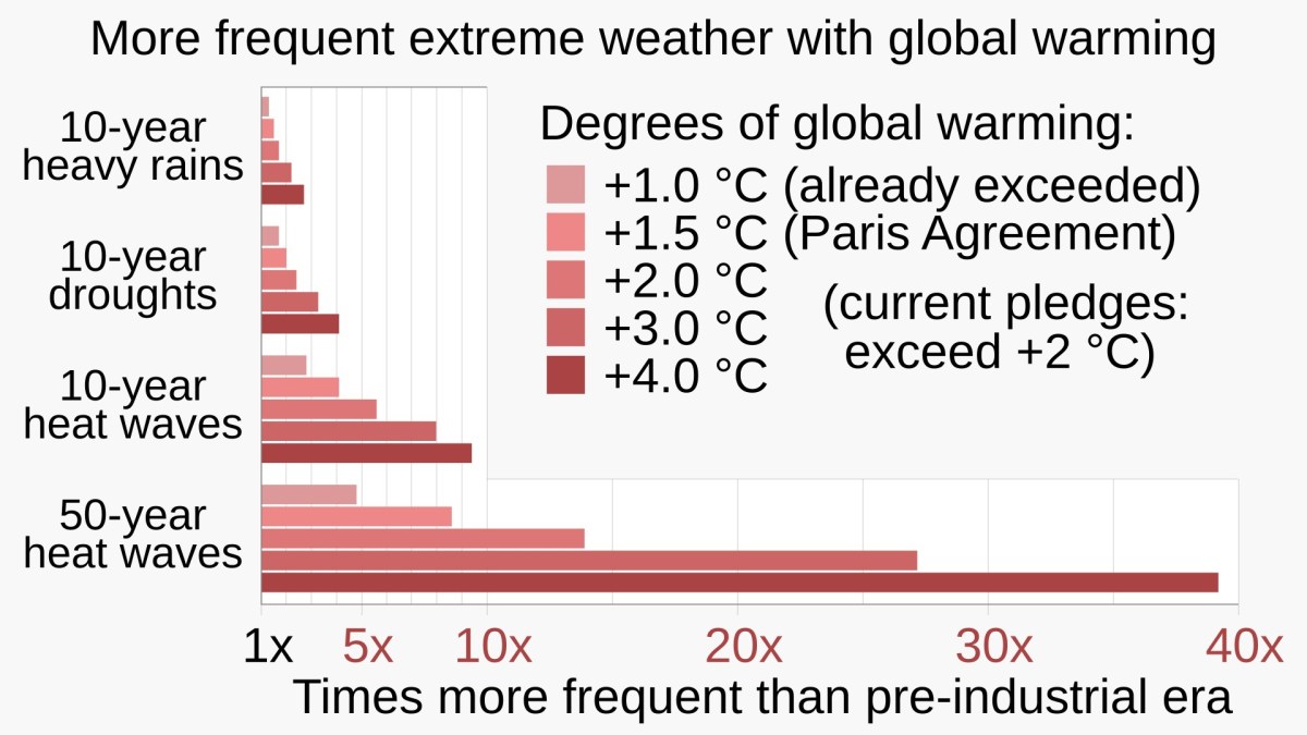
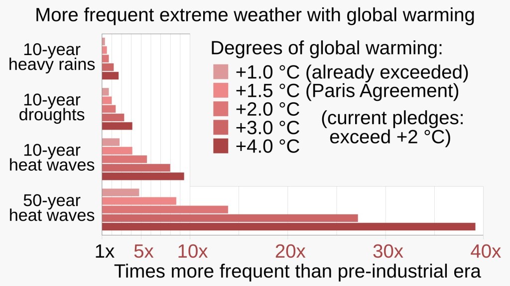
The graph shows the increased risk for 10-year heavy rains, 10-year droughts, 10-year heat waves and 50-year heat waves at differently increased global average temperatures, +1.0 Celsius, +1.5 Celsius, +2.0 Celsius, +3.0 Celsius, +4.0 Celsius,
Large increases in both the frequency and intensity of extreme weather events (for increasing degrees of global warming) are expected. RCraig09, CC BY-SA 4.0 https://creativecommons.org/licenses/by-sa/4.0, via Wikimedia Commons.

I should say that the Wet-bulb temperature of 95 Fahrenheit / 35 Celsius is more of an upper limit for survivability, like a suicide temperature. Wet bulb temperatures below 35 Celsius can also be very dangerous, at least for some people. As mentioned, excess heat and humidity kill about 500,000 people annually. You can read more here or here.

I was first made aware of the Wet-bulb temperatures when I read a science fiction novel focused on climate change, a so called Cli-Fi novel, the Ministry for the Future by Kim Stanley Robinson. It was a dystopian novel with the premise that 20 million Indians died because the Wet-bulb temperature became deadly in a large area in India, and not many people had air conditioning. Also, animals including wildlife and cattle died because, well obviously they did not have air-conditioning.

What followed was international crises, revenge and terrorism by the survivors against those whom they believed to be most responsible for our global warming / climate change, and desperate geo-engineering solutions to cool the planet. At first, I thought it seemed exaggerated but then I learned that dozens of places have already reached deadly Wet-bulb temperatures. Hopefully, a catastrophe like that will never happen but it is not entirely implausible.

The existence of the Wet-bulb temperature scale was a surprise to me. I knew that if you got locked into a Sauna for a long time you would not survive. Accidents that like that have happened in Sweden where I grew up. I did not know that the same thing could happen at natural temperatures. It made me realize that the more frequent, intense, and longer-lasting heat waves we are experiencing is a serious issue. I consider this to be a super fact because it is a true and important fact that many are unaware of.

What is the wet bulb temperature?

The wet bulb temperature is the lowest temperature to which a body can cool down through the evaporation of water (like sweating). It is measured using a thermometer covered in a water-soaked cloth. Because evaporation absorbs heat, the wet bulb temperature is lower than the actual air (dry bulb) temperature. When it is dry outside, sweat evaporates rapidly, keeping you comfortable. When it is humid, the air is already saturated, making it difficult for sweat to evaporate.

The humidex index, real feel and the wet-bulb all take both temperature and humidity into account, but Wet-bulb is focused on the body’s ability to cool down and is a safety measure. For example, if the Wet-bulb temperature is 28 Celsius then a body hotter than that (a human body is 37 Celsius) can lower the temperature via evaporation (sweating). So, a Wet-bulb temperature of 28 Celsius is not a problem (in that regard).

However, if the Wet-bulb temperature is 37 then the human body cannot use evaporation to cool down. Sweating won’t do anything. You’ll overheat and die. A Wet-bulb temperature of 35 is close enough to 37 for your evaporation system to fail and you’ll die. Basically, humidex is about feel, and Wet bulb about whether the body’s cooling system will work.

Our emissions seemed to have peaked, what is the worry ?

I have stated in other posts that thanks to the expansion of renewable energy our carbon emissions have taken a different path lately and that it looks like our emissions have started to go down, so what is the worry? It is important to understand that the average temperatures are not directly tied to our emissions but to the total amount of greenhouse gases in the atmosphere, for example, CO2 (an important greenhouse gas) leaves the atmosphere very slowly, and any level of excess CO2 emissions will keep accumulating.

Before we humans came along there was a balance, the soil, volcanoes, etc., added CO2 and roughly the same amount left the atmosphere. The so called carbon cycle. Imagine a bathtub with a drain that is slowly emptying water and a faucet adding about the same amount. Then we came along and sped up the faucet. For example, humans add roughly 60 to 100 times more CO2 to the atmosphere each year than all the volcanoes on the planet combined. Note: Our current administration is trying to censor climate science related information from NOAA and NASA, so tell me if the link in the previous sentence has stopped working.

A faucet is filling up a transparent glass bathtub with water, and a drain is emptying it but much slower.
The faucet is adding water to the bathtub faster than the drain is emptying the water, so it keeps filling up. The same is true for the CO2 in our atmosphere. Our emissions correspond to the faucet. I generated this picture with the help of ChatGPT.
Again a faucet is filling up a transparent glass bathtub with water, and a drain is emptying it but much slower. The difference between this picture and the previous is that in this picture the faucet is a bit slower than the faucet in the first picture, but still faster than the drain. | High Wet-bulb Temperatures the Mass Killer in Heat Waves
The faucet is adding water to the bathtub a little bit slower than in the previous picture but still faster than the drain is emptying the water, so the bathtub still keeps filling up, but a little bit slower. That is why the problem with heat waves will keep getting worse despite us doing a little bit better with our emissions. I generated this picture with the help of ChatGPT.

Other Climate Change Related Super facts


To see the Other Super Facts click here

The Unfolding Solar Power Boom

Superfact 117: The share of electricity generated from Solar Power in the world has grown from essentially 0% in the year 2000, 0.15% in 2010, to 3.19% in 2020, and to 8.75% in 2025. Both wind and solar energy are expanding fast around the world, but solar energy is a strong latecomer to the energy scene.

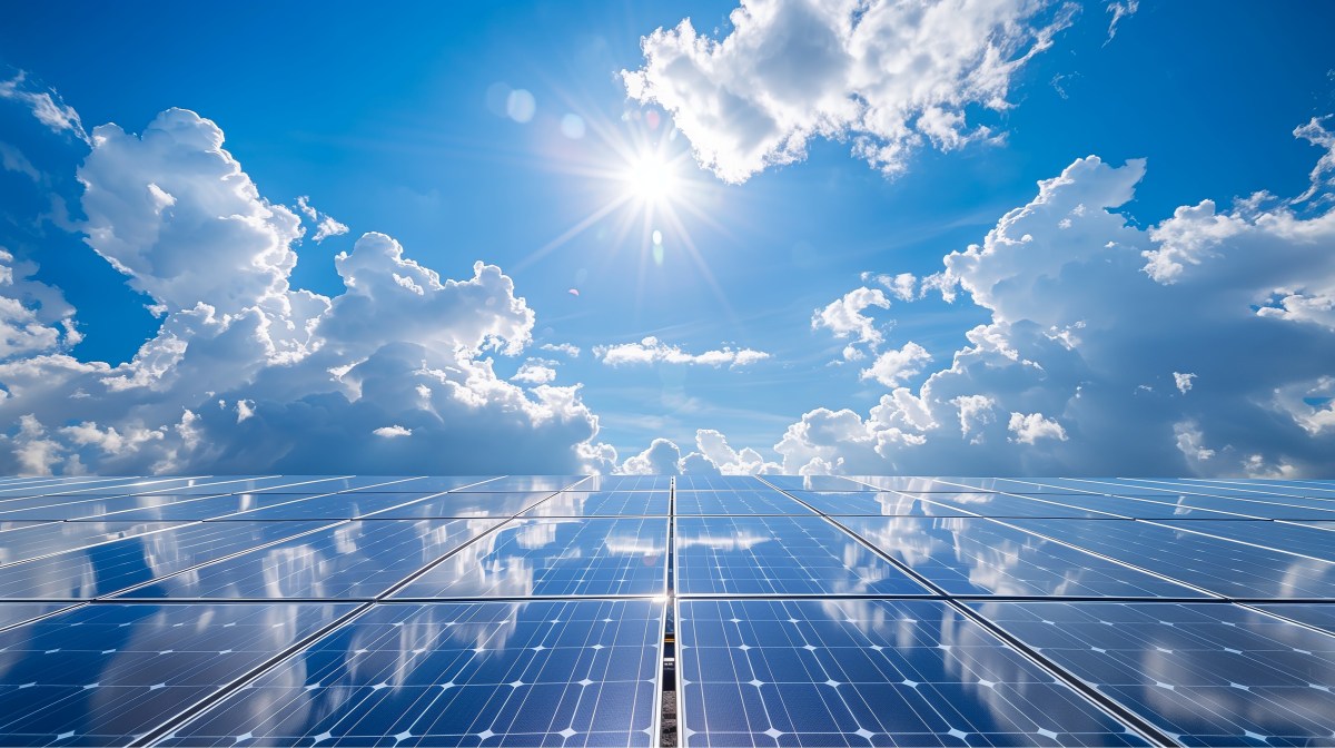
Solar energy panel harvesting in direct sunlight against a backdrop of clear blue skies capturing the essence of sustainable power generation and eco-friendly technology | The Unfolding Solar Power Boom
Solar energy panel. Shutterstock asset id: 2459435149 by Nordic Studio.

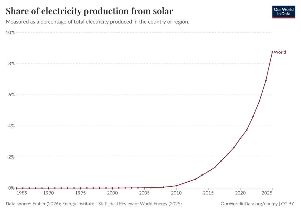
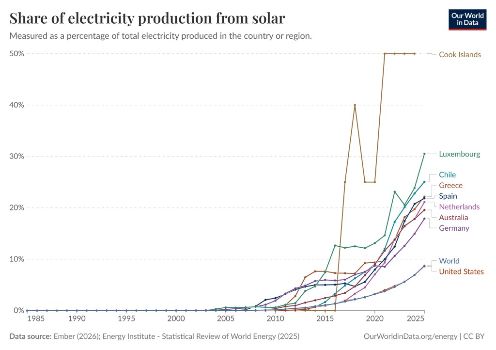
In the year 2000 less than 0.01% of the world’s electricity was generated by solar. In 2005 it was 0.02%, in 2010 it was 0.15%, in 2015 it was 1.07%, 2020 it was 3.19%, in 2025 it was 8.75%. Can you guess what will it will be in 2030? The United States may be behind the rest of the world with respect to wind power and EVs, but it closely follows the rest of world when it is about solar. You can play around with the graph below and select different countries by clicking here.

The graphs shows that the share of electricity from Solar remained nearly zero until the very recent sharp increase.
Share of electricity from Solar. Measured as a percentage of total electricity produced in the country or region. Data source: Ember (2026): Energy Institute – Statistical Review of World Energy (2025)    OurWorldinData.org/energy | CC BY
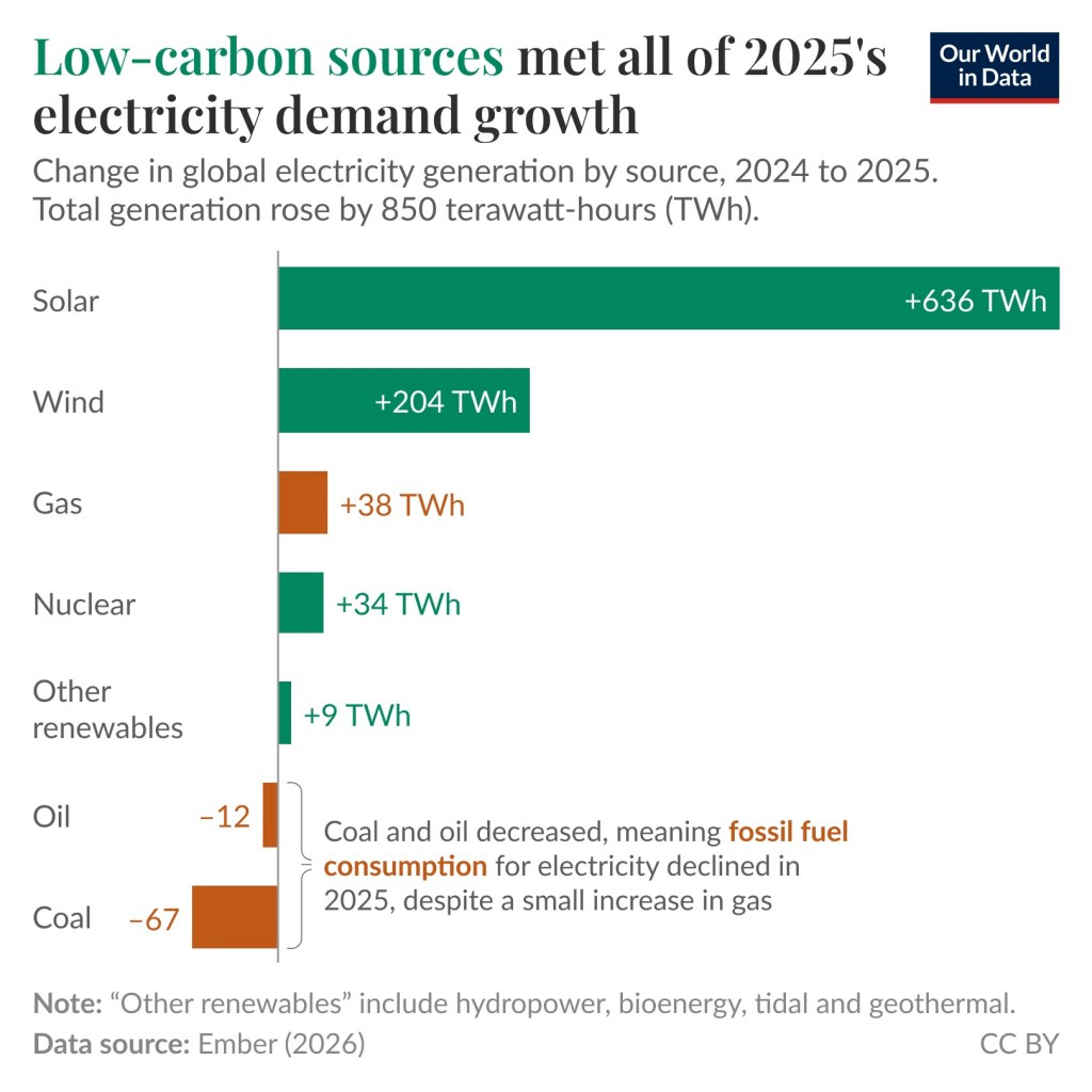
This is a bar graph showing an increase of 38TWh from gas, a decrease of 12TWh from oil, and a decrease of 67TWh from coal. The energy from wind, solar, nuclear, and other renewables increased by 850TWh.
Low carbon sources met all of 2025’s electricity demand growth. Change in global electricity generation by source, 2024 to 2025. Total generation rose by 850 terawatt-hours (TWh). Note: “Other renewables” include hydropower, bioenergy, tidal and geothermal. Data source: Ember (2026). This graph comes from this page.

New solar panel technology such as Perovskite Solar cells is being developed. The price of lithium-ion batteries has fallen by 99% since 1991 and by 82% in the last ten years. New battery technology such as sodium-ion batteries is being developed. One advantage of sodium-ion batteries is that they function exactly like a lithium-ion battery but replace lithium with abundant sodium ions to carry the electric charge. The evolving battery technology makes it easier to store power from solar during the night. SolarPower Europe project that the global solar fleet will more than double by 2030. In other words, the future looks bright for solar power, and that pun was intended.

The graph shows that solar contributed 2.2TW in 2024, and 2.9TW in 2025. Then follows bar graphs depicting three scenarios, low, medium, and high. The scenarios increase rapidly and by 2030 the low scenario is 5.8TW, the medium scenario is 6.6TW and the high scenario is 7.6TW | The Unfolding Solar Power Boom
Three different scenarios / projections by SolarPower Europe. The medium scenario predicts slightly more than a doubling of global solar fleet from 2026 to 2030.

Solar Power as a Share of Electricity Generation Around the World

For solar, the United States follows the rest of the world closely. Some countries have a higher percentage, such as the Cook Islands – 50%, Luxembourg – 30.52%, Chile – 25.06%. If you wish you can take a closer look here, or here, and you can play around with the different graphs. You can pick millions of combinations of countries and regions. For illustrative purposes I am showing some combinations below.

The graphs have different colors. Most graphs start out very low but increase significantly close to and after the year 2020. Cook Islands is an exception. The Cook Island graph shoot up sharply in 2016 from zero to more than 40%.
Share of electricity production from solar. Measured as a percentage of total electricity in the country or region. Some countries utilize solar more than other countries. These graphs include, Cook Islands, Luxembourg, Chile, Greece, Spain, Netherlands, Australia, Germany, the World and the United States. Data source: Ember (2026); Energy Institute – Statistical Review of World Energy (2025) OurWorldinData.org/energy | CC BY
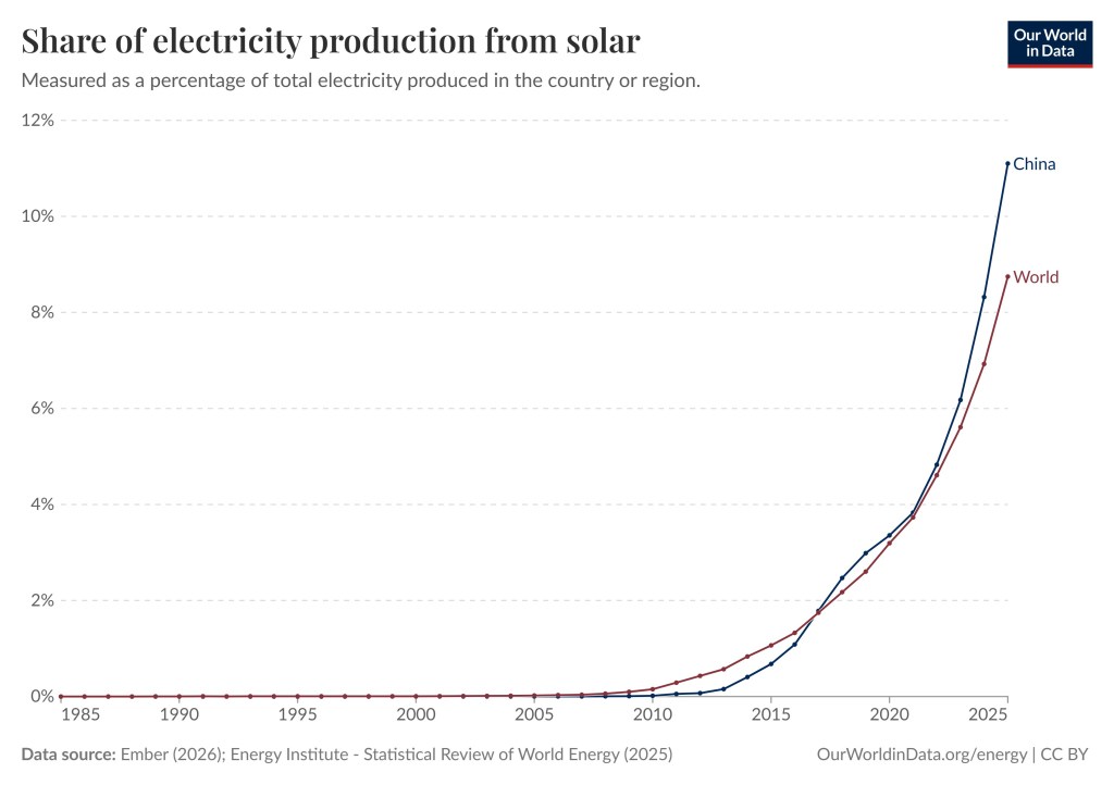
The graph for the world is brown and the graph for China is blue. The blue graphs reach a little bit higher than the brown graph. | The Unfolding Solar Power Boom
This graph shows that China has expanded their share of solar power a bit faster than the rest of the world. The share of electricity generated from Solar Power in the world was 8.75% in 2025 and in China 11.1%. Share of electricity production from solar. Measure as a percentage of total electricity in the country or region. Data source: Ember (2026); Energy Institute – Statistical Review of World Energy (2025) OurWorldinData.org/energy | CC BY
The graph for the EU is blue, for China it is red, for India it is green, for the World it is dark blue, and for the United States it is orange.
This graph shows the share of electricity generated from Solar Power in the largest countries and economic regions in the world. The share of electricity generated from Solar Power in the EU was 13.13% in 2025, in China 11.1%, in India 9.42%, in the World 8.75%, and in the US 8.6%. Data source: Ember (2026); Energy Institute – Statistical Review of World Energy (2025) OurWorldinData.org/energy | CC BY

How Clean and Safe is Solar Energy ?

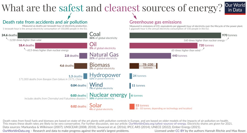
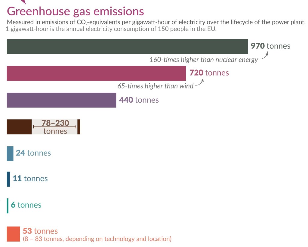
You sometimes come across claims that renewable energy isn’t really clean energy. The truth is that renewable energy such as wind, solar, etc., is much cleaner than gas, oil, and coal. These energy sources are also much safer and using them saves a lot of lives. As you can see, among the eight energy sources depicted solar is the safest, and among the cleanest. Coal has 1,230 times higher death rate than solar. According to the Energy Policy Institute at the University of Chicago Chinese citizens can expect to live on average 2.2 years longer than they would have a decade ago, due to the sharp drop in pollution. This is thanks to the increased use of EVs and renewables such as solar.

The graph depicts death rates and greenhouse gas emissions per unit for different energy sources including coal, oil, natural gas, biomass, hydropower, wind, nuclear power, and solar.
Greenhouse gas emissions and death rates from various sources of energy. Fossil fuels and biomass are based on state-of-the art plants with pollution control in Europe and are based on older models of the impacts of air pollution on health. This means that these death rates are likely to be very conservative. The graph shows that renewables and nuclear energy are the cleanest and safest forms of energy. For further discussion see the article: OurWorldinData.org/safest-sources-of-energy. Electricity shares are given for 2021. Data sources: Markandya & Wilkinson (2007); UNSCEAR (2008: 2018); Sovacol et al. (2016); IPCC AR5 (2014); UNECE (2022); Ember Energy (2001). OurWorldinData.org – Research and data to make progress against the world’s largest problems. Licensed under CC-BY by the authors Hannah Ritchie and Max Roser. Citation : Hannah Ritchie (2020) – “What are the safest and cleanest sources of energy?” Published online at OurWorldinData.org. Retrieved from: ‘https://archive.ourworldindata.org/20260202-100556/safest-sources-of-energy.html‘ [Online Resource] (archived on February 2, 2026).

Below are two pictures corresponding to zoom-in of the graph above.

The picture shows the death rates for the eight power sources in deaths per terawatt as horizontal bar graphs. Coal has a death rate of 24.6 death per terawatt and solar has a death rate of 0.02 deaths per terawatt. | The Unfolding Solar Power Boom
Death rates from accidents and air pollution. Measured as deaths per terawatt-hour of electricity production. 1 terawatt-hour is the annual electricity consumption of 150,000 people in the EU. The graph shows that coal, oil, gas, and biomass are a lot deadlier than hydropower, wind, nuclear power, and solar.
The picture shows the greenhouse gas emissions for the eight power sources in tonnes per gigawatt as horizontal bar graphs. Coal emits 970 tonnes per gigawatt and solar emits 53 tonnes per gigawatt. Wind emits the least 6 tonnes per gigawatt.
Greenhouse gas emissions. Measured in emissions of CO2 per gigawatt-hour of electricity over the lifecycle of the power plant. 1 gigawatt-hour is the annual electricity consumption of 150 people in the EU. The graph shows that coal, oil, gas, and biomass are responsible for a lot more greenhouse gas emissions than hydropower, wind, nuclear power, and solar.

Important Climate and Energy Facts

As I said, the misinformation about climate science has bamboozled a lot of people. We know that climate change / global warming is happening. We have also known for several decades that the current climate change / global warming is not natural. It is caused by us, chiefly due to the burning of fossil fuels. Yet many non-scientists dispute it.

The scientific evidence is conclusive, but a lot of people know very little about the evidence. It includes satellites directly measuring our greenhouse gases trapping heat, the upper troposphere is cooling whilst the lower atmosphere is warming, showing that the heating is from greenhouse gases, the unnatural speed of the warming is another piece of evidence, isotope studies, climate models, etc. Below are fourteen super facts related to climate science and clean energy.


To see the other Super Facts click here

The Unfolding Solar Energy Revolution

The goal of this blog is to create a list of what I call super facts. Super facts are important true facts that nevertheless are surprising to many, misunderstood, or disputed among the non-experts. They are special facts that we all can learn something important from. However, I also make posts that are not super facts but feature other interesting information, such as this book review and book recommendation. I should say that this book is not written by a scientist but an environmentalist, and he did not provide references for his hundreds of factual claims. However, I fact checked at least 20 claims and found only one that was not entirely correct, so I think his facts are for the part correct. The book is:

Here Comes the Sun: A Last Chance for the Climate and a Fresh Chance for Civilization by Bill McKibben

Below I am listing the four versions of this book. I bought the hardback version.

  • Hardback –  Publisher : W. W. Norton & Company (August 19, 2025), ISBN-10 : 1324106239, ISBN-13 : 978-1324106234, 224 pages, item weight : 12 ounces, dimensions : 5.8 x 0.9 x 8.6 inches. It costs $15.91on US Amazon. Click here to order it from Amazon.com.
  • Paperback –  Publisher : W. W. Norton & Company (August 11, 2026), ISBN-10 : 1324130628, ISBN-13 : 978-1324130628, 240 pages, item weight : 13 ounces, dimensions : 1 x 5.5 x 8.25 inches. It costs $19.99 on US Amazon. Click here to order it from Amazon.com.
  • Kindle –  Publisher : W. W. Norton & Company (August 19, 2025), ASIN : B0DXQGBM4Z, 220 pages, it costs $9.40 on US Amazon. Click here to order it from Amazon.com.
  • Audiobook – Publisher : Highbridge Audio (August 19, 2025), ASIN : B0F95QL1C2, Listening length : 7 hours and 36 minutes. $0.00 with membership. Click here to order it from Amazon.com.
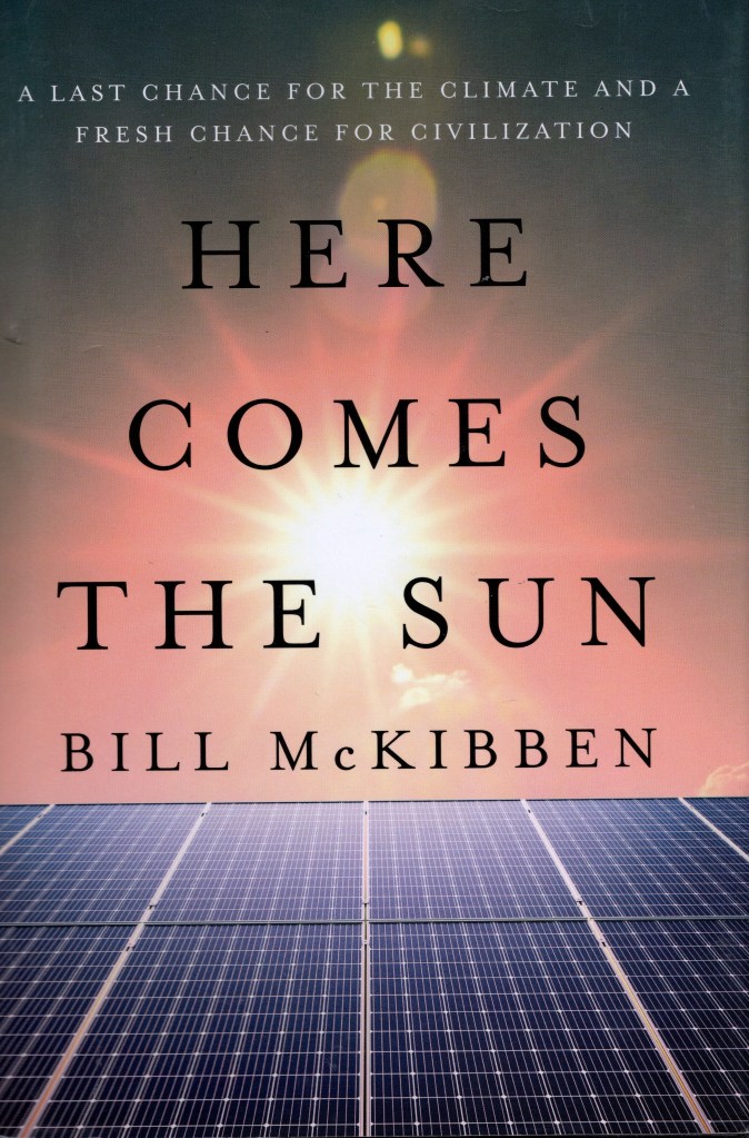
The front cover of Here Comes the Sun: A Last Chance for the Climate and a Fresh Chance for Civilization by Bill McKibben. | The Unfolding Solar Energy Revolution
The front cover of Here Comes the Sun: A Last Chance for the Climate and a Fresh Chance for Civilization by Bill McKibben. Click on the image to go to the Amazon page for the hardback version of the book.

Amazon’s Description of the Book

From the acclaimed environmentalist, a call to harness the power of the sun and rewrite our scientific, economic, and political future.

Our climate, and our democracy, are melting down. But Bill McKibben, one of the first to sound the alarm about the climate crisis, insists the moment is also full of possibility. Energy from the sun and wind is suddenly the cheapest power on the planet and growing faster than any energy source in history―if we can keep accelerating the pace, we have a chance.

Here Comes the Sun tells the story of the sudden spike in power from the sun and wind―and the desperate fight of the fossil fuel industry and their politicians to hold this new power at bay. From the everyday citizens who installed solar panels equal to a third of Pakistan’s electric grid in a year to the world’s sixth-largest economy―California―nearly halving its use of natural gas in the last two years, Bill McKibben traces the arrival of plentiful, inexpensive solar energy. And he shows how solar power is more than just a path out of the climate crisis: it is a chance to reorder the world on saner and more humane grounds. You can’t hoard solar energy or hold it in reserves―it’s available to all.

There’s no guarantee we can make this change in time, but there is a hope―in McKibben’s eyes, our best hope for a new civilization: one that looks up to the sun, every day, as the star that fuels our world.

This is my five-star review for Here Comes the Sun

The Spectacular Success of Renewables

Here comes the sun tells the story of the spectacular success of renewables around the world, especially the success of solar power and wind power, with a special emphasis on solar power. The success of renewables was one reason that the IPCC will likely retire the RCP8.5 emissions scenario. The RCP8.5 emissions scenario, which was the extremely bad emissions scenario, was never very likely to begin with, but the fact that the world, including China, is turning away from coal and fossil fuels made this scenario implausible as they stated. I am not sure whether Bill McKibben could have predicted this when he wrote this book, but I think this recent event makes this book very relevant now in 2026.

The book describes a very interesting situation for our world and contains interesting personal anecdotes and is written in a positive and optimistic way. However, I was delighted that the book was full of interesting facts, for example, in 2024 92.5% of all new electricity bought online around the world came from renewables. Other facts are, Chinese emissions are dropping. He tells us that forty percent of the world’s ship traffic consists of moving coal and gas back and forth across the ocean to be burned. He states that the entire continent of Africa has barely produced 3% of the greenhouse gases warming the atmosphere, whilst they are likely to bear the brunt of the effects of global warming.

Other interesting facts are; Chinese citizens can expect to live on average 2.2 years longer than they would have a decade ago, due to the sharp drop in pollution (thanks to renewables and EVs). Dealing with cleantech waste is a small problem compared to fossil fuels, and we have enough minerals, especially considering recycling. He tells us about various physics facts related to the sun, how our health is effected by the sun, the history of the day “Sunday”, sun worship in the ancient world, and other sun related facts.

He reviews the history of fossil fuels and renewables, particularly solar power, and the how the fossil fuel industry and certain politicians are fighting against renewables with disinformation and bad faith arguments. He explains the problems with fossil fuels and the dangers they pose, which is not just limited to climate change. He also explains a little bit about why we know that fossil fuels are causing global warming / climate change, why we need to keep pushing for renewables despite their success. He states that because fossil fuels themselves are easy to concentrate, they often yield authoritarian outcomes.

In the past renewables were an expensive alternative and fossil fuels cheap, but that situation has been reversed. He explains why EVs are in general cleaner and better for the environment than cars with internal combustion engines. He explains how we get around the intermittence issue with wind and solar and that batteries are getting much cheaper and environmentally friendlier, and why a lot of negative information you hear about batteries is not true anymore. Salt batteries is an example of an emerging technology.

My only concern with the book is that Bill McKibben is not a scientist. He is an activist. Because of that it is extra important that he provides references to reputable sources for all his claims. Typically, scientists provide references to their claims even though you in general can trust scientists more than activists. However, Bill McKibben provided no references to any of his several hundred facts and claims, except for some general and vague information in the back about where he got his information from.

I should say that I fact checked about two dozen of his claims and found only one that was not entirely accurate, so overall I trust this book. The book is easy, lighthearted and positive reading. It is not a heavy science book, the book was well organized, and he is a good author. Therefore, I highly recommend this book.

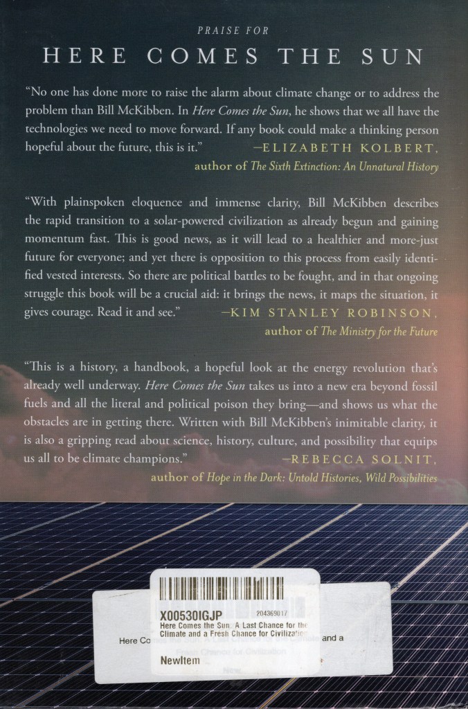
The back cover of Here Comes the Sun: A Last Chance for the Climate and a Fresh Chance for Civilization by Bill McKibben.
The back cover of Here Comes the Sun: A Last Chance for the Climate and a Fresh Chance for Civilization by Bill McKibben. Click on the image to go to the Amazon page for the paperback version of the book.

A related super fact is “The Unfolding Clean Energy Revolution


To see the Super Facts click here

The Number of people in the World without Electricity has halved since 2000

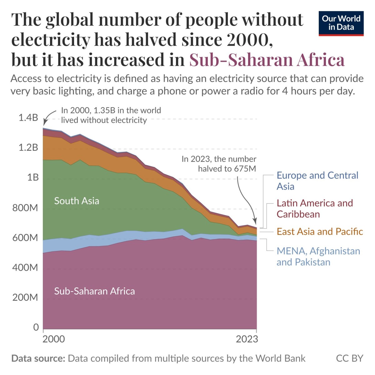
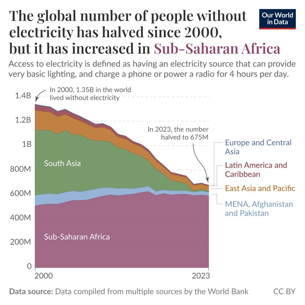
Super fact 109 : The global number of people without electricity has halved since 2000, but it has increased in Sub-Saharan Africa. In the year 2000 1.35 billion people in the world was without electricity and in the year 2023 it was 675 million people according to Our World in Data. The dark aspect of the statistics is that the number of people without electricity in Sub-Saharan Africa has increased from 500 million people to more than 600 million people.

The graph shows the number of people without electricity in five regions of the world, Europe and Central Asia, Latin America and the Caribbean, East Asia and the Pacific, MENA, Afghanistan, and Pakistan and Sub-Saharan Africa. The graph shows that the number of people in the world without electricity has gone from 1.35 billion to 675 million, and that all regions except Sub-Saharan Africa show a dramatic improvement. As a result, Africa now has the vast majority of people in the world without electricity. | The Number of people in the World without Electricity has halved since 2000
The global number of people without electricity has halved since 2000, but it has increased in Sub-Saharan Africa. Access to electricity is defined as having an electricity source that can provide very basic lightning and charge a phone or power a radio for 4 hours per day. Data source: Data compiled from multiple sources by the World Bank. CC BY. The graphs come from this page from Our World in Data.

This also means that the share of people without electricity living in Sub-Saharan Africa increased from 37% in the year 2000 to 80% now. However, it is also true that the share of people in Sub-Saharan Africa with electricity has doubled, rising from 26% to 53%. What is going on is that population growth has outpaced this expansion, meaning the number of people without electricity has still risen.

For the rest of the world, it is unequivocally good news. For example, in South Asia more than 500 million people lacked electricity in the year 2000, 414 million lacked electricity in 2010, and only 27 million people lacked electricity in 2023. Another way to look at the access to energy gap is by considering how long it is possible to run an air conditioner in different countries. Click here for data and analysis. In summary, the news for Sub-Saharan Africa is complicated but for the rest of the World, it is very good news. To read more about this topic click here.

I consider this a super fact because I believe it is an important but surprising fact in two parts. First the great news for the world and secondly the mixed news for Sub-Saharan Africa.

No Relief for the Heat Down in Africa

As mentioned, four of the five regions of the world, Europe and Central Asia, Latin America and the Caribbean, East Asia and the Pacific, MENA, Afghanistan, and Pakistan have made substantial progress. However, Sub-Saharan Africa is a complicated case. Note that MENA stand for Middle East and North Africa.

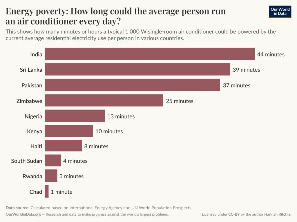
An alternative way of looking at access to electricity is to consider how much electricity is being used in each country and how that translates into the number of hours or minutes that an air conditioner could be running. Note it doesn’t mean that an air conditioner will be shut off after, let say 25 minutes, just that is much electricity one person use. What should be noted from the graph below is how dire the situation still looks like in Sub-Saharan countries. Sub-Saharan Africa is still very behind in this regard, and the fact that global warming is likely to hit Africa very hard that is not good news.

The bar graph includes India 44 minutes, Sri Lanka 37 minutes, Pakistan 37 minutes, Zimbabwe 25 minutes, Nigeria 13 minutes, Kenya 10 minutes, Haiti 8 minutes, South Sudan 4 minutes, Rwanda 3 minutes, Chad 1 minute.
Energy Poverty: How long could the average person run an air conditioner every day? This is how many hours a typical 1000 W single-room air conditioner could be powered by the current average residential electricity use per person in various countries. Data source: Calculated based on International Energy Agency and UN World Population Prospects. OurWorldinData.org – Research and data to make progress against the world’s largest problems. Licensed under CC BY by the author Hannah Ritchie. The graph is coming from this page from Our World in Data.


To see the other Super Facts click here