The Unfolding Clean Energy Revolution

Superfact 100: The share of fossil fuels for electricity generation is decreasing and EVs are replacing internal combustion engines. The share of hydro and nuclear energy, which is clean energy,  is decreasing, but the sharp increase in the share provided by renewables such as wind and solar is more than making up for it. In addition, there are new clean energy sources that are very promising but not yet widely implemented such as geothermal energy and fusion energy. The energy landscape is changing rapidly.
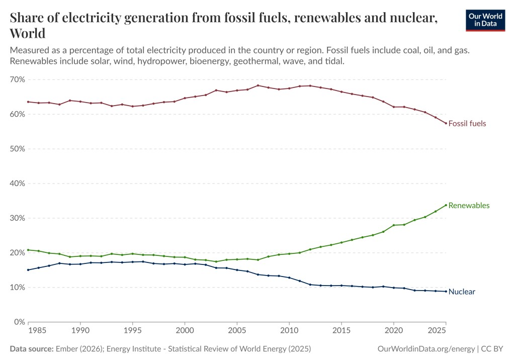
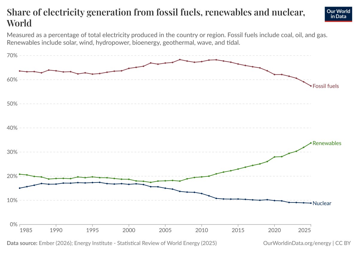
The chart includes three graphs showing the share of the world’s electricity generated by fossil fuels, nuclear and renewables from 1985 to 2025. | The Unfolding Clean Energy Revolution
Share of electricity generation from fossil fuels, renewables and nuclear, world. Measured as a percentage of total electricity produced in the world. Fossil fuels include coal, oil and gas. Renewables include solar, wind, hydropower, bioenergy, wave and tidal. Data source Ember (2026): Energy institute – Statistical Review of World Energy (2025)  OurWorldinData.org/energy | CC BY.

As can be seen in the graph above the share of electricity in the world generated by fossil fuels has gone down in recent years (from 66.48% in 2015 to 57.39% in 2025), and the share of electricity generated by nuclear has also gone down (from 10.55% in 2015 to 8.85% in 2025) whilst the share of electricity generated by renewables has increased (from 22.97% in 2015 to 33.76% in 2025). This is even though the most prominent source of renewable energy, hydro, has decreased its share substantially (from 16.2% in 2015  to 14% in 2025) as can be seen in the graph below.

What is going on is that two sources of renewable energy, wind and solar, have increased their share of electricity generated substantially (wind: from 3.5% in 2015 to 8.5% in 2025) and (solar: from 1.1% in 2015 to 8.7% in 2025), which can be seen in the graph below. It should be noted that renewable energy encompasses solar, wind, hydropower, bioenergy, geothermal, wave, and tidal sources.

To play around with the graph above and other similar graphs click here and select and look at the bottom charts. To play around with the graph below and similar graphs click here and select and look at the bottom charts.
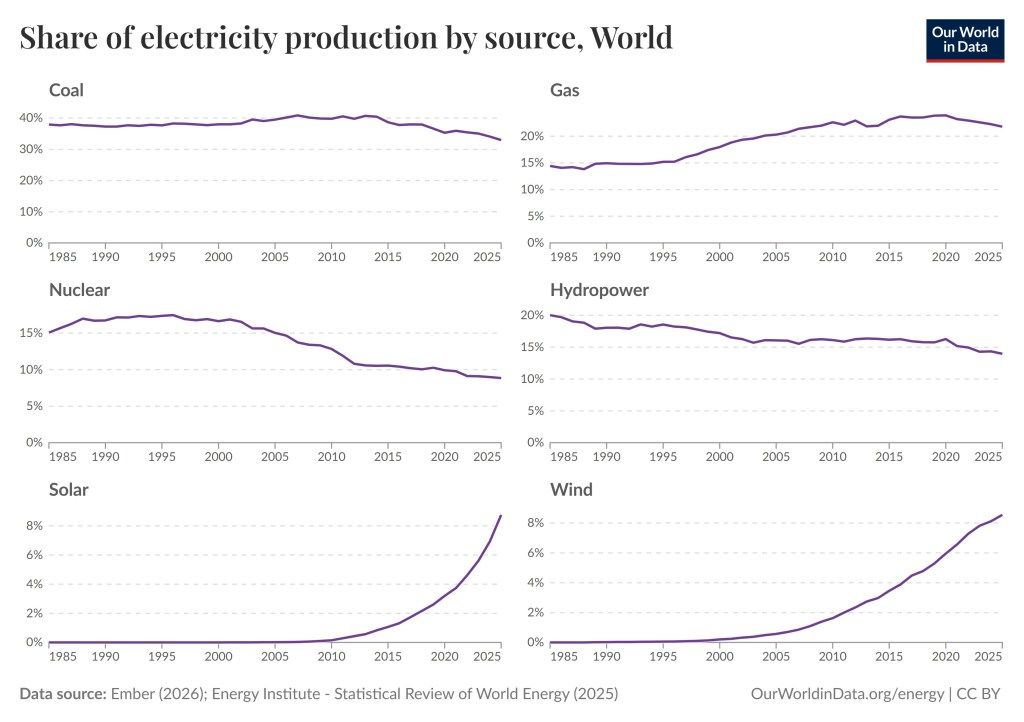
There are six graphs depicting the share of electricity production by six sources, coal, gas, nuclear, hydropower, solar and wind from 1985 to 2025. The graphs show that the share of electricity production by coal, gas, nuclear and hydropower have gone up and down but have been relatively steady with a decline over the last ten years. At the same time wind and solar have gone from almost to a sharp increase over the last 10-15 years.
Share of electricity production by source, World. Data source (2026): Energy Institute – Statistical Review of World Energy (2025)  OurWorldinData.org/energy | CC BY.

So far, I’ve been talking about the share of electricity production in the world by different energy sources. However, the world is using more and more electricity. Populations are growing, economies are growing, and the world is electrifying, for example, because of the worldwide adaption of EVs.

Just because an energy source’s share of electricity production is decreasing does not mean its total global electricity generation by that source is decreasing. In fact, as the share of electricity production by fossil fuels has decreased, the total production of electricity by fossil fuels has increased, well up until now. For the first time in history the total global electricity generation by fossil fuels went down in 2025. Note that since coal and oil decreased in the graph below fossil fuel consumption for electricity declined in 2025, despite s small increase in gas. This means that the use of fossil fuels is finally decreasing.
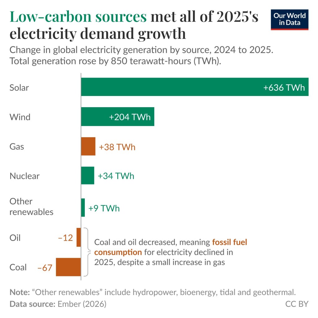
This is a bar graph showing an increase of 38TWh from gas, a decrease of 12TWh from oil, and a decrease of 67TWh from coal. The energy from wind, solar, nuclear, and other renewables increased by 850TWh. | The Unfolding Clean Energy Revolution
Low carbon sources met all of 2025’s electricity demand growth. Change in global electricity generation by source, 2024 to 2025. Total generation rose by 850 terawatt-hours (TWh). Note: “Other renewables” include hydropower, bioenergy, tidal and geothermal. Data source: Ember (2026). This graph comes from this page.

The practice of burning fossil fuels to generate electricity and for transportation is becoming less dominant. I believe this fact is surprising to many people, especially Americans since the current administration has taken a strong anti-renewable and anti-climate-science stance, and many Americans are not aware of what is happening in the rest of world in this regard. Superfact #100 is a super fact because the data is reliable, it is surprising to many people, and it is important.

It should be noted that we will likely keep using fossil fuels to produce fertilizers, plastics, medicines, and chemicals for a long time. However, this corresponds to only a few percent of our current use of fossil fuels and seems to be a lot better use of fossil fuels than burning it all up for energy. In fact, we may need the remaining fossil fuels for that purpose. In this post I am using data provided by Our World in Data which in turn got data from Ember Energy, or the International Energy Agency.

The Current Administration’s Opposition to Renewables and Climate Science

I am trying to keep politics out of my blog. However, the current administration’s strong opposition to and the misinformation they disseminate about renewables and climate science makes it difficult to discuss this renewable energy without bringing it up. It is an important piece in our understanding of what is going on. The misinformation about climate science (and other scientific topics) has bamboozled a lot of people and the actions taken to hinder the deployment of renewables have had real consequences. However, it is important to remember that the current situation here in the US is temporary and has a limited impact on the rest of the world.

Some actions that current administration has taken are:

  • Science organizations such as NOAA and NFS-NCAR have had their budgets severely cut and have been threatened to be dismantled. Websites related to climate science have been taken down. Click here to read more. NASA is also threatened to have its science programs severely cut (by 47%), as well as other programs, but it has not yet been implemented. Click here to read more.
  • Restricting or ordering the freezing of permits for renewables, canceling tax credits and investment credits for renewables, ordering the cancelation of renewables under construction, for additional information click here, or here.
  • In 2009 the EPA found that atmospheric concentrations of greenhouse gases endanger both current and future generations, enabling EPA to regulate greenhouse gases. This, so called endangerment finding was overturned in February 2026 by the administration. This article explain why there is no Scientific justification to revoke the endangerment finding.
  • The administration paid one billion dollars to France’s TotalEnergies in exchange for not developing windfarms on the east coast (kind of a bribe).
  • Pentagon has frozen permitting since last August halting more than 250 onshore wind projects, including those on private land, which is not only preventing us from meeting our energy needs, but is indirectly a violation of private property rights.
  • The United States is the only country to have withdrawn from the Paris Agreement (January 27, 2026). Three other countries, Iran, Libya, and Yemen, did not join.
  • 95,000 employees, including 10,000+ with PhD’s, at government science agencies (more than a third of them) have either been laid off / fired, or left, as a result of current policies. This effects CDC, NIH (National Institute of Health), and especially anything related to climate science. Many scientists have left the US for Europe.

There is not wonder many in the United States incorrectly believe clean energy is on its way out. I should say that even though support for solar and wind has declined in the US, solar and wind remain the sources of energy that most people want the federal government to encourage over any other source of energy, according to this Pew Research article.

Important Climate and Energy Facts

As I said, the misinformation about climate science has bamboozled a lot of people. As an example. We know that climate change / global warming is happening. We have also known for several decades that the current climate change / global warming is not natural. It is caused by us, chiefly due to the burning of fossil fuels. The scientific evidence is conclusive. It includes satellites directly measuring our greenhouse gases trapping heat, the upper troposphere is cooling whilst the lower atmosphere is warming, showing that the heating is from greenhouse gases, the unnatural speed of the warming, isotope studies, climate models, etc. How many people know about this? I believe very few people do. Below are eleven related super facts.

The graph depicts death rates and greenhouse gas emissions per unit for different energy sources including coal, oil, natural gas, biomass, hydropower, wind, nuclear power, and solar.
Greenhouse gas emissions and death rates from various sources of energy. Fossil fuels and biomass are based on state-of-the art plants with pollution control in Europe and are based on older models of the impacts of air pollution on health. This means that these death rates are likely to be very conservative. The graph shows that renewables and nuclear are the cleanest and safest forms of energy. For further discussion see the article: OurWorldinData.org/safest-sources-of-energy. Electricity shares are given for 2021. Data sources: Markandya & Wilkinson (2007); UNSCEAR (2008: 2018); Sovacol et al. (2016); IPCC AR5 (2014); UNECE (2022); Ember Energy (2001). OurWorldinData.org – Research and data to make progress against the world’s largest problems. Licensed under CC-BY by the authors Hannah Ritchie and Max Roser. Citation : Hannah Ritchie (2020) – “What are the safest and cleanest sources of energy?” Published online at OurWorldinData.org. Retrieved from: ‘https://archive.ourworldindata.org/20260202-100556/safest-sources-of-energy.html’ [Online Resource] (archived on February 2, 2026).

The Share of EVs

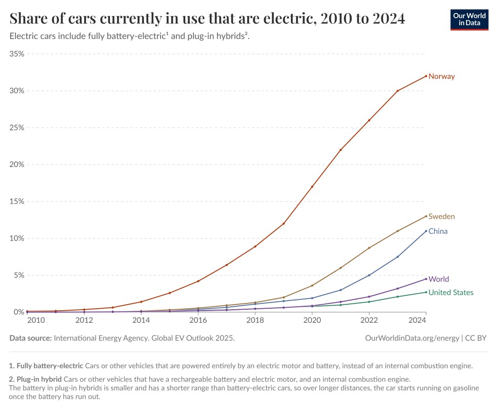
Another phenomenon that results in less burning of fossil fuels than we otherwise would have is that electric cars and plug-in hybrid are becoming more common in the world. Going from nearly non-existent in 2010 electric cars (EVs) are now starting to show up around the world. The share of electric cars on the roads in 2024 was in the United States was 2.7%, in the world 4.5%, in China 11%, in Sweden 13% and in Norway 32%.

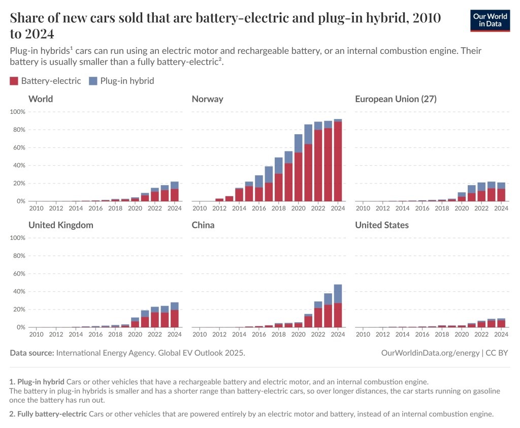
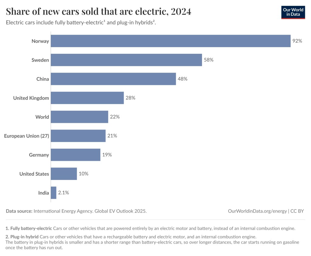
What matters more (for the future) is the sale of new EVs and plug-in hybrids. The share of new cars that are electric was 22% for the world, 10% in the United States, 21% in the EU, 28% in the United Kingdom, 48% in China, 58% in Sweden, 92% in Norway. In 2025 the share of new cars that were electric was 98% in Norway according to this website. To see more EV statistics and play around with various graphs visit this link.

One thing that might be surprising to Americans is that EVs are quite common in many other countries including EU, the Scandinavian countries, and China. Another is that EVs are indeed significantly cleaner than internal combustion engines, even when charged from a relatively dirty grid. See this super fact (29) EV Cars Indeed Emit Less Carbon Pollution.

The graph shows the share of cars currently in use that are electric for the world, the United States, China, Sweden and Norway.
Share of cars currently in use that are electric, 2010 to 2024. Electric cars include fully battery-electric and plug-in hybrids. With battery-electric cars is meant cars or other vehicles that are powered entirely by an electric motor and battery, instead of an internal combustion engine. With plug-in hybrid is meant cars or other vehicles that have a rechargeable battery and electric motor, and an internal combustion engine. The battery in plug-in hybrids is smaller and has a shorter range than battery-electric cars, so over longer distances, the car starts running on gasoline once the battery has run out.
Data source: International Energy Agency Global EV Outlook 2025.   OurWorldinData.org/energy | CC BY
Share of new cars sold that are battery-electric (in brown) and plug-in hybrid (in blue), 2010 to 2024, for six countries and regions, including the world, United States, United Kingdom, China, Norway and the European Union. | The Unfolding Clean Energy Revolution
Battery-electric cars are depicted with brown and plug-in hybrid in blue. Share of new cars sold that are battery-electric and plug-in hybrid, 2010 to 2024. Plug-in hybrids cars can run using an electric motor and rechargeable battery, or an internal combustion engine. Their battery is usually smaller than a fully battery-electric. Data source: International Energy Agency Global EV Outlook 2025.   OurWorldinData.org/energy | CC BY
The bar graph shows the share of new cars sold that are electric in 2024 for the world and 8 countries. The numbers are India 2.1%, the United States 10%, Germany 19%, European Union 21%, United Kingdom 28%, China 48%. Sweden 58%, Norway 92%, and the World 22%
Share of new cars sold that are electric, 2024. Electric cars include fully battery-electric and plug-in hybrids. Data source: International Energy Agency  Global EV Outlook 2025.  OurWorldinData.org | CC BY

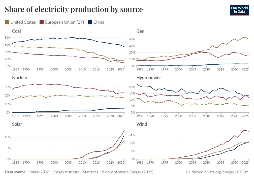
Share of electricity production by source EU, US, China

The first graph in this post depicted the share of electricity production by source for the world. The graph below breaks it up to show the share of electricity production by source for the three largest economies in the world, the United States, China and the EU. Again, the share of energy from coal, nuclear and hydro is decreasing whilst the share from wind and solar is going up for all three markets. One notable difference from the top graph is that gas keep increasing for the United States.

There are six charts in the picture depicting share of electricity production by coal, gas, nuclear, hydro, solar and wind. Each charts show three graphs in different colors representing the United States, the European Union, and China. | The Unfolding Clean Energy Revolution
Share of electricity production by source, United States, European Union, and China. Data source: Ember (2026): Energy Institute – Statistical Review of World Energy (2025)     OurWorldData.org/energy | CC BY

The Share of Electricity Production from Wind

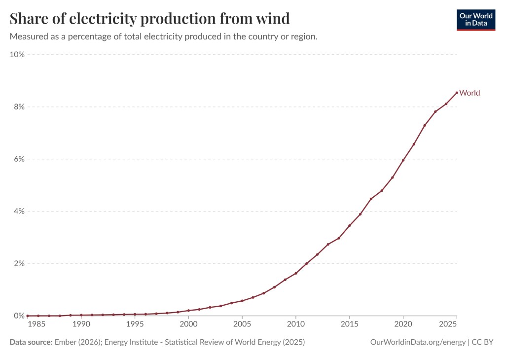
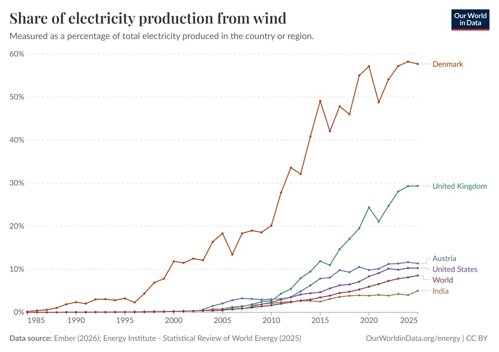
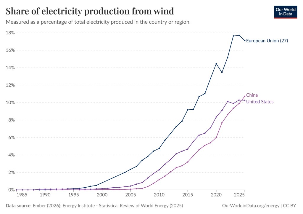
Below are a few charts depicting the share of electricity production from wind. The first graph is already included in the second chart from the top (above). However, this is a close up. The second graph depicts the share of electricity production from wind for multiple countries. It should be noted that Denmark and the United Kingdom are prominent users of wind power. For Denmark the share of electricity production from wind is almost 60%. By clicking here you can play around with the graphs and generate as many different graphs as you wish.

This graph shows the share of electricity production from wind for the world. In 1985 it is 0%, in the year 2000 it is 0.2%, in 2010 it is 1.6%, in 2015 3.5%, in 2020 4.0%, and in 2025 8.5%.
Share of electricity production from wind. Measured as a percentage of total electricity produced in the world. Data source: Ember (2026): Energy Institute – Statistical Review of World Energy (2025)   OurWorldinData.org/energy | CC BY
This graph shows the share of electricity production from wind for the world and for five selected countries, India, United States, Austria, United Kingdom, and Denmark. Denmark uses the most wind power at 57.7%.
Share of electricity production from wind. Measured as a percentage of total electricity produced in the country or region. Data source: Ember (2026): Energy Institute – Statistical Review of World Energy (2025)   OurWorldinData.org/energy | CC BY
The graph shows the share of electricity production from wind for the United States (dark blue), China (purple), and the European Union (blue).
Share of electricity production from wind. Measured as a percentage of total electricity produced in the United States, China and the European Union. Data source: Ember (2026): Energy Institute – Statistical Review of World Energy (2025)   OurWorldinData.org/energy | CC BY

The Share of Electricity from Solar

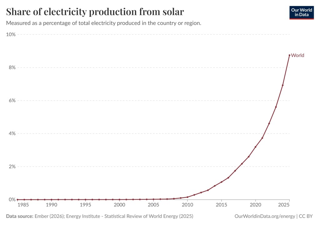
The share of electricity from Solar for the world has grown from essentially 0% in the year 2000 to 3.19% in 2020 to 8.75% in 2025. For solar, the United States follows the rest of the world closely. Some countries have a higher percentage, such as the Cook Islands – 50%, Luxembourg – 30.52%, Chile – 25.06%. If you wish you can take a look here, or here, and you can play around with the different graphs. You can create millions of scenarios at your pleasure.

The graphs shows that the share of electricity from Solar remained nearly zero until the very recent sharp increase. | The Unfolding Clean Energy Revolution
Share of electricity from Solar. Measured as a percentage of total electricity produced in the country or region. Data source: Ember (2026): Energy Institute – Statistical Review of World Energy (2025)    OurWorldinData.org/energy | CC BY

The Share of Electricity Production from Hydropower

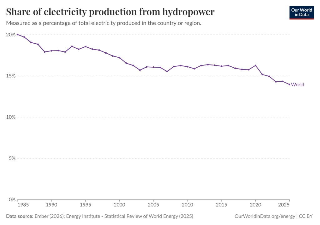
Hydro is a renewable energy source but its share of electricity production in the world has gone down. Unlike solar and wind, hydro is not an intermittent source of energy, so that is not necessarily something to celebrate. The intermittency of solar and wind can be mitigated using batteries, or energy sources that are not intermittent, preferably clean energy sources such as hydro and nuclear. Hydro is still the world’s most popular renewable energy source but that is changing quickly.

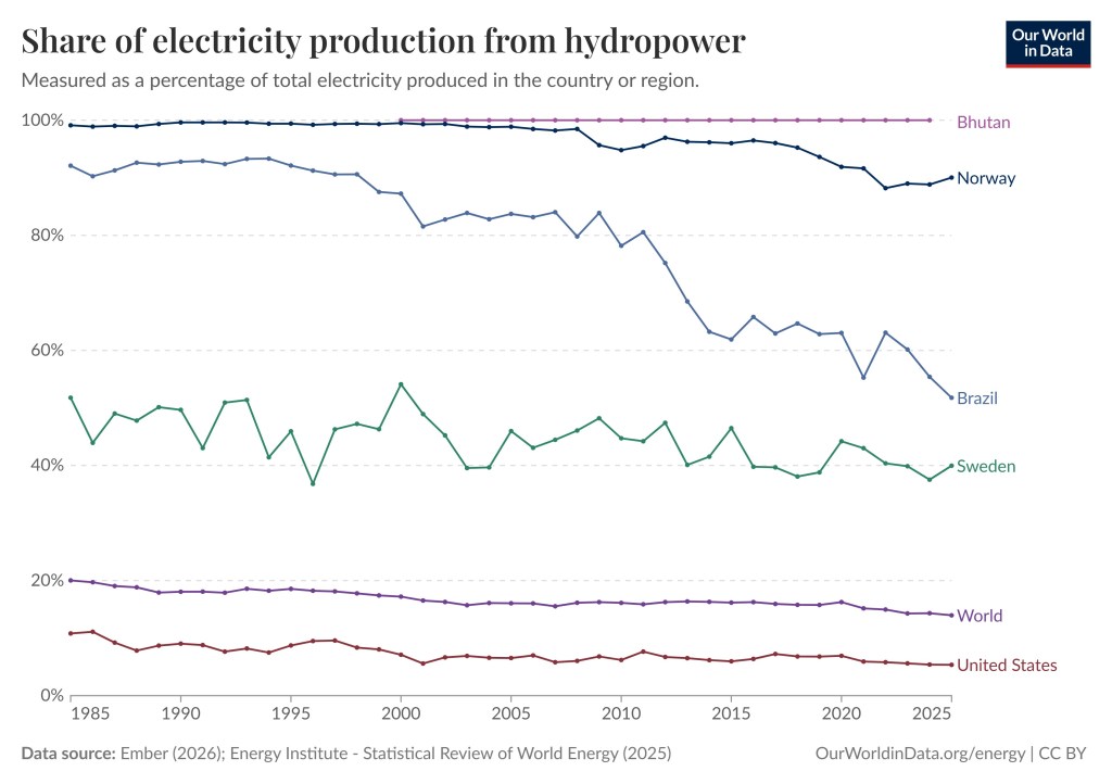
The graph below shows that the share of electricity production from hydropower for the world is 13.96%, USA 5.35%, Bhutan 100%, Norway 90.03%, Brazil 51.78%, Sweden 39.97%. If you wish you can take a look here, or here, and you can play around with the different graphs. You can create millions of scenarios at your pleasure.

There is only one graph in the chart and that is for the share of electricity production from hydropower. It has slowly been going down from 1985 (20.02%) to 2025 (13.96%).
Share of electricity production from hydropower. Measured as a percentage of total electricity produced in the world. Data source: Ember (2026): Energy Institute – Statistical Review of World Energy (2025)    OurWorldinData.org/energy | CC BY
The chart shows six colored graphs going from 1985 to 2025. The graphs correspond to the world, Bhutan, Norway, Brazil, Sweden, and the United States. | The Unfolding Clean Energy Revolution
Share of electricity production from hydropower. Measured as a percentage of total electricity produced in the world and five countries (Bhutan, Norway, Brazil, Sweden, United States). Bhutan remains at 100% hydro, Norway went from 99.12% in 1985 to 90.03% in 2025, Brazil went from 92.10% hydro in 1985 to 51.78% in 2025, Sweden went from 51.76% hydro in 1985 to 39.97% in 2025, the United States went from 10.81% hydro in 1985 to 5.35% in 2025. The world went from 20.02% hydro in 1985 to 13.96% in 2025. Data source: Ember (2026): Energy Institute – Statistical Review of World Energy (2025)    OurWorldinData.org/energy | CC BY

The Share of Electricity Production from Nuclear

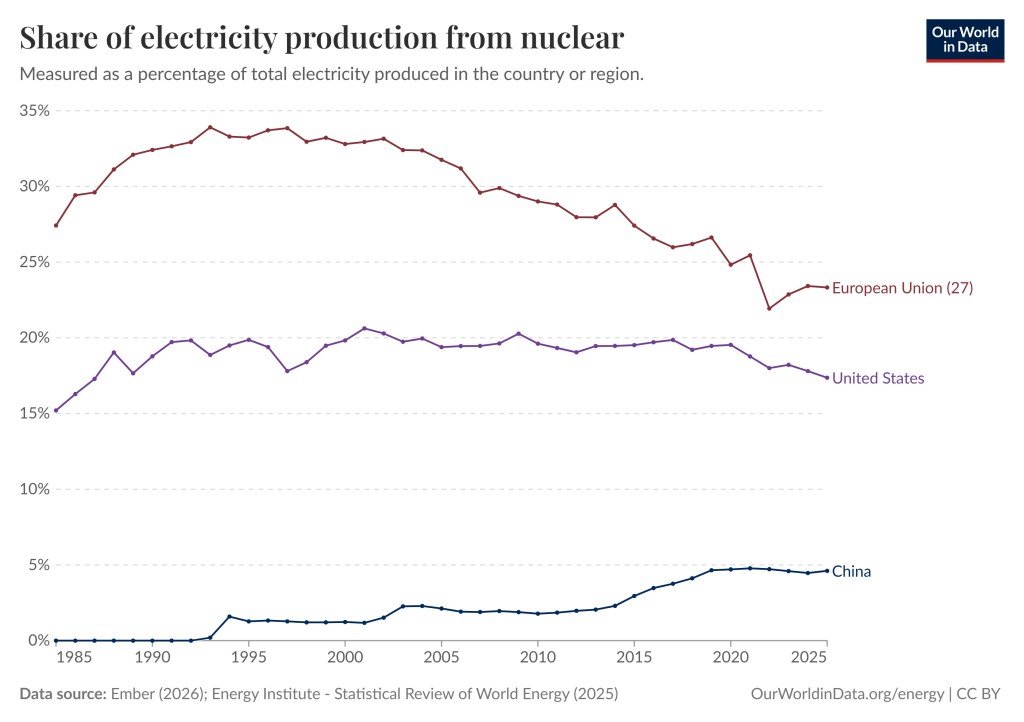
The share of electricity production in the world from nuclear went down from 15.06% in 1985 to 8.85% in 2025, which is a significant drop. During the same time the share of electricity production from nuclear in the United States went from 15.20% in 1985 to 17.36% in 2025, for China the numbers are 0% in 1985 to 4.61% in 2025, and for EU the share of electricity production in 1985 was 27.42% and in 2025 23.32%. However, in 1993% the share of electricity production in 1993 was 33.90%.

So, nuclear has taken a big step back in EU. Germany cancelled nuclear power entirely, for better and for worse. To interact with the graphs shown below or see other (millions) related charts or maps click here, or here.

This chart features three graphs corresponding to the United States, EU, and China. The share of electricity production from nuclear has gone up in both the United States and China while the share has gone down in the EU after a record high in 1993.
Share of electricity production from nuclear. Measured as a percentage of total electricity produced in the world’s three largest economies, the United States, EU, and China. Data source: Ember (2026): Energy Institute – Statistical Review of World Energy (2025)    OurWorldinData.org/energy | CC BY

Geothermal a Promising source of Energy

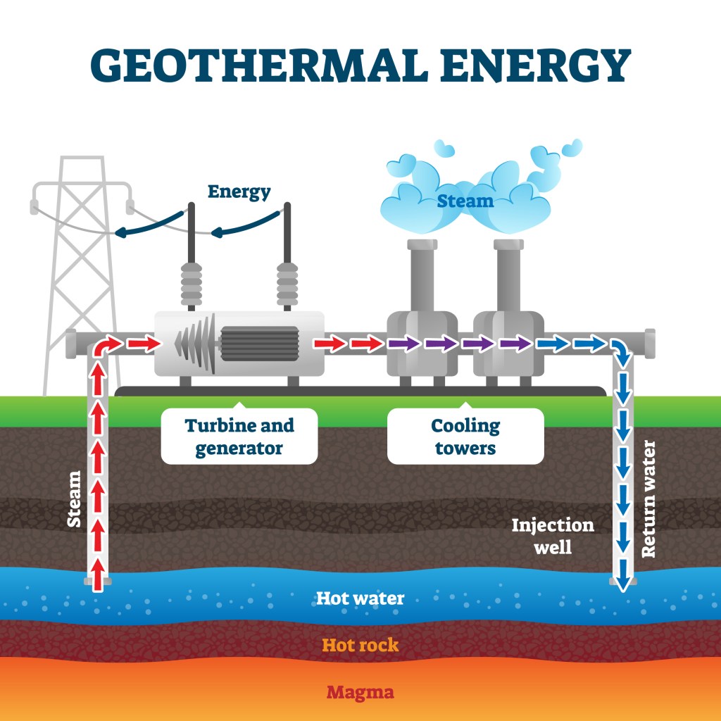
Another reason to believe that the energy transition away from fossil fuels has begun, is that in addition to fossil fuels losing share of total electricity produced, there are promising emerging renewables, such as Geothermal energy. Geothermal energy uses natural heat from deep within the Earth to generate electricity or heat buildings. Wells tap into underground hot water/steam reservoirs, forcing it up to spin turbines that power generators, after which the water is cooled and reinjected to replenish the source (see the picture below).

The illustration shows hot steam from hot water deep underground flowing up to earth’s surface and driving a turbine generating electricity. Then the steam is cooled and pushed back down into the ground.
Geothermal energy production example diagram illustration. Industrial renewable green energy plant example. Steam flow from the underground hot water to turbine generator and cooling towers. Shutterstock Asset id: 1637621995 by VectorMine.

Just like renewables geothermal energy is low emissions energy source but unlike renewables it is not an intermittent energy source. It is as of yet not widely used and not cost effective. However, it appears that might change soon. The advanced drilling techniques needed are utilizing oil and gas expertise and could therefore provide a good transition from fossil fuels to geothermal.

A geothermal plant. There are pipes going into a circular pool. | The Unfolding Clean Energy Revolution
Geothermal power plant from above Shutterstock Asset id: 2539157855 by Alrasyiqin

Is Fusion Power the Future ?

Fusion power is a clean, and near-limitless energy source generated by smashing light atomic nuclei together, usually hydrogen isotope, to form heavier ones. It is a form of nuclear power that releases immense heat. It replicates the process that powers the Sun. Unlike wind and solar it is not intermittent and can generate carbon-free baseload electricity without long-lived radioactive waste. However, it cannot yet be used to produce energy. That does not mean it will not work in the future.

The inside of a nuclear fusion plant. | The Unfolding Clean Energy Revolution
Nuclear fusion power generator concept image, 3d rendering Shutterstock asset id: 2262106105 by MeshCube.

Conclusion

The share of fossil fuels for electricity generation is decreasing despite the fact that the share from hydro and nuclear is also decreasing. The reason is the spectacular increase in the share provided by wind and solar. In addition, EV cars are rapidly replacing internal combustion cars around the world, especially in the EU and China. There are also renewable or clean energy sources that show great promise even though they are not yet widespread. This means that fossil fuels, coal, natural gas, and oil, which are all dirty and dangerous energy sources, are finally being replaced by cleaner alternatives.


To see the other Super Facts click here

Carbon Capture and Storage an Unfulfilled Promise

Superfact 99: Carbon capture is the process of separating carbon dioxide from industrial emissions. Even though it works and could be helpful it isn’t used very much, at least not the right way.

Esther’s writing prompt: April 29, 2026: Capture

Click here or here  to join in.

Carbon capture and storage is the process of separating carbon dioxide (CO2) from industrial emissions to prevent it from entering the atmosphere and contributing to climate change. There are also systems that can remove carbon dioxide directly from the atmosphere, but this is expensive. After capturing the carbon dioxide, it is compressed and stored permanently underground or used in products.

Capturing carbon dioxide from concentrated sources like ethanol or natural gas plants can cost as little as $15–$25 per ton, which should be compared to the huge cost from the damage to health and the environment caused by carbon dioxide added to atmosphere. This cost ranges from several hundred dollars per ton, to thousands of dollars per ton, and even one hundred thousand dollars per ton according to some estimates. Yet it has only captured about 0.1% of global emissions, making its overall climate impact negligible. Instead of storing the captured carbon dioxide it is often injected into nearly depleted oil wells to force out the remaining oil.

If you have not heard about carbon capture before, its existence may be a surprise to you. If you do know about carbon capture it is likely to come as a surprise to you that it is a potentially promising technology that is underutilized and not used correctly. The facts around this technology are surprising, which is why I call it a super fact.

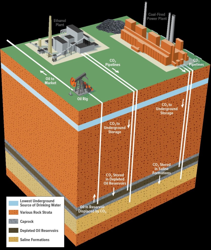
The illustration shows a geological cross section and includes an ethanol plant, and a coal fired power plant capturing emissions buried below earth’s surface. | Carbon Capture and Storage an Unfulfilled Promise
With CCS, carbon dioxide is captured from a point source, such as an ethanol refinery. It is usually transported via pipelines and then either used to extract oil or stored in a dedicated geologic formation. Congressional Budget Office, U.S. Federal Government, Public domain, via Wikimedia Commons.

Carbon dioxide and Global Warming

Global warming, or if you call it climate change, is happening and it is happening very fast. We also know that it is caused by us primarily as a result of our burning of fossil fuels. The primary culprit is carbon dioxide. There is a long-standing scientific consensus on these two/three facts because the evidence is conclusive. Some organizations and contrarians have successfully confused the public, but that does not mean there is a serious scientific discussion on the issue. To read more about this click here.

The damage caused by carbon dioxide to human health and the environment is difficult to assess, but you can get an idea, and you can put a dollar price on it. The economist William Nordhaus did this and got the Nobel Prize in economy for it in 2018. See my review for his book The Climate Casino. Now the question is what to do about it, and carbon capture and storage is one potential option.

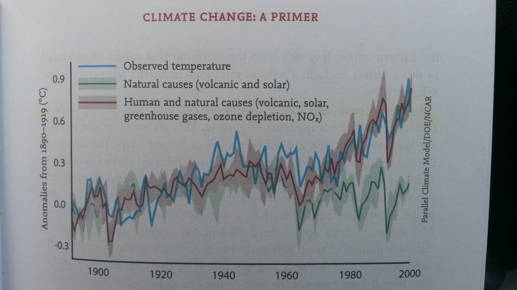
Graph showing possible causes for the observed temperature (blue), natural causes (volcanic, solar), human and natural causes (volcanic, solar, greenhouse gases, NO2, ozone depletion).
Natural causes for global warming / climate change would have cooled the planet, not warm it. Click here to visit this NASA web page regarding the causes behind global warming.

Carbon capture and storage an unfulfilled promise

The following is to a large degree my opinion, not just fact. Carbon capture and storage is a good idea. However, it adds costs to the production of energy, a cost someone must pay for. It seems like a no brainer that if carbon dioxide creates a social cost of several hundred dollars per ton, then paying much less than that to mitigate the emissions would be a good idea. However, the social cost that carbon dioxide imposes on all of us is imposed on all of us whether we are responsible for the emissions or not. Whereas the cost for carbon capture is a cost to a specific company or person responsible for the emissions.

Even though the cost for carbon capture may only be a few dollars added to the natural gas bill or a few cents per gallon on a gas tank it is a cost that is not incurred by your competitor who is not doing carbon capture. Unless the governments of the world either pay for carbon capture or put a price on carbon emissions, carbon capture isn’t going to be economically viable.

In addition, carbon capture and storage has been disappointing in other ways. It has been more difficult and expensive than expected. It has been used to extract more fossil fuels rather than removing carbon emissions. In addition, renewable energy has become so cheap that it is cheaper to use renewable energy instead of fossil fuels with carbon capture.


My Other Responses to Esther’s Prompts


To see the Other Super Facts click here

Smorgasbord Blog Magazine shares Superfact number 19

Please take a look at Smorgasbord Blog Magazine’s of my super fact #19 “An account impersonating you on Facebook does not mean you have been hacked“.

To see the other Super Facts click here

Mosquitos and Snakes Kill Hundreds of Thousands of People Annually

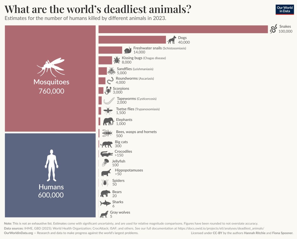
Super fact 98 : The deadliest animals in the world are mosquitos, snakes and dogs. Mosquitos kill an estimated 760,000 people each year. Snakes kill an estimated 100,000 people each year. Dogs kill an estimated 40,000 people each year. By comparison humans kill on average 600,000 other humans annually due to wars and violence.

The picture feature purple bar graphs with animal pictures and animal names. The numbers indicate the number of people killed each year (well 2023) by an animal. The numbers are Mosquitos 760,000, Humans 600,000, Snakes 100,000, Dogs 40,000, Freshwater Snails 14,000, Kissing bugs 8,000, Sandflies 5,000, Roundworms 4,000, Scorpions 3,000, Tapeworms 2,000, Tsetse flies 1,500, Elephants 1,000, Bees, wasps and hornets 500, Big cats 300, Crocodiles > 150, Jellyfish 100, Hippopotamuses > 50, Spiders 50, Bears 20, Sharks 6, Gray wolves 5.
Estimates for the number of humans killed by different animals in 2023. Note: This is not an exhaustive list. Estimates come with significant uncertainty and are used for relative magnitude comparisons. Figures have been rounded to not overstate accuracy. Data sources: IHME; GBD (2025); World Health Organization; CrocAttack; ISAF; and others. See the full documentation at https://docs.owid.io/projects/etl/analyses/deadliest_animals/   OurWorldInData –  Research and data to make progress against the world’s largest problems.  Licensed under CC-BY by the authors Hannah Ritchie and Fiona Spooner.

The first time I heard that the deadliest animal in the world was the mosquito I was surprised. After I heard that the reason was all the diseases that mosquitos spread, such as malaria, dengue fever, and yellow fever, it made more sense to me. I recently learned that snakes kill 100,000 people every year. It surprised me because it seemed like a lot to me.

I was also surprised to learn that our best friends the dogs, come in as number three on the list of deadliest animals, at an annual kill rate of 40,000 people. Even though scorpions are not at the top of the list they kill 3,000 people annually, while spiders only kill 50 people. We have both venomous spiders and scorpions where I live, but I’ve been worried about spiders, not scorpions. It is also surprising to me that sharks only kill about 6 people per year. I guess my super fact 98 is a collection of facts regarding “killer animals” rather than one specific fact. I am hoping that at least one of the facts will be surprising to you.

I should mention that the numbers vary over time and different sources give different statistics. Therefore, the numbers should be seen as ballpark numbers and not exactly. However, Our World in Data is considered one reputable and highly reliable data source that is frequently cited in scientific journals, and access is free.

Mosquitos Kill 760,000 People Each Year

Mosquitos are the biggest killers of humans by far. 80% of those deaths are the result of malaria which is transmitted and spread by the Anopheles mosquito. We have made progress against malaria, and it used to be worse. In the 20th century 150 to 200 million people died from malaria, which is more than one and half million people per year. Smallpox killed 300 million people in the 20th century, but it was entirely eradicated by 1977 thanks to the smallpox vaccine. The two existing vaccines for malaria are relatively recent (2021 & 2023), not as effective as the smallpox vaccine was, and not yet as widely used, which is one reason malaria is still a major health concern.

The picture shows a mosquito biting human skin. It is already filled up with blood. | Mosquitos and Snakes Kill Hundreds of Thousands of People Annually
The Aedes aegypti mosquito, which spreads dengue fever and yellow fever. Original author: US Department of Agriculture; then denoised rescaled, enhanced with adaptive denoising filters and minimal resharpening, then unscaled to original resolution, for easier refitting at various resolutions., Public domain, via Wikimedia Commons.

In addition, mosquitos spread other diseases killing more than 100,000 people every year. Dengue fever, yellow fever and Japanese encephalitis, are a few of the more dangerous mosquito borne diseases.

Snakes Kill 100,000 People Each Year

The death toll from venomous snakes is uncertain but it is likely to be 100,000 deaths per year. The World Health Organization estimates that snake bites kill between 81,410 and 137,880 each year.

The most venomous snake in the world is the Inland Taipan. Its venom can kill over 100 people in a single bite. However, due to its shy nature and remote Australian habitat, no human deaths have been attributed to it. The most dangerous snake to humans, in terms of fatalities, is often considered the Russell’s viper, responsible for 25,000 deaths annually. Other snakes that kill several thousand people every year are the saw-scaled viper, the common krait, the Indian cobra in Asia, and the black mamba.

The photo shows a brown speckled snake with a head that does not appear wider than the body unlike the head of vipers. | Mosquitos and Snakes Kill Hundreds of Thousands of People Annually
Inland Taipan. XLerate, CC BY-SA 3.0 http://creativecommons.org/licenses/by-sa/3.0/, via Wikimedia Commons.
The photo shows a light brown snake with dark brown spots and triangular viper head. | Mosquitos and Snakes Kill Hundreds of Thousands of People Annually
Russel’s Viper in the CME Dapodi campus. Photographed by Abhinav Chawla (self). AChawla, CC BY-SA 3.0 https://creativecommons.org/licenses/by-sa/3.0, via Wikimedia Commons.
A beige spectacled cobra with flared hood looking into the camera. | Mosquitos and Snakes Kill Hundreds of Thousands of People Annually
The Indian Cobra, here photographed at Hoskote, Karnataka, is one of the most dangerous snakes in all of Asia. Pavan Kumar N, CC BY-SA 3.0 <https://creativecommons.org/licenses/by-sa/3.0&gt;, via Wikimedia Commons.

Dogs Kill 40,000 People Each Year

Our mini-Australian Shepherd puppy Rollo is lying on a blanket.
Did you kill 40,000 people? Actually, our mini-Australian Shepherd Rollo did not kill anybody.

Even though there are some large and dangerous dogs, most deaths caused by dogs is from rabies resulting from being bitten by a rabies infected dog. See the horror movie Cujo.

Freshwater Snails, Kissing Bugs, Sandflies, Roundworms are Mass Killers

Other critters that kill thousand of people every year are freshwater snails, kissing bugs, sandflies, and roundworms. These critters kill people by infecting them with dangerous parasites or as in the case of roundworms, being a dangerous parasite.

Scorpions Kill 3,000 People Each Year but Spiders Only 50

I was at an overnight outing with the guys at work. I had just moved to Texas. We were standing or sitting around the fire drinking beer when I asked a question. I’ve heard about the scorpions in Texas, but I’ve never seen any. How common are scorpions?

A coworker named Gary told me to turn around, so I did. Behind me was a tree, and the tree was covered by crawling scorpions. Well, I was glad I did not lean on it. The scorpions I saw were the striped bark scorpion.

The reason scorpions kill a lot more people than spiders is that some scorpion species have a very potent and deadly venom. Some spiders are dangerous too, but spiders tend to have less potent venom.

A yellow, beige scorpion with light brown stripes.
Striped Bark Scorpion (Centruroides vittatus) Striped Bark Scorpion (Centruroides vittatus). Charles & Clint, CC BY 2.0 https://creativecommons.org/licenses/by/2.0, via Wikimedia Commons.

The Big Cats kill only 300 People Annually and Sharks Only 6

Would you prefer to stay in a room with a Tiger or with a mosquito? Mosquitos kill 760,000 people every year, whilst Tigers only kill a handful of people every year. However, Tigers don’t kill less people than mosquitos because they are less dangerous than mosquitos. The difference is exposure. Mosquitos are everywhere but not Tigers. If Tigers were as common as people and everywhere people were, the numbers probably would be different.

Bengal Tiger walking next to a forest.
Bengal tiger (Panthera tigris tigris) female, Kanha National Park, India. Attribution: Charles James Sharp.

Other Posts Related to Animals


To see the other Super Facts click here

Electrons Have Spin Without Spinning

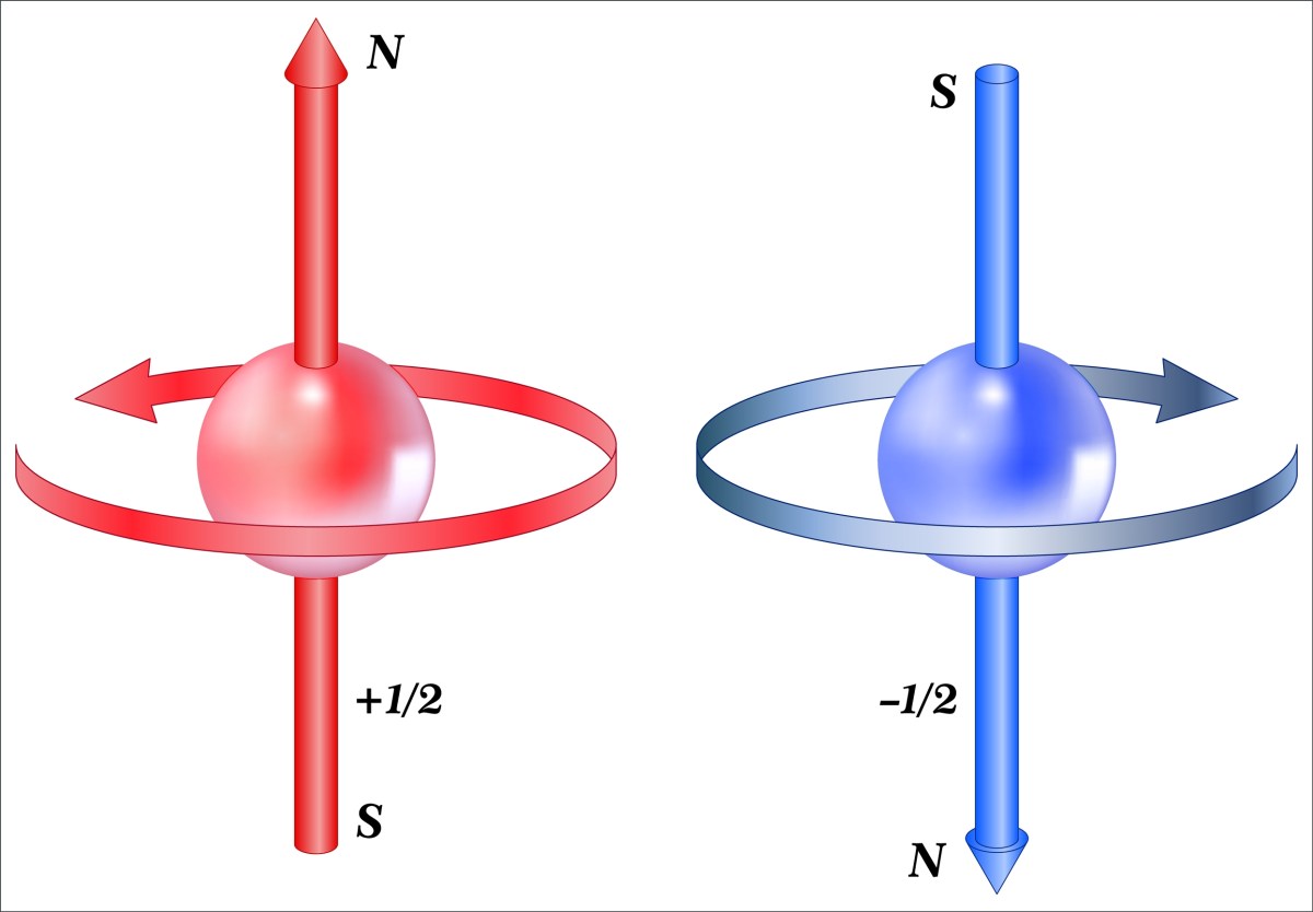
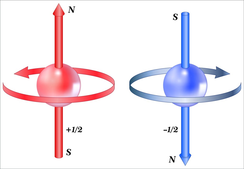
Super fact 97 : Things that spin have an angular momentum and if electrically charged they also generate a magnetic field (magnetic dipole). This is true for electrons and many other elementary particles. However, electrons are not physically spinning. This “spin” is an intrinsic property like electrical charge or mass. In addition, the electron has “Spin 1/2,” meaning you must rotate its wave function 720 degrees (two full circles) to get back to where you started. Moreover, this half spin oddity makes the existence of matter possible.

The picture shows a red ball representing a particle with +1/2 spin and a blue particle with -1/2 spin. The red spinning ball creates a magnetic dipole with the north pointing up and the south down. The spinning blue ball does the opposite. | Electrons Have Spin Without Spinning
The electron behaves as if it were spinning about an axis, thereby generating a magnetic field whose direction depends on the direction of spin. Shutterstock asset id: 1945241416 by Fouad A. Saad.

An electron with spin +1/2 will align parallel with an external magnetic field while an electron with spin -1/2 will align in the opposite direction. The existence of intrinsic spin and the fact that the half spin property requires you to rotate the electron’s wave function twice to get back to where you started is very surprising. Particles with half spin (electrons, protons, positrons, muons, etc.) are called Fermions. It is also surprising that the half spin property makes the existence of matter possible. These true but surprising facts are important, which is why I consider this a super fact.

Angular Momentum and Magnetic Dipoles

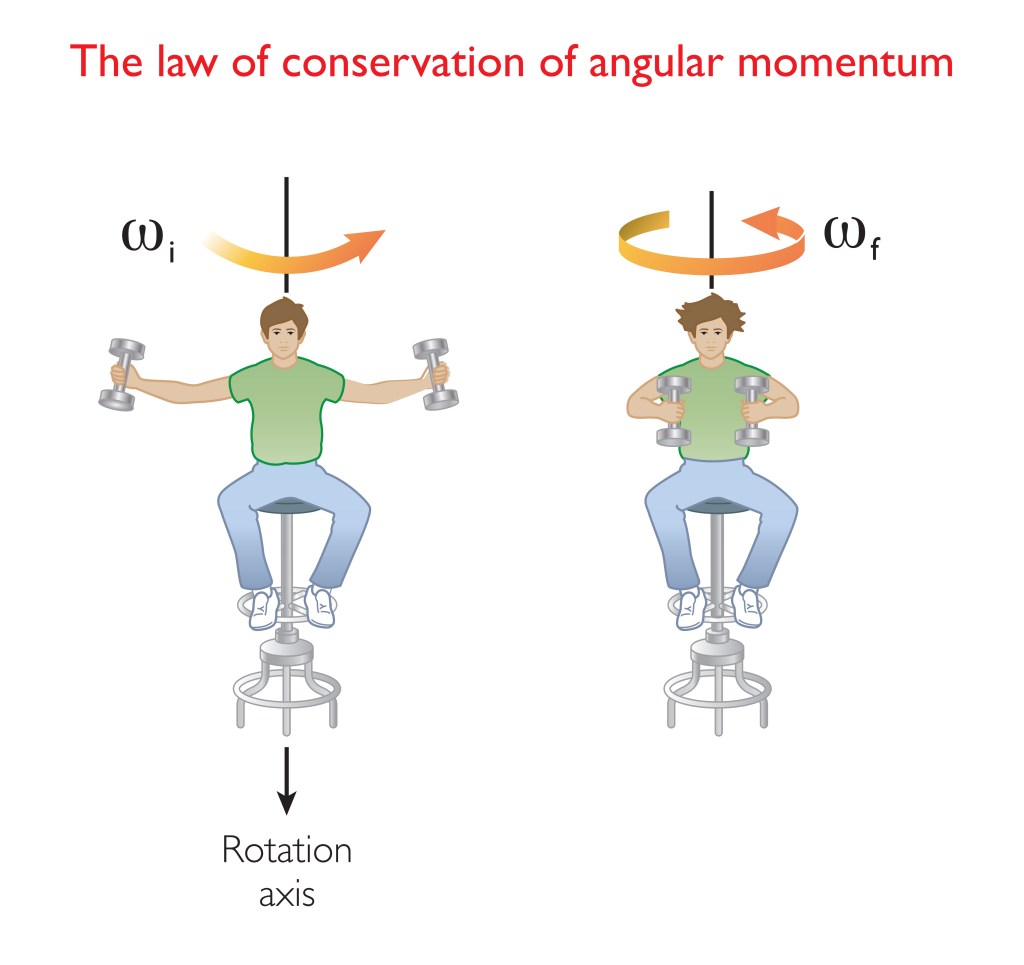
On the left the illustration shows a man sitting on a rotating chair with his hands stretched out. In his hands he is holding dumbbells. The right side of the illustration depicts him bringing his hands close to his body resulting in the rotation speeding up. This is an example of the law of conservation of angular momentum.
The law of conservation of angular momentum. Shutterstock asset id: 1669028755 by DKN0049

The picture above gives an example of the law of conservation of angular momentum. Bringing weights closer to the body speeds up the rotation. Another example of the law of conservation of angular momentum is when you try to tip the axis of the rotation. This would be the man tipping over. You can’t do that without applying a force. The electron, and other subatomic particles with spin, display this gyroscopic effect, like a spinning top. As mentioned, charged particles such as the electron, positron or proton, also generate a magnetic field as if they were spinning. However, the strange fact is that despite that electrons and other particles with spin display these spin properties, they aren’t spinning.

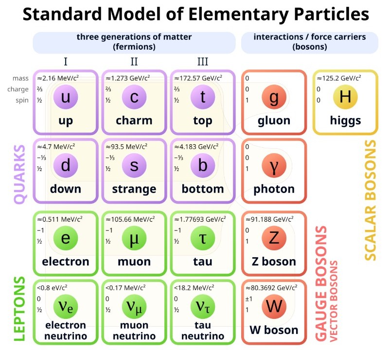
Below is an overview of the elementary particles. An elementary particle is a fundamental subatomic building block of the universe that cannot be divided into smaller components. Notice that the proton and the neutron are not listed because they are not fundamental particles. They consist of three quarks. The top number is the mass (0.511 MeV/c2 for an electron). The number below that is the charge (-1 for an electron) and the bottom number is spin (1/2 for an electron). The diagram shows three intrinsic properties per particle.

This is periodic table style map showing the six quarks, six leptons and five bosons. | Electrons Have Spin Without Spinning
Elementary particles of the Standard Model from Wikipedia By Cush – Own work using:PBS NOVA [1], Fermilab, Office of Science, United States Department of Energy, Particle Data Group, Public Domain, https://commons.wikimedia.org/w/index.php?curid=4286964

Electron Orbitals

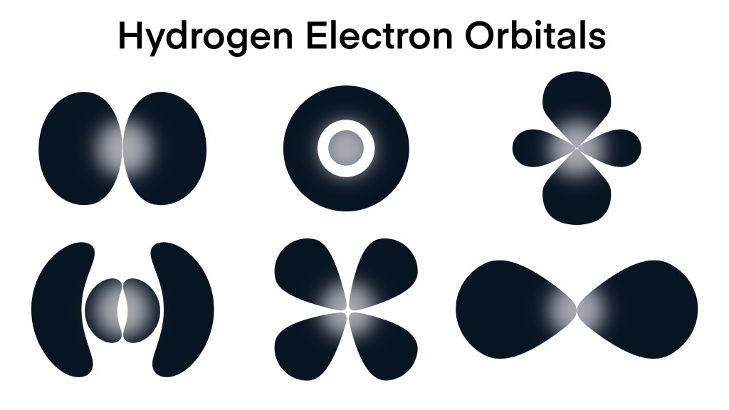
I should explain something about particles and waves. Subatomic particles are associated with quantum waves. This is quantum mechanics. For example, an electron is in a sense both a particle and a wave, or more correctly neither. However, it exhibits both point like particle characteristics and wave characteristics depending on circumstances. Below is a picture showing the standing quantum waves representing an electron in different orbitals (different states) in a Hydrogen atom.

Hydrogen atoms only have one electron, but that electron can exist in different orbitals (sort of different orbits). A standing wave is a wave that is not spreading out, like the waves going back and forth in a bathtub. You can’t really say that the electron is orbiting the nucleus like a planet. The standing quantum wave, or electron cloud, or orbital are more accurate ways to view it.

The standing quantum waves look like spheres, or ellipses, or drops, all kinds of strange shapes.
Hydrogen electron orbitals, the electron’s charge distribution around the atom’s nucleus, quantum mechanics, Orbital shell, atomic orbital, electron cloud or wave mechanics model. Shutterstock asset id: 2500396483 by Watthana Tirahimonchan.

There is some confusion as to what the standing quantum waves represent. The Copenhagen interpretation says that the electron exists in superposition, or all possible states, until measured. The quantum wave indicates the probability that you will find the electron in a certain place when you measure. The square of the amplitude of the wave is the probability that you will find the electron at that point. When you measure it and find out where the electron is the wave will collapse.

Other interpretations say that the electron is in a specific place, you just don’t know where, but again the square of the amplitude of the wave is the probability that you will find the electron at that point. Yet other interpretations say that the quantum wave is a real physical thing that guides the electron (pilot waves). The so called many-worlds-interpretation say that all possible outcomes of a measurement happens but in an infinite number of parallel universes (multi-verses).

Then some people say that the quantum wave does not exist at all, other than as a probability distribution. It represents what the observer knows about the system, nothing else. If you don’t know where the electron is, then the wave is all over the place. If you measure where it is then the wave collapses. Then we also have the you-don’t-know-what-you-are-talking-about-just-shut-up-and-calculate interpretation. The latter interpretation is focused on using the equations, for example the Schrödinger and Dirac equations, to make predictions and measurements and it ignores what’s behind the scenes. This interpretation is popular in college physics classes.

Whichever interpretation you prefer, the you-must-fully-rotate-the-wave-function-twice-to-get-back-to-start property leads to the Pauli exclusion principle.

The Pauli Exclusion Principle

The Pauli exclusion principle states that two identical fermions (such as electrons) cannot occupy the same quantum state simultaneously. For example, two electrons in the same orbital must have opposite spin +1/2 and -1/2 and you could never add a third electron. This adds structure to the atom and to the nucleus. If you did not have the Pauli exclusion principle everything could just fall into one point, and you could walk through walls. Matter as we know it could not exist. This is why fermions (electrons, muons, positrons, quarks, protons, neutrons, etc.) often are referred to as matter particles and bosons (photons, gluons, etc.) are referred to as radiation.

It turns out that that the Pauli exclusion principle is a direct result of the half spin of fermions, in other words, that you have to rotate the associated wave twice around to get back to the original.

Do you think this is confusing ? Don’t feel bad. Richard Feyman one of the most prominent pioneers of quantum mechanics and Nobel Prize winner in physics said, “I think I can safely say that nobody understands quantum mechanics”.

Other Super Facts Related to Modern Physics


To see the other Super Facts click here